Free original lessons
Draw the Letter A: Block and Serif Construction
Learn to draw a capital A in block and serif styles using measured guides, stroke order, and a clear convention for checking proportions and symmetry.
Free lesson
Four exercises
Worked answers
Object Drawing Lessons
Drawing a capital A well depends on a few measurable relationships: the apex position, the spread of the legs, the height of the crossbar, and the thickness of the strokes. This lesson separates block and serif construction so you can control each style deliberately. You will use a simple convention: x-height runs from the baseline to the midline, while the cap height runs from the baseline to the top guide. Letter styles vary, so treat every numerical value here as a hypothetical example you can adjust after measuring your own paper and tools. The goal is not one universal A but a consistent, checkable A that matches the style you intend.
Practice materials: Printable downloads are not available for this lesson yet. Use the instructions and four exercises below.
Reference illustration
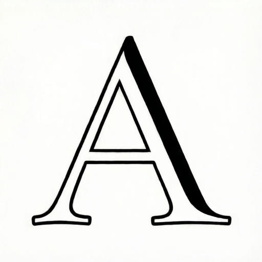
Use the stated measurements and conventions for each exercise.
Set up guides and define the convention
Draw a baseline and a top guide. Mark a midline halfway between them for x-height reference. For a capital A, the apex sits on or near the top guide, and both feet rest on the baseline. Decide a total cap height, for example 60 mm, and a leg spread, for example 40 mm between the outer feet. These are hypothetical examples, not standards.
Use light pencil guides so they can be erased. Mark the center vertical axis. The apex should sit on this axis, and the two feet should be equidistant from it. Keep all measurements in the same unit, such as millimeters, to avoid conversion errors.
- Draw a baseline and a top guide 60 mm apart.
- Mark a midline at 30 mm above the baseline.
- Draw a light center axis.
- Mark two foot points on the baseline, 20 mm left and 20 mm right of the center axis.
Construct the block A
A block A uses uniform stroke thickness and straight edges. Choose a stroke width, for example 6 mm. Draw the left leg from the apex to the left foot, then the right leg from the apex to the right foot. The crossbar connects the inner edges of the legs at a chosen height, for example 20 mm above the baseline.
Check symmetry by measuring from the center axis to each leg at the crossbar height. The two distances should match within your chosen tolerance, for example 1 mm. Because block letters are geometric, small deviations are easy to see, so measure rather than guess.
- Mark the apex on the center axis at the top guide.
- Draw the left leg as a straight stroke of 6 mm width from apex to left foot.
- Draw the right leg as a matching stroke from apex to right foot.
- Mark the crossbar height at 20 mm above the baseline.
- Draw the crossbar between the inner edges of the legs.
- Erase guides and compare left and right leg angles.
Construct the serif A
A serif A keeps the same basic skeleton but adds thick and thin strokes plus serifs at the feet and apex. A common convention is a thick left leg and a thinner right leg, with a horizontal crossbar. Serif shapes vary widely, so define your own serif length, for example 8 mm, and keep it consistent on both feet.
Draw the skeleton first, then thicken the left leg. Add foot serifs as short horizontal strokes centered on each foot. Add a small apex serif or flat top if your style calls for it. The crossbar can be slightly thicker than the thin strokes but thinner than the thick leg.
- Draw the same skeleton as the block A using light lines.
- Thicken the left leg to 8 mm and keep the right leg at 4 mm as a hypothetical contrast.
- Add foot serifs 8 mm long, centered on each foot and resting on the baseline.
- Add an apex serif or flat top consistent with your chosen style.
- Draw the crossbar at 20 mm above the baseline.
- Erase guides and check that serif lengths match.
Check proportions and stroke order
Stroke order affects consistency. For both styles, draw the left leg first, then the right leg, then the crossbar. This order lets you compare the legs before adding the crossbar. For the serif A, add serifs after the main strokes so you can adjust them to the final leg positions.
Use a simple proportion check: the crossbar height divided by cap height should be a deliberate ratio, for example 20 mm divided by 60 mm, or about one third. The leg spread divided by cap height is another useful ratio, for example 40 mm divided by 60 mm, or about two thirds. Record your chosen ratios so repeated drawings stay consistent.
- Measure cap height, leg spread, and crossbar height.
- Calculate crossbar height divided by cap height.
- Calculate leg spread divided by cap height.
- Compare left and right leg lengths from apex to foot.
- Confirm stroke widths match your chosen block or serif plan.
Worked example
Draw a block A with cap height 50 mm, leg spread 30 mm, stroke width 5 mm, and crossbar height 15 mm. Describe the construction and give one symmetry check.
Worked answer
Draw a baseline and top guide 50 mm apart. Mark the center axis. Place the apex on the axis at the top guide. Mark feet 15 mm left and 15 mm right of the axis on the baseline. Draw both legs with 5 mm width. Mark the crossbar at 15 mm above the baseline and draw it between the inner edges. Symmetry check: at crossbar height, measure from the axis to each leg; both distances should be equal within 1 mm.
Four practice exercises
Exercise 1
Construct a block A with cap height 40 mm, leg spread 24 mm, stroke width 4 mm, and crossbar height 12 mm. State the crossbar-to-cap-height ratio.
Show answer and check
The crossbar-to-cap-height ratio is 12 divided by 40, or 0.3. Draw the baseline and top guide 40 mm apart, place the apex on the center axis, mark feet 12 mm each side of the axis, draw 4 mm legs, and place the crossbar at 12 mm above the baseline.
Why: The ratio is a simple division using consistent units. The construction follows the block sequence and keeps symmetry by equal foot offsets.
Check: Measure the crossbar height and cap height, divide, and compare to 0.3. Measure from the axis to each leg at crossbar height and confirm they match within 1 mm.
Exercise 2
Construct a serif A with cap height 60 mm, leg spread 36 mm, thick left leg 8 mm, thin right leg 4 mm, crossbar height 20 mm, and foot serifs 8 mm long. Describe how to check serif consistency.
Show answer and check
Draw the skeleton with apex on the axis and feet 18 mm each side. Thicken the left leg to 8 mm and keep the right leg at 4 mm. Place the crossbar at 20 mm above the baseline. Add 8 mm foot serifs centered on each foot. Check serif consistency by measuring each serif from its foot point and comparing lengths.
Why: The serif A uses the same skeleton as the block A but adds controlled thick-thin contrast and measured serifs. Equal foot offsets preserve symmetry.
Check: Measure both serifs and confirm they are 8 mm within 1 mm. Measure the crossbar height and confirm 20 mm. Compare left and right leg widths to the chosen values.
Exercise 3
A block A has cap height 50 mm and leg spread 30 mm. Calculate the leg-spread-to-cap-height ratio and explain how to use it as a proportion check.
Show answer and check
The ratio is 30 divided by 50, or 0.6. To use it, measure the actual leg spread and cap height on your drawing, divide, and compare to 0.6. A small difference such as 0.02 is a reasonable hypothetical tolerance for hand drawing.
Why: The ratio converts two measurements into one checkable number. Consistent units make the division valid.
Check: Measure leg spread and cap height in millimeters, divide, and compare to 0.6. Repeat the measurement at least once to catch reading errors.
Exercise 4
You are drawing a serif A and the left foot serif measures 9 mm while the right foot serif measures 7 mm. Your chosen serif length is 8 mm. State the fix and the check you would perform after correcting it.
Show answer and check
Adjust both serifs to 8 mm, centered on their foot points. After correcting, measure each serif from its foot point and confirm both are 8 mm within 1 mm. Also confirm both feet still rest on the baseline.
Why: Unequal serifs break the consistency of the style. Correcting both to the chosen length restores the planned convention.
Check: Measure each serif length and compare to 8 mm. Check that each serif is centered on its foot and that the baseline contact is unchanged.
Common mistakes
- Placing the apex off the center axis. Mark the center axis first and place the apex directly on it before drawing either leg.
- Making the crossbar too high or too low. Measure the crossbar height from the baseline and record the value before drawing.
- Using different stroke widths on the two legs in a block A. Choose one block stroke width and apply it to both legs and the crossbar.
- Adding serifs of unequal length. Measure each serif from the foot point and compare lengths before finalizing.
Self-check rubric
- Apex lies on the center axis within the chosen tolerance.
- Both feet rest on the baseline and are equidistant from the axis.
- Crossbar height matches the recorded value.
- Stroke widths match the chosen block or serif plan.
- Serif lengths, if used, are consistent and measured.
- Stroke order follows left leg, right leg, crossbar, then serifs.
- Proportion ratios are recorded and reproducible.
Questions and answers
Do I have to use the example measurements?
No. The numbers are hypothetical examples. Measure your paper and tools, then choose values that fit your drawing size.
Can the serif A have a thick right leg instead?
Yes. Thick-thin contrast is a style choice. Keep the contrast consistent and check that the crossbar and serifs match your chosen convention.
How do I know if my A is symmetrical enough?
Measure from the center axis to each leg at the same height. A small difference such as 1 mm is a reasonable hypothetical tolerance for hand drawing.
Should the crossbar touch the outer edges of the legs?
In most block and serif constructions the crossbar connects the inner edges. If your style uses a different connection, define it clearly and keep it consistent.