Free original lessons
Colored Pencil Flowers: Layering, Blending, and Burnishing
Learn to draw flowers in colored pencil using base layers, mid-tones, petal blending, and burnishing for rich, smooth color.
Free lesson
Four exercises
Worked answers
Object Drawing Lessons
Colored pencil flowers reward patience more than pressure. This lesson teaches a repeatable sequence: establish a light base layer, build mid-tones with controlled strokes, blend adjacent hues on petals, then burnish selected areas to fuse the pigment into a smooth, luminous finish. You will work from a simple flower form and a defined color convention so that your results can be checked and compared fairly.
Practice materials: Printable downloads are not available for this lesson yet. Use the instructions and four exercises below.
Reference illustration
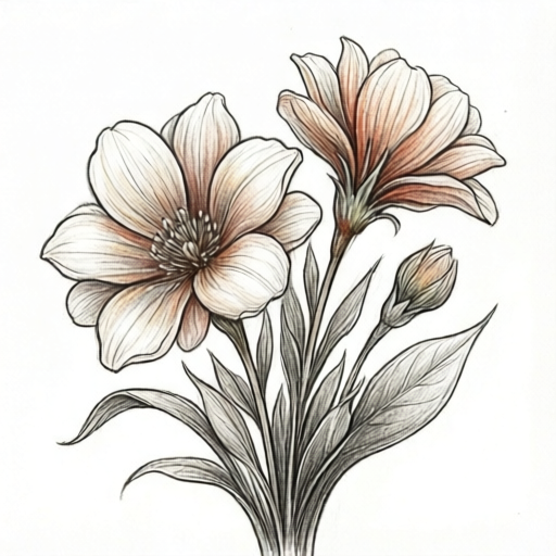
Use the stated measurements and conventions for each exercise.
Base Layer: Light Pressure, Consistent Direction
Begin with a light base layer using the lightest version of each petal color. Hold the pencil loosely and make overlapping strokes that follow the petal's curve from base to tip. Keep pressure low so the paper texture remains visible; this layer is a map, not a finish.
Define a convention before you start: treat the petal's midline as the ridge where light hits, and the baseline as the shadowed attachment point. Your strokes should run roughly parallel to the petal edges, not across them. This convention makes later blending predictable and lets valid stylistic alternatives be judged consistently.
- Outline the flower lightly with a pale yellow or cream pencil.
- Fill each petal with one even base layer, strokes following petal direction.
- Leave the midline slightly lighter than the edges to suggest a ridge.
- Check that no area is darker than a light tint before moving on.
Mid-Tone: Building Depth Without Mud
Add a mid-tone in the shadowed half of each petal using moderate pressure. Choose a hue one step darker or more saturated than the base. Work in small, overlapping patches rather than long scribbles so the color builds evenly.
Where two petals meet, keep a thin uncolored gap until you decide how the shadow will fall. This prevents accidental dark seams. If the mid-tone looks chalky, reduce pressure and add a second thin pass instead of pressing harder.
- Identify the shadow side of each petal using your midline convention.
- Apply mid-tone with short overlapping strokes, moderate pressure.
- Soften the transition by lightly dragging the base color into the mid-tone.
- Compare adjacent petals: the darkest mid-tone should sit near the flower center or under overlapping petals.
Petal Blending and Burnishing
Blend adjacent hues by alternating light strokes of each color across the boundary until the transition looks gradual. Then burnish selected areas with a light-colored pencil or a colorless blender, pressing firmly in small circles to fuse the pigment. Burnish only where you want a smooth, glossy finish; leave some textured areas for contrast.
Burnishing darkens and saturates color, so test on a spare strip first. A practical hypothetical example: if your base is light yellow and your mid-tone is orange, burnishing with the yellow pencil can soften the boundary without adding a new hue. Measure your own paper and pencil behavior rather than assuming a fixed result.
- Alternate light strokes of neighboring colors across each petal boundary.
- Test burnishing pressure on a scrap strip of the same paper.
- Burnish the lit midline and smooth transitions, avoiding deep shadow cores.
- Stop when the surface looks waxy but not crushed; check for paper shine.
Checking and Refining the Flower
Step back and check value order: the darkest darks should be few and deliberate, and the lightest lights should remain clean. If a petal looks flat, add a thin mid-tone pass rather than a heavy burnish. If colors look muddy, lift excess pigment with a clean eraser and restart that patch with lighter layers.
Use a simple rubric: consistent stroke direction, gradual blending, controlled burnishing, and a clear light source. Valid alternatives include softer pastel palettes or sharper petal edges, provided the layering sequence and value logic remain visible.
- Squint at the flower to check value grouping.
- Confirm each petal has base, mid-tone, and optional burnish.
- Refine edges only after color is built.
- Record your palette order for repeatability.
Worked example
A five-petal flower with a light-yellow base and orange mid-tone. Describe the layering order and one burnishing choice.
Worked answer
Apply light yellow base to all petals with strokes following petal direction. Add orange mid-tone on the shadow half of each petal, keeping the midline lighter. Blend the yellow-orange boundary with alternating light strokes. Burnish the lit midline with the yellow pencil using firm small circles, leaving the shadow cores textured. Check that the darkest orange sits near the center and under overlapping petals.
Four practice exercises
Exercise 1
A single petal is drawn with a light pink base and a magenta mid-tone on its lower half. The midline is left pale. Describe two blending passes and one burnishing choice.
Show answer and check
Pass one: alternate light pink and magenta strokes across the boundary. Pass two: drag pink upward into the magenta with light pressure. Burnish the pale midline with the pink pencil using firm small circles, leaving the lower magenta textured.
Why: Alternating strokes soften the boundary without adding a new hue; burnishing the lit midline increases smoothness where light hits.
Check: Squint at the petal: the transition should look gradual, and the midline should be lighter than the lower half.
Exercise 2
Two overlapping petals share a seam. The upper petal is yellow, the lower is orange. Where should the darkest mid-tone go, and how do you avoid a dark seam?
Show answer and check
Place the darkest orange mid-tone on the lower petal under the overlap. Keep a thin uncolored gap at the seam until the shadow direction is decided, then blend yellow into orange lightly across the seam.
Why: Overlapping petals cast shadow on the lower petal; a gap prevents accidental dark lines before the shadow is planned.
Check: Check that the seam is soft and that the darkest area sits under the upper petal, not along the entire seam.
Exercise 3
A flower center is drawn as a small circle. You want a smooth burnished center using yellow and brown. Give a three-step order and one check.
Show answer and check
Step one: light yellow base over the whole center. Step two: brown mid-tone in the lower half only. Step three: burnish the upper half with yellow, leaving the brown textured. Check that the center reads as a rounded form, not a flat disc.
Why: Limiting brown to the shadow half preserves the lit upper area; selective burnishing keeps contrast.
Check: Squint: the upper half should be lighter, and the brown should not cover the entire circle.
Exercise 4
Your petals look chalky after four layers. State one correction and one prevention step.
Show answer and check
Correction: lift excess pigment with a clean eraser and reapply one thin pass at lower pressure. Prevention: keep each layer light and stop before the paper surface looks crushed.
Why: Chalkiness often comes from heavy pigment in few passes; thin layers and lower pressure improve smoothness.
Check: Test on scrap paper: a thin pass should look even, and the paper texture should remain visible.
Common mistakes
- Pressing hard from the first layer, which flattens paper texture and limits later blending. Keep the base layer light and build pressure gradually across passes.
- Blending with dark colors too early, creating muddy petals. Blend adjacent light and mid-tones first; add darks only at shadow cores.
- Burnishing every petal, which removes contrast and makes the flower look plastic. Burnish selected lit areas and leave some textured shadow passages.
- Changing stroke direction randomly, so petals look fuzzy. Follow the petal curve consistently and use the midline convention as a guide.
Self-check rubric
- Base layer is light and even, with visible paper texture.
- Stroke direction follows petal form consistently.
- Mid-tone is placed on a logical shadow side.
- Blending between adjacent hues is gradual, not striped.
- Burnishing is selective and does not flatten all contrast.
- Value order is clear when squinting.
- Valid alternatives in palette or edge sharpness are accepted if layering logic remains visible.
Questions and answers
Do I need a colorless blender?
No. A light-colored pencil can burnish effectively. Test on scrap paper to see which gives the finish you want.
How many layers are enough?
Three to five thin layers usually suffice for a smooth petal. Stop when the color is even and the paper is not crushed.
Can I use a different flower shape?
Yes. The sequence works for any simple flower. Keep the midline and baseline convention so blending remains checkable.
What if my colors look chalky?
Reduce pressure, add a thin pass of the same hue, and avoid over-burnishing. Chalkiness often comes from too much pigment in one pass.