Free original lessons
Rose Tattoo Drawing: Line and Shading Design
Learn to draw an original rose tattoo design using outline construction, layered shading, and a defined line-weight convention. Includes practice tasks and a rubric.
Free lesson
Four exercises
Worked answers
Object Drawing Lessons
This lesson teaches a repeatable method for drawing a rose tattoo design that reads clearly at small scale. You will build the rose from simple geometric guides, refine the outline with a deliberate line-weight convention, and add shading that suggests depth without muddying the silhouette. The convention is explicit: a heavier contour line marks the outer boundary of the design, a medium line marks major internal separations such as petal overlaps, and a fine line marks surface detail such as vein creases. X-height here means the distance from the baseline of a letter to its midline; letter styles vary, so use the convention as a guide rather than a universal rule. All numerical values in this lesson are hypothetical examples chosen for practice, not manufacturing standards. Measure your own paper and tools before committing to any size.
Practice materials: Printable downloads are not available for this lesson yet. Use the instructions and four exercises below.
Reference illustration
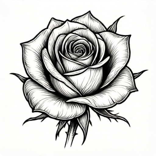
Use the stated measurements and conventions for each exercise.
Building the Rose Skeleton
Begin with a light pencil cross to locate the bloom center. Draw a small circle for the core, then add three concentric arcs that spiral outward. These arcs are guides, not final lines. Place the outer petals as broad teardrop shapes that overlap the core arcs. Keep the stem and two leaves as simple tapered lines so the bloom remains the focal point.
Check the silhouette before adding detail: squint at the drawing. If the outer petal shapes merge into a blob, separate them by adjusting the overlap angle. A tattoo design must remain legible when reduced, so favor clear gaps between major shapes over dense texture.
- Mark a center point and draw a circle about 2 cm across (hypothetical example; measure your own paper).
- Add three spiral arcs inside the circle, each offset by roughly one third of the circle's width.
- Draw four to six outer petals as overlapping teardrops, keeping at least 3 mm of clear space between adjacent petal tips.
- Add a tapered stem and two leaves, angling the leaves away from the stem at about 45 degrees.
- Erase construction arcs lightly, leaving faint guides for the outline stage.
Outline with a Line-Weight Convention
Ink or darken the outline using three line weights. The heaviest line traces the outer boundary of the entire design. A medium line traces the major internal separations where petals overlap. The finest line traces surface creases and vein details. This hierarchy keeps the design readable at small scale because the eye follows the heaviest contour first.
Letter styles vary, and so do drawing styles; the convention is a starting point, not a universal answer. If your design uses a softer look, you may reduce the contrast between weights, but keep the outer boundary heavier than internal detail lines. Test the result by viewing the drawing from about one meter away: the silhouette should still read as a rose.
- Trace the outer boundary with the heaviest line, keeping the stroke continuous.
- Trace petal overlap separations with a medium line, stopping where they meet the outer boundary.
- Add fine crease lines inside each petal, following the petal's curve rather than crossing it.
- Leave the stem and leaves with a medium outline and fine vein lines.
- Check line-weight contrast by viewing the drawing at arm's length and at one meter.
Layered Shading for Depth
Shade in three passes. First, block in the darkest areas at the base of each petal where it meets the core. Second, add a mid-tone along the lower half of each petal, following the petal's curve. Third, add fine hatching or stippling only in the darkest zones to suggest texture. Keep highlights as unshaded paper; do not erase into wet ink.
A common error is shading every petal equally. Instead, choose a light direction, such as upper left, and shade the opposite side of each petal more heavily. This creates a consistent sense of form. If the design will be tattooed, remember that very fine shading may blur over time; the convention here favors clear mid-tones over extremely delicate gradients.
- Choose a light direction and mark it lightly outside the design area.
- Block the darkest tone at petal bases and under overlapping petal edges.
- Add mid-tone shading on the side of each petal facing away from the light.
- Add fine hatching or stippling only in the darkest zones, keeping strokes parallel to the petal curve.
- Leave highlight areas unshaded and check that the darkest and lightest zones alternate clearly.
Design Panel and Final Check
Transfer or redraw the finished rose into a blank design panel of your chosen size. The panel should include the bloom, stem, and leaves with clear margins. Before finalizing, check that the design works as a tattoo: the silhouette is clear, the line weights are consistent, and the shading does not rely on extremely fine detail that may not survive reduction.
Use the rubric below to evaluate the design. Valid alternatives are allowed: a tighter spiral core or a looser petal arrangement can both succeed if the silhouette reads clearly and the line-weight convention is followed. The goal is a coherent rose tattoo design, not a single universal answer.
- Redraw or transfer the design into a blank panel with at least 1 cm margins (hypothetical example).
- Check the silhouette at small scale by reducing the drawing to about half size.
- Verify that outer boundary lines are heaviest and internal detail lines are finest.
- Confirm that shading follows a single light direction and that highlights remain clear.
- Label the design panel with the line-weight convention used for future reference.
Worked example
A student draws a rose with a 3 cm bloom, a 6 cm stem, and two leaves. They use a heavy outer line, medium overlap lines, and fine crease lines. They shade the lower right of each petal, leaving the upper left unshaded. Evaluate the design against the lesson convention.
Worked answer
The design follows the line-weight convention: heavy outer boundary, medium overlaps, fine creases. Shading is consistent with a light direction from the upper left. The silhouette should be checked at one meter; if the petals remain distinct, the design meets the rubric. The stem and leaves are proportionally simple, which supports the bloom as focal point.
Four practice exercises
Exercise 1
Draw a rose bloom with four outer petals and a spiral core. Use the three-weight line convention. Describe where you place the heaviest, medium, and finest lines.
Show answer and check
Heaviest line traces the outer boundary of the bloom and stem. Medium lines trace where each outer petal overlaps the next and where petals meet the core. Finest lines trace creases inside each petal and vein lines on leaves.
Why: The convention prioritizes the silhouette so the design reads at small scale; internal detail is subordinate.
Check: View the drawing from one meter away. The outer shape should read first, then petal separations, then creases.
Exercise 2
A rose design has a 4 cm bloom and a 8 cm stem. The artist shades the upper left of every petal and leaves the lower right unshaded. Is the shading consistent with a single light direction? Explain.
Show answer and check
Yes, if the light direction is from the lower right. The shaded upper left is opposite the light, which is consistent. If the intended light is upper left, the shading is reversed.
Why: Consistent shading requires that the shaded side is opposite the chosen light direction for every petal.
Check: Mark the light direction outside the design and confirm that every shaded area faces away from it.
Exercise 3
You draw a rose with six petals packed tightly so that adjacent petal tips touch. At half size, the bloom looks like a solid circle. What change should you make, and how will you check the result?
Show answer and check
Separate the petal tips by at least 3 mm (hypothetical example) and adjust overlap angles so gaps remain visible. Check by reducing the drawing to half size and viewing from one meter; the petal separations should still be visible.
Why: Tattoo designs must remain legible when reduced; clear gaps preserve the silhouette.
Check: Compare the half-size view before and after the change; count visible petal separations.
Exercise 4
Design a rose tattoo panel with a bloom, stem, and two leaves. State the line weights you use and the light direction. Then list two valid alternative choices that would still meet the rubric.
Show answer and check
Example: heavy outer boundary, medium overlaps, fine creases; light from upper left. Alternatives: a tighter spiral core with five petals, or a looser arrangement with seven petals; either can meet the rubric if silhouette and line-weight hierarchy remain clear.
Why: The rubric allows valid alternatives because letter styles and drawing styles vary; the convention is a guide, not a universal answer.
Check: Apply the rubric items to each alternative and confirm silhouette clarity and line-weight hierarchy.
Common mistakes
- Shading every petal with the same tone, which flattens the bloom. Choose one light direction and shade the opposite side of each petal more heavily, leaving highlights unshaded.
- Using the same line weight for the outer boundary and internal creases. Apply the three-weight convention: heaviest outer boundary, medium overlap separations, finest surface detail.
- Packing petals so tightly that the silhouette becomes a blob at small scale. Keep clear gaps between major petal shapes and check legibility by viewing the drawing from one meter away.
- Relying on extremely fine shading that may blur in a tattoo. Favor clear mid-tones and simple hatching over delicate gradients, and test the design at reduced size.
Self-check rubric
- Silhouette reads clearly as a rose at small scale and from one meter away.
- Outer boundary line is heaviest; overlap separations are medium; surface detail is finest.
- Shading follows a single light direction with clear highlights and mid-tones.
- Petal overlaps are distinct and do not merge into a blob.
- Stem and leaves support the bloom without competing for attention.
- Design is original and fits the rose tattoo design boundary.
Questions and answers
Do I need special tattoo equipment to practice this design?
No. Use pencil, pen, and paper. The lesson focuses on line and shading decisions that apply to any drawing surface.
How large should the design be?
Any size works for practice. The numerical examples in this lesson are hypothetical; measure your own paper and choose a size that lets you control line weight and shading.
Can I change the petal arrangement?
Yes. Valid alternatives are allowed. Keep the silhouette clear and follow the line-weight convention; the exact petal count and spiral tightness can vary.
What does x-height mean in this lesson?
X-height is the distance from a letter's baseline to its midline. Letter styles vary, so treat it as a reference for proportion rather than a fixed rule.