Free original lessons
Graffiti Dice Drawing: Lettered Cube Faces with Shading
Learn to draw a graffiti-style dice cube with lettering on each face, using a net, shading guide, and a convention for letter height.
Free lesson
Four exercises
Worked answers
Object Drawing Lessons
This lesson teaches a specific drawing task: a graffiti dice cube whose visible faces carry bold lettering and controlled shading. You will plan letter placement on a cube net, transfer the design to an isometric cube, and shade faces to show depth. The convention for letter height is baseline to midline (x-height), and letter styles may vary, so the rubric rewards consistent choices rather than one universal answer. All measurements are hypothetical examples; measure your own paper and tools before drawing.
Practice materials: Printable downloads are not available for this lesson yet. Use the instructions and four exercises below.
Reference illustration
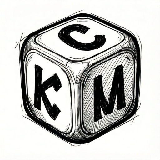
Use the stated measurements and conventions for each exercise.
Plan the cube net and letter placement
Start with a cube net of six equal squares. A practical hypothetical example is a 6 cm square face on A4 paper, but measure your actual paper and choose a size that leaves a 1 cm margin. Label the squares Top, Bottom, Front, Back, Left, Right so you can track which face receives which letter.
Place one bold letter or short word per face. Keep letters inside the square with at least 0.5 cm clearance from edges. Use the baseline-to-midline convention: draw a baseline and a midline for each letter, then keep the main body of the letter between them. Ascenders and descenders may extend beyond, but the x-height band must stay consistent across faces.
- Draw a cube net of six equal squares and label each face.
- Mark a baseline and midline on each square; the gap is the x-height band.
- Sketch one letter per face, keeping the main body inside the x-height band.
- Check clearance from edges and adjust letter width before inking.
Transfer the net to an isometric cube
Draw an isometric cube with three visible faces: top, front, and one side. Use a hypothetical edge length of 6 cm to match the net, but measure your own drawing. Transfer the letters from the corresponding net squares onto the visible faces, preserving the baseline-to-midline band.
Because isometric faces are parallelograms, letter strokes that are vertical on the net become slanted on the side face. Keep the x-height band parallel to the face edges so the lettering reads as painted on the surface rather than floating.
- Draw the isometric cube outline with three visible faces.
- Lightly mark the baseline and midline on each visible face.
- Transfer each letter, slanting strokes to follow the face edges.
- Erase construction lines after the letter shapes are clear.
Add graffiti-style shading and depth
Choose a single light direction, for example from the upper left. Shade the front face lightly, the side face more, and the top face least. Use hatching or solid fill, but keep the lettering readable by leaving a thin unshaded outline around each letter.
Add a cast shadow on the ground plane opposite the light direction. A hypothetical shadow length of 2 cm works for a 6 cm cube, but adjust to your drawing. Keep shading consistent: if the light is upper left, the right side and lower edges receive more shading.
- Mark the light direction with a small arrow outside the cube.
- Shade each visible face according to its angle to the light.
- Leave a thin clear outline around letters so they stay legible.
- Add a cast shadow on the ground plane opposite the light.
Refine lettering and check consistency
Review each face for consistent x-height, clearance, and shading. Letters may be blocky, rounded, or angular, but the baseline-to-midline band should be the same height on every face. If a letter looks too tall, redraw its midline rather than shrinking the whole letter.
Check that the shading direction matches the arrow and that no letter is lost in dark fill. A simple check is to view the drawing from a step back: the cube should read as a solid object with lettering on its surfaces, not as flat shapes.
- Compare x-height bands across all visible faces.
- Confirm the light direction matches the shading on each face.
- Ensure every letter has a clear outline against shaded areas.
- Make final adjustments to line weight and shadow shape.
Worked example
A cube net has six 6 cm squares. The light comes from the upper left. On the front face, a letter has a baseline at 1 cm from the bottom edge and a midline at 3 cm from the bottom edge. What is the x-height, and which visible face should receive the darkest shading?
Worked answer
The x-height is 3 cm minus 1 cm = 2 cm. With light from the upper left, the side face on the right receives the darkest shading among the three visible faces.
Four practice exercises
Exercise 1
A cube net uses 5 cm squares. A letter on the top face has its baseline 1 cm from the bottom edge and its midline 3.5 cm from the bottom edge. What is the x-height in centimeters?
Show answer and check
2.5 cm
Why: Subtract the baseline distance from the midline distance: 3.5 cm - 1 cm = 2.5 cm. The x-height is the gap between baseline and midline.
Check: Re-measure the two distances on the net square and confirm the difference equals 2.5 cm; the value must be less than the 5 cm face size.
Exercise 2
An isometric cube has a light arrow pointing from the upper right. The three visible faces are top, front, and left side. Which visible face should be shaded darkest, and which lightest?
Show answer and check
The left side face should be darkest; the top face should be lightest.
Why: Light from the upper right strikes the top face most directly and the left side face least directly, so the left side receives the darkest shading and the top the lightest.
Check: Confirm the arrow direction and compare each face angle to the light; the face facing away from the light should have the darkest shading.
Exercise 3
On a 6 cm cube face, a letter is drawn with 0.3 cm clearance from the left edge and 0.4 cm from the right edge. The letter width is 4.8 cm. Does the letter fit within the face with at least 0.5 cm clearance on both sides? Show the arithmetic.
Show answer and check
No. Total used width is 0.3 + 4.8 + 0.4 = 5.5 cm, leaving 0.5 cm total, not 0.5 cm on each side. The left clearance is 0.3 cm and the right is 0.4 cm, both below 0.5 cm.
Why: Add the clearances and letter width, then compare each clearance to the 0.5 cm requirement. The sum fits the 6 cm face, but the individual clearances fail.
Check: Re-add 0.3 + 4.8 + 0.4 = 5.5 cm and check that 6 - 5.5 = 0.5 cm total remaining; then verify each side clearance separately against 0.5 cm.
Exercise 4
A cube has a 6 cm edge. A cast shadow is drawn 2 cm long on the ground plane, starting at the cube's right edge and extending away from the cube. If the light direction is from the upper left, on which side of the cube should the shadow appear, and what is the total horizontal distance from the cube's left edge to the shadow's far end?
Show answer and check
The shadow should appear on the lower right side. The total horizontal distance is 6 cm + 2 cm = 8 cm from the cube's left edge to the shadow's far end.
Why: Light from the upper left casts a shadow to the lower right. The shadow starts at the cube's right edge, which is 6 cm from the left edge, and extends 2 cm beyond it, giving 6 + 2 = 8 cm total.
Check: Confirm the shadow direction is opposite the light arrow, then add the cube edge length and shadow length: 6 + 2 = 8 cm.
Common mistakes
- Drawing letters without a baseline and midline, so x-height varies across faces. Mark a baseline and midline on every face before lettering, and keep the main body of each letter between them.
- Shading faces randomly without a consistent light direction. Choose one light direction, mark it with an arrow, and shade each face according to its angle to that light.
- Letting letters touch or cross face edges on the net. Keep at least 0.5 cm clearance from edges; adjust letter width or spacing before inking.
- Filling shaded areas so darkly that letters disappear. Leave a thin unshaded outline around each letter, or use lighter hatching near letter edges.
Self-check rubric
- Cube net has six equal squares with labeled faces and clear margins.
- Each face has one letter or short word with main body inside a consistent baseline-to-midline band.
- Letters keep at least 0.5 cm clearance from face edges on the net.
- Isometric cube shows three visible faces with letters transferred and slanted to follow face edges.
- Shading follows one marked light direction, with the darkest visible face opposite the light.
- Letters remain legible against shaded areas through outlines or lighter fill near edges.
- Cast shadow is placed opposite the light direction and is proportionate to the cube.
- Valid alternative letter styles are accepted if x-height consistency and legibility are maintained.
Questions and answers
Do all letters have to be the same style?
No. Letter styles may vary, but the x-height band (baseline to midline) should stay consistent so the faces read as one design.
How do I decide the cube size?
Measure your paper and choose a face size that leaves a margin. A 6 cm face on A4 paper is a hypothetical example, not a required standard.
Can I use color instead of shading?
Yes, if the value contrast still shows depth. Keep one light direction and ensure letters remain legible against each face.
What if my isometric cube looks uneven?
Check that all three visible edges meet at consistent angles and that face sizes match your net. Lightly redraw construction lines before adding lettering.