Free original lessons
Graffiti Alphabet Drawings: Block and Bubble Letter Basics
Learn to draw graffiti alphabet letters in block and bubble styles, with spacing, outline, and a simple rubric for self-checking your letterforms.
Free lesson
Four exercises
Worked answers
Object Drawing Lessons
This lesson teaches you to draw graffiti alphabet letters in two clear styles: block and bubble. You will build letters from simple shapes, control spacing, and add a clean outline. The focus is letterform construction only, not color, wildstyle, or wall context. You will use a defined drawing convention so you can check your work and accept valid alternatives. All practice is self-contained: no downloads or images are required. Read the sections, study the worked example, then complete the four exercises. Use the rubric to judge your drawings fairly.
Practice materials: Printable downloads are not available for this lesson yet. Use the instructions and four exercises below.
Reference illustration
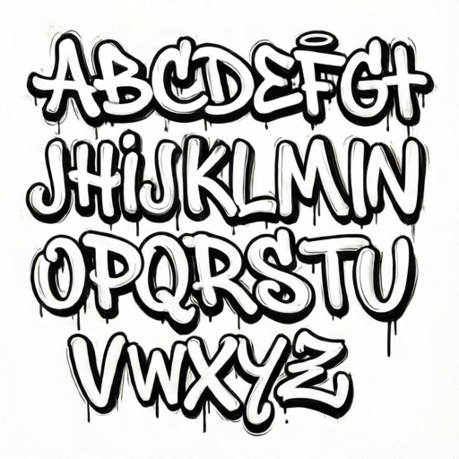
Use the stated measurements and conventions for each exercise.
Set up a simple letter grid
Draw a light rectangle for each letter. A useful convention is to mark a baseline at the bottom, a midline at the top of lowercase letters, and a cap line above that for uppercase letters. X-height is the distance from baseline to midline. Letter styles vary, so choose one x-height for your whole word and keep it consistent.
For block letters, sketch straight-sided shapes inside each rectangle. For bubble letters, sketch rounded shapes that touch the same baseline and midline. Keep your pencil lines light so you can adjust them before outlining.
- Draw a row of equal-width rectangles, one per letter.
- Mark baseline, midline, and cap line lightly across the row.
- Choose one x-height and keep it the same for every letter.
- Sketch each letter lightly inside its rectangle before committing to an outline.
Build block letters from straight shapes
Block letters use straight or nearly straight sides. Start with the outer shape, then add internal gaps or bars. For example, an A can be a triangle with a crossbar; an E can be a vertical bar with three horizontal arms. Keep stroke thickness even across the word so the letters look related.
Spacing matters as much as shape. Leave a consistent gap between letters, and make sure the gap is smaller than the width of a letter. If two letters nearly touch, redraw one slightly narrower rather than squeezing the gap.
- Draw the outer boundary of each block letter first.
- Add internal bars or gaps with even thickness.
- Check that all letters share the same baseline and cap line.
- Adjust spacing so gaps are consistent and smaller than letter width.
Build bubble letters from rounded shapes
Bubble letters use rounded outlines. Draw each letter as a set of overlapping circles or rounded rectangles, then smooth the outer edge. Keep the outline thickness even. A bubble O can be a ring; a bubble S can be two curved shapes joined smoothly.
Because bubble letters are wider, spacing needs extra care. Use the same gap rule: consistent gaps, smaller than the letter width. If a letter looks too wide, reduce its width slightly rather than shrinking the gap to zero.
- Sketch each bubble letter as overlapping rounded shapes.
- Smooth the outer outline so it reads as one shape.
- Keep outline thickness even around the whole letter.
- Compare gaps between letters and adjust width, not gap size.
Outline, check, and use the rubric
Once your pencil sketch is clean, outline the final letter shape with a darker line. Erase construction lines only after the outline is complete. Check your word against the rubric: consistent baseline, consistent x-height, even stroke or outline thickness, readable letterforms, and consistent spacing.
Valid alternatives are allowed. A block letter may have sharp or slightly rounded corners; a bubble letter may be more circular or more oval. The rubric checks consistency and readability, not one universal shape.
- Outline the final shape with a darker line.
- Erase light construction lines after outlining.
- Check baseline, x-height, thickness, readability, and spacing.
- Score your work with the rubric and note one improvement.
Worked example
Draw the word CAT in block style using three equal-width rectangles. Use a baseline at the bottom, a cap line at the top, and a consistent gap of about one-third of a letter width. Describe the shapes and check the result.
Worked answer
Draw three rectangles side by side with equal width and a gap of about one-third of a rectangle width. Mark baseline and cap line across all three. In the first rectangle, draw a C as a block shape open on the right: a vertical bar on the left with top and bottom arms. In the second rectangle, draw an A as a triangle with a crossbar, keeping stroke thickness even. In the third rectangle, draw a T as a vertical bar centered under a top horizontal bar. Outline all letters with the same thickness. Check: all letters sit on the baseline, reach the cap line, use even strokes, and have equal gaps. The word reads clearly as CAT.
Four practice exercises
Exercise 1
Draw the word DOG in block style using three equal-width rectangles. Use a baseline and cap line, even stroke thickness, and a consistent gap of about one-third of a letter width. Describe each letter shape.
Show answer and check
D: a vertical bar on the left with a rounded or angled right side made of straight segments. O: a rectangle with a rectangular hole, or a block ring with even sides. G: a block C shape with a short horizontal bar at the lower right. All letters sit on the baseline, reach the cap line, and use the same stroke thickness and gap.
Why: Block letters are built from straight-sided outer shapes and internal gaps. Equal rectangles and a shared baseline make height and spacing checkable. The gap rule keeps letters from touching.
Check: Place a straight edge along the baseline and cap line. Compare stroke widths by eye or with a pencil mark. Check that each gap is about one-third of a letter width and that D, O, and G are readable.
Exercise 2
Draw the word SUN in bubble style using three equal-width rectangles. Use rounded outlines, even outline thickness, and a consistent gap smaller than the letter width. Describe each letter shape.
Show answer and check
S: two rounded curves joined smoothly, like a stacked pair of open circles. U: a rounded cup shape open at the top. N: two vertical rounded bars joined by a diagonal rounded bar. All letters share the baseline and midline, have even outline thickness, and use consistent gaps.
Why: Bubble letters use rounded outer outlines. Keeping the same baseline and midline controls height, while even outline thickness and consistent gaps make the word look unified.
Check: Trace each outline with your finger to feel for sudden thickness changes. Check that all letters touch the baseline and midline. Confirm gaps are consistent and smaller than letter width, and that S, U, and N are readable.
Exercise 3
Draw the word BEE in block style. Use a baseline and cap line. Make the two E letters identical in height and stroke thickness, and keep the gap between B and E the same as between E and E. Describe how you check the two E letters.
Show answer and check
B: a vertical bar with two rounded or angled right-side bumps made of straight segments. E: a vertical bar with three horizontal arms of equal length and even thickness. Draw the first E, then copy its arm lengths and spacing for the second E. Check both E letters against the same cap line and baseline, and compare arm lengths with a pencil mark.
Why: Repeated letters are a good test of consistency. Using the first E as a template and checking arm lengths makes the comparison concrete.
Check: Measure the three arms of each E with a pencil mark or scrap paper. Confirm both E letters reach the same cap line and baseline, and that the two gaps around the middle E are equal.
Exercise 4
Draw the word MOM in bubble style. Use rounded outlines and a consistent gap. Then draw the same word in block style below it, using the same baseline spacing and gap rule. Describe one difference between your bubble M and block M.
Show answer and check
Bubble M: two rounded vertical shapes joined by a rounded V in the middle, with smooth outer edges. Block M: straight vertical sides and a straight V middle, with even stroke thickness. Both versions sit on the same baseline and use the same gap rule. One difference is that the bubble M has rounded joins, while the block M has straight joins.
Why: Drawing the same word in two styles shows how shape changes while spacing and height rules stay the same. Comparing one letter directly makes the style difference clear.
Check: Check that both words share the same baseline and gap rule. Confirm the bubble M has even rounded outlines and the block M has even straight strokes. Verify that both words read as MOM.
Common mistakes
- Letters drift above or below the baseline. Redraw the baseline lightly across the whole word and align every letter to it.
- Spacing changes randomly between letters. Use a consistent gap smaller than the letter width, and adjust letter width instead of gap size.
- Outline thickness varies around a bubble letter. Trace the outer edge slowly and keep the same distance from the sketch line all the way around.
- Block letters look like different fonts in one word. Choose one stroke thickness and one corner style, then apply them to every letter.
Self-check rubric
- Baseline: every letter sits on the same baseline.
- X-height or cap height: letters share a consistent height.
- Thickness: stroke or outline thickness is even across the word.
- Readability: each letter is clearly identifiable.
- Spacing: gaps are consistent and smaller than letter width.
- Style consistency: block letters use straight shapes; bubble letters use rounded shapes.
Questions and answers
Do I need special markers or paper?
No. A pencil, eraser, and plain paper are enough. Use a darker pencil or pen for the final outline if you have one.
How wide should the gap between letters be?
Use a consistent gap that is smaller than the width of a letter. Measure with your pencil tip or a small mark on scrap paper, and keep it the same across the word.
Can I mix block and bubble letters in one word?
For this lesson, draw the whole word in one style first. Mixing styles is allowed later, but it makes spacing and consistency harder to check.
What if my letters are not perfectly even?
Use the rubric to find the weakest point, then redraw only that letter or gap. Small differences are acceptable if the word stays readable and consistent.