Free original lessons
Drawing a Block and Serif M: Stroke Order and Style Practice
Learn to draw a capital M in block and serif styles using a construction grid, numbered strokes, and a clear convention for checking shape and proportion.
Free lesson
Four exercises
Worked answers
Object Drawing Lessons
This lesson teaches you to draw a capital M in two styles: block and serif. You will use a simple construction grid, follow numbered stroke-order steps, and apply a defined convention for judging your work. The convention treats the baseline as the bottom line and the midline as the top of lowercase letters; for a capital M, the top sits at the cap line above the midline. Letter styles vary, so the rubric allows valid alternatives in width, serif shape, and stroke direction. All measurements are hypothetical examples; measure your own paper and tools before drawing.
Practice materials: Printable downloads are not available for this lesson yet. Use the instructions and four exercises below.
Reference illustration
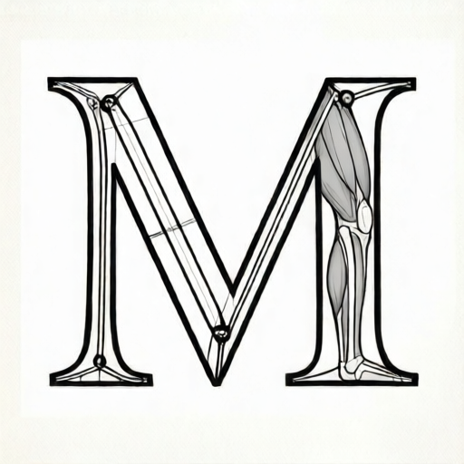
Use the stated measurements and conventions for each exercise.
Set up a construction grid
Draw a rectangle for the M. For this lesson, use a hypothetical height of 6 units from baseline to cap line and a width of 5 units. Mark a midline 3 units above the baseline. Lightly draw vertical guides at the left edge, center, and right edge. These guides help you place the four main strokes of M: left vertical, first diagonal, second diagonal, and right vertical.
Keep your pencil light for guides. You will erase them after inking or darkening the final strokes. The grid is a tool, not part of the letter.
- Draw a baseline and a cap line 6 units apart.
- Mark the midline 3 units above the baseline.
- Draw vertical guides at 0, 2.5, and 5 units across the width.
- Label the left edge A, the center C, and the right edge B.
Block M stroke order
A block M uses straight strokes with no serifs. Start at the top left and work in a consistent order. The block M in this lesson has vertical sides and two diagonals that meet at the center near the midline. The center point may sit slightly above or below the midline; choose one and keep it consistent.
Stroke 1 goes down the left side from cap line to baseline. Stroke 2 goes from the top left to the center point. Stroke 3 goes from the center point to the top right. Stroke 4 goes down the right side from cap line to baseline. This order keeps the diagonals balanced.
- Stroke 1: draw the left vertical from cap line to baseline.
- Stroke 2: draw the first diagonal from top left to the center point.
- Stroke 3: draw the second diagonal from the center point to top right.
- Stroke 4: draw the right vertical from cap line to baseline.
- Check that both verticals are parallel and the diagonals meet at one point.
Serif M stroke order and serif convention
A serif M adds small horizontal or angled strokes at the ends of the main strokes. Serif shape is not universal. For this lesson, use a simple bracketed serif: a short horizontal stroke at the top and bottom of each vertical, and small angled serifs at the top ends of the diagonals. The serif extends outward from the stroke by about 0.5 units in this hypothetical example.
Draw the main strokes first, then add serifs. This keeps the letter shape clear. The serif M may be slightly wider than the block M to accommodate the serifs, but the height stays the same.
- Draw the four main strokes in the same order as the block M.
- Add a top serif to the left vertical, extending left and right.
- Add a bottom serif to the left vertical, extending left and right.
- Repeat top and bottom serifs on the right vertical.
- Add small angled serifs at the top ends of both diagonals.
- Check that serifs are consistent in length and angle.
Checking shape and proportion
Use the grid to check that the M is upright and balanced. The left and right verticals should be the same height. The center point should sit near the midline. The two diagonals should be similar in length. In the serif style, serifs should not make the letter look wider on one side.
Because letter styles vary, accept alternatives: a narrower M, a center point above or below the midline, rounded serifs, or angled serifs. The rubric below lists what to check rather than a single correct drawing.
- Measure the height of both verticals; they should match within 0.5 units.
- Check that the center point is within 1 unit of the midline.
- Compare diagonal lengths; they should be similar.
- For serif M, check that serifs are present on all four main stroke ends and are similar in size.
Worked example
Draw a block M on a grid 6 units tall and 5 units wide. The center point is at 2.5 units across and 3 units above the baseline. Describe the four strokes and one check.
Worked answer
Stroke 1: left vertical from (0,6) to (0,0). Stroke 2: diagonal from (0,6) to (2.5,3). Stroke 3: diagonal from (2.5,3) to (5,6). Stroke 4: right vertical from (5,6) to (5,0). Check: both verticals are 6 units tall and the center point is at the midline height of 3 units.
Four practice exercises
Exercise 1
On a grid 6 units tall and 5 units wide, draw a block M with the center point at 2.5 units across and 3 units above the baseline. List the four strokes in order.
Show answer and check
Left vertical from top left to baseline; first diagonal from top left to center; second diagonal from center to top right; right vertical from top right to baseline.
Why: The order keeps the center point fixed and balances the diagonals. The center point at 3 units matches the midline.
Check: Measure both verticals; they should be 6 units. Check that the center point is at 3 units above the baseline and 2.5 units across.
Exercise 2
Draw a serif M on a grid 6 units tall and 6 units wide. Add simple horizontal serifs of 0.5 units to the top and bottom of each vertical. Describe where the serifs go.
Show answer and check
Serifs go at the top and bottom ends of the left vertical and the right vertical, extending 0.5 units outward. Small angled serifs go at the top ends of the diagonals.
Why: Serifs are added after the main strokes so the letter shape stays clear. The wider grid allows room for the serifs.
Check: Check that each vertical has a top and bottom serif and that serif lengths are about 0.5 units. Confirm the M still fits within 6 units width.
Exercise 3
A block M is drawn with verticals 6 units tall, but the center point is 1 unit above the baseline. Is this acceptable under the rubric? Explain.
Show answer and check
No, because the center point is 2 units below the midline, which is outside the 1-unit tolerance. The M may look like a W.
Why: The rubric requires the center point to be near the midline within 1 unit. At 1 unit above the baseline, the center is too low.
Check: Measure the center point height. The midline is 3 units; the allowed range is 2 to 4 units. A center at 1 unit fails.
Exercise 4
Draw a block M 6 units tall and 4 units wide with the center point at 2 units across and 3 units above the baseline. Then draw a serif M with the same main strokes and add serifs. State one difference in your check.
Show answer and check
The block M has no serifs. The serif M has added serifs at the stroke ends. The check for the serif M includes confirming serif consistency, while the block M check focuses on straight stroke ends.
Why: Both styles share the same main stroke order. The serif style adds a separate check for serif size and placement.
Check: For both, measure verticals and center point. For the serif M, also measure serif length and confirm serifs appear on all main stroke ends.
Common mistakes
- Drawing the diagonals before the verticals, which makes the center point drift. Draw the left vertical first, then the diagonals, then the right vertical.
- Making the center point too low, so the M looks like a W. Place the center point near the midline and check it against the grid.
- Adding serifs that are too long, which changes the letter width. Keep serifs short and consistent; measure one serif and repeat its length.
- Using heavy guide lines that are hard to erase. Draw guides lightly and erase them after the final strokes are dark.
Self-check rubric
- Both verticals are present and similar in height.
- The two diagonals meet at one center point.
- The center point is near the midline, within 1 unit.
- The M fits within the planned width and height.
- For serif M, serifs are present on the main stroke ends and are consistent in size.
- Valid alternatives in width, center height, serif shape, and stroke direction are accepted if the letter remains readable as M.
Questions and answers
Do I have to draw the M exactly 6 units tall?
No. The 6-unit height is a hypothetical example. Measure your own paper and choose a height that fits your practice space.
Can I draw the diagonals from the center outward?
Yes. Stroke direction can vary. The important check is that the diagonals meet at one center point and are similar in length.
What counts as a serif?
A serif is a small added stroke at the end of a main stroke. It can be horizontal, angled, or bracketed. This lesson uses a simple bracketed serif, but other consistent serif shapes are valid.
How do I know if my M is balanced?
Compare the two verticals and the two diagonals. If they are similar in height and length, and the center point is near the midline, the M is balanced.