Free original lessons
Draw a Monet-Style Bridge: Arch and Reflection Worksheet Plan
Plan a printable lesson for drawing a Monet-inspired arched bridge with water reflection, using simple geometry, ripple practice, and a flexible color guide.
Free lesson
Four exercises
Worked answers
Object Drawing Lessons
This instructional plan describes a free printable worksheet set for drawing a Monet-inspired bridge with a clear arch and a believable water reflection. The approach separates the task into three checkable parts: the arch curve, the bridge deck and posts, and the reflection with ripple marks. A convention is stated for judging line placement: x-height means the distance from the baseline to the midline of lowercase letters in the learner's normal handwriting, and letter styles vary, so any consistent personal x-height is acceptable. All numerical values below are hypothetical examples chosen for practice; measure actual paper and tools before printing or drawing. The resources are planned, not yet built, and no downloads or files currently exist.
Practice materials: Printable downloads are not available for this lesson yet. Use the instructions and four exercises below.
Reference illustration
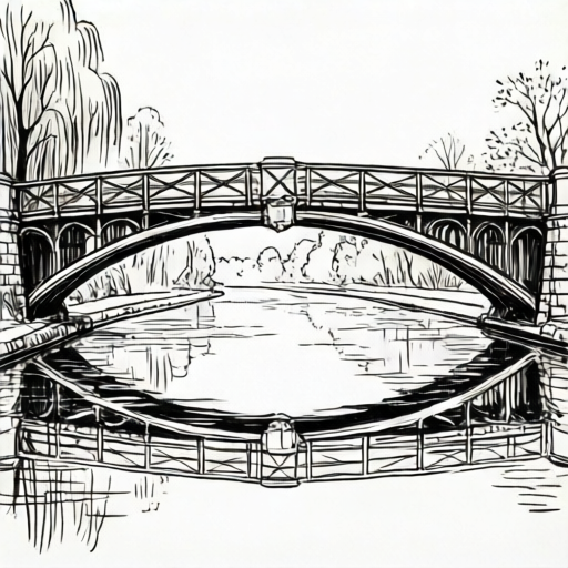
Use the stated measurements and conventions for each exercise.
Set the page and the arch guide
Place the paper in landscape orientation. Mark a waterline about two-thirds down the page; this is a hypothetical example, so adjust to the paper you actually have. Above the waterline, draw a light horizontal baseline for the bridge deck. The arch springs from two points on this baseline. Choose an arch width that fits comfortably between the page edges, for example 12 cm on a 21 cm wide sheet, and label this as a hypothetical value.
Draw the arch as a smooth curve using three reference points: the left springing point, the right springing point, and a top point midway between them. A simple check is to compare the height of the top point above the baseline with half the arch width; for a pleasing Monet-style arch, the height is often close to half the width, but this is a suggestion, not a rule. Keep the curve continuous and avoid sharp corners.
- Mark the waterline and the deck baseline lightly.
- Mark left and right springing points on the deck baseline.
- Mark a top point above the midpoint of the springing points.
- Draw a smooth curve through the three points, then check symmetry by folding or measuring.
Build the bridge deck and posts
The deck is a shallow band above the arch. Draw two parallel lines for the deck edges, keeping the band narrow enough that the arch remains the main shape. Add vertical posts at regular intervals along the deck; spacing can be measured with a ruler or estimated by eye, but keep the spacing consistent. A hypothetical example is five posts across the deck, with the middle post aligned to the arch top.
Use the x-height convention to judge small details such as post thickness: if your normal lowercase x-height is about 3 mm, a post line about one x-height wide is easy to see and keeps the drawing light. Because handwriting styles vary, any consistent x-height is acceptable. Check that posts do not cross the arch curve and that the deck lines stay parallel.
- Draw the upper and lower deck lines parallel to the baseline.
- Mark post positions evenly across the deck.
- Draw vertical posts from the lower deck line to the upper deck line.
- Check that the middle post aligns with the arch top and that no post crosses the arch.
Reflect the bridge in the water
Below the waterline, mirror the main bridge shapes downward. The arch reflection should sit directly under the arch, and the post reflections should sit under the posts. Keep the reflection slightly lighter or less detailed than the bridge itself. Add horizontal ripple marks across the reflection to suggest water movement; these can be short dashes or gentle wavy lines, spaced irregularly to avoid a mechanical look.
A simple check is to compare the distance from the waterline to the arch top with the distance from the waterline to the bottom of the arch reflection; these should be similar. Ripples may break the reflection lines, which is acceptable and expected. Use the same units throughout, for example centimeters for spacing and millimeters for line thickness, and label any chosen numbers as hypothetical examples.
- Draw the arch reflection downward from the waterline.
- Draw post reflections under each post.
- Add horizontal ripple marks across the reflection area.
- Check that reflection distances match the bridge distances above the waterline.
Add color and brushstroke suggestions
Use a limited palette of soft blues, greens, and warm highlights. Apply color in short, overlapping strokes rather than flat fills. For the bridge, suggest warm stone or wood tones with a few darker strokes for structure. For the water, layer blues and greens with lighter horizontal strokes to echo the ripples. The color guide is a suggestion, not a required scheme; valid alternatives include cooler or warmer palettes as long as the bridge and reflection remain distinguishable.
Check color contrast by viewing the page from a short distance: the arch should still read as a curve, and the reflection should still read as a mirrored shape. Avoid inventing printer tolerances or hardware standards; if printing, measure the actual printer margins and paper size first. The planned worksheet will include a small color-and-brushstroke suggestion guide, but it is not yet built.
- Choose three to five colors and test them on a scrap area.
- Apply short strokes to the bridge, keeping the arch edge visible.
- Layer horizontal strokes in the water reflection.
- Check contrast and legibility from a short distance.
Worked example
On a landscape sheet, draw a Monet-style bridge with one arch, five posts, and a water reflection with ripple marks. Use a waterline two-thirds down the page and an arch width of 12 cm as hypothetical examples.
Worked answer
The finished drawing shows a smooth arch springing from two points on the deck baseline, a narrow deck band with five evenly spaced posts, and a lighter mirrored reflection below the waterline. Horizontal ripple marks cross the reflection. The arch top is roughly half the arch width above the baseline, and the reflection distances match the bridge distances above the waterline.
Four practice exercises
Exercise 1
Draw only the arch guide on a landscape page: mark a deck baseline, two springing points 10 cm apart (hypothetical), and a top point 5 cm above the midpoint. Draw a smooth curve through the points.
Show answer and check
A smooth arch curve connects the two springing points and passes through the top point, with no sharp corners.
Why: The three-point method gives a checkable curve; the top height is half the width in this hypothetical example, making symmetry easy to check.
Check: Measure the distance from each springing point to the top point; they should be similar. Fold the page along the midpoint to check symmetry.
Exercise 2
Add a deck band and five posts to the arch from the previous exercise. Keep the posts vertical and evenly spaced, and do not let any post cross the arch.
Show answer and check
Two parallel deck lines sit above the arch, and five vertical posts are spaced evenly between them, with the middle post aligned to the arch top.
Why: Even spacing and vertical posts keep the bridge structure clear; aligning the middle post to the arch top provides a simple reference.
Check: Measure the gaps between posts; they should be equal or nearly equal. Check that each post starts and ends on the deck lines and does not touch the arch curve.
Exercise 3
Below a waterline, draw the reflection of the arch and posts from the previous exercise. Add at least six horizontal ripple marks across the reflection area.
Show answer and check
The arch and post reflections sit directly below their originals, are lighter in line weight, and are crossed by horizontal ripple marks.
Why: Mirroring the main shapes downward creates a believable reflection; ripples break the reflection lines to suggest water movement.
Check: Compare the distance from the waterline to the arch top with the distance from the waterline to the bottom of the arch reflection; they should be similar. Count the ripple marks and check that they are roughly horizontal.
Exercise 4
Color the bridge and reflection using at least three colors and short overlapping strokes. Keep the arch edge and ripple marks visible, then check the drawing from a short distance.
Show answer and check
The colored drawing shows a distinguishable arch, a lighter reflection, and visible ripple marks; the palette may differ from the suggestion guide.
Why: Short strokes preserve edges and texture; a limited palette keeps the bridge and reflection readable.
Check: View the page from about one meter away. Confirm that the arch still reads as a curve and the reflection still reads as a mirrored shape. Check that no flat fill hides the arch edge or ripples.
Common mistakes
- Drawing the arch with sharp corners or an uneven curve. Use three reference points and redraw the curve smoothly; check symmetry by folding the page or measuring from the midpoint.
- Making the reflection too dark or too detailed. Lighten the reflection lines and reduce detail; the reflection should suggest the bridge without competing with it.
- Spacing posts unevenly or letting them cross the arch. Mark post positions first, then draw vertical lines only between the deck lines; check that no post crosses the arch curve.
- Using flat color fills that hide the arch and ripples. Switch to short overlapping strokes and keep the arch edge and ripple marks visible.
Self-check rubric
- Arch is smooth and roughly symmetrical, with clear springing points.
- Deck lines are parallel and posts are evenly spaced without crossing the arch.
- Reflection mirrors the bridge and is lighter or less detailed than the bridge.
- Ripple marks are present and suggest water movement without hiding the reflection.
- Color and brushstrokes support the arch and reflection; alternative palettes are acceptable if legibility is maintained.
- Small details use a consistent personal x-height reference; any consistent x-height is valid.
Questions and answers
Do I need special paper or tools?
No. A pencil, eraser, ruler, and any coloring tools are enough. Measure your actual paper and tools before choosing sizes; the numbers in this plan are hypothetical examples.
How exact must the arch be?
The arch should be smooth and roughly symmetrical, but it does not need to match a single universal curve. Use the three-point method and a simple symmetry check.
Can I use different colors from the suggestion guide?
Yes. The guide is a suggestion. Any palette is valid if the bridge and reflection remain distinguishable and the arch reads clearly.
What does x-height mean here?
X-height is the distance from the baseline to the midline of lowercase letters in your normal handwriting. Letter styles vary, so use your own consistent x-height as a simple size reference for small details.