Free original lessons
Colorful Landscape Drawing: Palette and Layering
Plan a colorful landscape by choosing a limited palette and layering foreground, midground, and background in clear order.
Free lesson
Four exercises
Worked answers
Object Drawing Lessons
A colorful landscape reads clearly when color choices and layer order work together. This lesson teaches a repeatable method: define a horizon, assign a limited palette to each depth zone, and build layers from background to foreground. You will use simple shapes and checkable steps, not a single prescribed style. All measurements are hypothetical examples; measure your own paper and tools. The goal is a coherent, colorful scene you can explain and revise.
Practice materials: Printable downloads are not available for this lesson yet. Use the instructions and four exercises below.
Reference illustration
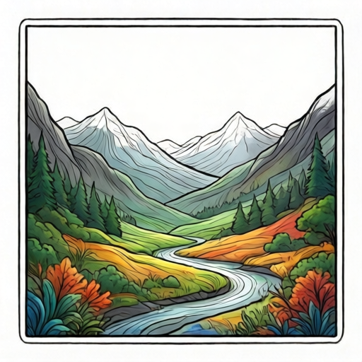
Use the stated measurements and conventions for each exercise.
Set the horizon and depth zones
Draw a light horizontal horizon line across the middle third of your paper. Above it is background (sky and distant forms); below it is midground and foreground. Mark two faint lines below the horizon to divide the lower area into midground (upper half) and foreground (lower half). These are guides, not final edges.
Depth is shown by overlap, size, and color separation. Background shapes are smaller and less detailed; foreground shapes are larger and can overlap midground shapes. Keep the horizon visible until the final layer so you can check alignment.
- Measure your paper and mark the horizon at about one-third from the top; label it lightly.
- Divide the area below the horizon into two bands: midground and foreground.
- Sketch three to five simple background shapes above the horizon, such as hills or clouds.
- Sketch two to three midground shapes that overlap the horizon slightly.
- Sketch one or two large foreground shapes that overlap the midground.
Choose a limited palette by zone
A limited palette means a small set of colors you repeat. Choose one dominant color family for each zone, then one accent color that appears in two zones to tie the scene together. For example, use cool blues and greens for background, warm greens and yellows for midground, and a strong warm accent in foreground.
Test each color on a scrap strip before applying it. Label the strip with zone names so you can compare values. If two colors look too similar, separate them by making one lighter or darker, or by placing a neutral shape between them.
- Select three to five colors total; write them on a palette-swatch strip.
- Assign at least one color to background, midground, and foreground.
- Choose one accent color and plan where it will appear twice.
- Test each color on scrap paper and note whether it is lighter or darker than its neighbor.
- Adjust the palette if two adjacent zones lack contrast.
Layer from background to foreground
Layer order prevents muddy edges. Start with background shapes, let them dry if using wet media, then add midground shapes that overlap the background, then foreground shapes that overlap the midground. Keep each layer slightly distinct in value or hue so the depth reads.
Use the layer-order boxes on the printable to record which shapes belong to each layer. If a shape crosses zones, decide its main zone and draw it in that layer. Check overlap: foreground shapes should cover part of midground shapes, and midground shapes should cover part of background shapes.
- Fill background shapes first, keeping edges simple.
- Add midground shapes, overlapping the background by a small amount.
- Add foreground shapes, overlapping the midground clearly.
- Leave a few gaps or lighter areas to suggest distance.
- Review the layer-order boxes and confirm each shape is in the planned layer.
Refine color and check the scene
Refinement is about contrast and repetition, not adding many new colors. Strengthen the accent color in two places, darken one foreground edge, and lighten one background area. Step back and check whether the three zones are distinguishable without labels.
Use a simple check: squint at the drawing. If foreground and midground merge, increase value contrast. If background competes with foreground, reduce detail or lighten it. Record changes on the practice panel before finalizing.
- Squint-check zone separation and note any merged areas.
- Increase contrast at one foreground edge.
- Repeat the accent color in a second zone.
- Lighten or simplify one background shape.
- Label the final layer order on the printable and date it.
Worked example
Plan a colorful landscape on a 20 cm by 25 cm sheet. Place the horizon at 8 cm from the top. Choose a palette of blue, green, yellow, and orange. Assign blue to background sky, green to midground hills, yellow to foreground field, and orange as an accent repeated in background clouds and foreground flowers. Describe the layer order and one contrast check.
Worked answer
Horizon at 8 cm leaves 17 cm below. Divide below into midground 8.5 cm and foreground 8.5 cm. Layer 1: blue sky and orange cloud accents above horizon. Layer 2: green midground hills overlapping the horizon by about 1 cm. Layer 3: yellow foreground field overlapping midground by about 2 cm, with orange flower accents. Contrast check: squint; if hills and field merge, darken one hill edge or lighten the field near the overlap. The accent orange appears twice, tying background and foreground.
Four practice exercises
Exercise 1
On a 15 cm by 20 cm sheet, place the horizon at 6 cm from the top. Divide the area below into two equal bands. Name the three zones and state one color for each from a three-color palette.
Show answer and check
Horizon at 6 cm leaves 14 cm below; each band is 7 cm. Zones: background above 6 cm, midground from 6 cm to 13 cm, foreground from 13 cm to 20 cm. Example palette: light blue background, green midground, yellow foreground.
Why: The horizon and equal division create three measurable zones. Assigning one color per zone keeps the palette limited and checkable.
Check: Measure the horizon and bands with a ruler; confirm three zone labels and three distinct colors.
Exercise 2
A drawing has background hills, midground trees, and foreground rocks. List the correct layer order and describe one overlap that proves the order.
Show answer and check
Order: background hills, then midground trees, then foreground rocks. Proof: a foreground rock overlaps the base of a midground tree, and a midground tree overlaps the edge of a background hill.
Why: Layer order is shown by overlap: later layers cover earlier ones. The described overlaps make the order visible.
Check: Trace each overlap in the drawing and confirm the later layer covers the earlier layer at that edge.
Exercise 3
You have blue, green, yellow, and orange. Background uses blue and orange clouds; midground uses green; foreground uses yellow. Where should the accent color repeat, and why?
Show answer and check
Repeat orange in the foreground, such as on flowers or a path edge. Orange already appears in background clouds, so repeating it in foreground ties the zones without adding a new color.
Why: An accent repeated in two zones creates visual connection. The palette stays at four colors.
Check: Count the colors used; confirm orange appears in exactly two zones and no new color is introduced.
Exercise 4
After a squint-check, foreground and midground merge. Give two specific fixes using only value or size changes, not new colors.
Show answer and check
Fix one: darken one foreground edge or lighten the adjacent midground area to increase value contrast. Fix two: enlarge one foreground shape so it clearly overlaps the midground.
Why: Merging zones usually lack value contrast or size difference. Changing value or size preserves the palette and restores separation.
Check: Squint again after each fix; confirm the foreground edge is distinguishable from the midground without labels.
Common mistakes
- Using too many unrelated colors so no zone reads clearly. Limit the palette to three to five colors and assign each to a zone; repeat one accent in two zones.
- Drawing foreground shapes before background shapes, causing overlaps to look flat. Build background first, then midground, then foreground; check overlap at each stage.
- Making background shapes as large and detailed as foreground shapes. Reduce background size and detail; keep the strongest contrast and largest shapes in the foreground.
- Letting the horizon disappear under shapes without a plan. Keep the horizon guide visible until the final layer and decide which shapes cross it.
Self-check rubric
- Horizon and three depth zones are marked and visible.
- Palette is limited to three to five colors with a clear zone assignment.
- Layer order is background, then midground, then foreground, with intentional overlaps.
- Foreground shapes are larger or more contrasted than background shapes.
- One accent color appears in at least two zones.
- A squint-check or value-contrast check is recorded.
- Valid alternative color schemes and shape styles are accepted if zone separation and layer order remain clear.
Questions and answers
Do I need expensive art supplies?
No. Any colored pencils, markers, or paints work. Test colors on scrap paper and adjust value contrast rather than buying new tools.
How many colors should I use?
Three to five is a practical limit for a clear palette. Choose one color per zone plus one accent repeated in two zones.
What if my foreground and midground look the same?
Increase value contrast at one foreground edge, enlarge a foreground shape, or simplify the midground detail.
Can I change the horizon line?
Yes. The one-third guide is a starting point. Move it and recheck zone sizes so each zone remains visible.