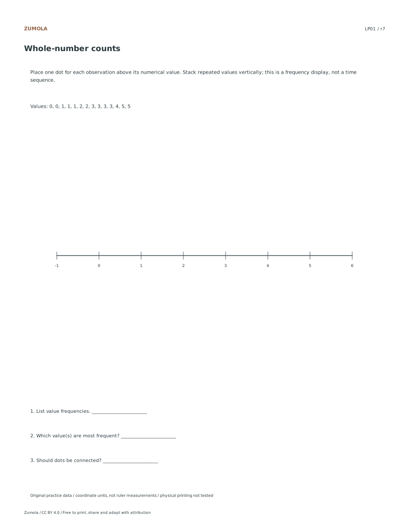
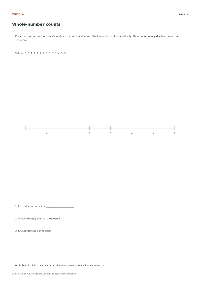
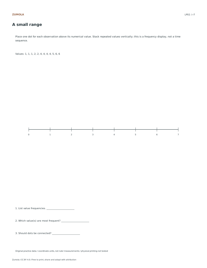
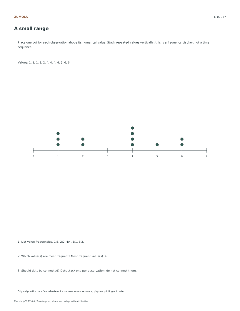
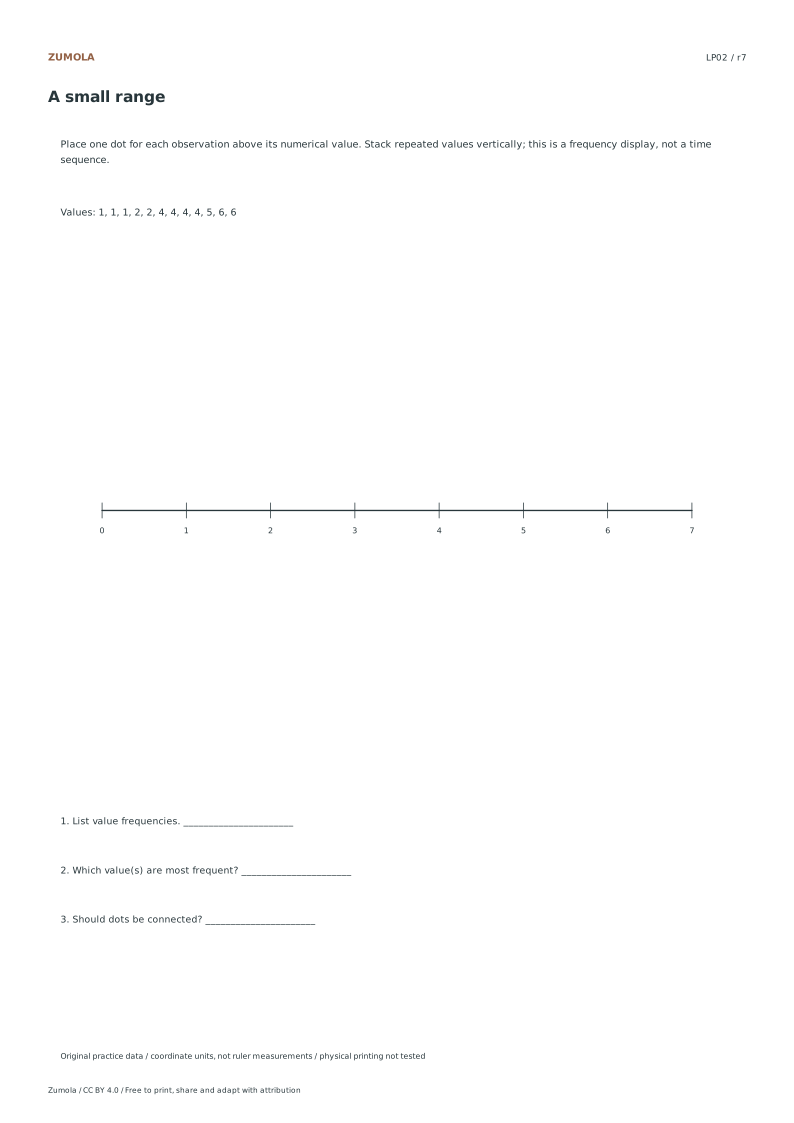
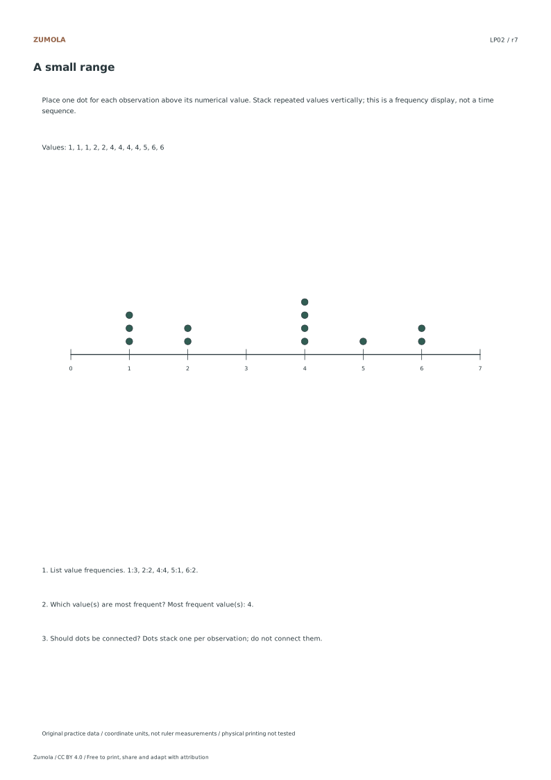
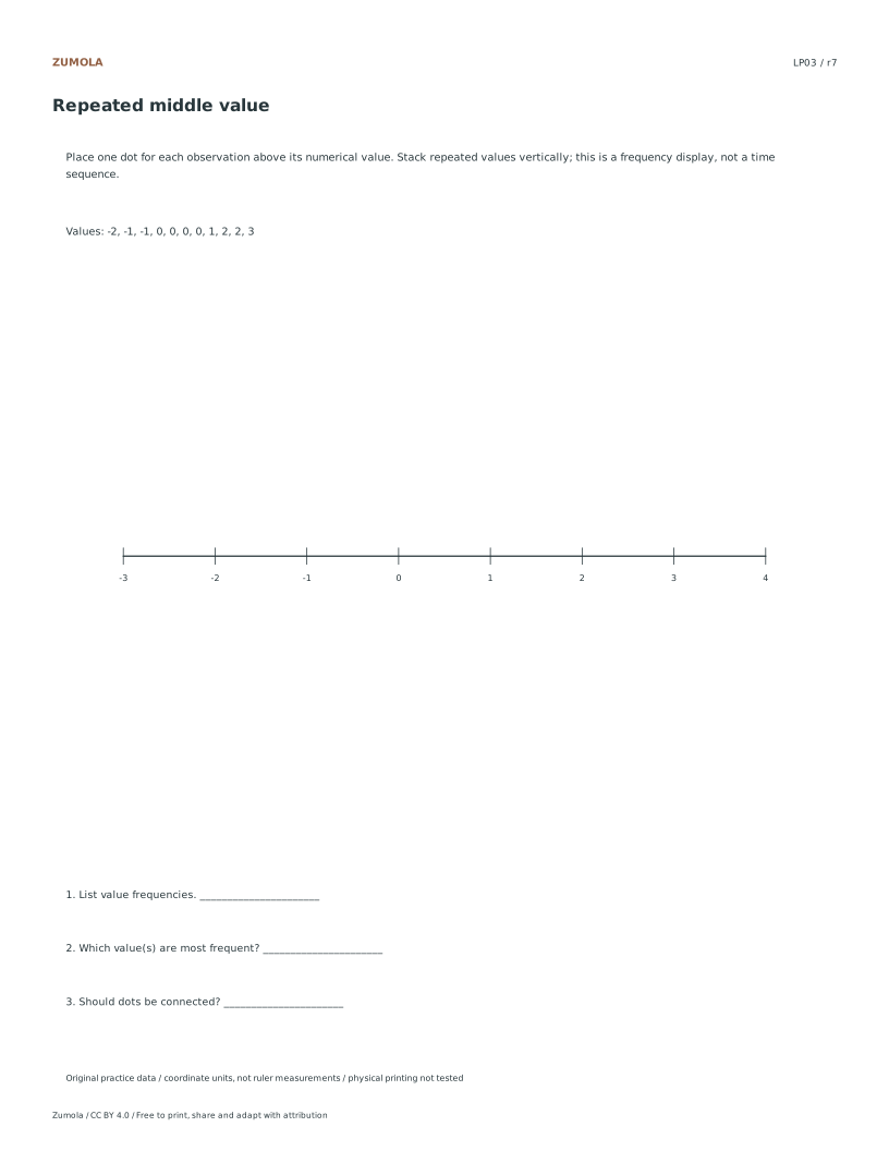
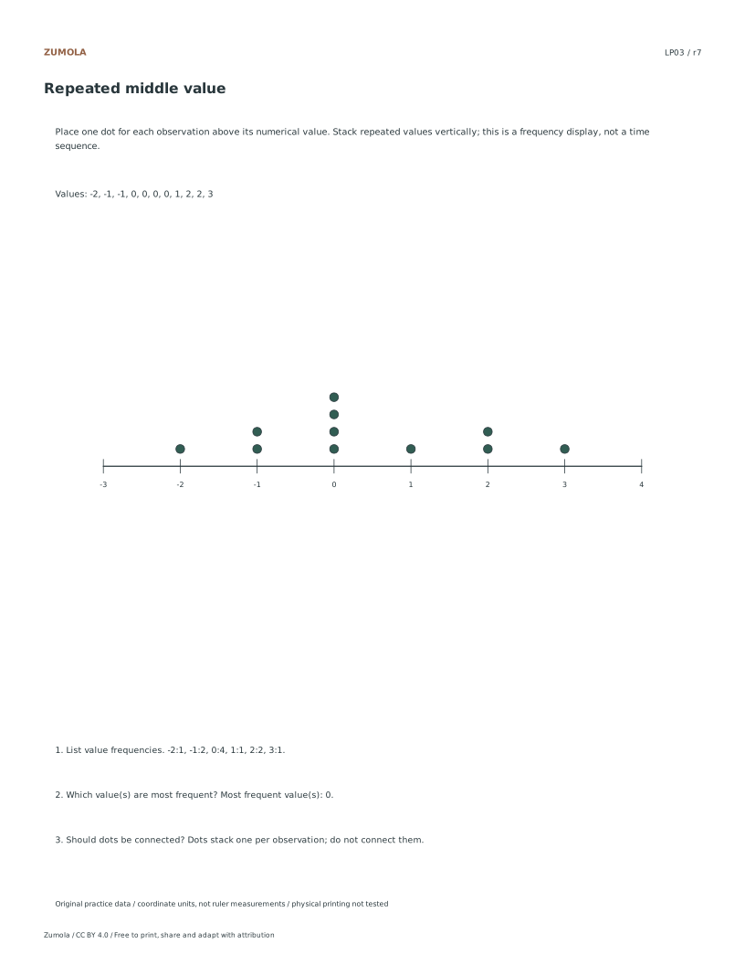
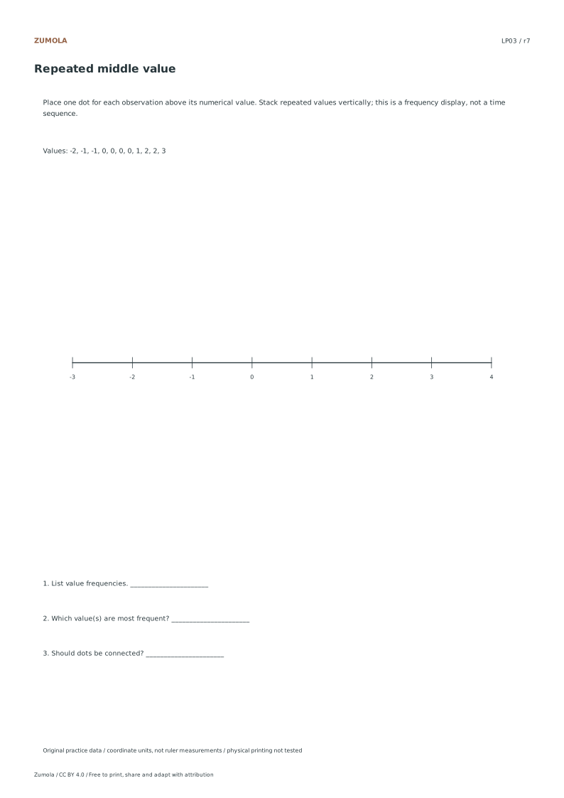
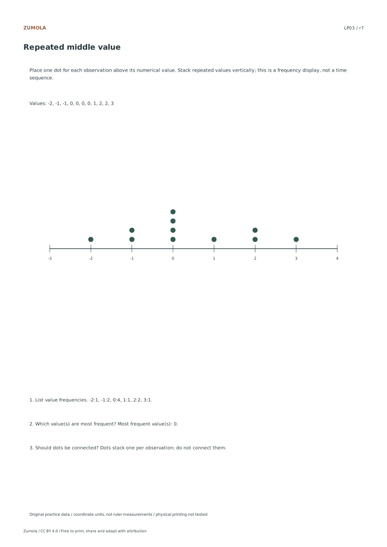
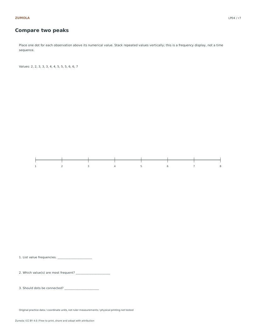
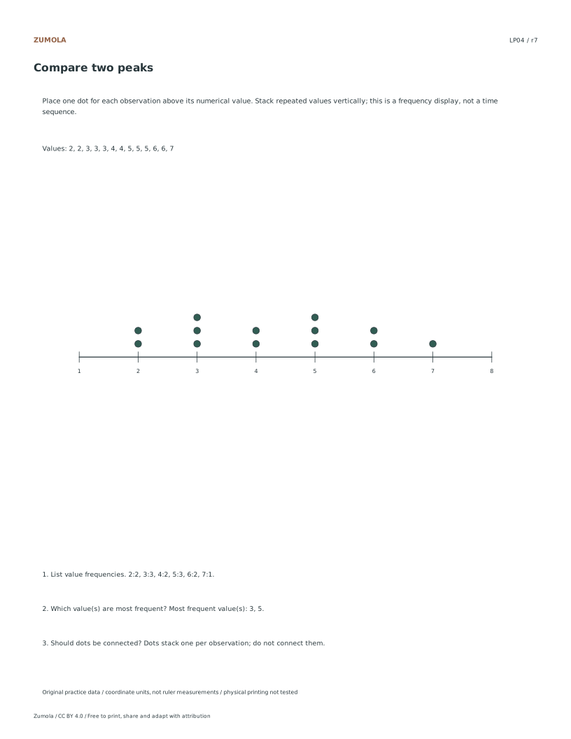
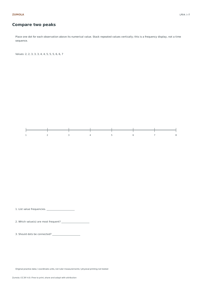
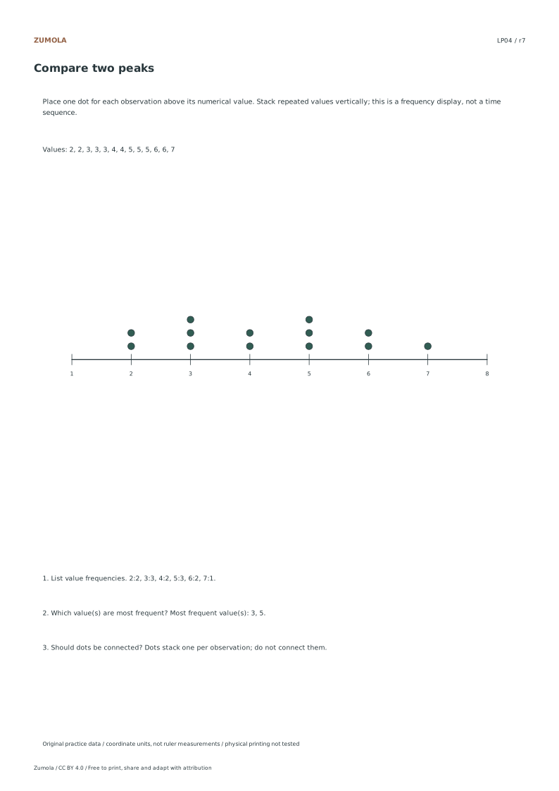
Turn four lists into line plots. Count repeated values, identify every mode and keep the dots unconnected because this is a frequency display.
Choose Letter or A4, then download a student sheet first. Keep the separate reference or answer file closed until you have attempted the case. Every worksheet, SVG and answer is free without signup.
Choose your paper and download
Download paper size
Every worksheet and answer is free. No signup.
Free original resourceLP01
Whole-number counts
Original worksheet collection. Letter or A4 PDF and editable SVG.
All examples use original fictional data and coordinate units. They are practice material, not measured classroom results, published questions or evidence about real people.
Check the first case
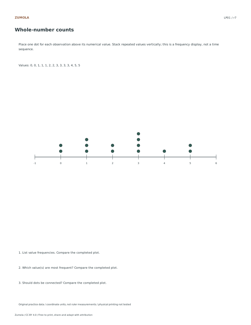
LP01: Whole-number counts
Check
Worked result
1
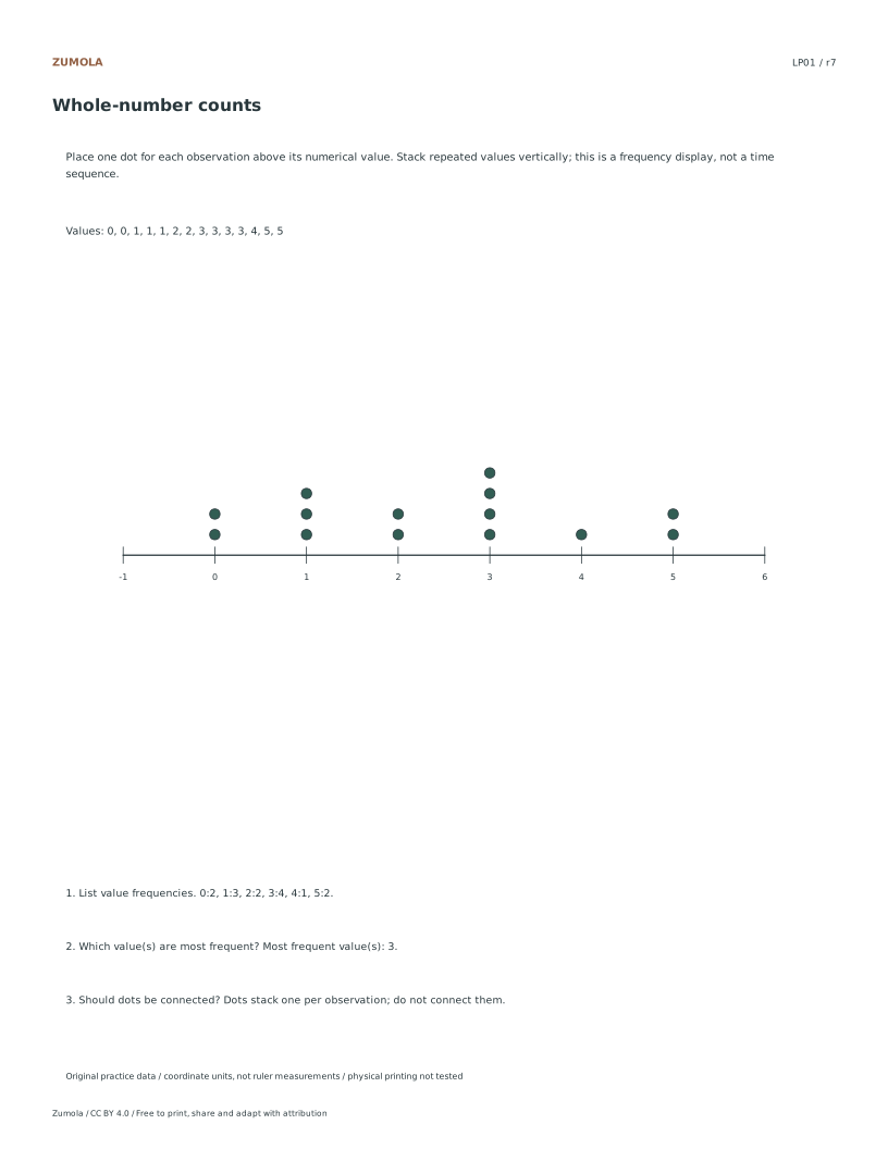
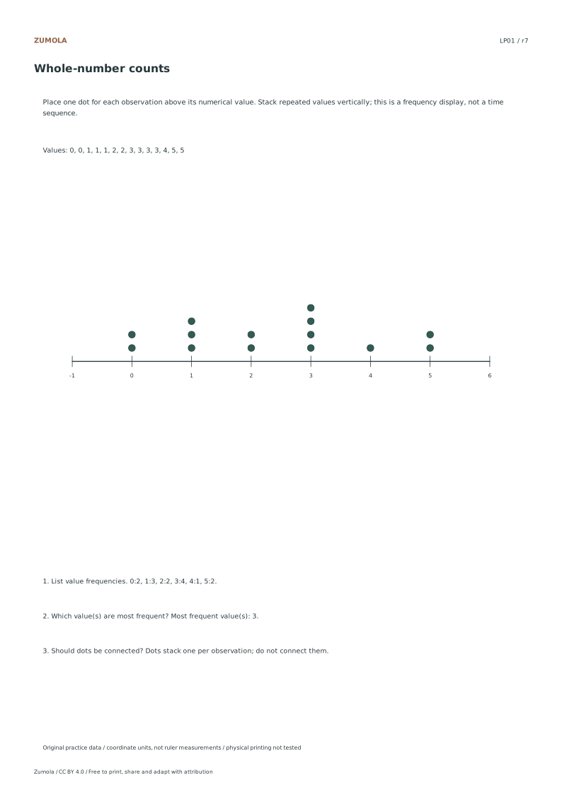
0:2, 1:3, 2:2, 3:4, 4:1, 5:2.
2
Most frequent value(s): 3.
3
Dots stack one per observation; do not connect them.
The first case shows the checking pattern. Individual answer files contain the completed graph and result for every case.
Work through the graph
Verify Data Integrity Before Printing
Begin by confirming that the listed coordinates and supplied values in the source files match the intended integer lists. Since physical printer checks have not been performed, rely on the original fictional practice material to ensure accuracy. Open the reference PDF to cross-check the four original integer lists against the listed data. This step ensures that the stacked marks will align correctly with the horizontal values. Because these are not measured people or experiments, the focus remains on the internal consistency of the fictional data sets provided in the CC BY 4.0 resources.
Configure Layout for Stacked Marks
Adjust your document settings to accommodate the specific layout required for line plots. Ensure that the horizontal axis displays the integer values clearly without connecting the dots, as these are frequency displays rather than time observations. Set the vertical spacing to allow for one stacked mark per observation above its value. This configuration prevents visual clutter and ensures that the most frequent values are easily identifiable. Remember that the horizontal values are not time observations, so maintain a static scale for accurate comparison of the four distinct cases.
Validate Answer Key Alignment
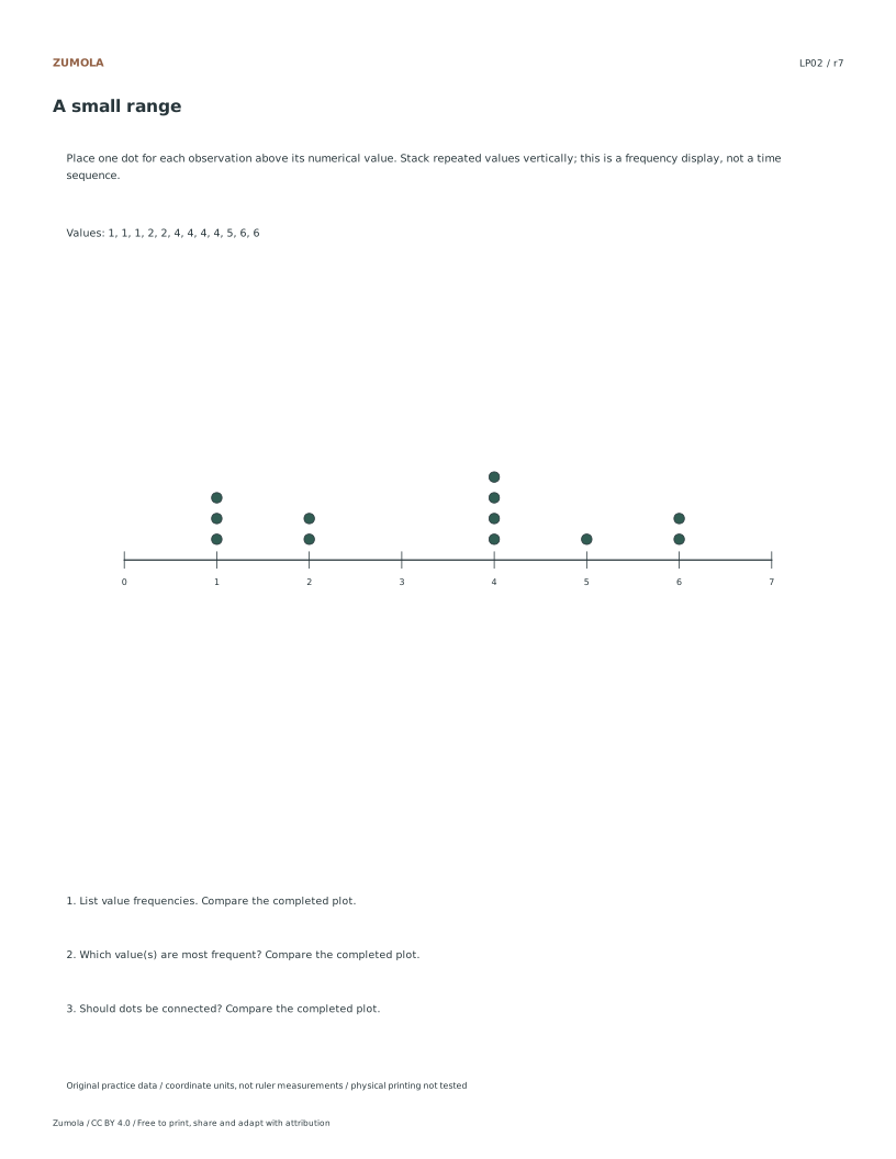
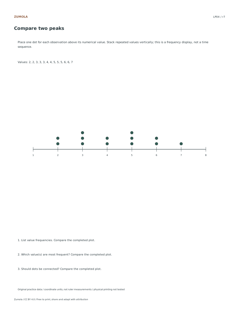
Before distributing the student PDFs, verify that the answer PDFs correspond correctly to the specific case IDs such as LP01 or LP04. Since listed coordinates determine the answers, ensure that the count of stacks matches the frequency of each value in the fictional data. This validation step confirms that the separate reference, student, and answer files are properly paired. By checking the alignment of the answer keys with the original integer lists, you ensure that the comparison of most frequent values is accurate for users who download the free CC BY 4.0 pack.
Checks that catch common errors
Watch for
Check instead
Connecting the dots on the line plot as if they represent a continuous trend or time series.
Keep the dots separate and stacked vertically above each integer value to accurately represent frequency counts without implying temporal continuity.
Assuming the horizontal axis represents time intervals or measured experimental data points.
Treat the horizontal values strictly as discrete integer categories from the fictional practice material, not as measured people or time observations.
Expecting physical print quality to match digital precision without verifying the layout first.
Rely on the digital coordinates and supplied values for accuracy, acknowledging that physical printer checks have not been performed on these resources.
Keep the labels and margins readable
Choose the PDF that matches your paper. Print at Actual size / 100% and turn off Fit, Shrink and browser headers. SVG is editable but an editor can rescale it; the PDF is the simpler print route. Physical printer, classroom and curriculum tests have not been completed.
Useful answers
Should I connect the dots?
No. A line plot stacks marks above values to show frequency.
What is a mode here?
A mode is a value with the greatest frequency; list every tied mode.
Why are repeated values stacked?
Each dot represents one observation, so stacking makes the count visible.
Are the answer files and editable graphs free?
Yes. The individual student, reference and answer files plus collection packs are free without signup. Credit Zumola under CC BY 4.0 when sharing or adapting.
Optional Google Analytics helps us understand which free resources are useful. It is off until you allow it. Drawing tools and downloads work with either choice. Privacy details