Free original lessons
Draw a Dollar Sign: Stroke Order and Serif Practice Plate
Learn to draw a dollar sign with clear stroke order, serif variants, and a practice plate for tracing and freehand repetition.
Free downloads
Letter & A4
PDF & SVG
Object Drawing Lessons
This lesson teaches a reliable way to draw a dollar sign by hand, focusing on stroke order and serif choices. You will use a simple convention: baseline and midline are guides, the S body is built from two connected open arcs, and a separate vertical stroke extends beyond those arcs while staying inside its cell. Letter styles vary, so the goal is consistency and legibility rather than one universal shape. The practice plate is a free printable in both paper sizes with step diagrams, serif variants, and a blank row for tracing and freehand work. All measurements are hypothetical examples; measure your own paper and pen before setting sizes.
Practice materials: Download the free reference pages, practice sheets and separate answer keys below, in A4 and US Letter PDF and SVG formats.
Set Up the Practice Plate
Choose a clear pen and suitable paper. In the given 20 mm by 30 mm cell, keep the baseline at its bottom and the midline halfway up, 15 mm above that baseline. These guides do not force the S or its bar to touch a cell border. For the worked model choose an S body between 3 mm and 13 mm above baseline; its vertical bar from 1 mm to 15 mm then extends 2 mm beyond both arcs and still stays within the cell. Other stated insets are valid. The word x-height is only a chosen body-zone analogy here; it does not define a universal dollar-sign standard.
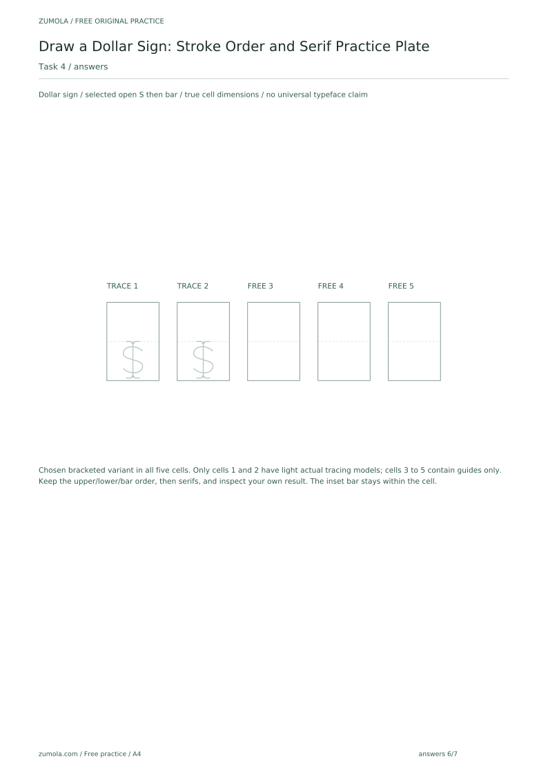
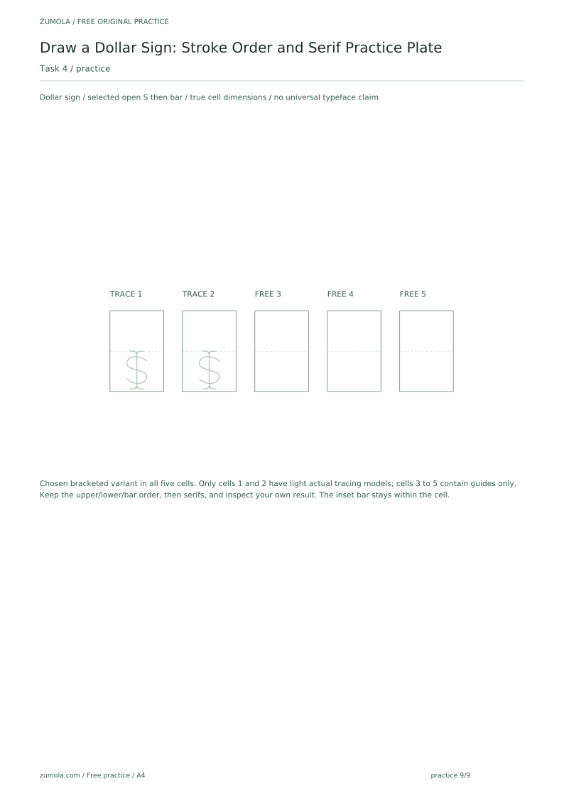
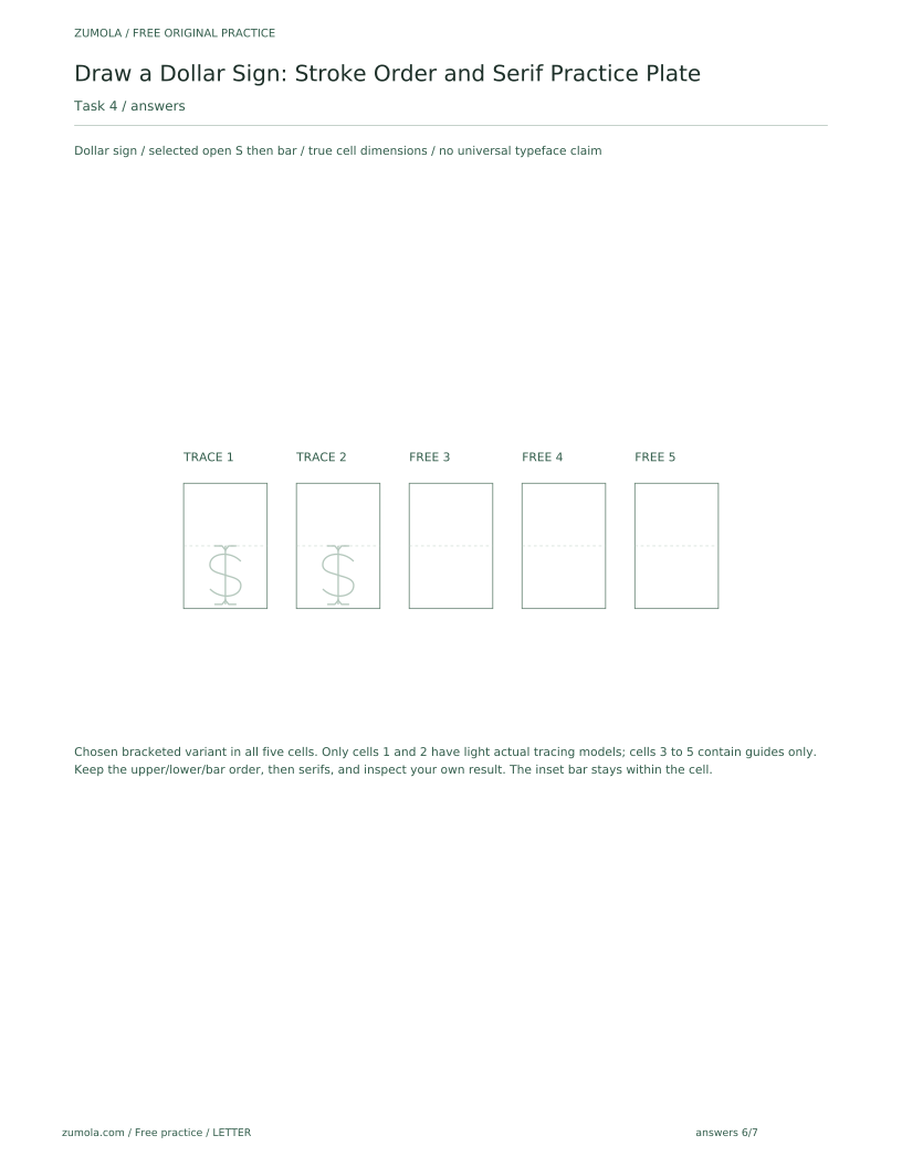
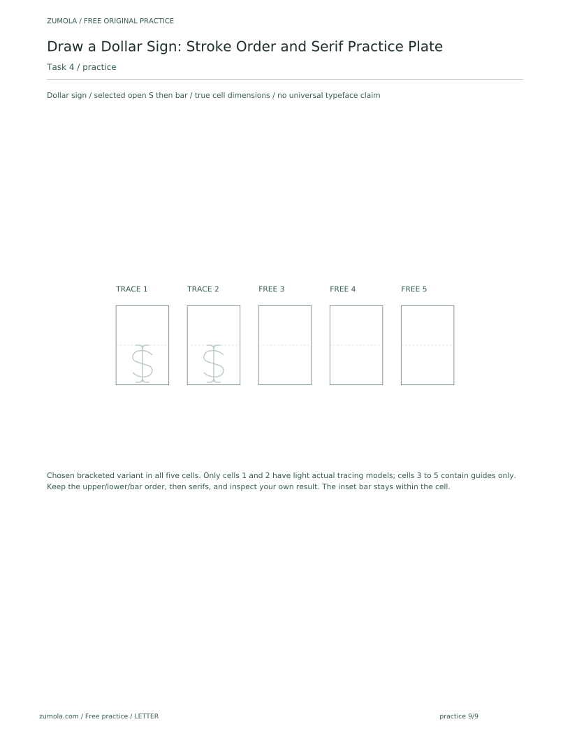
Plan a row of five practice cells, each about 20 mm wide and 30 mm tall as a hypothetical example. In each cell, draw faint guide lines for baseline and midline. The first two cells are for tracing the step diagrams; the last three are for freehand attempts. Keep the pen angle steady and rotate the paper rather than your wrist when drawing curves.
- Mark a baseline and midline across the practice row.
- Draw a light vertical guide through the center of each cell.
- Label cells 1 and 2 as tracing, cells 3 to 5 as freehand.
- Test your pen on scrap paper to confirm line width and drying time.
Stroke Order for the Dollar Sign
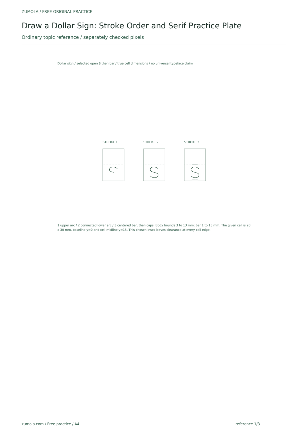
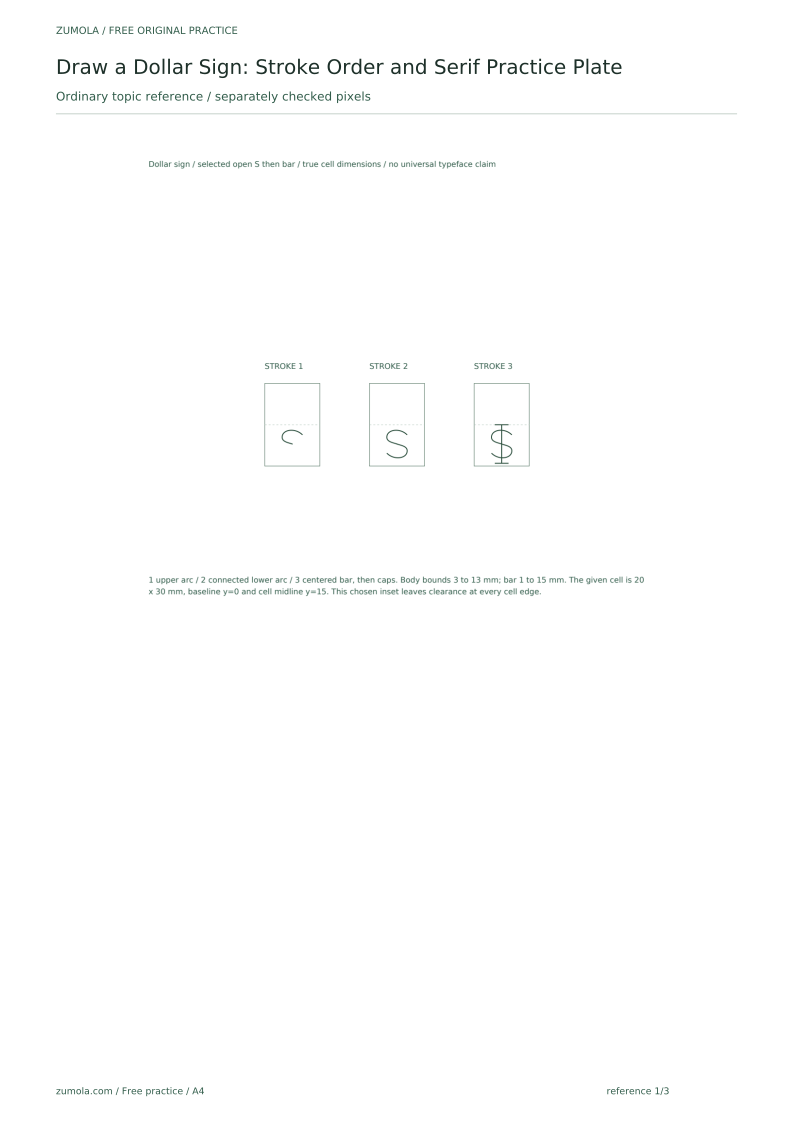
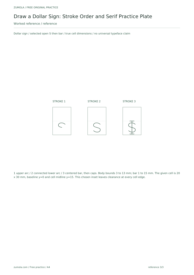
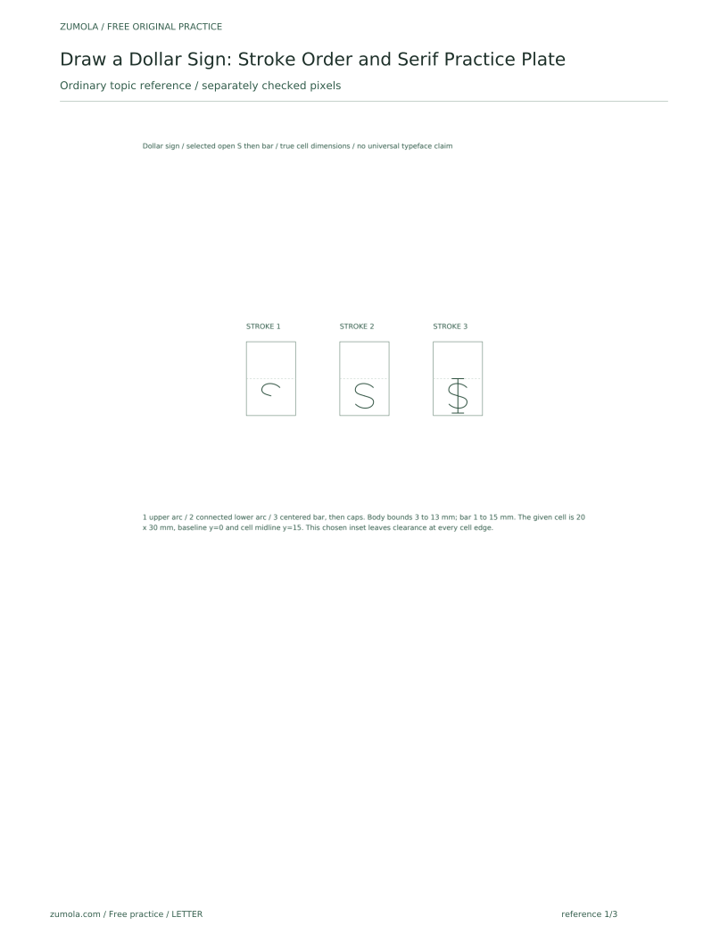
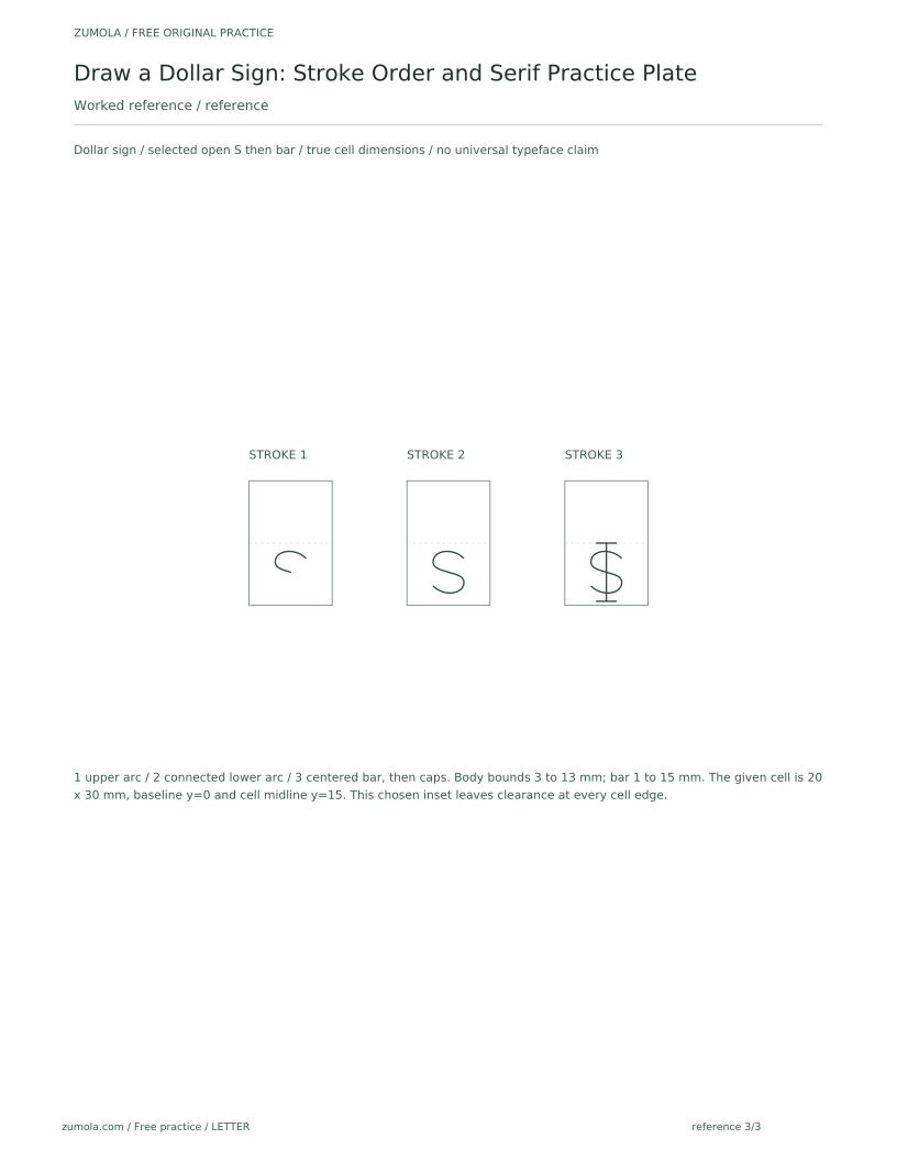
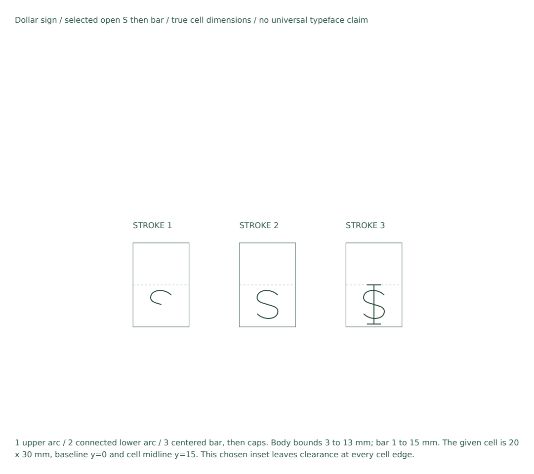
Use three selected main strokes: an upper S arc, a lower S arc and the vertical bar, followed by any chosen serifs. Start near the upper right of the inset S body, curve left across its rounded top, then turn inward to the center. Continue the lower arc from the center toward the lower right and around to a left-facing open end near the body bottom. The two arcs meet at their shared center without closing either lobe. Pass the vertical bar through that center from slightly above the S to slightly below it, leaving clearance inside the cell.
Keep the arcs open and even. If the upper arc closes too tightly, the sign reads as a figure eight. If the lower arc is too flat, the sign loses its balance. Compare each attempt to the step diagram by checking that the vertical stroke crosses the S at its midpoint and that both arcs have similar height.
- Draw the upper arc from the upper-right open end, round the top toward the left, and turn inward to the S center.
- Continue the lower arc from the center toward the lower right, around the bottom, and out toward the lower-left open end.
- Draw the vertical stroke through the center, extending slightly beyond both arcs.
- Check that the vertical stroke crosses the S at its midpoint.
Serif Variants and Consistency
Serifs are small finishing strokes at the ends of the vertical line. Three valid variants are: no serif (clean line), single crossbar serif (short horizontal caps at top and bottom), and bracketed serif (small curved transitions into the vertical). Choose one variant per practice row and repeat it. Mixing variants within a row makes comparison difficult.
The rubric allows any of these variants if they are drawn consistently and do not distort the S. A serif should not extend so far that it touches the arcs. Keep serif length to about one quarter of the cell width as a hypothetical example, and measure your own cell to set a repeatable length.
- Choose one serif variant for the row.
- In freehand cells use the same upper-arc, lower-arc, then vertical-bar sequence; add the chosen serifs afterward.
- Compare serif length across cells; adjust to match.
- Mark any cell where the serif touches an arc and redraw.
Tracing Then Freehand
Tracing builds motor memory; freehand builds control. In tracing cells, place the step diagram under thin paper or copy it directly beside your cell. In freehand cells, cover the diagram and draw from memory. After each freehand attempt, uncover the diagram and compare stroke order, arc height, and serif consistency.
Use a simple check: the vertical stroke should be straight, the arcs should be open, and the sign should fit within the cell without touching the edges. If a cell fails one check, redraw only that cell rather than the whole row. This keeps practice focused and avoids fatigue.
- Trace the step diagram in cells 1 and 2.
- Cover the diagram and draw freehand in cells 3 to 5.
- Compare each freehand cell to the diagram.
- Redraw only the cells that fail the check.
Worked example
Draw one dollar sign in a 20 mm by 30 mm cell using the single crossbar serif variant. The baseline is at the bottom of the cell and the midline is halfway up. Describe the stroke order and the check you would use.
Worked answer
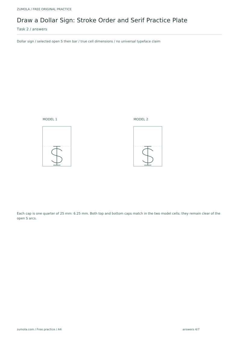
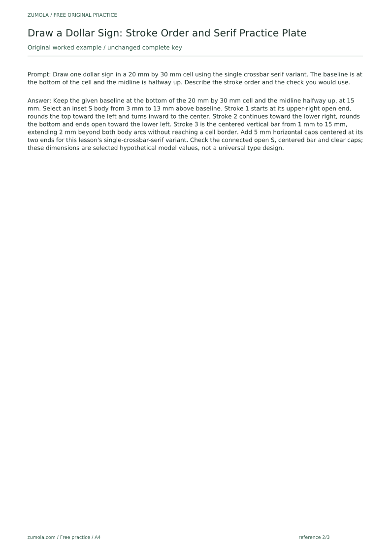
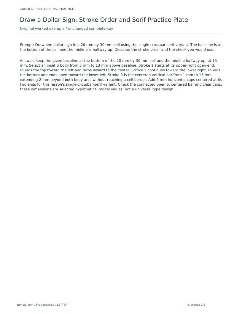
Keep the given baseline at the bottom of the 20 mm by 30 mm cell and the midline halfway up, at 15 mm. Select an inset S body from 3 mm to 13 mm above baseline. Stroke 1 starts at its upper-right open end, rounds the top toward the left and turns inward to the center. Stroke 2 continues toward the lower right, rounds the bottom and ends open toward the lower left. Stroke 3 is the centered vertical bar from 1 mm to 15 mm, extending 2 mm beyond both body arcs without reaching a cell border. Add 5 mm horizontal caps centered at its two ends for this lesson's single-crossbar-serif variant. Check the connected open S, centered bar and clear caps; these dimensions are selected hypothetical model values, not a universal type design.
Four practice exercises
Exercise 1
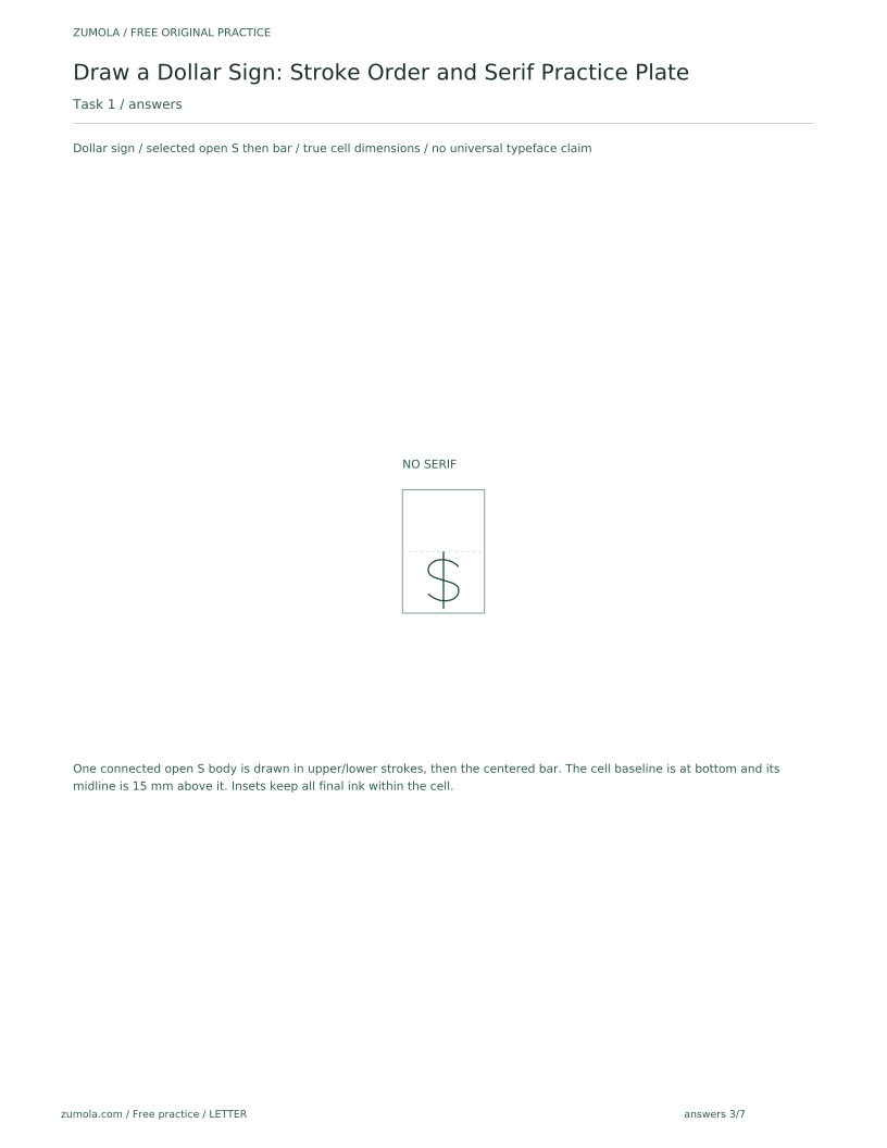
In a 20 mm by 30 mm cell with baseline at the bottom and midline halfway up, draw a dollar sign with no serifs. State the stroke order and one check.
Show answer and check
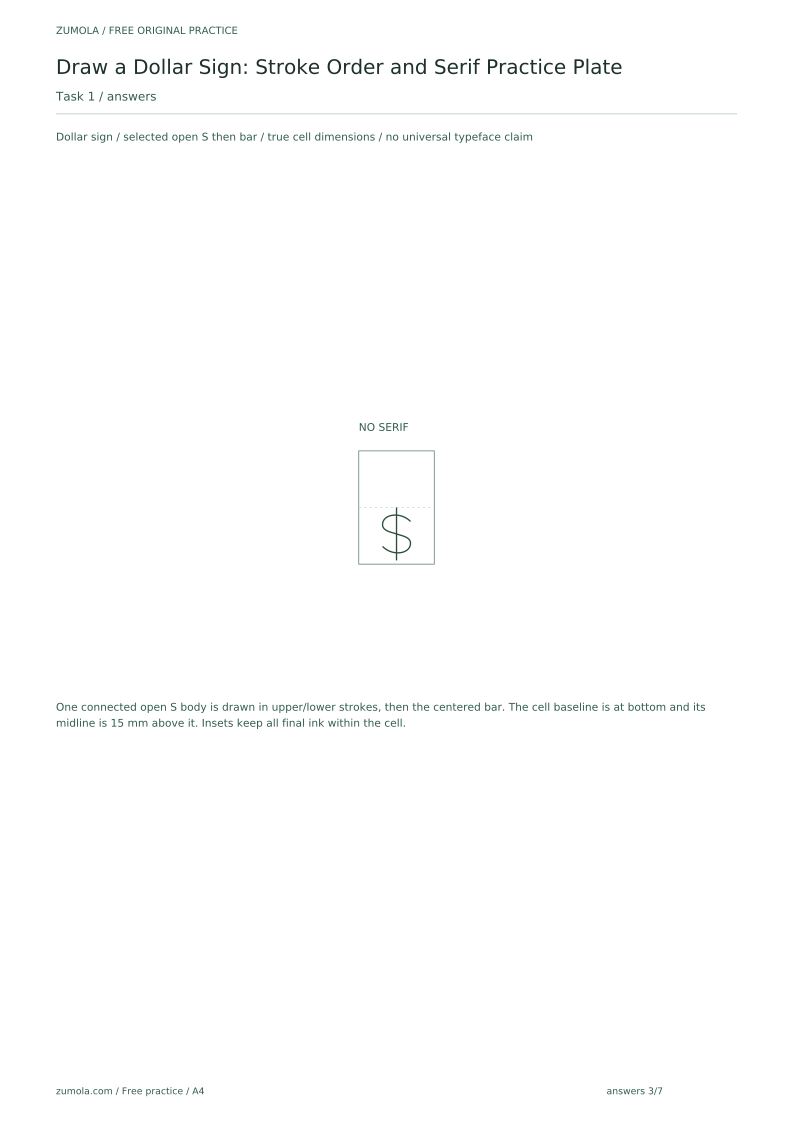
Keep the baseline at the bottom and the midline halfway up the cell. Use inset S-body and bar endpoints so no final stroke touches a cell edge. Draw the upper arc from its upper-right open end around the top toward the left and into the center, then the lower arc toward the lower right and around to an open lower-left end. Add the centered vertical bar extending slightly beyond both arcs. No serifs. Check that the bar crosses the connected S center, both lobes stay open and all ink remains inside the cell.
Why: The three-stroke order keeps the arcs balanced before the vertical stroke is placed. The midpoint check confirms the vertical stroke is centered.
Check: Measure from the top of the upper arc to the crossing point and from the crossing point to the bottom of the lower arc; the two distances should be equal within your drawing tolerance.
Exercise 2
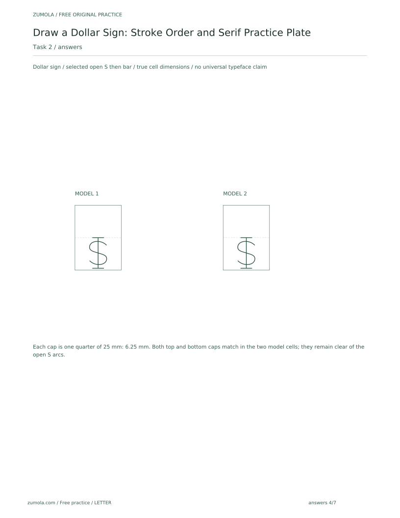
Draw two dollar signs in separate cells using the single crossbar serif variant. The cells are 25 mm wide and 35 mm tall as a hypothetical example. Describe how you keep the serifs consistent.
Show answer and check
Draw both signs with the same stroke order and add horizontal serifs of equal length at the top and bottom of each vertical stroke. Keep serif length to about one quarter of the cell width, measured on your own cell.
Why: Consistency comes from repeating the same serif length and placement in every cell. Measuring the cell width gives a repeatable reference.
Check: Compare the two serifs in each sign by length and placement; they should match each other and not touch the arcs.
Exercise 3
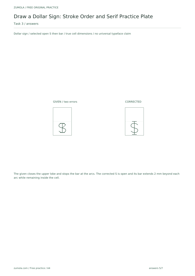
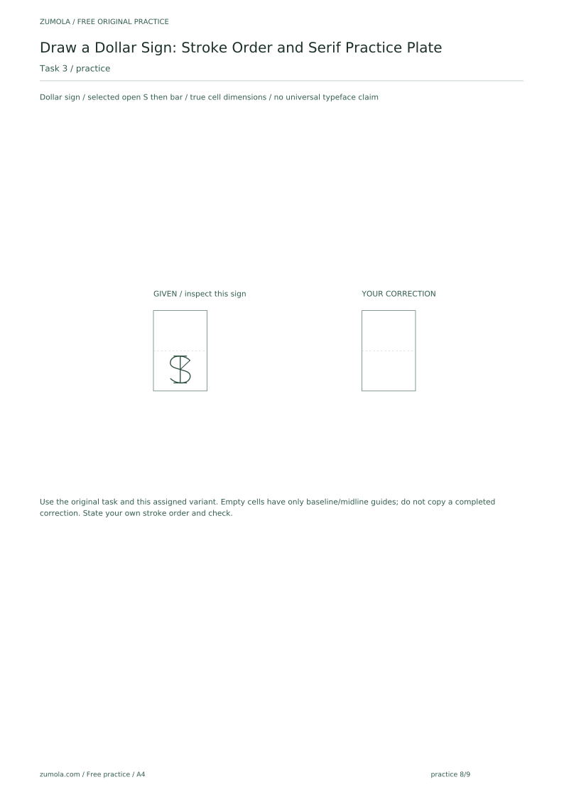
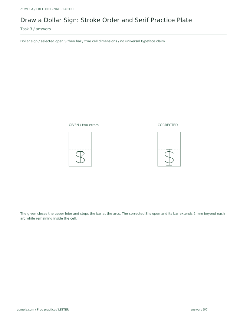
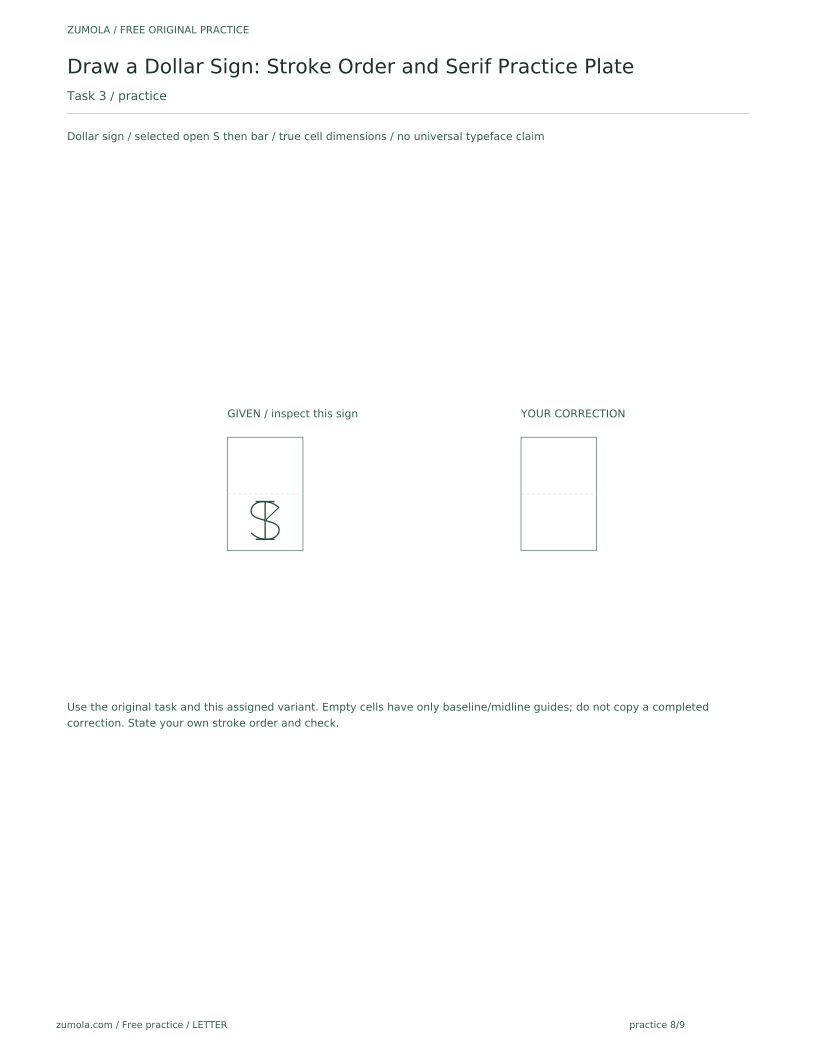
A learner draws a dollar sign where the upper arc closes into a loop and the vertical stroke stops at the arcs. Identify two mistakes and give a fix for each.
Show answer and check
Mistake one: upper arc too closed. Fix: end the upper arc near the center without curling inward. Mistake two: vertical stroke too short. Fix: extend the vertical stroke slightly above and below the arcs.
Why: A closed upper arc changes the sign into a figure eight, and a short vertical stroke weakens the dollar sign structure. Both fixes restore the intended shape.
Check: Check that the upper arc remains open and that the vertical stroke extends beyond both arcs by a small, equal amount.
Exercise 4
Plan a practice row of five cells. Cells 1 and 2 are tracing, cells 3 to 5 are freehand. Describe the serif variant you will use and the final check for the row.
Show answer and check
Choose one serif variant, such as bracketed serif, and use it in all five cells. After drawing, check stroke order, arc openness, serif consistency, and that each sign fits its cell without touching the edges.
Why: A single variant per row makes comparison fair. The final check covers the main rubric points in one pass.
Check: Compare each cell to the step diagram and to the other cells; mark any cell that fails a rubric point and redraw only that cell.
Common mistakes
- Drawing the vertical stroke first and forcing the arcs to fit around it. Draw the upper and lower arcs first, then place the vertical stroke through the center.
- Making the upper arc too closed, so the sign looks like an eight. Keep the upper arc open by ending it near the center rather than curling inward.
- Using different serif styles within one practice row. Choose one serif variant per row and repeat it in every cell.
- Letting the vertical stroke stop at the arcs instead of extending slightly beyond. Extend the vertical stroke a small, consistent amount above and below the S.
Self-check rubric
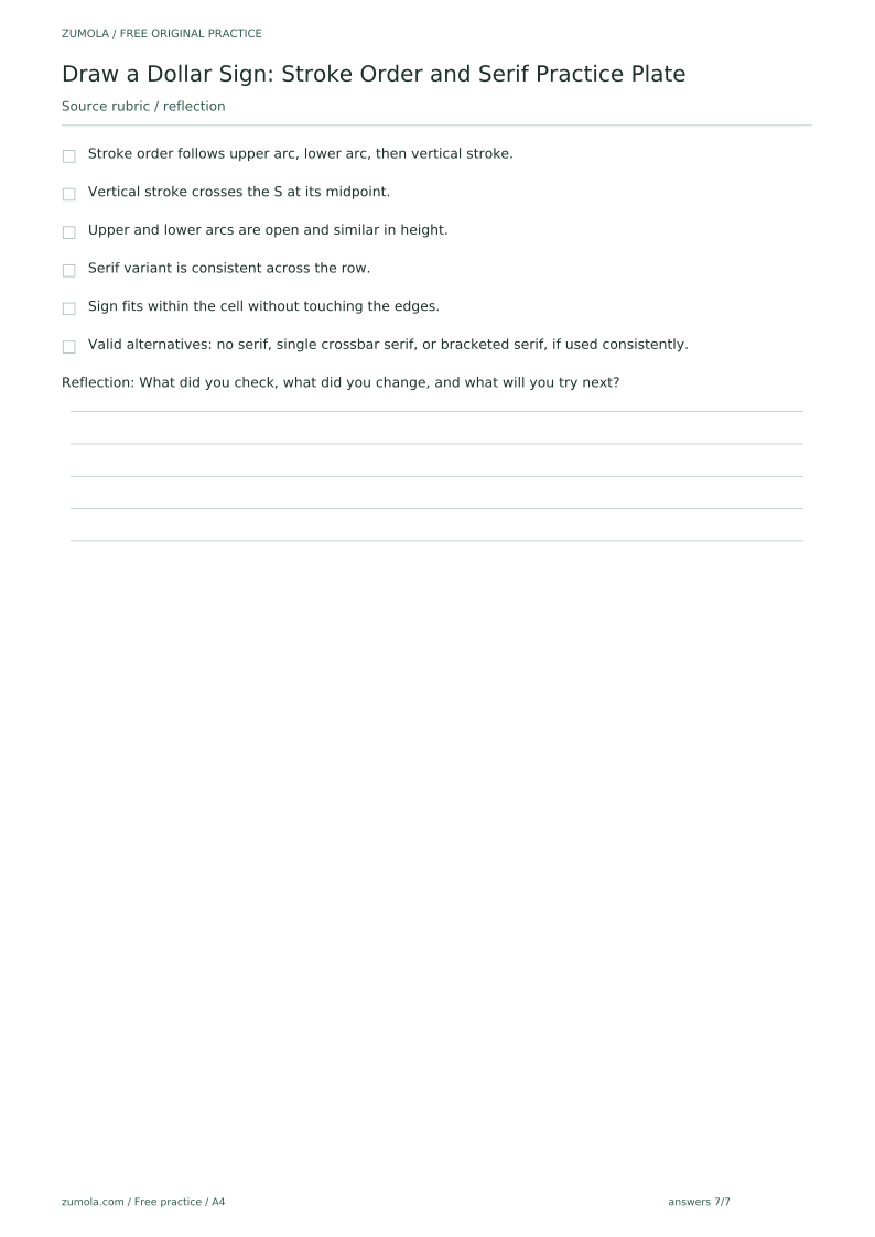
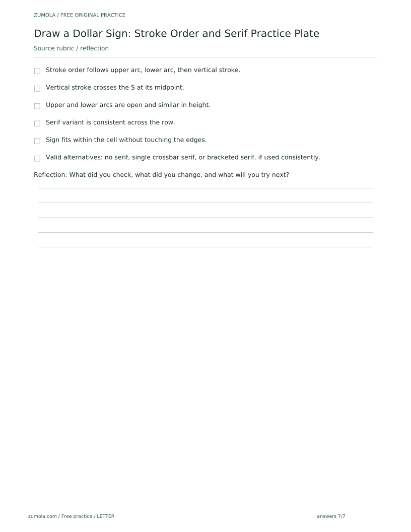
- Stroke order follows upper arc, lower arc, then vertical stroke.
- Vertical stroke crosses the S at its midpoint.
- Upper and lower arcs are open and similar in height.
- Serif variant is consistent across the row.
- Sign fits within the cell without touching the edges.
- Valid alternatives: no serif, single crossbar serif, or bracketed serif, if used consistently.
Questions and answers
Do I have to use serifs?
No. The no-serif variant is valid. The rubric checks consistency and legibility, not a single required style.
How large should each practice cell be?
Any size that fits your pen and paper. The 20 mm by 30 mm example is hypothetical; measure your own materials and keep cells equal.
Can I rotate the paper while drawing?
Yes. Rotating the paper helps keep curves smooth and is allowed as long as the final sign is upright.
What if my arcs are uneven?
Compare the upper and lower lobes around the actual S center, not around the cell midline unless those coincide in your chosen placement. Adjust an uneven lobe while keeping both ends open and the complete bar inside the cell.
Reference illustration
Free printable downloads
Choose a paper size. Practice sheets and answer keys are separate. Download every file free, without registration.
This standard pack covers the four original exercises, blank work areas, complete keys and necessary figures. Additional extension sets described in the lesson are outside this download.
PDF bundles
Individual SVG pages
Reference-page preview