Free original lessons
Draw the Letter E: Block and Serif Stroke Construction
Learn to construct a capital E in block and serif styles using stroke order, grid guides, and measurable proportions. Includes practice tasks and a rubric.
Free lesson
Four exercises
Worked answers
Object Drawing Lessons
This lesson teaches the stroke construction of a single capital letter E in two styles: block (sans-serif) and serif. You will use a simple grid convention, follow explicit stroke orders, and check your work with arithmetic and visual tests. The focus is on the letter E only, not other letters or full alphabet sheets. All measurements are hypothetical examples; measure your own paper and tools. A consistent convention is defined so that valid stylistic alternatives are accepted.
Practice materials: Printable downloads are not available for this lesson yet. Use the instructions and four exercises below.
Reference illustration
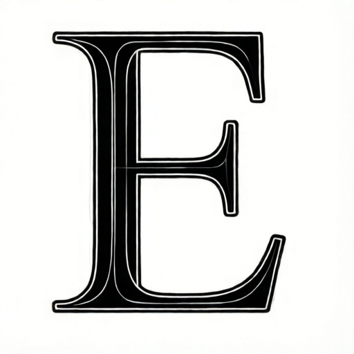
Use the stated measurements and conventions for each exercise.
Convention and Setup
Define the letter height as the distance from baseline to midline. For practice, use a hypothetical height of 40 mm. The width of the E is a stylistic choice; a common block E uses a width about half the height, so 20 mm. Serif E may be slightly wider to accommodate serifs, for example 22 mm. These numbers are examples only; measure your actual paper and adjust.
Use a light grid: draw a baseline, a midline at the chosen height, and a left vertical guide. Mark the width to the right. For block style, strokes are uniform thickness; choose a hypothetical stroke width of 4 mm. For serif style, the vertical stem is thicker than horizontal arms; choose a hypothetical stem width of 5 mm and arm thickness of 3 mm. Serifs extend beyond the stem by about 2 mm on each side. All values are hypothetical; measure your tools and paper to set your own consistent values.
- Draw a baseline and a midline 40 mm above it (hypothetical).
- Mark a left vertical guide and a right width guide 20 mm to the right for block, or 22 mm for serif.
- Lightly sketch the outer bounding box for the E.
- Label the three horizontal arm positions: top at midline, middle at half height (20 mm above baseline), bottom at baseline.
Block E Stroke Order
The block E is built from four strokes: one vertical stem and three horizontal arms. Keep stroke thickness uniform. The top arm sits at the midline, the middle arm at half height, and the bottom arm at the baseline. The arms extend from the stem to the right width guide. The middle arm is often slightly shorter than the top and bottom arms in many block styles; for this lesson, use equal arm lengths for simplicity, but you may shorten the middle arm by up to 20 percent as a valid stylistic alternative.
Draw the vertical stem first, from top to bottom, along the left guide. Then draw the top arm from the stem to the right, the middle arm from the stem to the right, and the bottom arm from the stem to the right. Check that the arms are parallel and evenly spaced: the middle arm should be halfway between the top and bottom arms. With a 40 mm height, the middle arm is at 20 mm above the baseline.
- Draw the vertical stem from midline to baseline along the left guide.
- Draw the top arm from the top of the stem to the right width guide.
- Draw the middle arm from the midpoint of the stem to the right; keep it horizontal.
- Draw the bottom arm from the bottom of the stem to the right width guide.
- Check spacing: top arm at 40 mm, middle at 20 mm, bottom at 0 mm above baseline (hypothetical).
Serif E Stroke Order
The serif E adds small horizontal strokes (serifs) at the ends of the stem and arms. Use a thicker vertical stem and thinner arms. Draw the stem first, then the arms, then add serifs. Serifs are short strokes perpendicular to the main stroke, extending about 2 mm beyond the stem on each side (hypothetical). The top and bottom serifs on the stem are horizontal; the arm ends may have small vertical or angled serifs depending on style. Accept any consistent serif style that is clearly visible and proportional.
For the serif E, the top arm may have a serif at its right end, and the bottom arm may have a serif at its right end. The middle arm often has a serif at its right end as well. Keep serifs small relative to the letter height: about 2 mm extension is a hypothetical example. Check that serifs do not overlap or create thick blobs. The stem serifs at top and bottom should be centered on the stem.
- Draw the vertical stem from midline to baseline, thicker than block stem.
- Draw the top arm from stem to right width guide.
- Draw the middle arm from stem midpoint to right.
- Draw the bottom arm from stem bottom to right.
- Add top and bottom stem serifs: short horizontal strokes extending 2 mm left and right of the stem (hypothetical).
- Add small serifs at the right ends of the arms, keeping them proportional.
Checking Proportions and Consistency
Use simple arithmetic to check your E. Measure the actual height from baseline to midline. Measure the width from stem to right guide. For block, width should be about half the height; for serif, slightly more. Measure arm spacing: the middle arm should be at half the height within a few millimeters. Measure stroke thickness: block strokes should be uniform within 1 mm; serif stem should be thicker than arms by a visible amount, for example 2 mm (hypothetical).
Check alignment: the three arms should be parallel to the baseline. The stem should be vertical. Serifs should be symmetric on the stem. If you used a grid, verify that the arms end at the same right guide or follow your chosen style consistently. Valid alternatives include a shorter middle arm, angled serifs, or slightly different width, as long as the letter remains clearly an E and proportions are internally consistent.
- Measure height and width; record values.
- Measure middle arm position; compare to half height.
- Measure stroke thickness at several points.
- Check parallelism of arms and verticality of stem.
- Confirm serif symmetry and size if using serif style.
Worked example
Construct a block E with height 40 mm, width 20 mm, uniform stroke width 4 mm, and equal arm lengths. Describe the stroke order and check the middle arm position.
Worked answer
Draw baseline and midline 40 mm apart. Mark left guide and right guide 20 mm to the right. Draw vertical stem from midline to baseline along left guide, 4 mm wide. Draw top arm at midline from stem to right guide, 4 mm thick. Draw middle arm at 20 mm above baseline from stem to right guide, 4 mm thick. Draw bottom arm at baseline from stem to right guide, 4 mm thick. Check: middle arm is at half height (20 mm), arms are parallel, stroke width is 4 mm throughout. The letter is clearly an E with consistent proportions.
Four practice exercises
Exercise 1
Draw a block E with height 30 mm, width 15 mm, and uniform stroke width 3 mm. Use equal arm lengths. After drawing, measure the middle arm position and state whether it is at half height.
Show answer and check
The middle arm should be at 15 mm above the baseline. If measured within 2 mm of 15 mm, it is acceptable.
Why: Half of 30 mm is 15 mm. The middle arm is placed at half the letter height to create balanced proportions. Equal arm lengths and uniform stroke width are style choices for this block E.
Check: Measure height from baseline to midline; measure middle arm height from baseline; compare to half height. Measure stroke width at three points and confirm within 1 mm of 3 mm.
Exercise 2
Draw a serif E with height 40 mm, width 22 mm, stem width 5 mm, arm thickness 3 mm, and serif extension 2 mm on each side of the stem. Add serifs at the top and bottom of the stem and at the right ends of the arms. Check stem serif symmetry.
Show answer and check
Stem serifs should extend 2 mm left and 2 mm right of the stem, making the total serif width 9 mm (5 mm stem plus 2 mm each side). Left and right extensions should be equal within 1 mm.
Why: Serifs are short strokes perpendicular to the main stroke. Symmetry on the stem ensures a balanced look. The hypothetical values are examples; actual measurements should be taken from your drawing.
Check: Measure left and right extensions of the top stem serif; they should be equal within 1 mm. Repeat for bottom stem serif. Check that arm serifs are present and proportional.
Exercise 3
Draw a block E with height 50 mm and width 25 mm. Choose a middle arm that is 20 percent shorter than the top and bottom arms. State the length of the middle arm and check that the letter remains clearly an E.
Show answer and check
Top and bottom arms are 25 mm long. The middle arm is 20 percent shorter, so 25 mm minus 5 mm equals 20 mm. The letter should still be clearly an E because the middle arm is present and proportional.
Why: A shorter middle arm is a valid stylistic alternative. Twenty percent of 25 mm is 5 mm, so the middle arm is 20 mm. This keeps the letter readable while following a consistent style rule.
Check: Measure top, middle, and bottom arm lengths. Confirm middle arm is 20 mm within 1 mm. Visually confirm the letter is recognizable as an E.
Exercise 4
Draw a serif E with height 35 mm and width 18 mm. Use a stem width of 4 mm and arm thickness of 2.5 mm. Add angled serifs at the right ends of the arms, keeping them small (about 1.5 mm extension). Check that the serifs are consistent and do not overlap.
Show answer and check
Angled serifs are acceptable if they are consistent in angle and size. Each arm serif should extend about 1.5 mm beyond the arm end. Check that no serif overlaps another stroke and that the letter is clearly an E.
Why: The rubric allows valid alternatives such as angled serifs. Consistency and proportionality are key. The hypothetical extension of 1.5 mm is small relative to the 35 mm height.
Check: Measure serif extensions at each arm end; confirm they are approximately equal within 0.5 mm. Check visually for overlaps. Confirm stem width is about 4 mm and arm thickness about 2.5 mm.
Common mistakes
- Drawing the middle arm at the wrong height, such as too close to the top or bottom. Measure half the letter height from the baseline and mark that point on the stem before drawing the middle arm.
- Making the arms different lengths without a consistent style choice. Decide on a style rule (equal arms or middle arm shorter by a set amount) and apply it consistently; check with a ruler.
- Using uneven stroke thickness in block style. Use a consistent tool or pressure; measure thickness at several points and adjust to within 1 mm (hypothetical tolerance).
- Adding serifs that are too large or asymmetric. Keep serif extension small, about 2 mm (hypothetical), and center stem serifs; measure left and right extensions to confirm symmetry.
Self-check rubric
- Letter is clearly recognizable as a capital E.
- Height and width are measured and consistent with the chosen style.
- Middle arm is positioned at approximately half the letter height (within a few millimeters).
- Arms are parallel to the baseline and stem is vertical.
- Stroke thickness is uniform for block style or appropriately differentiated for serif style.
- Serifs, if used, are proportional, symmetric on the stem, and consistent.
- Valid stylistic alternatives (e.g., shorter middle arm, angled serifs) are applied consistently and documented.
Questions and answers
Do I have to use the hypothetical measurements given?
No. The numbers are examples. Measure your actual paper and tools, then choose consistent values and label them as your own working measurements.
Can the middle arm be shorter than the top and bottom arms?
Yes, that is a valid stylistic alternative in many block and serif styles. Keep the shortening consistent and document your choice.
What if my serifs are angled instead of horizontal?
Angled serifs are acceptable if they are consistent, proportional, and clearly visible. The rubric allows valid alternatives as long as the letter remains readable and internally consistent.
How do I know if my E is good enough?
Use the rubric and check method: measure height, width, arm spacing, stroke thickness, and alignment. If your measurements are consistent with your chosen style and the letter is clearly an E, it meets the criteria.