Free original lessons
Pen Flower Textures: Hatching, Cross-Hatching and Stipple
Learn to draw a flower in pen using three texture methods. Compare hatching, cross-hatching and stipple on petals, then apply them to a full flower.
Free lesson
Four exercises
Worked answers
Object Drawing Lessons
This lesson teaches a pen texture study of a flower. You will compare three mark-making methods on petal shapes: hatching (parallel lines), cross-hatching (layered line directions) and stipple (dots). The goal is controlled texture and clear value change, not realistic flower anatomy. Work on smooth paper with a fine-tip pen. Keep line spacing and dot spacing deliberate. Use the same pen throughout so comparisons are fair. X-height convention: when judging letter or label size, x-height is measured from baseline to midline; letter styles vary, so accept any legible style that meets the stated size. All numerical values below are hypothetical examples for practice, not equipment standards. Measure your own pen tip and paper if you need exact values.
Practice materials: Printable downloads are not available for this lesson yet. Use the instructions and four exercises below.
Reference illustration
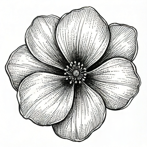
Use the stated measurements and conventions for each exercise.
Set up the petal study
Draw or trace a simple five-petal flower outline about 10 cm wide. Divide one petal into three equal zones with light pencil lines, then erase most of the pencil. Label zones A, B and C in small handwriting; x-height about 2 mm is a hypothetical example. Zone A uses hatching only, Zone B uses cross-hatching, Zone C uses stipple only.
Keep the pen moving at a steady speed. For hatching, draw parallel lines spaced about 1 mm apart. For cross-hatching, add a second set at roughly 45 degrees to the first. For stipple, place dots about 1 mm apart, varying density to change value. These spacings are hypothetical starting points; adjust to your pen tip and paper.
- Draw the flower outline and mark three zones on one petal.
- Fill Zone A with parallel hatching, spacing lines evenly.
- Fill Zone B with cross-hatching, adding a second line direction.
- Fill Zone C with stipple, keeping dots separate and evenly spaced.
- Compare the three zones from arm's length and note which reads darker.
Control value with spacing and layering
Value in pen comes from how much white paper remains. Closer lines or dots create darker areas; wider spacing creates lighter areas. In hatching, you can also layer a second parallel set slightly offset to darken without changing direction. In cross-hatching, each added direction darkens the zone. In stipple, density is the main control.
Test each method on a scrap strip: make a light band, a medium band and a dark band. For hatching, use spacings of about 2 mm, 1 mm and 0.5 mm as hypothetical examples. For stipple, use dot spacings of about 2 mm, 1 mm and 0.5 mm. Check that the three bands are visibly different from arm's length.
- Make a scrap strip with three bands for each method.
- Label each band light, medium or dark.
- Check value differences from arm's length.
- Choose the spacing that gives the clearest three-step change.
- Record your chosen spacings in a small note beside the study.
Apply textures to the full flower
On a blank flower outline, assign one method to each petal group. For example, use hatching on outer petals, cross-hatching on inner petals and stipple near the center. Keep the method consistent within each petal so the comparison stays clear. Leave some paper white for highlights.
Where petals overlap, darken the overlap with the same method used on that petal. Avoid mixing methods inside one petal unless you are deliberately testing a transition. At the end, check that each petal reads as a distinct texture and that the flower has a clear light-to-dark pattern.
- Assign a method to each petal group.
- Fill petals with even spacing, leaving highlights white.
- Darken overlaps with the petal's own method.
- Check texture consistency within each petal.
- Compare the full flower to the three-zone study.
Judge and refine the study
Use a simple rubric: even spacing, clear value change, consistent method per petal, and clean overlaps. Valid alternatives include different line angles, dot shapes and spacing choices, provided the method is recognizable and the value change is visible. There is no single universal answer for texture appearance.
If a zone looks muddy, reduce dot density or widen line spacing. If a zone looks too light, add a second layer of the same method. Check your work by viewing it from about one meter away; the three textures should still be distinguishable.
- Score each petal on the four rubric points.
- Refine the weakest zone with spacing or layering.
- Recheck from arm's length and one meter.
- Note one improvement for a second attempt.
Worked example
A petal is divided into two halves. The left half uses hatching with lines 1 mm apart. The right half uses stipple with dots 1 mm apart. Which half likely reads darker from arm's length, and why?
Worked answer
The hatching half likely reads darker because continuous lines remove more white paper than separated dots at the same spacing. Check by viewing from arm's length; if the difference is unclear, reduce dot spacing on a scrap strip and compare again.
Four practice exercises
Exercise 1
On a scrap strip 6 cm long, make three hatching bands with line spacings of 2 mm, 1 mm and 0.5 mm. Label them light, medium and dark. Describe the order you expect from lightest to darkest.
Show answer and check
Lightest is 2 mm, then 1 mm, darkest is 0.5 mm.
Why: Closer lines leave less white paper, so the band reads darker. The order follows spacing from widest to narrowest.
Check: View the strip from arm's length; the 0.5 mm band should appear darkest and the 2 mm band lightest.
Exercise 2
A petal zone uses cross-hatching with first lines at 0 degrees and second lines at 45 degrees, spaced 1 mm apart. A second zone uses hatching only at 0 degrees, also 1 mm apart. Which zone has more ink coverage, and by what simple count?
Show answer and check
The cross-hatched zone has more ink coverage because it has two line directions instead of one.
Why: Each direction adds lines across the same area. Counting line sets, cross-hatching has two sets and hatching has one.
Check: Count the number of line directions in each zone; the zone with two directions should read darker from arm's length.
Exercise 3
You stipple a petal with dots 1 mm apart, then add a second layer of dots offset between the first. Describe the expected value change and one way to check it.
Show answer and check
The petal should read darker after the second layer because more dots cover white paper.
Why: Adding offset dots increases dot density without changing dot size. More dots mean less white paper.
Check: Compare the petal to an unlayered scrap strip from arm's length; the layered area should appear darker.
Exercise 4
A flower has five petals. You assign hatching to petals 1 and 2, cross-hatching to petals 3 and 4, and stipple to petal 5. State one rule that keeps the study clear and one valid alternative choice.
Show answer and check
Rule: use one method per petal. Valid alternative: assign methods in a different petal order, such as stipple on petals 1 and 2, as long as each petal stays consistent.
Why: Consistency within a petal makes texture comparison clear. The order of methods across petals is a design choice, not a fixed answer.
Check: Inspect each petal for a single recognizable method; confirm the full flower still shows three distinct textures.
Common mistakes
- Lines or dots are unevenly spaced, creating blotchy texture. Slow down and use a light guide line or a scrap strip to practice even spacing before filling the petal.
- Mixing hatching, cross-hatching and stipple inside one petal without a clear reason. Keep one method per petal; reserve mixed methods for a separate transition test.
- Pressing too hard and spreading ink or tearing paper. Use light pressure and let the pen tip do the work; test pressure on scrap paper first.
- Leaving no white paper, so the flower looks flat and dark. Plan highlights before filling and keep some areas unmarked.
Self-check rubric
- Spacing is even within each texture zone.
- Three value levels are visible from arm's length.
- One method is used consistently per petal.
- Overlaps are darkened with the petal's own method.
- Highlights remain white and intentional.
- Labels are legible; x-height measured baseline to midline, any letter style accepted.
Questions and answers
Do I need a special pen?
No. A fine-tip pen works. Measure your own tip and test on your paper; any numerical spacing in this lesson is a hypothetical example.
Can I use different line angles?
Yes. Any consistent angle is valid if the method is recognizable and the value change is visible.
How do I know which method is darkest?
Compare your three-zone study from arm's length. The method with the least white paper reads darkest.
Is realistic flower anatomy required?
No. This is a texture study; simple petal shapes are enough.