Free original lessons
Pen-and-Ink Landscape: Hatching, Cross-Hatching and Line-Weight Control
Learn to build a pen-and-ink landscape using directional hatching, cross-hatching density and deliberate line-weight changes across foreground, midground and sky.
Free lesson
Four exercises
Worked answers
Object Drawing Lessons
Pen-and-ink landscape drawing rewards control: every mark is permanent, so direction, spacing and pressure must be chosen before the nib touches paper. This lesson treats hatching as a system of parallel strokes, cross-hatching as layered systems at an angle, and line weight as a deliberate variable from thin to thick. You will plan value zones, test stroke direction, and produce a complete landscape with a clear foreground, midground and sky. All measurements are simple and checkable; any numbers given are hypothetical examples to be replaced by measurements of your own equipment.
Practice materials: Printable downloads are not available for this lesson yet. Use the instructions and four exercises below.
Reference illustration
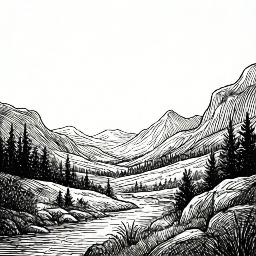
Use the stated measurements and conventions for each exercise.
Planning value zones before inking
Begin by dividing the page into three horizontal bands: sky, midground and foreground. Assign each band a target value from light to dark using a simple three-step scale you define yourself, for example light, medium and dark. Write the scale at the edge of the paper so your decisions stay consistent.
Within each band, identify two or three shapes that will carry the hatching. A distant hill might receive sparse parallel lines; a foreground bank might receive dense cross-hatching. The goal is contrast between bands, not uniform texture everywhere.
- Draw the horizon line and two band boundaries lightly in ink or pencil.
- Label each band light, medium or dark using your own three-step scale.
- Sketch the main shapes in each band with a single thin outline.
- Decide which shapes will use hatching and which will use cross-hatching.
Hatching direction and spacing
Hatching is a set of parallel strokes. Choose a direction that follows the form: strokes on a slope run along the slope, strokes on a flat field run horizontally or at a slight angle. Keep spacing even within one patch so the texture reads as a single value.
Test spacing on scrap paper. If lines are about two millimetres apart, the patch reads light; at one millimetre it reads medium; overlapping or doubled lines read dark. These numbers are hypothetical examples; measure your own pen width and adjust.
- Draw a test patch of five parallel lines at a chosen spacing.
- Draw a second patch at half that spacing.
- Compare the two patches from arm's length and note which reads lighter.
- Apply the lighter spacing to sky shapes and the denser spacing to midground shapes.
Cross-hatching density and line weight
Cross-hatching adds a second set of strokes at an angle to the first. The angle should be consistent within a patch, for example thirty to forty-five degrees. Density increases when the second set is closer together or when a third set is added.
Line weight is controlled by nib pressure and by drawing speed. A slow, light stroke gives a thin line; a slightly faster, firmer stroke gives a thicker line. Reserve thick lines for foreground edges and thin lines for sky and distant forms. Keep a scrap-paper weight test beside the drawing so your hand remembers the pressure.
- Draw three short strokes on scrap paper: light, medium and firm pressure.
- Label them thin, medium and thick using your own judgement.
- Use thin strokes for sky hatching and medium strokes for midground.
- Use thick strokes only on foreground contours and shadow edges.
Assembling the landscape
Work from light to dark: sky first, then midground, then foreground. This order lets you judge contrast as the page fills. Leave white paper as your lightest value; do not fill every area with lines.
Check the whole page from a distance after each band. If two bands read as the same value, adjust spacing or add a cross-hatch layer to the darker band. Stop when the three bands are clearly distinct.
- Hatch the sky with sparse thin lines, leaving gaps of white paper.
- Hatch the midground with medium spacing, then add one cross-hatch layer to the darkest midground shape.
- Hatch the foreground with dense cross-hatching and thick contour lines.
- Review from arm's length and adjust one band only if values merge.
Worked example
A page is divided into sky, midground and foreground. The sky is hatched with lines two millimetres apart, the midground with lines one millimetre apart, and the foreground with cross-hatching at one millimetre spacing in two directions. Describe the expected value order and one adjustment if sky and midground look equal.
Worked answer
The expected order from lightest to darkest is sky, midground, foreground. If sky and midground look equal, halve the midground spacing to half a millimetre or add one cross-hatch layer to the midground, then recheck from arm's length.
Four practice exercises
Exercise 1
On scrap paper, draw two hatching patches: patch A with five parallel lines two millimetres apart, patch B with five parallel lines one millimetre apart. State which patch reads lighter and why.
Show answer and check
Patch A reads lighter because its lines are farther apart, leaving more white paper visible.
Why: Value in hatching depends on the ratio of ink to white paper. Wider spacing means less ink per area, so the patch appears lighter.
Check: View both patches from arm's length and confirm patch A appears lighter; measure spacing with a ruler to verify two millimetres versus one millimetre.
Exercise 2
A midground hill is hatched with lines one millimetre apart and still reads too light next to a dark foreground. Describe one cross-hatching change that would darken it without changing the first layer.
Show answer and check
Add a second set of lines at a consistent angle, spaced one millimetre apart, over the existing hatching.
Why: A second layer increases ink coverage and therefore darkens the patch while keeping the first layer intact.
Check: Compare the hill with the foreground from arm's length; if the hill still reads too light, reduce the second-layer spacing to half a millimetre and recheck.
Exercise 3
You have drawn a sky with thin lines and a foreground with thick contour lines. The midground currently uses thick lines and reads too heavy. State the line-weight change and the expected effect.
Show answer and check
Redraw the midground strokes with light pressure to make them thin or medium, keeping thick lines only on foreground edges. The midground will then read lighter and sit between sky and foreground.
Why: Thick lines carry more visual weight. Reducing midground weight restores the intended order of thin sky, medium midground and thick foreground.
Check: Squint at the page: the midground should no longer compete with the foreground. Confirm by comparing stroke widths on scrap paper.
Exercise 4
A foreground bank is cross-hatched in two directions at one millimetre spacing and reads as the darkest band. The sky is hatched at two millimetres and the midground at one millimetre. State the value order and one check to confirm it.
Show answer and check
The order from lightest to darkest is sky, midground, foreground. Check by viewing the page from arm's length and confirming three distinct values.
Why: Density increases from sky to midground to foreground, so ink coverage increases in the same order.
Check: Stand back and compare the three bands; if any two merge, adjust only the lighter band by increasing its spacing.
Common mistakes
- Hatching every shape with the same spacing and direction. Assign a different spacing or direction to each band so sky, midground and foreground separate clearly.
- Using thick lines everywhere to make the drawing bold. Reserve thick strokes for foreground edges and keep sky and distant forms thin.
- Cross-hatching at inconsistent angles within one patch. Choose one angle for the second layer and repeat it across the patch.
- Filling all white paper with lines. Leave deliberate white gaps as the lightest value and check the page from a distance.
Self-check rubric
- Three value bands are clearly distinguishable from arm's length.
- Hatching direction follows form and stays consistent within each patch.
- Cross-hatching uses a consistent angle and increases density only where needed.
- Line weight varies deliberately: thin in sky, medium in midground, thick on foreground edges.
- White paper is preserved as the lightest value.
- The landscape reads as a complete scene with foreground, midground and sky.
Questions and answers
How do I choose hatching direction?
Follow the form: strokes run along slopes, across flat fields, and around rounded shapes. Keep one direction per patch.
How many cross-hatch layers are enough?
Usually one or two layers are enough for a landscape. Add a layer only when a shape still reads too light compared with its neighbours.
Can I erase ink mistakes?
Ink is permanent, so plan lightly first. If a patch becomes too dark, leave it and lighten neighbouring areas instead of adding more lines.
What pen should I use?
Any pen that gives a consistent line works. Test your own pen on scrap paper to learn its thin, medium and thick pressure responses.