Free original lessons
Draw a Happy Birthday Banner: Lettering and Layout Guide
Plan and draw a balanced Happy Birthday banner with consistent letter spacing, clear baselines, and a repeatable layout method.
Free lesson
Four exercises
Worked answers
Object Drawing Lessons
A birthday banner reads best when the lettering is evenly spaced and the layout is planned before ink goes down. This guide treats the banner as a layout problem: decide the strip size, set a baseline and midline, space letters by eye using a simple convention, and check the result with arithmetic. You will practice spacing, plan a full banner, and then letter a blank strip independently. All measurements are examples; measure your own paper and tools.
Practice materials: Printable downloads are not available for this lesson yet. Use the instructions and four exercises below.
Reference illustration
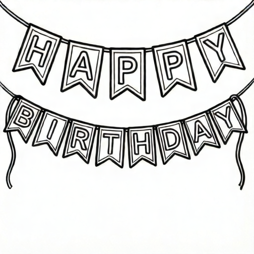
Use the stated measurements and conventions for each exercise.
Set up the strip and the lettering zone
Cut or choose a strip of paper. For this guide, assume a strip 60 cm long and 15 cm tall, but measure your actual strip and record its true length and height. Mark a baseline 4 cm above the bottom edge and a midline 8 cm above the baseline. The space between baseline and midline is the x-height zone for lowercase letters; capitals may rise above the midline. Keep these two lines light so they can be erased or hidden later.
Decide the lettering convention before drawing. In this guide, letters are spaced so that the gap between adjacent letters is about one quarter of the average letter width. This is a convention, not a universal rule; other spacing can look correct if it is consistent. Write the convention at the top of your planning sheet so your checks match your choice.
- Measure the strip length and height; write the numbers down.
- Draw a baseline and a midline with a ruler; label the x-height zone.
- Write your spacing convention in one sentence.
- Lightly mark the left and right margins, each about 3 cm from the strip ends.
Plan the words and count the letters
The banner text is HAPPY BIRTHDAY. Count the letters: HAPPY has 5 letters, BIRTHDAY has 8 letters, for 13 letters total. If you include a space between words, treat it as a gap of about one letter width. For planning, assume an average capital width of 4 cm and a gap of 1 cm between letters. These numbers are hypothetical examples; adjust them to your actual letter size.
Estimate the total width: 13 letters times 4 cm equals 52 cm of letter width. There are 12 gaps between the 13 letters, plus one word space. If each gap is 1 cm and the word space is 4 cm, the gaps total 12 + 4 = 16 cm. The lettering therefore needs about 52 + 16 = 68 cm. That is longer than the 60 cm strip, so either reduce the average letter width to 3.5 cm or shorten the gaps. This arithmetic check prevents crowding.
- Write the text and count letters: 5 + 8 = 13.
- Choose an average letter width and a gap width; record both.
- Multiply letters by average width; add gaps and word space.
- Compare the total to the usable strip length between margins; adjust one value if needed.
Space the letters and draw the banner
Divide the usable strip length by the number of letters to get a spacing interval. For example, if the usable length is 54 cm and there are 13 letters, 54 divided by 13 is about 4.15 cm per letter position. Place light tick marks at these intervals along the baseline. Center each letter on its tick mark rather than starting every letter at the tick; centering keeps the visual rhythm even when letters differ in width.
Letter the words in pencil first. Keep capitals sitting on the baseline and rising above the midline; keep lowercase letters between baseline and midline. Check that the gap between letters matches your convention. If a letter looks too wide, do not change the tick marks; adjust the letter shape slightly and keep the center fixed. After pencil approval, go over the letters with ink or marker, then erase the guide lines.
- Divide usable length by 13 to get the interval; round to a practical value.
- Mark ticks along the baseline at the interval.
- Center each letter on its tick; keep baseline and midline consistent.
- Check gaps against your convention, then ink and erase guides.
Check the finished layout
Measure the actual lettering block from the left edge of the first letter to the right edge of the last letter. Compare it to your planned total. A difference of 1 to 2 cm is acceptable for hand lettering; a larger difference means the spacing convention drifted. Also check that the left and right margins are roughly equal. If the banner will hang, mark two small holes or attachment points near the top corners, but measure your own strip before making holes.
Use a simple rubric: letters sit on the baseline, lowercase letters stay within the x-height zone, gaps are consistent with the stated convention, margins are balanced, and the text is readable from about two meters away. Valid alternatives include wider gaps, narrower letters, or a different letter style, provided the convention is stated and followed consistently.
- Measure the lettering block and compare with the plan.
- Check margins and baseline alignment.
- Read the banner from a short distance to test legibility.
- Record any changes for the next banner.
Worked example
A strip is 50 cm long with 3 cm margins on each side. The text has 10 letters, an average letter width of 3 cm, and 9 gaps of 1 cm. Does the lettering fit?
Worked answer
Usable length is 50 minus 6 equals 44 cm. Letter width total is 10 times 3 equals 30 cm. Gap total is 9 times 1 equals 9 cm. Planned lettering is 30 plus 9 equals 39 cm. Since 39 cm is less than 44 cm, it fits with 5 cm to spare.
Four practice exercises
Exercise 1
A strip is 40 cm long with 2 cm margins each side. There are 8 letters, average width 3 cm, and 7 gaps of 1 cm. Does the lettering fit?
Show answer and check
Usable length is 40 minus 4 equals 36 cm. Letter total is 8 times 3 equals 24 cm. Gap total is 7 times 1 equals 7 cm. Planned total is 31 cm, which is less than 36 cm, so it fits with 5 cm spare.
Why: Subtract margins first, then add letter widths and gaps, and compare to usable length.
Check: Recompute 40 - 4 = 36; 8 x 3 = 24; 7 x 1 = 7; 24 + 7 = 31; 31 < 36.
Exercise 2
A 60 cm strip has 3 cm margins each side and 12 letters. What is the spacing interval if you divide the usable length equally among the letters?
Show answer and check
Usable length is 60 minus 6 equals 54 cm. 54 divided by 12 equals 4.5 cm per letter position.
Why: The interval is the usable length divided by the number of letters, used to place tick marks.
Check: Multiply 4.5 by 12 to get 54, then add 6 cm of margins to get 60 cm.
Exercise 3
You plan 9 letters of average width 4 cm with 8 gaps of 1.5 cm. What is the planned lettering width?
Show answer and check
Letter total is 9 times 4 equals 36 cm. Gap total is 8 times 1.5 equals 12 cm. Planned width is 36 plus 12 equals 48 cm.
Why: Multiply letters by average width, multiply gaps by gap width, and add the two totals.
Check: Recompute 9 x 4 = 36; 8 x 1.5 = 12; 36 + 12 = 48.
Exercise 4
A banner has 13 letters and 12 gaps. If each gap is 1 cm and the word space adds 4 cm, what is the total gap allowance?
Show answer and check
The 12 gaps total 12 cm. Adding the 4 cm word space gives 16 cm total gap allowance.
Why: Count the gaps between letters, multiply by gap width, then add the word space separately.
Check: 12 x 1 = 12; 12 + 4 = 16.
Common mistakes
- Starting to letter without measuring the strip or counting letters. Measure the strip, count the 13 letters, and do the width arithmetic before drawing.
- Using different gaps between letters because each letter is drawn separately. Mark evenly spaced ticks first and center each letter on its tick.
- Letting lowercase letters float above the baseline or sink below it. Keep the baseline and midline visible until the lettering is inked and checked.
- Ignoring the word space and crowding HAPPY against BIRTHDAY. Treat the word space as about one letter width in the planning arithmetic.
Self-check rubric
- Baseline and midline are drawn and visible during lettering.
- All 13 letters are present and centered on planned ticks.
- Gaps follow the stated spacing convention consistently.
- Left and right margins are roughly equal.
- Lowercase letters stay within the x-height zone; capitals share the baseline.
- The banner is legible from about two meters away.
- Valid alternatives are accepted if the convention is stated and followed.
Questions and answers
Do I have to use the quarter-letter gap convention?
No. It is a stated convention for this guide. You may choose a different consistent gap, but write it down and check the layout against it.
What if my strip is shorter than the planned lettering?
Reduce the average letter width or the gap width, then recalculate. Do not squeeze letters unevenly.
Should capitals and lowercase letters be the same height?
No. Capitals may rise above the midline, while lowercase letters sit between baseline and midline. Keep the baseline shared.
How do I know the banner is balanced?
Measure the left and right margins and compare the actual lettering block to your planned total. Balanced margins and consistent gaps are the main checks.