Free original lessons
Fire and Ice Drawing: Contrasting Elements with Texture and Color
Learn to draw stylized fire and ice side by side using shape, texture strokes, and color cues. Includes steps, common mistakes, and practice tasks.
Free lesson
Four exercises
Worked answers
Object Drawing Lessons
This guide teaches a clear, repeatable method for drawing fire and ice as contrasting elements. You will build each form from simple shapes, add texture strokes that read as flame or frost, and use color and value to separate the two. The approach is stylized, not physically realistic: it focuses on visual cues that make fire look hot and moving, and ice look cold and still. All measurements are hypothetical examples; measure your own paper and tools. The convention for letter height in any labels is baseline to midline, and letter styles may vary. Work on a single sheet with fire on the left and ice on the right so the contrast is easy to compare.
Practice materials: Printable downloads are not available for this lesson yet. Use the instructions and four exercises below.
Reference illustration
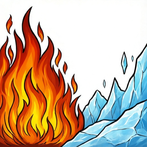
Use the stated measurements and conventions for each exercise.
Build the two forms from simple shapes
Start by drawing a light vertical divider down the middle of your page. On the left, sketch a flame mass as a tall teardrop with a wide base and a pointed tip that leans slightly. On the right, sketch an ice mass as a blocky cluster of angular facets, wider at the base and narrower at the top. Keep both shapes about the same overall height so the contrast is about form and texture, not size.
Use a light pencil for construction lines. The flame should feel curved and upward-reaching; the ice should feel straight-edged and grounded. Check that the flame's widest point is near the bottom third and the ice's widest point is near the base. These proportions are hypothetical examples; adjust to your composition.
- Draw a faint vertical divider.
- Sketch the flame as a teardrop with a leaning tip.
- Sketch the ice as a cluster of angular facets.
- Compare heights and adjust so both masses balance.
Add texture strokes that read as flame or frost
Texture is the main cue that separates fire from ice. For fire, use curved, tapering strokes that flow upward and outward from the base. Vary their length and spacing; group them in loose bundles. For ice, use straight or slightly jagged strokes that follow facet edges, with short cross-strokes to suggest cracks and planes. Keep ice strokes cooler and more orderly than fire strokes.
A useful convention: draw fire strokes as open curves that never close into loops, and ice strokes as straight segments that meet at angles. This keeps the two textures distinct even in a quick sketch. Test your strokes on a scrap area first; if a fire stroke looks like a crack, soften its curve.
- Practice five curved fire strokes and five straight ice strokes on scrap paper.
- Add fire strokes from the base upward, varying length.
- Add ice strokes along facet edges, then short cross-strokes.
- Step back and check that the textures do not mix.
Use color and value to strengthen contrast
Choose a warm palette for fire (for example, yellow, orange, red) and a cool palette for ice (for example, pale blue, blue-green, white). Keep the fire's brightest area near the base and let the tip darken slightly; keep the ice's brightest area on upper facets and let lower areas cool into shadow. Use value contrast: fire can have high contrast between bright core and darker edges, while ice can have softer transitions with sharp highlights.
If you work in graphite only, use dense dark strokes for fire edges and light, crisp strokes for ice highlights. Label any color choices as hypothetical examples and test them on scrap paper before committing.
- Test warm and cool color patches on scrap paper.
- Block in fire with warm mid-tones, then add bright core.
- Block in ice with cool mid-tones, then add bright facets.
- Check that warm and cool areas do not bleed into each other.
Refine edges and finish
Refine the flame tip with a few clean curved strokes and soften the base where it meets the ground. For ice, sharpen facet edges and add a few crisp highlight lines. Keep the divider light or erase it at the end. The goal is a clear side-by-side contrast: curved and moving versus angular and still.
Check your drawing from a short distance. If the fire and ice feel too similar, increase the curve of fire strokes or the angularity of ice strokes. If one element dominates, reduce its stroke density.
- Clean up the flame tip and base.
- Sharpen ice facet edges and add highlights.
- Erase or lighten the divider.
- Review from a distance and adjust texture density.
Worked example
Draw a small flame on the left and a small ice block on the right, each about 6 cm tall, using the construction and texture steps. Use a pencil and two colors if available.
Worked answer
A finished sketch with a teardrop flame leaning slightly right, curved tapering strokes from a wide base, warm mid-tone with a brighter core, and a blocky ice mass with three visible facets, straight edge strokes and short cross-strokes, cool mid-tone with bright upper facets. The divider is light or erased, and the two textures are clearly different.
Four practice exercises
Exercise 1
Draw a flame 5 cm tall and an ice block 5 cm tall side by side. Use only pencil. Add at least six fire strokes and six ice strokes.
Show answer and check
A sketch with a teardrop flame and a blocky ice mass, each about 5 cm tall, with six or more distinct curved fire strokes and six or more straight ice strokes.
Why: The task isolates form and texture without color, so the contrast must come from shape and stroke direction.
Check: Measure both heights with a ruler; count strokes; confirm fire strokes are curved and ice strokes are straight or jagged.
Exercise 2
Draw the same flame and ice block but use two colors: one warm and one cool. Keep the colors on their own sides of a light divider.
Show answer and check
A sketch with warm color only on the flame side and cool color only on the ice side, with the divider still visible or lightly erased.
Why: This checks palette separation and color cueing.
Check: Look for any warm color crossing to the ice side or cool color crossing to the fire side; adjust if found.
Exercise 3
Draw a flame with a bright core near the base and a darker tip, and an ice block with bright upper facets and cooler lower areas. Use pencil shading only.
Show answer and check
A sketch showing value contrast: flame brighter at the base, ice brighter on upper facets.
Why: Value placement reinforces the hot-versus-cold reading.
Check: Squint at the drawing; the flame base should appear lighter than its tip, and the ice upper facets lighter than its lower areas.
Exercise 4
Draw a flame and ice block where the flame leans left and the ice has four facets. Add a short label under each using the baseline-to-midline convention for letter height.
Show answer and check
A sketch with a left-leaning flame, a four-facet ice block, and two short labels whose letters fit between baseline and midline.
Why: This checks directional variation, facet count, and the stated letter-height convention.
Check: Count the ice facets; confirm the flame tip points left; check that label letters do not exceed the midline.
Common mistakes
- Using the same curved strokes for both fire and ice. Make ice strokes straight or jagged and fire strokes curved and tapering.
- Making the flame and ice the same overall shape. Keep the flame teardrop-like and the ice blocky with angular facets.
- Letting warm and cool colors mix across the divider. Keep palettes separate and test colors on scrap paper first.
- Overworking the fire tip until it looks like a solid blob. Use fewer, cleaner curved strokes at the tip and leave some open space.
Self-check rubric
- Flame form is teardrop-like with a wide base and a leaning tip.
- Ice form is blocky with at least three angular facets.
- Fire texture uses curved, tapering strokes that flow upward.
- Ice texture uses straight or jagged strokes with cross-strokes.
- Warm and cool color or value cues are kept separate.
- Edges are refined and the divider is light or erased.
- Valid alternatives: letter styles may vary; stroke density and exact proportions may vary as long as the contrast remains clear.
Questions and answers
Do I need special art supplies?
No. A pencil, eraser, and any coloring tools you have are enough. Test your tools on scrap paper first.
How large should the drawing be?
Any size that fits your paper. Keep both elements about the same height so the contrast is clear.
Can I draw ice as a single block?
Yes, but add at least three facets and some cross-strokes so it reads as ice rather than a plain shape.
What if my fire looks like hair?
Make strokes more tapering and group them in bundles that flow upward from a wide base.