Free original lessons
Pastel Fish Scales: Layered Color Technique
Learn to draw overlapping fish scales with pastels using a defined layering convention, step-by-step practice, and self-checking rubrics.
Free lesson
Four exercises
Worked answers
Object Drawing Lessons
This lesson teaches a repeatable pastel technique for drawing overlapping fish-scale patterns. You will work on a flat practice plate, building color in layers from light to dark, then adding edge definition. The convention is simple: each scale is a rounded arc that overlaps the one below it, and color is applied in three passes—base, mid-tone, and accent. Because pastels vary by brand and paper, all numerical values here are hypothetical examples; measure your own materials before starting. The goal is a clean, rhythmic pattern with visible layering, not photorealism or fine detail.
Practice materials: Printable downloads are not available for this lesson yet. Use the instructions and four exercises below.
Reference illustration
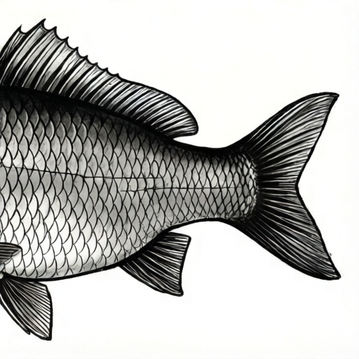
Use the stated measurements and conventions for each exercise.
Setting Up the Plate and Defining the Scale Grid
Choose a pastel paper with a visible tooth; smoother paper holds fewer layers. Tape the paper to a board. Using a light pastel or a white pastel pencil, mark a horizontal baseline near the bottom of the plate. Decide a scale width—for example, 2 cm—and mark evenly spaced points along the baseline. This is your first row of scale centers. Offset the next row by half a scale width and raise it by about one-third of the scale width. Repeat until the plate is filled. Keep the grid light so it does not muddy later layers.
The overlap convention: each scale is drawn as a shallow arc that sits over the scale below, like roof tiles. The top edge of each scale is the visible arc; the sides tuck under neighboring scales. Work from the bottom row upward so each new row overlaps the one beneath it. This order prevents smudging and keeps the pattern readable.
- Tape paper to a board and mark a baseline.
- Mark scale centers at a chosen width (example: 2 cm).
- Offset each new row by half a width and raise it by one-third of the width.
- Check that rows are evenly spaced before adding color.
Three-Pass Pastel Layering
Pass one is the base color: a light, warm tone applied with the side of the pastel in soft, even strokes. Fill each scale shape without pressing hard. Pass two is the mid-tone: a slightly darker or cooler color applied over the lower two-thirds of each scale, leaving the top edge light. Pass three is the accent: a dark or saturated color applied only along the overlapping top edge and at the sides where scales meet. Blend sparingly with a fingertip or a soft cloth; too much blending removes the layered look.
Keep the pastel clean by wiping it on a cloth between colors. If the paper fills up and stops accepting color, stop adding layers—overworking causes muddiness. A useful check is to tilt the plate under light: the top edges should catch light, and the lower parts should read as shadow.
- Apply base color with the side of the pastel in light strokes.
- Add mid-tone over the lower two-thirds of each scale.
- Add accent along the top overlapping edge and side seams.
- Blend only lightly and wipe pastels between colors.
Building Rhythm and Checking the Pattern
Rhythm comes from consistent spacing and repeated arc shapes. After every two rows, step back and look at the plate from a short distance. Check that the arcs line up and that no scale is much larger or smaller than its neighbors. If a row drifts, correct it before adding more color. Because pastels are forgiving, small adjustments are possible, but large corrections may require lifting color with a kneaded eraser.
Use a simple arithmetic check: if your scale width is 2 cm and your plate is 20 cm wide, you should fit about 10 scales per row. Count a sample row to confirm. If the count is off by more than one, adjust the spacing before continuing. This keeps the pattern even and makes the layering easier to read.
- Step back after every two rows to check alignment.
- Count scales in a sample row and compare to the expected number.
- Correct drifting rows before adding more color.
- Lift excess color with a kneaded eraser if needed.
Worked example
On a 20 cm wide plate, you mark scale centers every 2 cm. You draw 4 rows, each offset by half a scale width. How many scales are in the first row, and what is the offset for the second row?
Worked answer
First row: 20 ÷ 2 = 10 scales. Second row offset: half of 2 cm = 1 cm to the right (or left) of the first row's centers.
Four practice exercises
Exercise 1
A practice plate is 18 cm wide. You choose a scale width of 3 cm. How many scale centers fit in one row, and what is the offset for the next row?
Show answer and check
18 ÷ 3 = 6 scales per row. Offset = half of 3 cm = 1.5 cm.
Why: Divide the plate width by the scale width to find the count. The offset is always half a scale width to create the overlapping pattern.
Check: Count the marks on your plate: there should be 6 centers in the first row. Measure the second row's first center: it should be 1.5 cm to the side of the first row's first center.
Exercise 2
You are drawing a row of 8 scales. You apply base color to all 8, mid-tone to the lower two-thirds of each, and accent to the top edge of each. How many accent applications do you make?
Show answer and check
8 accent applications, one per scale.
Why: The accent is applied only along the top overlapping edge of each scale, so the number of accents equals the number of scales in the row.
Check: Point to each scale and confirm one accent stroke at its top edge. The total should match the scale count.
Exercise 3
Your plate is 24 cm wide and you want 8 scales per row. What scale width should you use, and what is the row offset?
Show answer and check
Scale width = 24 ÷ 8 = 3 cm. Offset = 1.5 cm.
Why: Divide the plate width by the desired count to get the scale width. The offset is half that width.
Check: Mark 8 centers at 3 cm intervals and measure the second row's offset; it should be 1.5 cm.
Exercise 4
After three rows, you notice the fourth row is drifting to the right by about 1 cm over the row length. What is the best correction before adding more color?
Show answer and check
Realign the fourth row using a light guideline and adjust the centers so they match the offset pattern; lift any misplaced color with a kneaded eraser before continuing.
Why: Correcting drift early prevents the pattern from becoming uneven. A light guideline and center marks restore the rhythm without overworking the paper.
Check: Step back and compare the fourth row's centers to the third row's offset. The spacing should be consistent within about half a centimeter across the row.
Common mistakes
- Pressing too hard on the first pass, which flattens the paper tooth and limits later layers. Use light pressure with the side of the pastel and build color gradually.
- Blending every layer until the scales look flat and muddy. Blend only lightly at the edges and leave the top edge unblended for contrast.
- Drawing scales from top to bottom, so new rows smudge the ones below. Work from the bottom row upward so each new row overlaps cleanly.
- Using inconsistent scale widths, which breaks the rhythm. Mark centers with a ruler or a paper strip and check the count per row.
Self-check rubric
- Scale shapes are consistent rounded arcs that overlap from bottom to top.
- Three distinct layers are visible: light base, mid-tone, and dark accent at the top edge.
- Spacing is even; a sample row count matches the expected number within one scale.
- Blending is minimal and does not obscure the layered look.
- The pattern reads as fish scales from a short distance, with clear rhythm.
Questions and answers
Do I need special pastel paper?
A paper with some tooth holds layers better, but any pastel-friendly paper works. Test a small corner first to see how many layers it accepts.
Can I use oil pastels instead of soft pastels?
Yes, but oil pastels behave differently: they are stickier and blend more readily. Apply thinner layers and clean the pastel between colors.
How do I fix a scale that is too dark?
Lift some color with a kneaded eraser, then reapply a lighter base and mid-tone. Avoid adding more dark accent over the mistake.
What if my rows drift out of alignment?
Correct the drift before adding more color. Use a light guideline and count scales per row to keep spacing even.