HomeRussian Cyrillic Alphabet Chart: Letterforms and Stroke Order (Planned Resource) Free original lessons
Russian Cyrillic Alphabet Chart: Letterforms and Stroke Order (Planned Resource)
A planning guide for a printable Russian Cyrillic alphabet chart with numbered stroke order and tracing rows. Free standard downloads are available.
Free downloads
Letter & A4
PDF & SVG
Writing and Handwriting Paper Guides
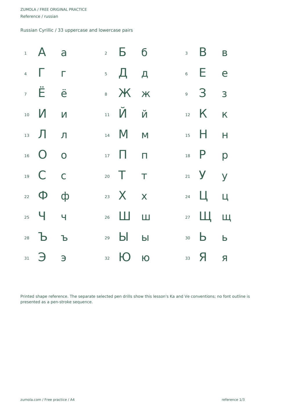
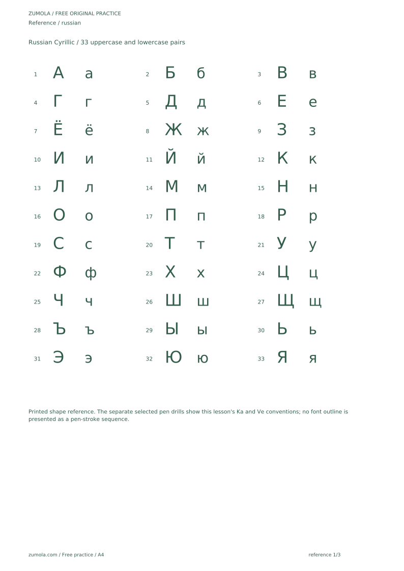
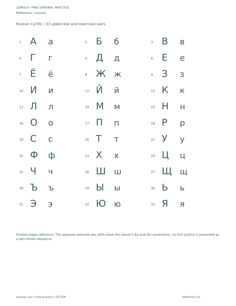
The standard download supplies a printed alphabet table, selected letter drills, blank work areas and separate complete keys in both paper sizes. The full per-letter tracing series in the original expanded proposal below is not part of this standard download. Historical original extension proposal, not the delivered pack: This page explains how a printable Russian Cyrillic alphabet chart could support learning letterforms and stroke order. The chart described here is planned, not yet produced or available. It would cover the Russian Cyrillic alphabet in upper and lower case, with numbered stroke-order arrows and a light tracing row beneath each letter. A second page would provide blank guide rows for copying. The guide also explains how to read stroke arrows, how to practice tracing and copying, and how to judge letterform accuracy with a rubric rather than a single exact shape. The expected letter count is 33; this is a planning assumption to be confirmed against a reliable Russian alphabet reference before publication, not a verified fact.
Practice materials: Download the free reference pages, practice sheets and separate answer keys below, in A4 and US Letter PDF and SVG formats.
What the planned chart would contain
The planned chart is a one-page reference and tracing sheet for the Russian Cyrillic alphabet. Each letter would appear in upper and lower case, with numbered stroke-order arrows showing a common writing sequence. Beneath each letter, a light tracing row would let a learner follow the form before writing it independently. A second page would offer blank guide rows for copying each letter without tracing.
The chart is scoped to Russian Cyrillic only. It would not cover Latin, Greek, Hebrew, Japanese, or other scripts. The blank guide rows on the copying page are part of the chart's practice sequence, not a standalone handwriting line-paper template. The expected count of 33 letters is a planning assumption to be confirmed against a reliable Russian alphabet reference before publication; this draft does not assert it as verified.
Stroke-order arrows show one reasonable writing path. They are a teaching aid, not a claim that only one sequence is correct. Letterform shape can vary in bowl size, arm angle, and proportion while remaining recognizable.
- Read the letter name and identify its upper and lower case forms.
- Follow the numbered arrows in order to see a common stroke sequence.
- Trace the light row slowly, matching the arrow direction.
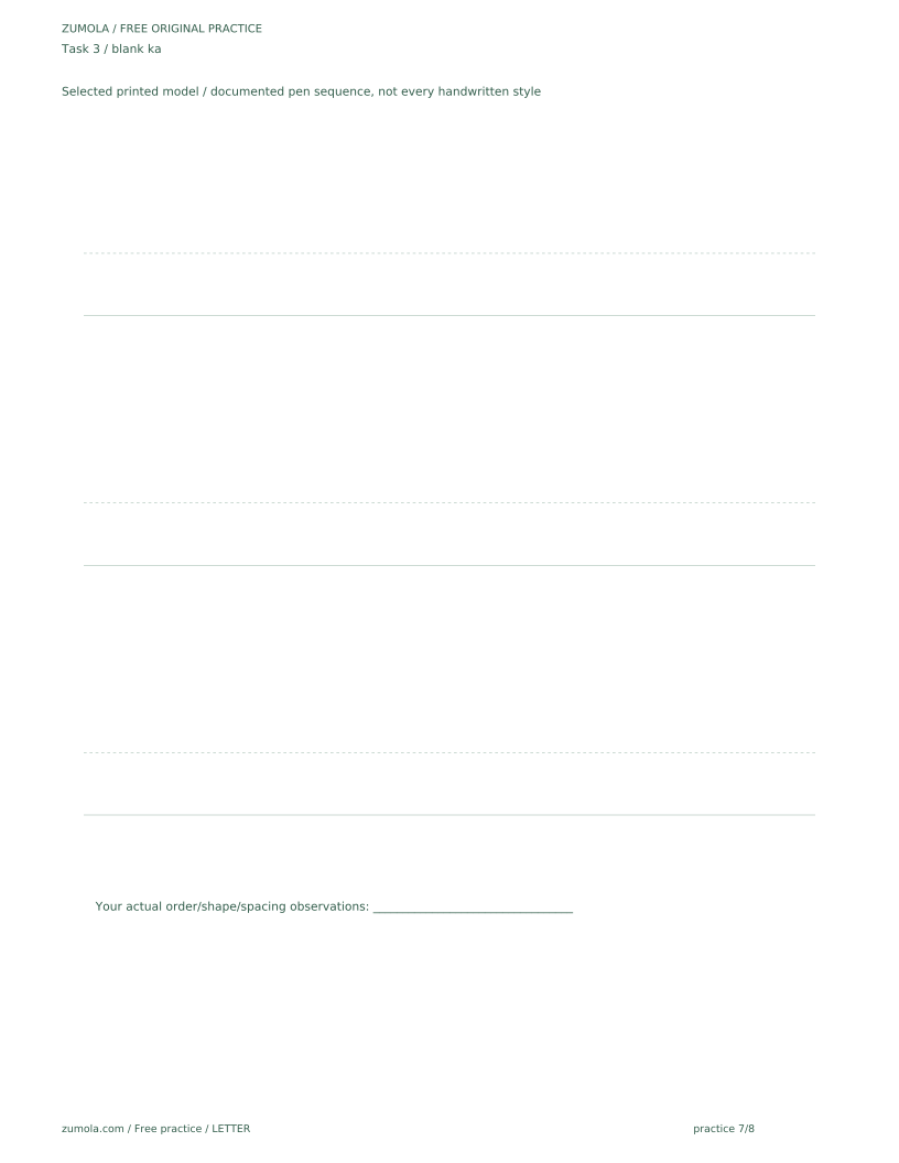
- Copy the letter on the blank guide rows without tracing.
- Compare your copy to the chart and note one shape feature to adjust.
Reading stroke-order arrows accurately
Numbered arrows indicate sequence, not speed. A small number beside an arrow shows which stroke comes first, second, and so on. Where two arrows share a number, the strokes may be written in either order. Direction arrows show where a stroke begins and ends; a curved arrow means the stroke bends rather than staying straight. In this guide, a letter's form is described relative to a baseline (the line letters sit on) and a midline (the chosen top line of the lowercase printed body in this chart). Letter styles vary between models, so treat the described forms as one reasonable convention.
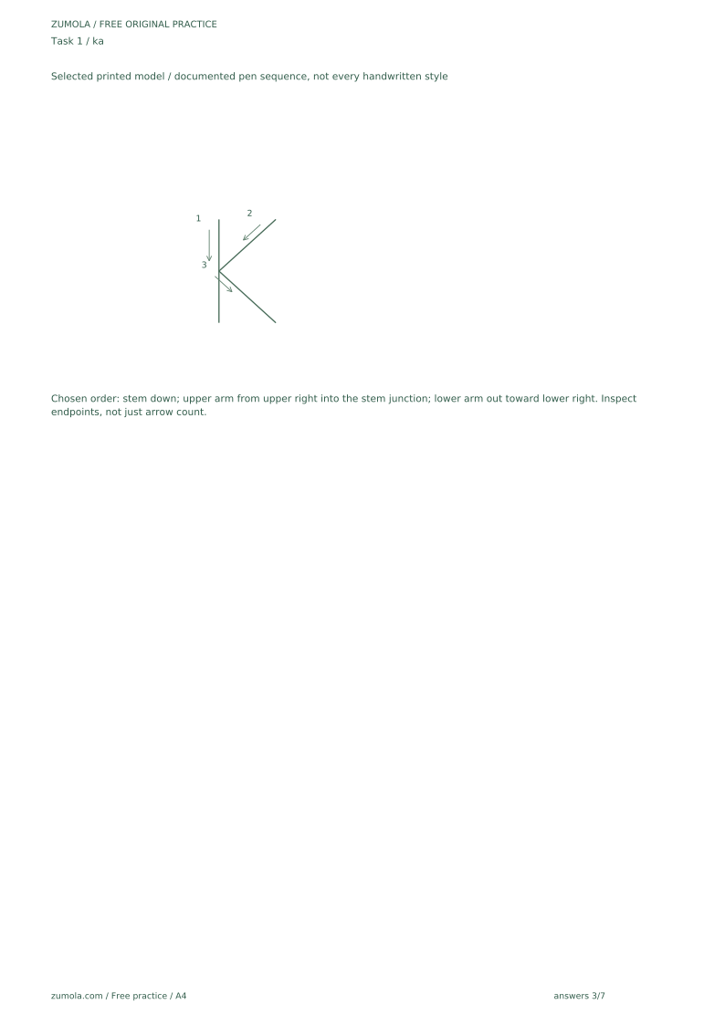
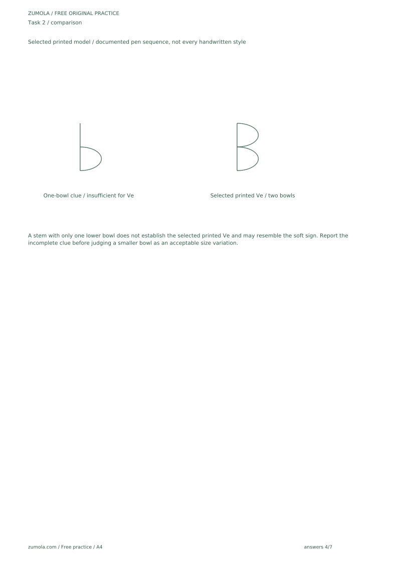
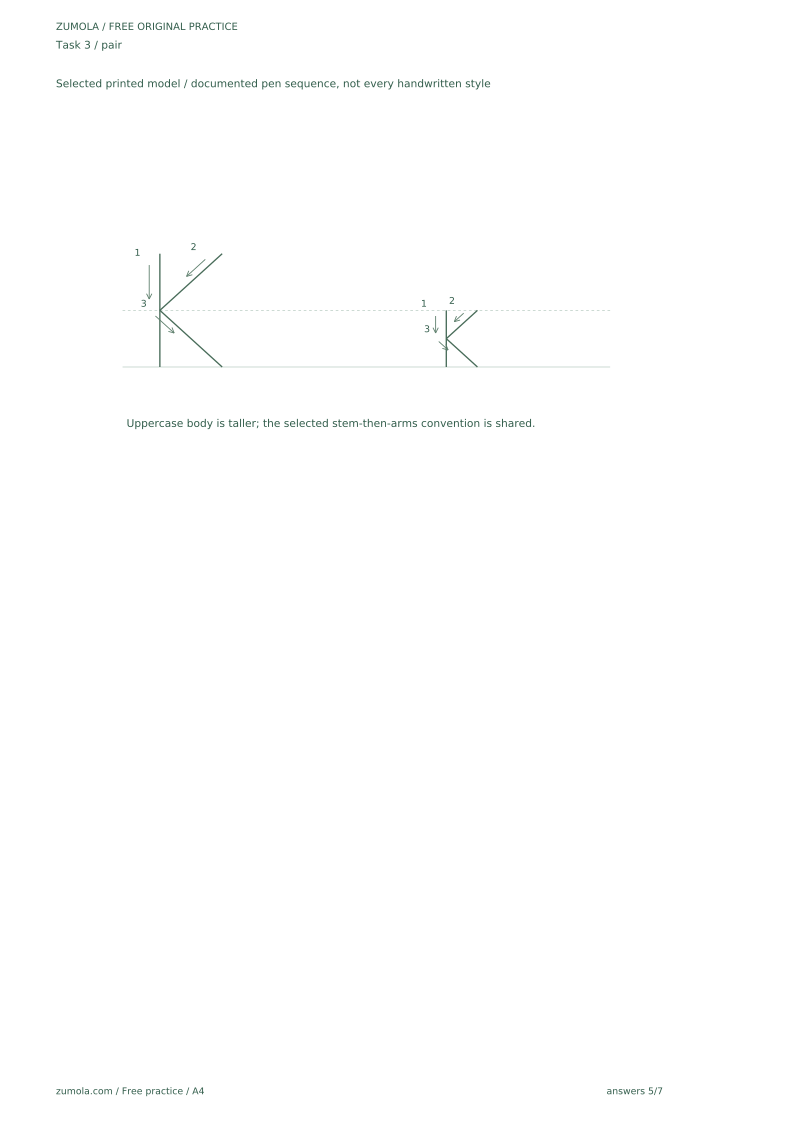
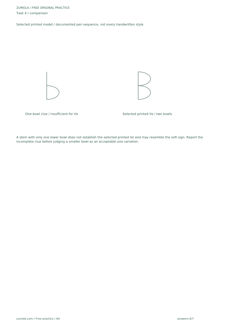
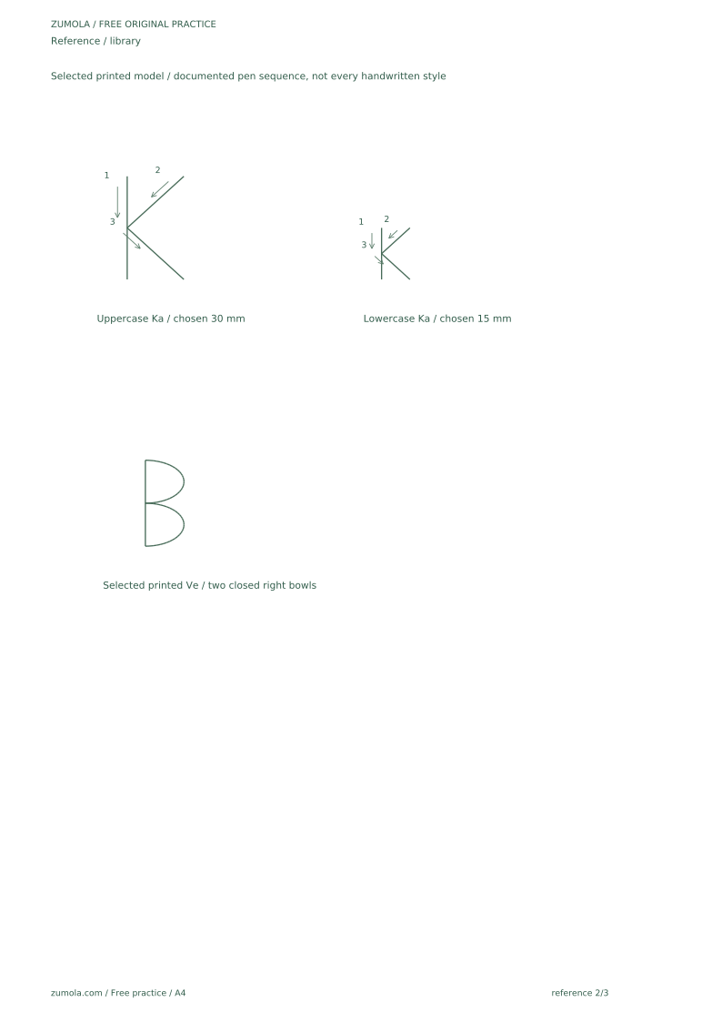
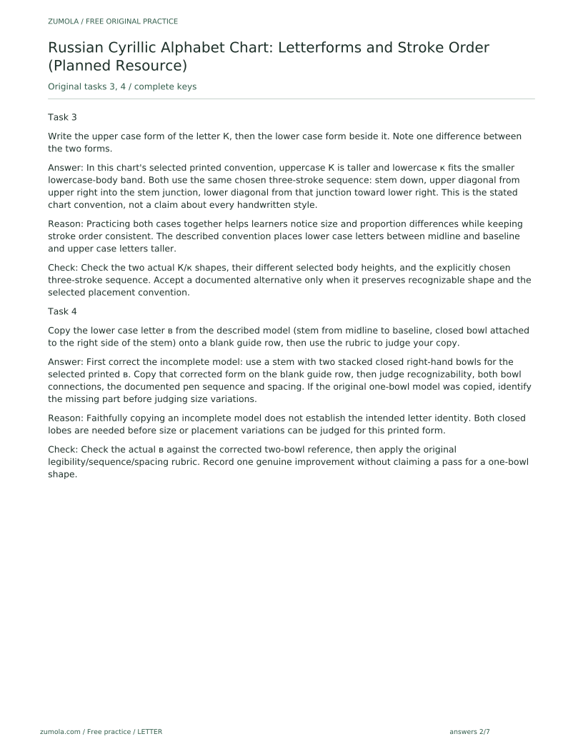
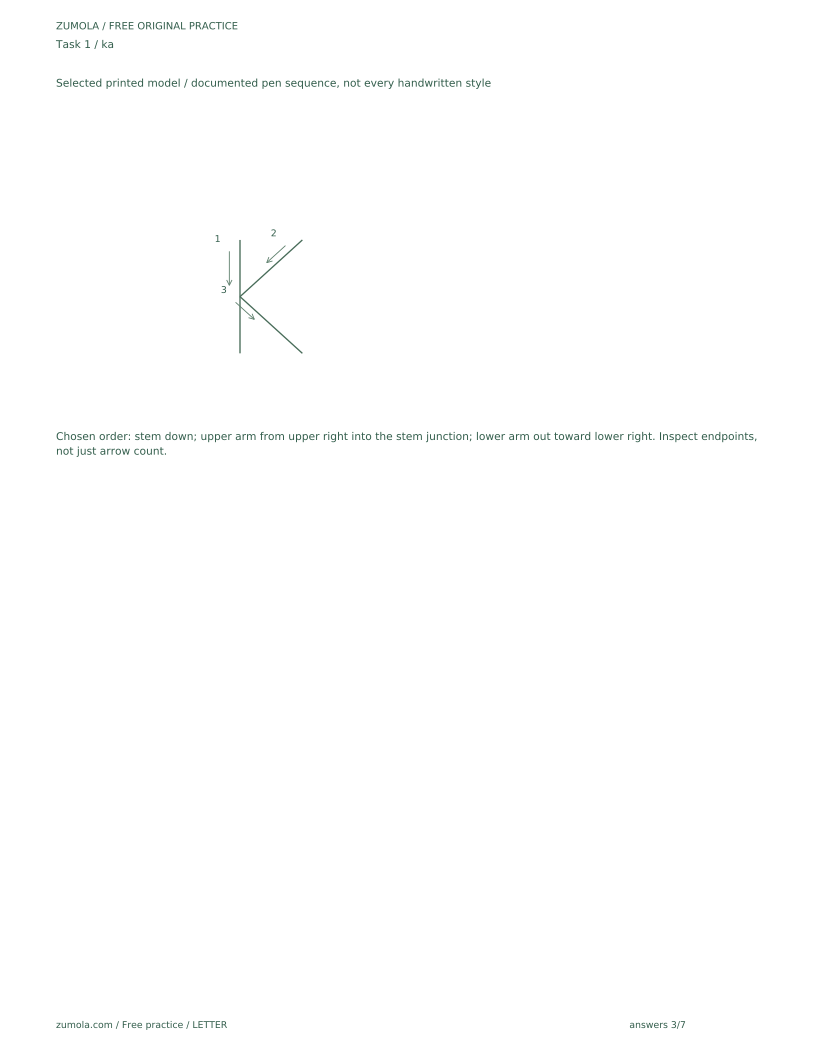
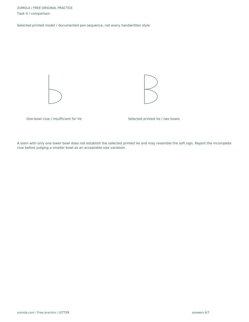
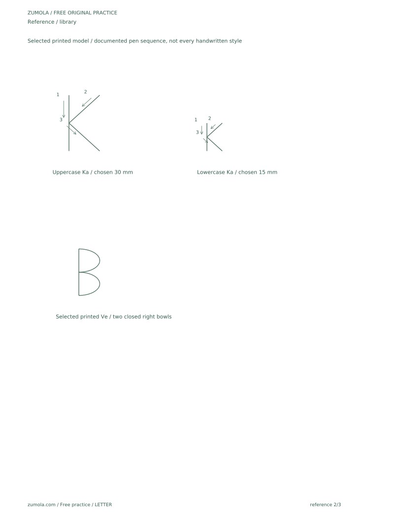
For letters with similar forms, such as upper and lower case pairs, compare where the stroke starts and how the bowl or arm is attached. The goal is a consistent, legible form, not a perfect match to one model. If a letter has a descender (a part below the baseline) or an ascender (a part above the x-height), note how it sits relative to the baseline and midline before copying. For the simplified printed examples used here, lowercase в has two stacked closed right-hand bowls. A stem and only one lower bowl does not uniquely identify it and may resemble ь. Similarly, К has arms toward upper right and lower right; the chosen arrows must follow those actual endpoints. These shape corrections take priority over an incomplete verbal model in a supplied practice prompt. The selected model here is PRINTED, not every handwritten style. It uses stem, upper bowl, lower bowl for в, and stem, upper-right arm, lower-right arm for both К and к. Shape alternatives are judged within the documented selected model.
- Find the number next to each arrow and follow the order.
- Trace the arrow direction with a finger before writing.
- Write the letter once while saying the stroke order aloud.
- Check that each stroke starts where the arrow begins.
Tracing, copying, and self-checking
Tracing builds familiarity with a form; copying tests whether you can produce it without guidance. Use the tracing row first, then move to the blank guide rows. Keep the chart visible as a reference but cover the traced letter if you tend to copy the trace rather than the form.
Self-checking works best with a short rubric. Ask whether the letter is recognizable as the intended Russian Cyrillic upper or lower case form, whether stroke order matches the numbered arrows, and whether spacing and proportion are consistent across the row. Allow variation in bowl size and arm angle; these do not make a letter wrong.
- Trace one row of the target letter.
- Copy the same letter on a blank guide row without tracing.
- Compare your copy to the chart using the rubric criteria.
- Circle one feature to improve and rewrite the letter once.
Using the chart with upper and lower case together
Some Russian Cyrillic letters differ noticeably between upper and lower case, while others are similar in shape but different in size. Practicing both forms on the same row helps you notice these differences. Write the upper case form, then the lower case form beside it, and compare where strokes begin and how the bowl or arm is positioned.
This combined practice is optional but useful for learners who confuse similar forms. Keep the chart's stroke arrows visible so you can check sequence for each case separately.
- Choose one letter and write its upper case form.
- Write the lower case form directly beside it.
- Note one difference in size, bowl position, or stroke start.
- Repeat with a second letter that has a similar pair.
Worked example
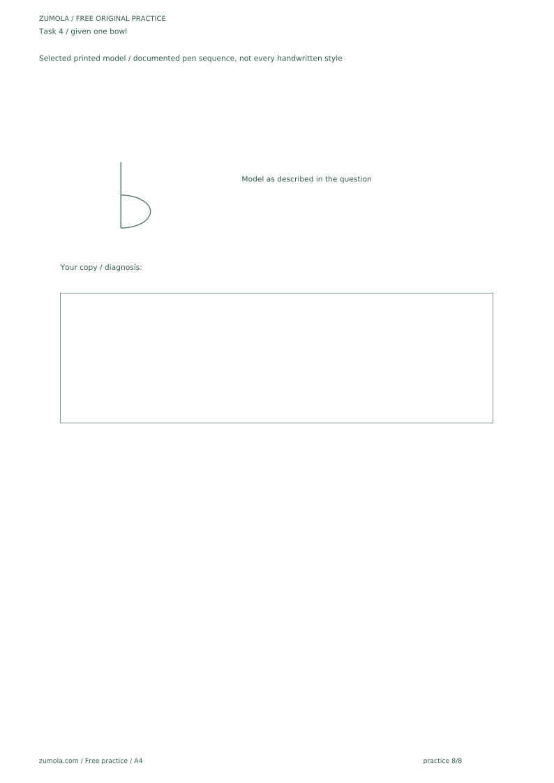
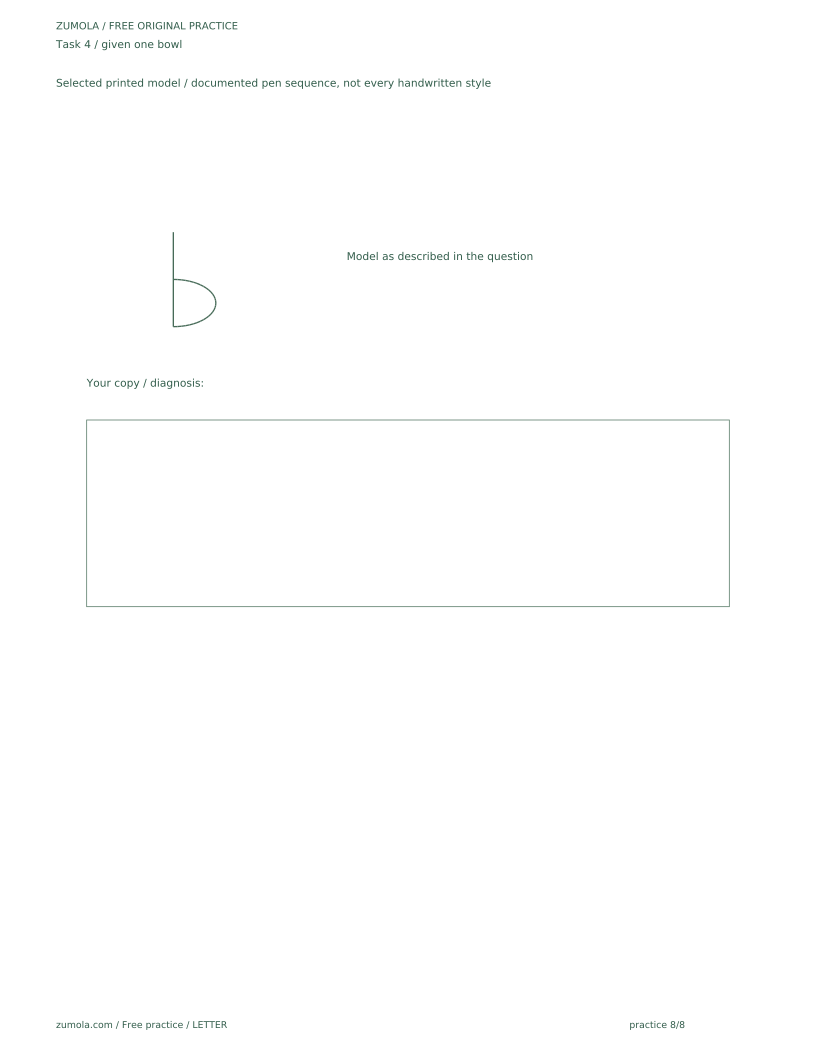
A learner copies the lower case letter в from a described model: a vertical stem from the midline down to the baseline, with a closed bowl attached to the right side of the stem between midline and baseline. The learner's copy has a smaller bowl than the model. Is the copy acceptable?
Worked answer
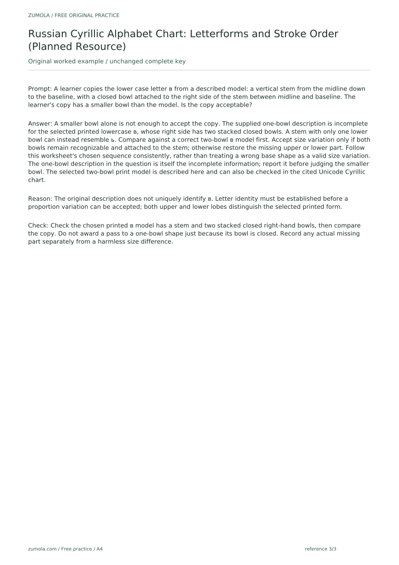
A smaller bowl alone is not enough to accept the copy. The supplied one-bowl description is incomplete for the selected printed lowercase в, whose right side has two stacked closed bowls. A stem with only one lower bowl can instead resemble ь. Compare against a correct two-bowl в model first. Accept size variation only if both bowls remain recognizable and attached to the stem; otherwise restore the missing upper or lower part. Follow this worksheet's chosen sequence consistently, rather than treating a wrong base shape as a valid size variation. The one-bowl description in the question is itself the incomplete information; report it before judging the smaller bowl. The selected two-bowl print model is described here and can also be checked in the cited Unicode Cyrillic chart.
Why: The original description does not uniquely identify в. Letter identity must be established before a proportion variation can be accepted; both upper and lower lobes distinguish the selected printed form.
Check: Check the chosen printed в model has a stem and two stacked closed right-hand bowls, then compare the copy. Do not award a pass to a one-bowl shape just because its bowl is closed. Record any actual missing part separately from a harmless size difference.
Four practice exercises
Exercise 1
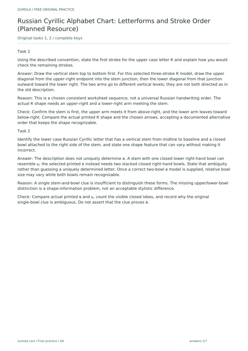
Using the described convention, state the first stroke for the upper case letter К and explain how you would check the remaining strokes.
Show answer and check
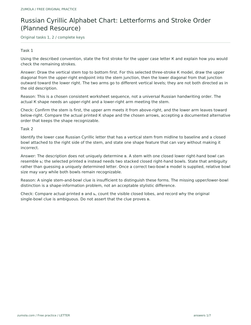
Draw the vertical stem top to bottom first. For this selected three-stroke К model, draw the upper diagonal from the upper-right endpoint into the stem junction, then the lower diagonal from that junction outward toward the lower right. The two arms go to different vertical levels; they are not both directed as in the old description.
Why: This is a chosen consistent worksheet sequence, not a universal Russian handwriting order. The actual К shape needs an upper-right and a lower-right arm meeting the stem.
Check: Confirm the stem is first, the upper arm meets it from above-right, and the lower arm leaves toward below-right. Compare the actual printed К shape and the chosen arrows, accepting a documented alternative order that keeps the shape recognizable.
Exercise 2
Identify the lower case Russian Cyrillic letter that has a vertical stem from midline to baseline and a closed bowl attached to the right side of the stem, and state one shape feature that can vary without making it incorrect.
Show answer and check
The description does not uniquely determine в. A stem with one closed lower right-hand bowl can resemble ь; the selected printed в instead needs two stacked closed right-hand bowls. State that ambiguity rather than guessing a uniquely determined letter. Once a correct two-bowl в model is supplied, relative bowl size may vary while both bowls remain recognizable.
Why: A single stem-and-bowl clue is insufficient to distinguish these forms. The missing upper/lower-bowl distinction is a shape-information problem, not an acceptable stylistic difference.
Check: Compare actual printed в and ь, count the visible closed lobes, and record why the original single-bowl clue is ambiguous. Do not assert that the clue proves в.
Exercise 3
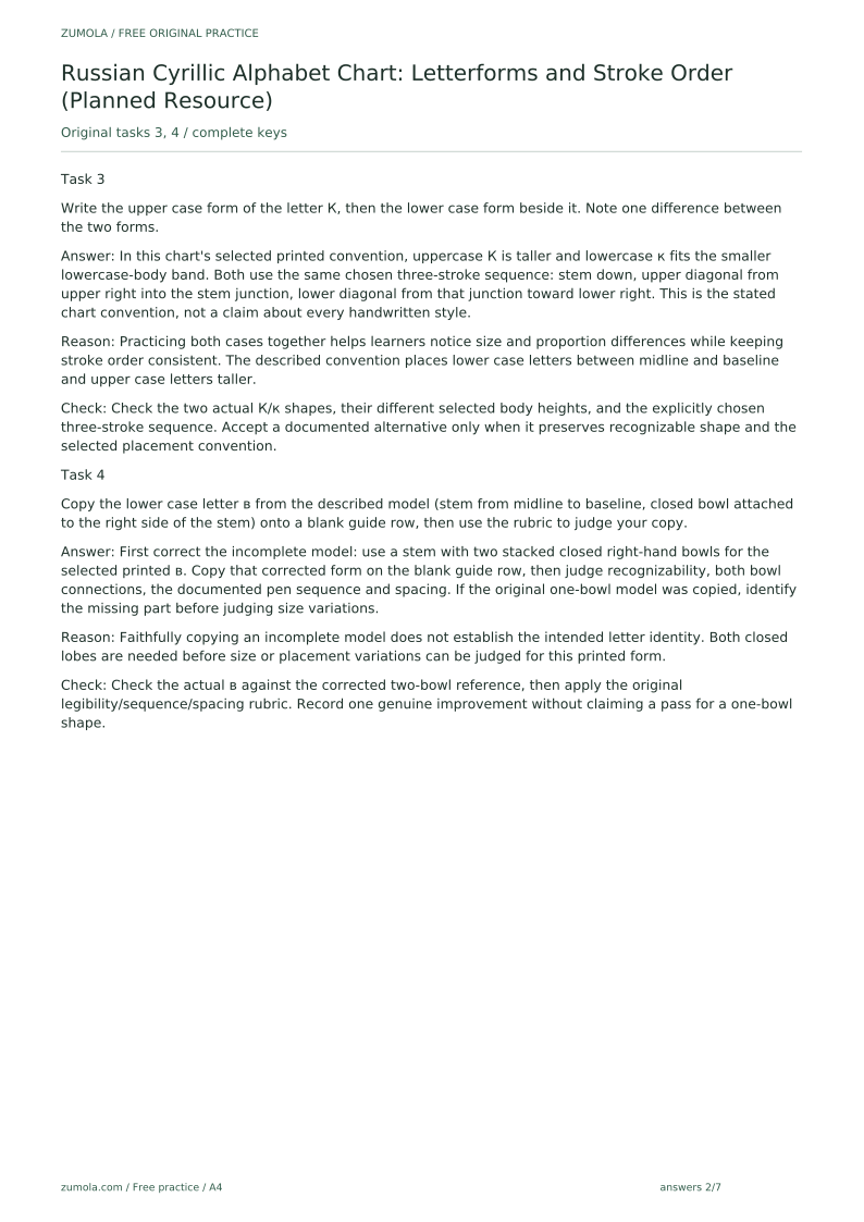
Write the upper case form of the letter К, then the lower case form beside it. Note one difference between the two forms.
Show answer and check
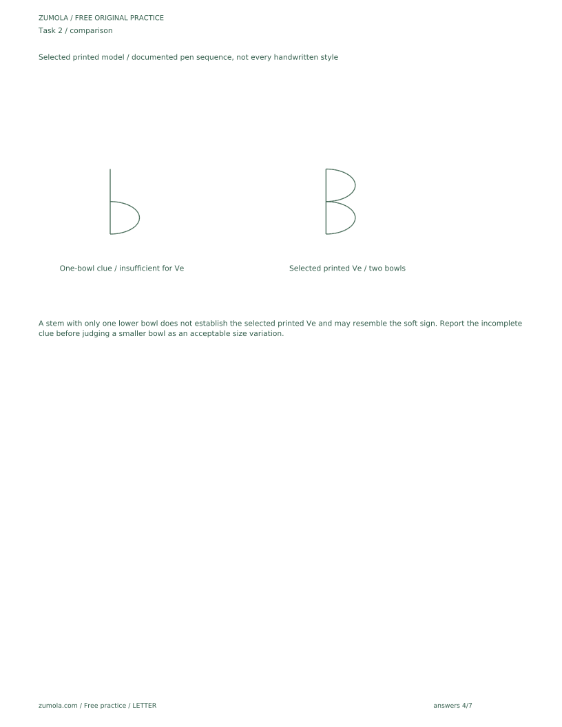
In this chart's selected printed convention, uppercase К is taller and lowercase к fits the smaller lowercase-body band. Both use the same chosen three-stroke sequence: stem down, upper diagonal from upper right into the stem junction, lower diagonal from that junction toward lower right. This is the stated chart convention, not a claim about every handwritten style.
Why: Practicing both cases together helps learners notice size and proportion differences while keeping stroke order consistent. The described convention places lower case letters between midline and baseline and upper case letters taller.
Check: Check the two actual К/к shapes, their different selected body heights, and the explicitly chosen three-stroke sequence. Accept a documented alternative only when it preserves recognizable shape and the selected placement convention.
Exercise 4
Copy the lower case letter в from the described model (stem from midline to baseline, closed bowl attached to the right side of the stem) onto a blank guide row, then use the rubric to judge your copy.
Show answer and check
First correct the incomplete model: use a stem with two stacked closed right-hand bowls for the selected printed в. Copy that corrected form on the blank guide row, then judge recognizability, both bowl connections, the documented pen sequence and spacing. If the original one-bowl model was copied, identify the missing part before judging size variations.
Why: Faithfully copying an incomplete model does not establish the intended letter identity. Both closed lobes are needed before size or placement variations can be judged for this printed form.
Check: Check the actual в against the corrected two-bowl reference, then apply the original legibility/sequence/spacing rubric. Record one genuine improvement without claiming a pass for a one-bowl shape.
Common mistakes
- Treating the stroke-order arrows as the only correct writing sequence. Use the arrows as one reasonable teaching path; accept other legible sequences if the letter remains recognizable.
- Confusing the chart's blank guide rows with a standalone handwriting line-paper template. Treat the guide rows as part of the chart's copying page only; they are not a separate line-paper resource.
- Assuming the chart is already produced, downloadable, or tested. Frame all chart features as planned; do not claim availability until production and checks are complete.
Self-check rubric
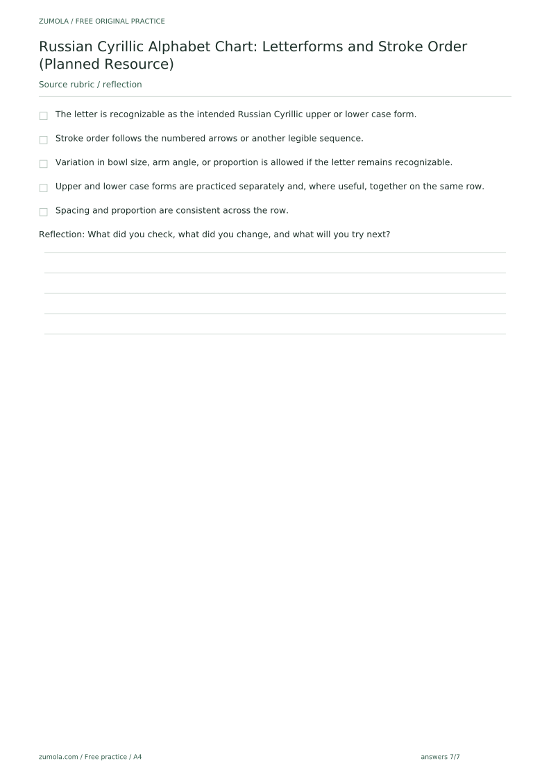
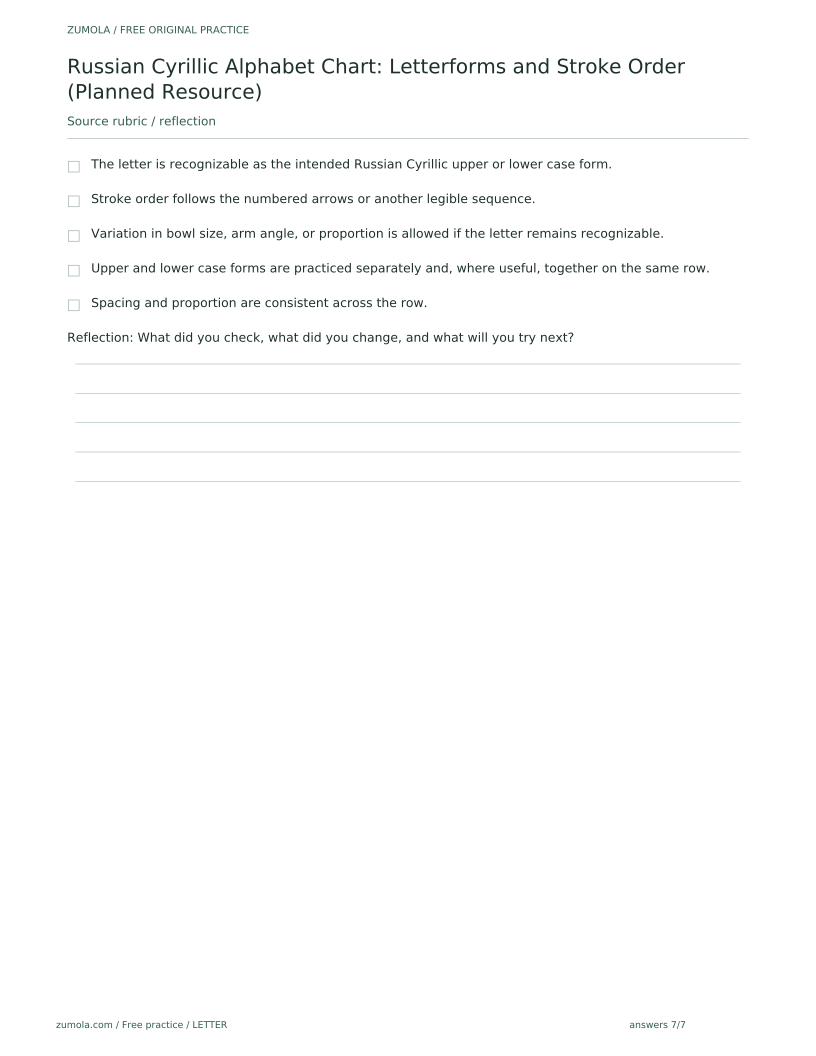
- The letter is recognizable as the intended Russian Cyrillic upper or lower case form.
- Stroke order follows the numbered arrows or another legible sequence.
- Variation in bowl size, arm angle, or proportion is allowed if the letter remains recognizable.
- Upper and lower case forms are practiced separately and, where useful, together on the same row.
- Spacing and proportion are consistent across the row.
Questions and answers
Is the Russian Cyrillic alphabet chart available to print now?
Yes. The standard printed chart and selected drills are available, with blank work areas and separate complete answer keys in both paper sizes. The original full per-letter tracing series is a separate unbuilt extension outside this standard download. This page explains the intended design and how it could be used.
Does the chart cover other scripts?
No. It is scoped to Russian Cyrillic only and excludes Latin, Greek, Hebrew, Japanese, and other scripts.
How many letters does the Russian Cyrillic alphabet have?
The expected count is 33, but this is a planning assumption to be confirmed against a reliable Russian alphabet reference before publication. This draft does not assert the count as verified.
Free printable downloads
Choose a paper size. Practice sheets and answer keys are separate. Download every file free, without registration.
This standard pack covers the four original exercises, blank work areas, complete keys and necessary figures. Additional extension sets described in the lesson are outside this download.
PDF bundles
Individual SVG pages
Reference-page preview