5 original worksheets. Reference values + self-checks.
A printable task with a way to check it
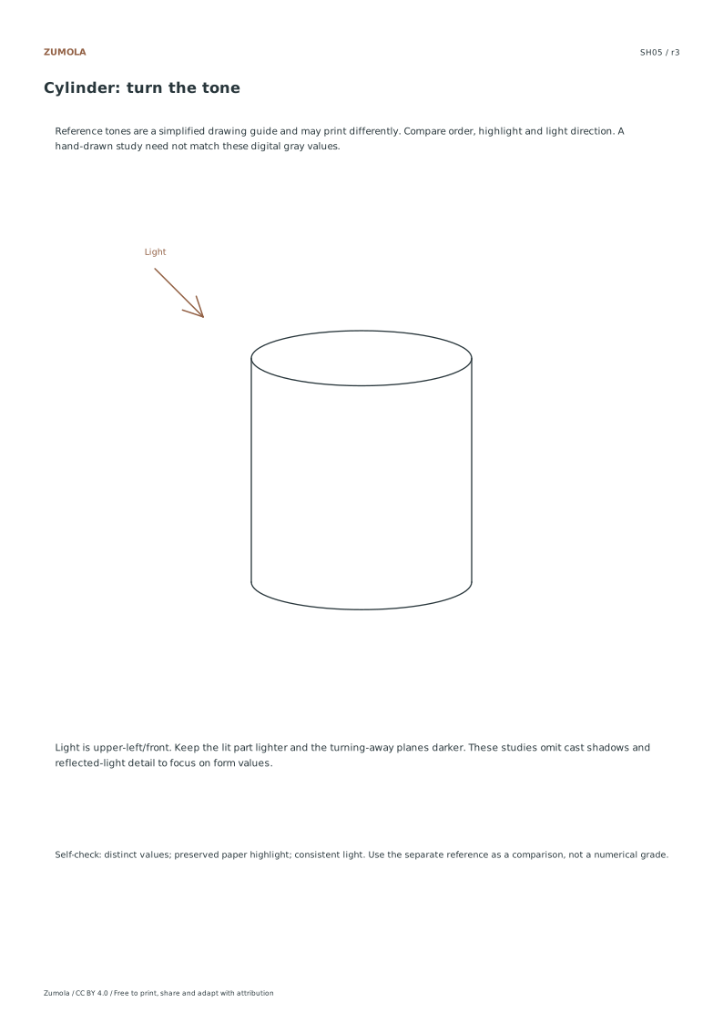
Build a value scale before shading simple forms. Follow one marked light direction and compare the relationships between lighter and darker surfaces.
Choose US Letter or A4, then download the PDF for printing or the SVG for editing. Keep the student worksheet separate from its answer or reference completion. All files, including the answers, are free without signup.
Choose your paper and download
Download paper size
Every worksheet and answer is free. No signup.
The complete collection
Keep practice and answers separate.
Use the student pack first, then compare the reference or answer. Packs are PDFs; individual sheets below also include editable SVG files. The paper choice applies to every download.
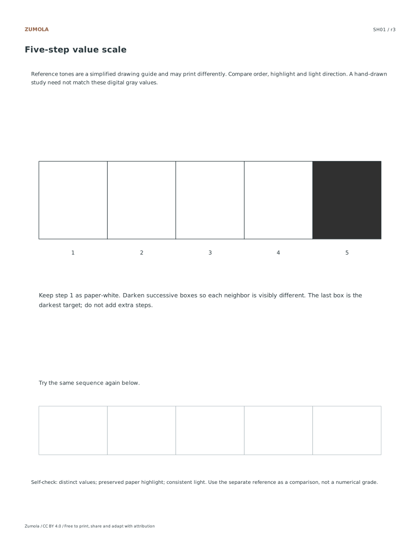
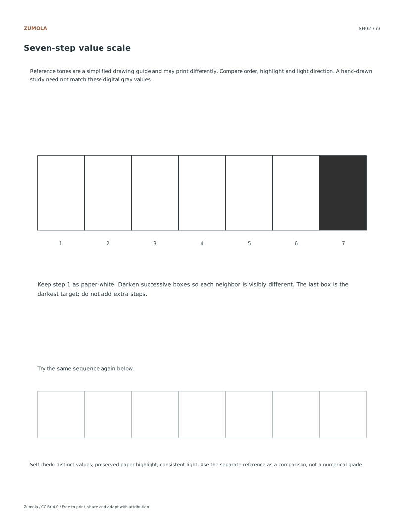
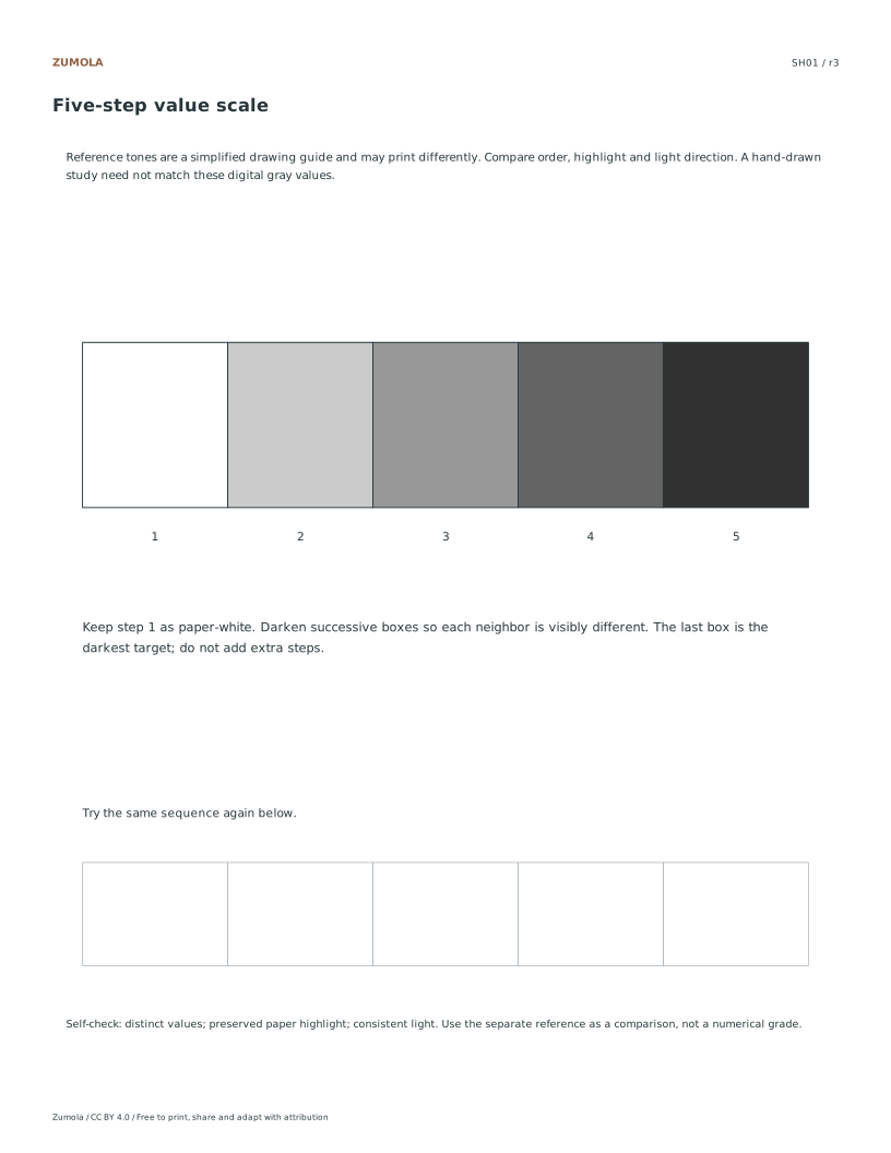
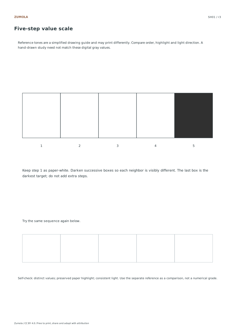
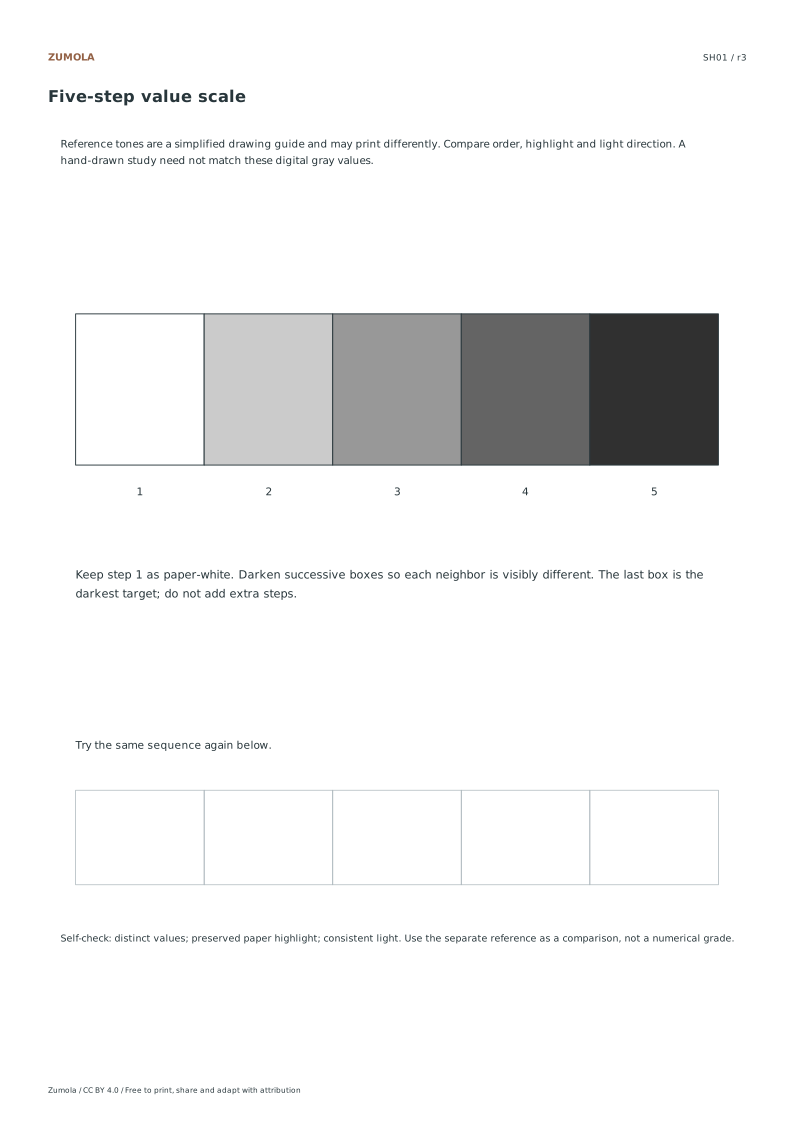
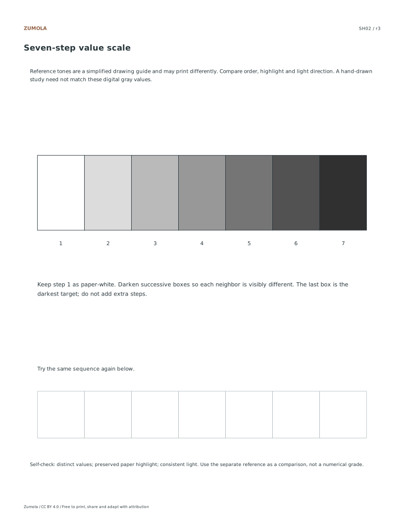
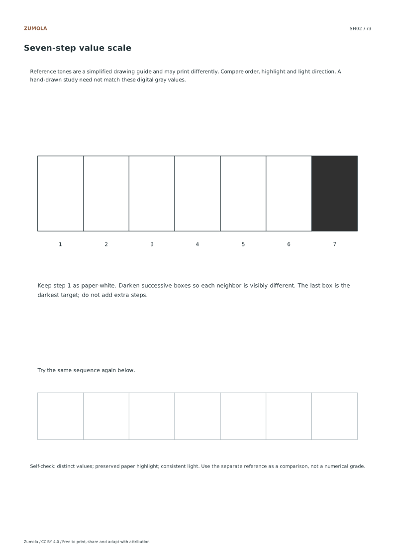
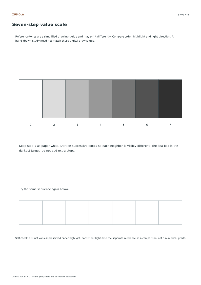
On the value sheets, the first and last boxes establish the ends of the range. Fill intermediate boxes so that neighboring values are distinguishable. The digital reference steps from paper white toward a dark gray. A pencil, ink wash or printer will produce a different tonal range, so compare order and separation rather than exact RGB values.
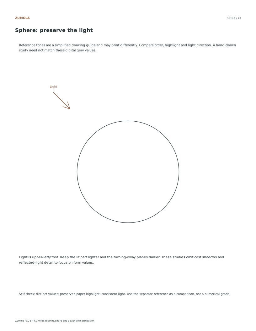
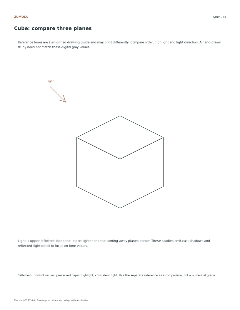
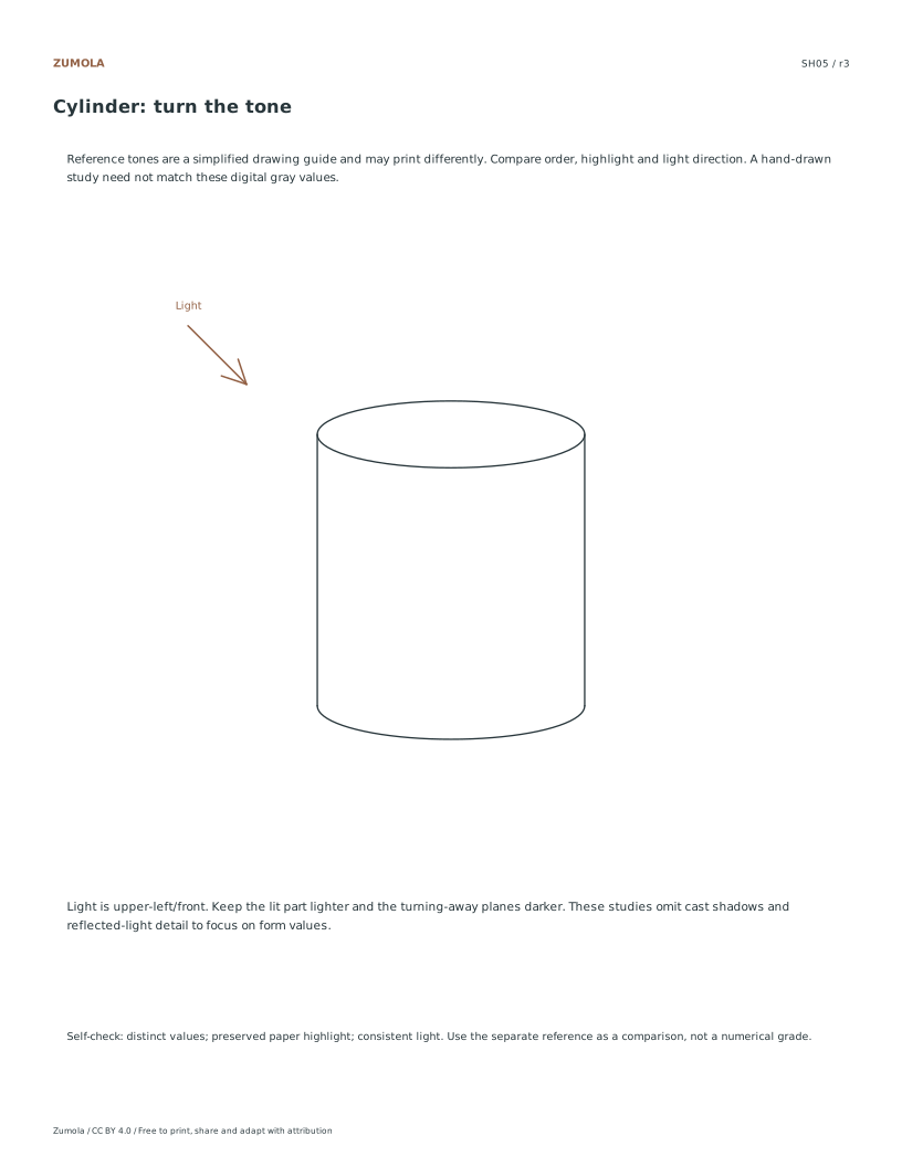
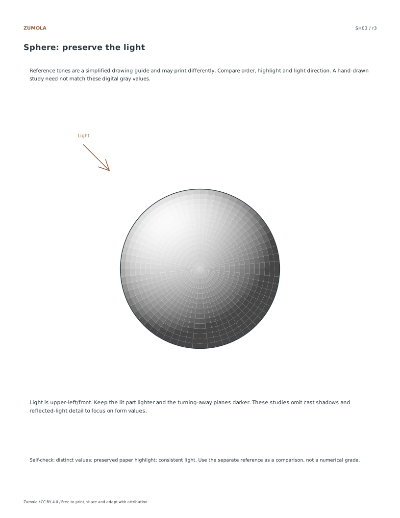
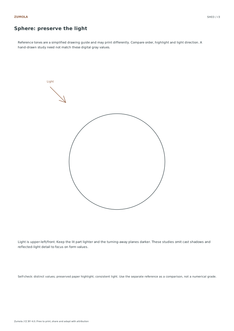
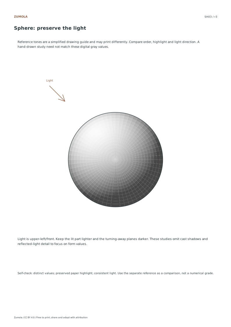
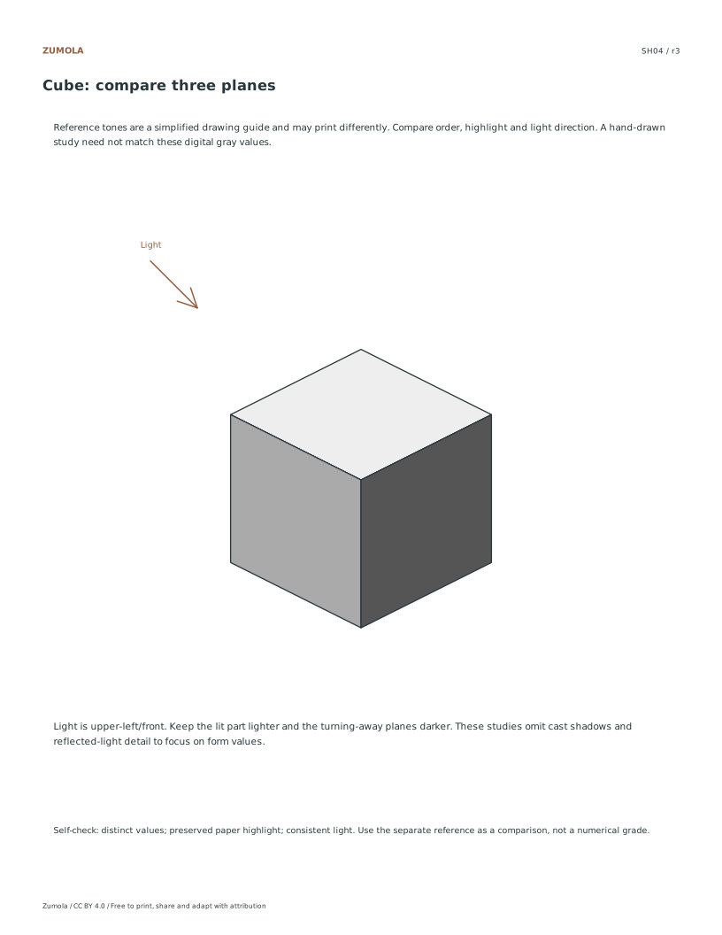
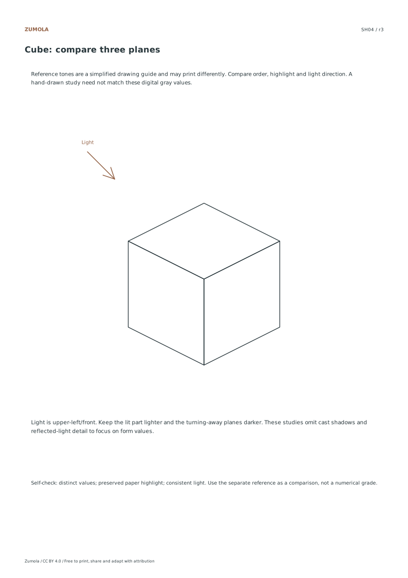
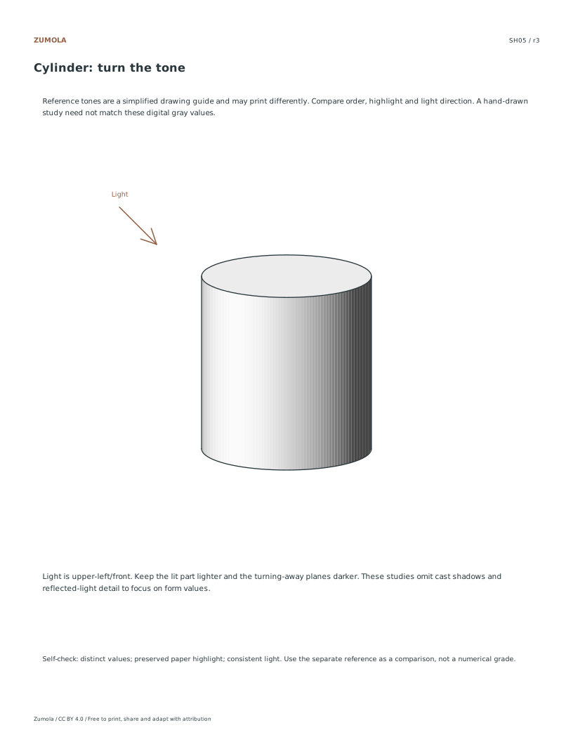
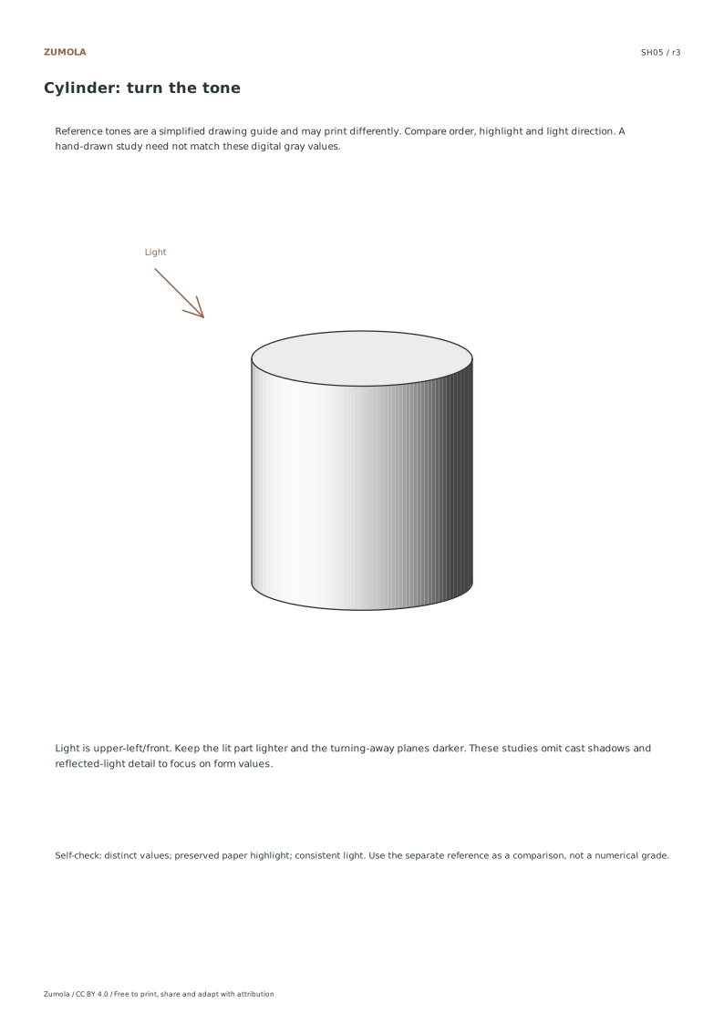
The sphere reference uses small vector tone patches to describe a smooth form. The cube uses three flat plane values. The cylinder uses a light top and a graded curved side. They are simplified original teaching studies with a marked light direction, not material-accurate renderings. Cast shadows, surface textures and environmental reflections are outside these reference examples; add them in a later study if useful.
To review your page, cover the outlines briefly and ask whether the bright and dark regions still suggest the intended form. Check that a second accidental highlight has not appeared on the dark side. If a face looks too similar to its neighbor, adjust that relationship before adding detail.
Work through the page
Verifying Value Progression
Begin by examining the five-step and seven-step value scales to ensure the gradient moves logically from paper-white to the darkest fill. Since digital gray examples can print differently, do not expect exact pixel matching. Instead, focus on the relative order of the tones. Confirm that each step is visibly distinct from the previous one, maintaining a smooth transition without abrupt jumps. This check ensures the foundational understanding of value hierarchy is intact before moving to complex forms, providing a clear baseline for assessing the subsequent geometric studies.
Checking Light Source Consistency
Inspect the sphere, cube, and cylinder studies to verify that the light source remains consistently positioned at the upper-left or front. For the sphere, ensure the highlight is preserved in the upper-left area while the shadow deepens toward the lower-right. On the cube, the top face should be the lightest, the left face middle, and the right face darkest. The cylinder must show a light top, a lighter left side, and a darker right side. This uniformity confirms the simplified form shading logic is applied correctly across all shapes.
Reviewing Form Simplification
Evaluate the geometric studies as simplified form shading rather than exact material simulations. Note that cast shadows are intentionally omitted to focus on the intrinsic value of the objects themselves. Check that the highlight on the sphere is preserved and that the value order on the cube and cylinder aligns with the established light direction. Since these are original vector examples, the goal is understanding structural shading. Do not look for realistic texture or environmental reflections, but rather for a clear demonstration of how light interacts with basic three-dimensional forms.
Small checks that catch common errors
Watch for
Check instead
Expecting digital gray tones to print exactly as they appear on screen.
Accept that digital gray examples can print differently; focus on the relative order of values from paper-white to darkest fill rather than exact color matching.
Confusing an object’s darker surface with a shadow cast onto the table.
These references show form shading on the object. A cast shadow lies on a different surface. You can add one as an extension, but it is not included in the supplied comparison.
Treating the shading as a realistic material simulation with complex textures.
View the studies as simplified form shading; ensure the highlight is preserved and the value steps follow the correct light direction without attempting exact material simulation.
Print a test sheet before a full pack
Use the PDF that matches the paper loaded in your printer. Choose Actual size / 100% and turn off Fit, Shrink and browser headers. The SVG keeps millimeter dimensions, but an editor or browser can rescale it; the PDF is the simpler print path. Measure any calibration bars with a separate physical ruler when the exercise depends on printed size. A screen preview does not establish physical scale.
Packs combine the same individual pages; they are not extra different exercises. Print a student copy first and keep references nearby for review. Letter and A4 preserve the stated grid spacing or model definition while their surrounding white space can differ. Color is optional: the references also use line position, text or relative lightness to explain the result.
Useful answers
Why do the printed grays look different from my screen?
Digital gray examples can print differently due to printer variations. The resource focuses on the correct order of values from paper-white to darkest fill, so check the relative progression rather than expecting exact pixel matching with your monitor.
Should I add shadows on the table for the cube?
You can add a table shadow as a separate study. The supplied reference omits cast shadows and checks the cube’s top, left and right faces from light to dark. Keep any added shadow consistent with your chosen light.
How can I check the light direction?
Use the printed light arrow. Compare where the sphere is brightest and check the ordering of the cube’s three faces. For the cylinder, compare the light top and left/front band with the darker right side. Judge relationships rather than matching exact digital grays.
Are the answers and editable files free too?
Yes. Every linked PDF, SVG, worksheet and answer is free without signup. The original Zumola resources use CC BY 4.0: credit Zumola, link the license and indicate changes. Analytics consent is not required to download or use them.
Optional Google Analytics helps us understand which free resources are useful. It is off until you allow it. Drawing tools and downloads work with either choice. Privacy details