Free original lessons
Pen Drawing Face: Hatching and Line-Weight Control
Learn pen-only face drawing using hatching for shadow and line-weight variation for feature emphasis. Includes exercises, rubric, and a worked example.
Free lesson
Four exercises
Worked answers
Object Drawing Lessons
This lesson teaches you to draw a face using only a pen, with no pencil underdrawing or erasing. You will use hatching—sets of parallel or crossed lines—to build shadow on the cheek, jaw, and brow, and you will vary line weight to emphasize features such as the eyes, nose, and mouth. The convention for line weight is simple: thicker strokes read as closer or more important, thinner strokes as farther or quieter. Hatching direction follows the form: lines curve around the cheek, angle down the jaw, and sweep across the brow. Because pen marks are permanent, you will plan each stroke before touching the paper. All practice tasks are self-contained; where a diagram would help, the text describes it precisely. Numerical values are hypothetical examples for measurement practice, not manufacturing standards.
Practice materials: Printable downloads are not available for this lesson yet. Use the instructions and four exercises below.
Reference illustration
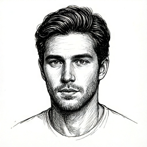
Use the stated measurements and conventions for each exercise.
Hatching for Shadow on Cheek, Jaw, and Brow
Hatching is a set of evenly spaced pen lines. Where shadow is deeper, lines are closer together or crossed with a second set. On the cheek, hatch lines curve gently around the cheekbone, following its rounded form. On the jaw, lines angle downward and slightly back toward the ear. On the brow, lines sweep across the brow ridge in short arcs. Keep line spacing consistent within one zone; changing spacing abruptly creates a visible seam.
Use a single pen for all hatching so line weight stays controlled. If you want darker shadow, add a second layer of hatching at a different angle rather than pressing harder. Pressing harder widens the stroke and can bleed. A useful hypothetical example: if your pen stroke measures about 0.3 mm wide at light pressure and about 0.6 mm at heavy pressure, treat those as measured values from your own test marks, not as a standard.
- Draw a light face outline in pen using thin strokes; keep the outline simple and avoid detail.
- Mark three shadow zones with a dot: cheek hollow below the cheekbone, jaw edge below the ear, and brow shadow above the eye.
- In the cheek zone, draw five parallel curved lines spaced about 2 mm apart, following the cheek curve.
- In the jaw zone, draw five angled lines spaced about 2 mm apart, pointing down and back.
- In the brow zone, draw four short arcs spaced about 1.5 mm apart, sweeping across the brow.
- Add a second crossed layer only in the darkest part of each zone, keeping the new lines at a clearly different angle.
Line-Weight Variation for Feature Emphasis
Line weight is the thickness of a stroke. In pen drawing, you control it by pressure, speed, and pen angle. A thick stroke draws attention; a thin stroke recedes. Use thick strokes for the upper eyelid line, the nostril edge, and the mouth line. Use thin strokes for the iris outline, the inner eye corner, and the lip edges. Transition gradually: start thin, increase pressure through the middle of the feature, then release. This thick-to-thin transition makes the feature feel solid without looking heavy.
Test your pen on scrap paper before drawing the face. Make three strokes: light, medium, and firm. Measure each width with a ruler if you want a checkable number. Label these as your own measured examples. Then choose which pressure level matches thick and which matches thin for your face drawing.
- On scrap paper, make one light stroke, one medium stroke, and one firm stroke; measure each width and record the values.
- Draw the upper eyelid with a medium-to-firm stroke that is thickest at the center and tapers at both ends.
- Draw the lower eyelid with a thin stroke, barely touching the paper.
- Draw the nostril edge with a short firm stroke; draw the bridge of the nose with two thin strokes.
- Draw the mouth line with a firm stroke that thins at the corners; draw the upper and lower lip edges with thin strokes.
- Check that no feature uses the same weight for both its main edge and its secondary edges.
Combining Hatching and Line Weight
Hatching and line weight work together. Hatching creates shadow areas, while line weight separates important edges from quiet ones. A common error is hatching over a thick feature line, which muddles the edge. Keep hatching at least one stroke-width away from thick feature lines. Another error is using thick lines everywhere, which flattens the face. Reserve thick strokes for the few features you want to emphasize.
Plan the order: outline first with thin strokes, then feature lines with varied weight, then hatching in the shadow zones. This order keeps hatching from covering feature edges. If a hatch line accidentally crosses a feature, do not try to erase it; instead, incorporate it by adding a matching line on the other side or by thickening the feature line slightly to absorb it.
- Draw the face outline with thin strokes.
- Draw the eyes, nose, and mouth with varied line weight as described in the previous section.
- Add cheek hatching, keeping lines clear of the eye and mouth edges.
- Add jaw hatching, stopping before the mouth line.
- Add brow hatching, stopping before the upper eyelid line.
- Review the face: thick strokes should appear on no more than four feature edges; all other lines should be thin or medium.
Worked example
Draw a simple face in pen. Use thin strokes for the outline, thick strokes for the upper eyelid and mouth line, and hatching on the cheek and jaw. Keep hatching clear of feature lines. Describe your stroke choices.
Worked answer
Outline: thin strokes, light pressure. Upper eyelid: medium-to-firm stroke, thickest at center, tapering at ends. Mouth line: firm stroke, thinning at corners. Cheek hatching: five curved lines spaced about 2 mm apart, following the cheek curve, stopping one stroke-width below the eye. Jaw hatching: five angled lines spaced about 2 mm apart, pointing down and back, stopping before the mouth line. No second crossed layer was needed because the shadow was light. Check: thick strokes appear on exactly two feature edges; hatch lines do not cross feature lines; spacing within each zone is even.
Four practice exercises
Exercise 1
On scrap paper, make three pen strokes: light, medium, and firm. Measure each width with a ruler. Record the three widths in millimeters. Then state which width you will use for thick feature lines and which for thin lines.
Show answer and check
Example measured widths: light 0.3 mm, medium 0.5 mm, firm 0.7 mm. Thick feature lines use the firm width; thin lines use the light width. Your own measurements may differ; use your recorded values.
Why: Measuring your own strokes gives checkable numbers and prevents guessing. The choice of thick and thin is based on your actual pen and pressure, not on a standard.
Check: Confirm three widths are recorded with units. Confirm the thick choice is the largest measured width and the thin choice is the smallest.
Exercise 2
Draw a cheek shadow zone as a rounded rectangle about 4 cm wide and 3 cm tall. Inside it, draw five curved hatch lines spaced about 2 mm apart, following the curve of the rectangle. Then add a second crossed layer of three lines at a clearly different angle in the darkest half. Describe the spacing and angles.
Show answer and check
Five curved lines follow the rounded rectangle's curve, spaced about 2 mm apart. The second layer has three lines at roughly 45 degrees to the first layer, placed only in the darkest half. Spacing in each layer is even.
Why: Even spacing within a layer keeps the shadow readable. A crossed layer at a different angle darkens without crowding. Limiting the second layer to the darkest half preserves a gradient.
Check: Check that first-layer spacing is even within about 1 mm variation. Check that second-layer lines are at a clearly different angle and appear only in the darkest half.
Exercise 3
Draw an upper eyelid line with a thick-to-thin transition: start thin, increase to firm at the center, and taper to thin at the other end. Then draw a lower eyelid line that stays thin throughout. Compare the two lines and state one visible difference.
Show answer and check
The upper eyelid line is widest at its center and narrows at both ends. The lower eyelid line is narrow throughout. Visible difference: the upper line has a measurable width change, while the lower line has nearly constant width.
Why: A thick-to-thin transition emphasizes the upper eyelid as a main feature. Keeping the lower eyelid thin makes it secondary. The comparison makes the weight difference checkable.
Check: Measure the upper line at its center and near one end; the center should be wider. Measure the lower line at two points; widths should be nearly equal.
Exercise 4
Draw a simple face outline in thin pen strokes. Add thick strokes to exactly two feature edges: the mouth line and one nostril edge. Add cheek hatching of four curved lines and jaw hatching of four angled lines, keeping all hatch lines at least one stroke-width away from the thick feature edges. Then count how many thick feature edges you used and state whether any hatch line crosses a thick edge.
Show answer and check
The face has exactly two thick feature edges: the mouth line and one nostril edge. Four cheek hatch lines curve around the cheek; four jaw hatch lines angle down and back. No hatch line crosses a thick edge. Count of thick feature edges: two.
Why: Limiting thick edges to two keeps emphasis clear. Keeping hatching away from thick edges preserves their readability. Counting and checking crossings makes the result verifiable.
Check: Count thick feature edges; the total should be two. Inspect each hatch line near the mouth and nostril; none should touch or cross the thick edges.
Common mistakes
- Pressing hard to make hatching darker. Keep pressure light and add a second crossed layer at a different angle instead.
- Using thick strokes on every feature. Choose at most four feature edges for thick strokes; keep all other lines thin or medium.
- Hatching in straight lines across a curved cheek. Curve each hatch line to follow the cheek form, and keep spacing even within the zone.
- Letting hatch lines cross thick feature lines. Stop hatching one stroke-width before feature edges, or thicken the feature line slightly to absorb the crossing.
Self-check rubric
- Outline uses thin strokes and remains simple.
- At most four feature edges use thick strokes; all other lines are thin or medium.
- Cheek hatching curves around the cheek form with even spacing within the zone.
- Jaw hatching angles down and back with even spacing within the zone.
- Brow hatching sweeps across the brow in short arcs with even spacing.
- Hatch lines stop at least one stroke-width before thick feature lines.
- Darker shadow is achieved by a crossed second layer, not by heavy pressure.
- Line-weight transitions are gradual, not abrupt.
Questions and answers
Can I use a pencil to plan the face first?
No. This lesson is pen-only. Plan by making light thin pen strokes and by testing pressure on scrap paper before drawing the face.
How do I know if my line weight is thick enough?
Compare your feature strokes to your scrap-paper test strokes. A thick stroke should be visibly wider than a thin stroke at normal viewing distance. Measure widths if you want a checkable number.
What if my hatching looks uneven?
Check spacing within each zone. Lines should be evenly spaced in one zone; if you need darker shadow, add a crossed layer rather than crowding lines unevenly.
Do I need special pen paper?
Use any paper that does not bleed heavily with your pen. Test on a corner first. No specific paper standard is required.