Free original lessons
Gold Crown Drawing: Metallic Shading and Highlight Placement
Learn to draw a gold crown with convincing metallic shading and highlights using point geometry, value mapping, and a simple highlight-placement convention.
Free lesson
Four exercises
Worked answers
Object Drawing Lessons
This lesson teaches you to draw a gold crown with metallic shading and highlights. You will first plan the crown's point geometry, then map light and shadow across its surfaces, and finally place highlights using a defined convention. The approach works for any crown style because it focuses on how gold reflects light rather than on copying one fixed shape. All measurements are hypothetical examples; measure your own paper and tools. A printable guide is planned but not yet built, so work directly from the text and your own sketches.
Practice materials: Printable downloads are not available for this lesson yet. Use the instructions and four exercises below.
Reference illustration
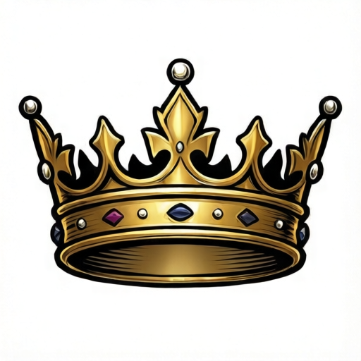
Use the stated measurements and conventions for each exercise.
Plan the crown's point geometry
Start by deciding how many points the crown has and how they are spaced. A five-point crown is a good default: one central point, two side points, and two outer points. Mark a horizontal baseline for the crown band and a vertical center line. Place the central point on the center line, then space the remaining points symmetrically. The distance between adjacent point tips should be roughly equal, but you can vary it slightly for a natural look.
Each point is a triangle or a tapered spike rising from the band. Draw the front face of each point as a simple polygon. Keep the base of each point attached to the band so the crown reads as one object. If you want a more complex crown, add smaller points between the main ones, but keep the overall silhouette balanced. Check that no point crosses another and that the band's top edge follows a smooth curve.
- Draw a horizontal baseline for the band and a vertical center line.
- Mark the central point tip on the center line, then mark two side tips and two outer tips at equal horizontal intervals.
- Connect each tip to the band with two lines to form a tapered point.
- Erase construction lines and confirm that all points sit on the band without overlapping.
Map metallic shading on gold
Gold is a metal, so its shading is not a smooth gradient from light to dark. Instead, it shows a pattern of bright highlights, mid-tone reflections, and dark shadows that often sit next to each other. Decide on one light source, such as upper left. The left-facing surfaces of each point catch light, while right-facing surfaces fall into shadow. The band also has a top edge that catches light and a lower edge that darkens.
Use three values: light, mid, and dark. Assign the light value to surfaces facing the light source, the mid value to surfaces at an angle, and the dark value to surfaces facing away. On a gold crown, the dark value is not black; it is a deep brown or warm gray. Keep the transitions crisp on edges and softer on curved surfaces. A common mistake is to shade every point identically; instead, let the central point receive the strongest light and the outer points slightly less.
- Choose a light source direction and mark it lightly outside the crown.
- On each point, shade the side facing away from the light with the dark value.
- Add a mid value to the front face where it turns away from the light.
- Shade the band's lower edge dark and its upper edge light, following the band's curve.
Place highlights with a defined convention
For this lesson, use the following convention: a highlight is a small, bright shape placed on the edge or surface that faces the light source most directly. On each point, place one highlight near the tip on the lit side, and one shorter highlight along the lit edge of the band. Highlights should be narrow and slightly curved, not large blobs. Leave the paper white or use the lightest value available.
Because gold is reflective, you can add a secondary highlight on the shadow side to suggest reflected light from the environment. Keep this secondary highlight dimmer and smaller than the main one. Do not outline highlights with dark lines; let them sit directly on the shaded surface. If you use a convention where highlights are dots rather than strokes, that is also valid as long as you state it and apply it consistently. The rubric below accepts any clearly defined highlight convention.
- Place a narrow highlight near the tip of each point on the lit side.
- Add a short highlight along the lit edge of the band.
- Optionally add a smaller, dimmer secondary highlight on the shadow side.
- Check that highlights are consistent in shape and direction across the crown.
Refine edges and final checks
Once shading and highlights are placed, refine the edges. Metallic objects often have sharp edges where surfaces meet, so keep the boundary between light and dark crisp on the points. The band can have a softer transition. Check that the crown still reads as a single object: the points should sit on the band, and the band should curve naturally. If a point looks flat, add a mid-tone wedge on its front face to suggest a facet.
Finally, step back and compare the light source direction across all parts. Every highlight should be on the lit side, and every dark area should be on the shadow side. If one point contradicts the others, adjust it. Remember that gold's dark values are warm, not neutral black. A quick check is to squint at the drawing: the bright highlights should still stand out, and the crown's silhouette should remain clear.
- Sharpen the boundary between light and dark on each point.
- Soften the band's shading slightly to suggest a curved surface.
- Verify that all highlights follow the chosen light source.
- Squint at the drawing to confirm the crown's shape and metallic contrast.
Worked example
Draw a three-point gold crown with a light source from the upper right. Use the highlight convention from this lesson. Describe the shading and highlight placement for each point and the band.
Worked answer
The crown has a central point and two side points on a curved band. With light from the upper right, the right-facing surfaces are light and the left-facing surfaces are dark. The central point gets a narrow highlight near its tip on the right side and a dark left face. The right side point gets a similar but slightly smaller highlight, and its left face is mid-tone. The left side point is mostly in shadow, with a dim secondary highlight on its right edge. The band's upper right edge is light, and its lower left edge is dark. All highlights are narrow and curved, following the defined convention.
Four practice exercises
Exercise 1
Draw a four-point gold crown with light from the upper left. Use three values and place one highlight per point. Describe your shading choices.
Show answer and check
A valid answer shows a band with four points, left-facing surfaces light, right-facing surfaces dark, and a narrow highlight near each tip on the left side. The band's upper left edge is light and lower right edge is dark.
Why: The light source determines which surfaces are light and dark. Four points require balanced spacing and consistent highlight placement on the lit side.
Check: Verify that every highlight is on the left side of its point and that dark values are warm. Squint to confirm the crown's silhouette and metallic contrast.
Exercise 2
Draw a five-point gold crown with light from directly above. Use a dot-highlight convention and state it. Describe how the band is shaded.
Show answer and check
A valid answer shows five points with highlights as small dots on the top edges of each point. The band's top edge is light and its lower edge is dark, with mid-tone on the front face.
Why: Overhead light means top surfaces catch light. A dot convention is valid if stated and applied consistently. The band's curve means its top edge is lit and lower edge is shadowed.
Check: Check that all dots are on top edges and that the band's top edge is lighter than its lower edge. Confirm the dot convention is stated.
Exercise 3
Draw a three-point gold crown with light from the lower right. Add one secondary highlight. Explain where the secondary highlight goes and why.
Show answer and check
A valid answer shows right-facing surfaces light and left-facing surfaces dark. The secondary highlight is a small, dim shape on the shadow side, suggesting reflected light. It is placed on the left face of the central point.
Why: Lower-right light makes right-facing surfaces bright. A secondary highlight on the shadow side mimics reflected light and adds metallic realism.
Check: Verify that the main highlights are on the right side and the secondary highlight is smaller and dimmer on the left side. Check consistency across points.
Exercise 4
Draw a six-point gold crown with light from the upper left. Use a stroke-highlight convention. Describe how you vary highlight size across the points.
Show answer and check
A valid answer shows six points with narrow stroke highlights on the left side of each point. The central points have slightly larger highlights than the outer points, reflecting stronger light near the center.
Why: More points require careful spacing. Varying highlight size suggests light intensity differences while keeping the convention consistent.
Check: Check that all highlights are strokes on the left side and that outer highlights are not larger than central ones. Confirm the crown's points are evenly spaced and attached to the band.
Common mistakes
- Shading every point with the same gradient from tip to base. Assign light and dark sides based on the light source, and vary the intensity slightly across points.
- Using black for the darkest gold shadow. Use a deep warm brown or warm gray so the shadow still reads as gold.
- Making highlights large and round. Keep highlights narrow, slightly curved, and placed on the lit edge or surface.
- Letting points overlap or float above the band. Attach each point's base to the band and check the silhouette before shading.
Self-check rubric
- Crown has a clear band and at least three points attached to it.
- Point geometry is balanced and no points overlap.
- Shading uses at least three values: light, mid, and dark.
- Dark values are warm, not black.
- Highlights follow a stated convention and are consistent in shape and direction.
- Light source direction is consistent across all points and the band.
- Crown reads as a single metallic object when squinting.
Questions and answers
Do I need a specific number of points?
No. Five points is a simple default, but any number works if the spacing is balanced and the points sit on the band.
Can I use dots instead of strokes for highlights?
Yes, as long as you define the convention clearly and apply it consistently. The rubric accepts any defined highlight convention.
How do I know where the light source is?
Choose one direction before shading, such as upper left, and mark it lightly outside the crown. Then keep every highlight and shadow consistent with that direction.
What if my crown looks flat?
Add a mid-tone wedge on the front face of each point and sharpen the edge between light and dark. Also check that the band's top edge is lighter than its lower edge.