Free original lessons
Shark Pencil Drawing: Shading and Fin Detail
Learn to draw a realistic shark in pencil with clear fin placement, layered shading, and fine fin detail using a simple convention and checkable steps.
Free lesson
Four exercises
Worked answers
Object Drawing Lessons
This lesson teaches a realistic shark pencil drawing focused on two skills: building smooth, controlled shading and rendering fin detail that reads clearly at small scale. You will use a simple value convention: lightest tone is the paper, mid tone is one even layer of pencil, dark tone is two or three crossed layers, and the darkest accents are reserved for edges and fin tips. X-height is defined as the distance from the baseline to the midline of lowercase letters; this convention helps you judge small shapes and spacing consistently, though letter styles vary and no single handwriting style is required. All measurements are hypothetical examples unless you measure your own paper and pencil. Work on ordinary drawing paper with a graphite pencil, a soft eraser, and a blending tool such as a paper stump or your finger wrapped in tissue. Keep the shark’s body long and tapered, place the dorsal fin slightly behind the midpoint of the back, and use the pectoral fins to anchor the body visually. The goal is not a cartoon shark but a calm, believable form with readable fins and controlled tone.
Practice materials: Printable downloads are not available for this lesson yet. Use the instructions and four exercises below.
Reference illustration
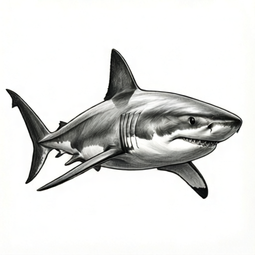
Use the stated measurements and conventions for each exercise.
Set Up the Shark Outline and Fin Placement
Begin with a light outline using very little pressure. Draw a long oval for the body, then taper the snout and tail. Mark the dorsal fin on the back, slightly behind the body’s midpoint, and place the pectoral fins low on the sides. Keep the tail fin asymmetrical, with the upper lobe longer than the lower lobe. Use the x-height convention to check small gaps: if a fin gap is about one x-height wide on your paper, it will read as a clear separation rather than a smudge. Letter styles vary, so treat x-height as a personal measuring unit, not a fixed size.
Before shading, erase the construction oval until only faint guide lines remain. Decide your light direction, for example from the upper left. That means the upper back and top of the dorsal fin catch light, while the belly and the underside of fins stay lighter than the back but darker than the paper. Mark three shading zones lightly: the back (mid to dark), the flank (mid), and the belly (light). Keep fin edges crisp by sharpening the pencil and drawing detail lines before adding broad tone.
- Draw a long tapered body outline with a soft pencil and very light pressure.
- Place the dorsal fin slightly behind the midpoint of the back and two pectoral fins low on the sides.
- Check fin gaps using one x-height as a personal spacing unit; adjust until gaps are clear.
- Mark back, flank, and belly zones, then note the light direction with a small arrow outside the drawing.
Build Shading in Layers
Shade in thin, overlapping layers rather than pressing hard. Start with the back zone using one even layer of pencil, moving in the direction of the body’s curve. Add a second layer at an angle only where the back should be darker. Keep the flank to one layer and leave the belly mostly paper, with a faint layer near the lower edge. Blend lightly with a paper stump or tissue, then restore edges with a sharp pencil. If the tone becomes muddy, erase gently and rebuild with lighter layers.
Use checkable arithmetic to plan tone: if one layer takes about 20 seconds to cover a small zone evenly, two layers take about 40 seconds, and three layers about 60 seconds. These are hypothetical examples, not standards. Measure your own timing on scrap paper if you want a personal benchmark. The important check is evenness: hold the paper at arm’s length and look for sudden dark patches. Smooth transitions matter more than exact darkness.
- Apply one even layer to the back zone, following the body curve.
- Add a second angled layer only on the darkest part of the back.
- Keep the flank to one layer and leave the belly mostly paper.
- Blend lightly, then sharpen the pencil and restore the outline and fin edges.
Add Fin Detail Without Overworking
Fin detail should support the shape, not clutter it. On the dorsal fin, draw a few fine lines that follow the fin’s leading edge and taper toward the trailing edge. On the pectoral fins, add short lines that radiate from the base toward the tip. Keep the lines spaced about one x-height apart at the fin base and closer near the tip. Because letter styles vary, use your own x-height as a spacing guide and accept slight variation; the goal is readable rhythm, not mechanical repetition.
Darken the fin tips and the trailing edges with a sharp pencil, then lift a thin highlight along the leading edge with an eraser. Check that the fin detail does not cross into the body shading unless it describes a real edge. If a fin looks flat, add one darker accent at the tip and one lighter gap near the base. Avoid scribbling; short, controlled strokes read better at small scale.
- Draw fine lines on the dorsal fin following the leading edge and tapering toward the trailing edge.
- Add short radiating lines on the pectoral fins, spaced about one x-height apart at the base.
- Darken fin tips and trailing edges with a sharp pencil.
- Lift a thin highlight along the leading edge and check that detail stays within the fin shape.
Review and Refine the Whole Drawing
Step back and compare the shark’s silhouette to your outline. The body should taper smoothly, the dorsal fin should sit slightly behind the midpoint, and the pectoral fins should balance the lower body. Check tone by squinting: the back should be darkest, the flank mid, and the belly lightest. If the back is too dark, erase a little and blend; if the belly is too dark, lift tone with an eraser. Keep the tail fin asymmetrical and avoid making it look like a triangle.
Finally, clean stray marks and strengthen only the most important edges: the snout, the dorsal fin leading edge, and the tail fin outline. Leave some soft edges so the shark does not look outlined. Sign and date the back if you wish. The drawing is complete when the fins read clearly at arm’s length and the shading shows a smooth transition from back to belly.
- Compare the silhouette to the outline and adjust any fin placement that looks unbalanced.
- Squint to check the value order: back darkest, flank mid, belly lightest.
- Clean stray marks and strengthen only key edges.
- Check the drawing at arm’s length for clear fins and smooth shading.
Worked example
A student draws a shark with the dorsal fin at the midpoint and shades the belly as dark as the back. The fins look flat. Describe how to revise the drawing using the lesson’s convention.
Worked answer
Move the dorsal fin slightly behind the midpoint and adjust the pectoral fins so they balance the lower body. Erase excess tone on the belly until it is mostly paper with a faint lower edge, and keep the back as the darkest zone. Add short fin lines that follow the leading edge and taper toward the trailing edge, spaced about one x-height apart at the base. Darken the fin tips and lift a thin highlight along the leading edge. Check by squinting: the back should be darkest, the flank mid, and the belly lightest, with fins readable at arm’s length.
Four practice exercises
Exercise 1
On scrap paper, draw three small rectangles about 3 cm by 2 cm. Shade the first with one even layer, the second with two crossed layers, and the third with three crossed layers. Label them light, mid, and dark. Then describe where each tone would go on the shark.
Show answer and check
The one-layer rectangle is light, the two-layer rectangle is mid, and the three-layer rectangle is dark. On the shark, the belly is light, the flank is mid, and the back is dark. Fin tips may use the dark tone as accents.
Why: Layering controls value without heavy pressure. A consistent order from light to dark makes the shark’s form readable and prevents the belly from becoming as dark as the back.
Check: Hold the rectangles at arm’s length and confirm the three tones are distinct. Squint at the shark plan and check that the back is darkest, the flank mid, and the belly lightest.
Exercise 2
Draw a dorsal fin about 4 cm tall and 3 cm wide at the base. Add five fine detail lines that follow the leading edge and taper toward the trailing edge. Use one x-height as a spacing guide at the base. Describe how you checked the spacing.
Show answer and check
The fin has five short lines that begin near the leading edge and become shorter toward the trailing edge. At the base, the gaps are about one x-height wide. I checked by comparing each gap to the baseline-to-midline distance of a lowercase letter on my paper.
Why: Fin lines should describe the fin’s shape, not clutter it. Spacing lines with a personal x-height unit creates readable rhythm and allows valid variation because letter styles differ.
Check: Look at the fin from arm’s length: the lines should be visible but not crowded. Measure two or three base gaps against your chosen x-height and confirm they are similar, not identical.
Exercise 3
A shark drawing has the dorsal fin at the exact midpoint of the back and the belly shaded as dark as the back. List two changes that would improve it and explain how you would check each change.
Show answer and check
First, move the dorsal fin slightly behind the midpoint. Second, erase tone on the belly until it is mostly paper with a faint lower edge. Check the fin by comparing its position to the body’s midpoint; check the belly by squinting to confirm the back is darkest and the belly lightest.
Why: Fin placement affects realism, and value order affects form. Both changes are simple and checkable without special tools.
Check: Mark the body midpoint lightly and confirm the dorsal fin is behind it. Squint at the drawing and verify the value order from back to belly.
Exercise 4
Plan a pencil shark drawing on paper about 15 cm by 10 cm. State a hypothetical light direction, the three shading zones, and a spacing guide for fin lines. Then give one arithmetic check using hypothetical times: one layer takes 20 seconds per small zone, two layers 40 seconds, and three layers 60 seconds. How long would three small zones with two layers each take?
Show answer and check
Light direction: upper left. Zones: back dark, flank mid, belly light. Fin-line spacing: about one x-height at the fin base. Three small zones with two layers each take 3 times 40 seconds, which equals 120 seconds, or 2 minutes.
Why: A plan makes the drawing consistent. The arithmetic check is simple multiplication and keeps units consistent in seconds.
Check: Confirm the light direction is noted outside the drawing, the three zones are labeled, and the fin spacing guide is stated. Recalculate 3 times 40 to verify 120 seconds.
Common mistakes
- Pressing hard with the pencil to make the shark dark quickly. Use thin layers and light pressure; build darkness gradually and blend only after two or three layers.
- Placing the dorsal fin exactly at the body’s midpoint. Move the dorsal fin slightly behind the midpoint so the shark reads as a realistic form rather than a cartoon.
- Drawing fin detail as random scribbles. Use short lines that follow the fin’s leading edge and taper toward the trailing edge, spaced about one x-height apart at the base.
- Making the belly as dark as the back. Leave the belly mostly paper and add only a faint layer near the lower edge; check the value order by squinting.
Self-check rubric
- Silhouette: body tapers smoothly and the dorsal fin sits slightly behind the midpoint.
- Fin placement: pectoral fins are low on the sides and the tail fin is asymmetrical.
- Shading: back darkest, flank mid, belly lightest, with smooth transitions and no muddy patches.
- Fin detail: short controlled lines follow fin edges and taper toward tips; spacing uses a personal x-height guide.
- Edges: key edges are strengthened while some soft edges remain; no heavy outline around the whole shark.
- Alternative conventions allowed: any consistent light direction and any personal x-height spacing are acceptable if the value order and fin readability hold.
Questions and answers
Do I need special pencils?
No. A standard graphite pencil and a soft eraser are enough. A sharp pencil helps with fin detail, and a paper stump or tissue helps blending.
How dark should the shark be?
Use a relative scale: back darkest, flank mid, belly lightest. There is no universal darkness; check evenness and smooth transitions instead.
What is the x-height convention for?
It is a personal spacing unit based on the baseline-to-midline distance of lowercase letters. Use it to judge small gaps and fin-line spacing; letter styles vary, so exact size is not fixed.
Can I use a different light direction?
Yes. Choose one light direction and keep it consistent. The shading zones may flip, but the value order should still read clearly.