Free original lessons
Pen-and-Ink Hair Texture: Micron Stroke Direction and Layering Practice
Learn to draw hair texture with micron pen strokes: control direction, taper, spacing, and layering to build believable strand flow without designing a hairstyle.
Free lesson
Four exercises
Worked answers
Object Drawing Lessons
This lesson focuses on the ink marks that make hair read as hair: short directional strokes, tapered ends, varied spacing, and deliberate layering. You will not design a hairstyle silhouette or map braids. Instead, you will practice controlling a micron pen to produce strand texture that follows a chosen flow. The convention used here is simple: a hair strand is drawn as a single tapered stroke that starts with light pressure, reaches its widest point near the middle, and lifts cleanly at the end. X-height is measured from baseline to midline; letter styles vary, so this convention is about stroke behavior, not a universal shape. All numerical values below are hypothetical examples for practice, not manufacturing standards. Measure your own pen and paper if you need exact values.
Practice materials: Printable downloads are not available for this lesson yet. Use the instructions and four exercises below.
Reference illustration
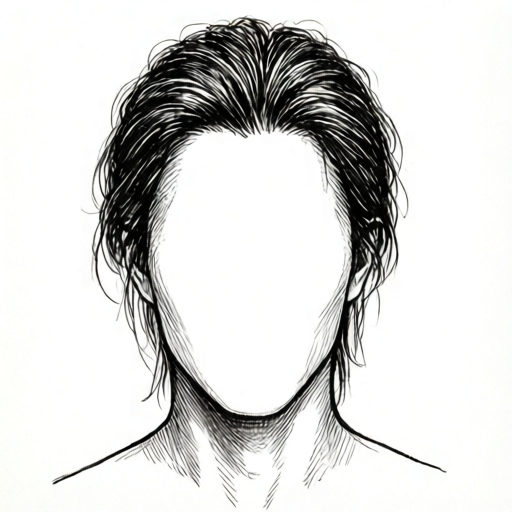
Use the stated measurements and conventions for each exercise.
Direction and Flow
Hair texture depends on consistent direction. Choose a flow line first, then draw strokes that follow it with slight fanning. A common error is drawing strokes perpendicular to the flow, which creates a fuzzy or fur-like texture instead of hair.
Use short strokes, roughly 4 to 8 mm long on standard practice paper, as a hypothetical starting range. Keep the pen moving in one smooth motion; do not scrub back and forth. The stroke should taper at both ends, with the heaviest ink near the middle.
- Draw a light flow line with a pencil, then erase it after practice.
- Place the pen at the start point with light pressure.
- Move along the flow line, increasing pressure slightly at the middle.
- Lift the pen cleanly at the end to create a taper.
- Repeat strokes in small groups, fanning outward by 5 to 15 degrees.
Spacing and Density
Even spacing looks mechanical. Vary gaps between strokes: tighter clusters suggest shadow or thickness, wider gaps suggest light or thin areas. A useful hypothetical ratio is one tight cluster for every three loose strokes, but adjust to your subject.
Density should increase gradually. Sudden jumps from sparse to dense create blotches. Build density in layers rather than pressing harder with a single stroke.
- Draw a row of five strokes with 2 mm gaps as a hypothetical baseline.
- Draw a second row with gaps alternating 1 mm and 3 mm.
- Compare the two rows and note which reads more naturally.
- Add a third row that gradually tightens gaps from left to right.
Layering and Cross-Strokes
Layering creates depth. Draw a first pass of long directional strokes, then add shorter strokes at slight angles to suggest individual strands lifting away. Avoid crossing at 90 degrees; keep cross-strokes within 20 to 40 degrees of the main flow.
Let each layer dry before adding the next if your ink smears. A hypothetical wait of 10 to 20 seconds is enough for many micron pens on smooth paper, but test your own materials.
- Complete a first layer of strokes following the flow line.
- Add a second layer of shorter strokes at 20 to 40 degrees off the flow.
- Place a few isolated strokes outside the main mass to suggest flyaways.
- Check that the darkest area has the most overlapping strokes, not the heaviest pressure.
Taper and Pressure Control
Taper is the visual narrowing at the start and end of a stroke. It comes from pressure change and speed, not from drawing an outline. Practice lifting the pen slightly at the end rather than stopping abruptly.
Pressure should stay light enough that the pen does not dig into the paper. If your strokes look uniform and blunt, practice the lift-and-taper motion on scrap paper before adding them to the texture plate.
- Draw ten strokes that start light, peak in the middle, and end light.
- Mark any stroke that lacks a visible taper.
- Redraw those strokes more slowly, focusing on the lift at the end.
- Compare the redrawn set to the first set and keep the better row.
Worked example
On a 6 cm by 4 cm practice panel, draw a small hair texture swatch that flows from left to right. Use at least three layers of strokes. Keep all strokes within 30 degrees of the flow line. Make the left third denser than the right third.
Worked answer
Draw a light horizontal flow line. First layer: 12 strokes, each about 6 mm long, fanning 10 degrees, spaced 2 mm apart. Second layer: 8 shorter strokes, about 4 mm, placed in the left third with 1 mm gaps. Third layer: 5 isolated strokes on the right third with 3 mm gaps. The left third has more overlapping strokes, so it reads darker. All strokes taper at both ends and stay within 30 degrees of the flow line.
Four practice exercises
Exercise 1
Draw a 5 cm wide texture band with strokes flowing left to right. Use 10 strokes in the first layer with 2 mm gaps, then add 5 shorter strokes in the middle third with 1 mm gaps. Keep all strokes within 20 degrees of the flow line.
Show answer and check
A band with a clear left-to-right flow, a first layer of 10 tapered strokes, and a denser middle third created by 5 shorter overlapping strokes. All strokes stay within 20 degrees of the flow line.
Why: The first layer establishes direction; the shorter middle strokes add density without changing flow. Taper and consistent angle make the texture read as hair rather than fur.
Check: Verify that every stroke is within 20 degrees of the flow line, that the middle third has more overlapping strokes than the ends, and that most strokes taper at both ends.
Exercise 2
Create two small swatches side by side. Swatch A uses even 2 mm spacing for all strokes. Swatch B alternates 1 mm and 3 mm gaps. Both use 8 strokes flowing downward. Describe which looks more natural and why.
Show answer and check
Swatch B looks more natural because the alternating gaps create varied density, while Swatch A looks mechanical and fur-like.
Why: Hair texture benefits from uneven spacing that suggests clusters and gaps. Even spacing removes the visual variation that reads as individual strands.
Check: Count the gaps in each swatch. Confirm Swatch A has eight equal gaps and Swatch B has alternating tight and loose gaps. Check that both swatches still follow a downward flow.
Exercise 3
Draw a texture patch with a first layer of 6 long strokes flowing right to left. Add a second layer of 4 shorter strokes at 30 degrees off the flow. Add 2 isolated flyaway strokes at 40 degrees off the flow. Keep the darkest area where the second layer overlaps the first.
Show answer and check
A patch with a clear right-to-left flow, a second layer at 30 degrees, and two flyaways at 40 degrees. The overlap area is darkest because it has the most strokes.
Why: Layering at slight angles adds depth without breaking flow. Flyaways at 40 degrees suggest individual strands lifting away. Darkness comes from overlap, not pressure.
Check: Check that the second layer is within 30 degrees of the flow, flyaways are within 40 degrees, and the darkest area has the most overlapping strokes rather than the heaviest ink.
Exercise 4
Draw a 4 cm by 3 cm panel with hair texture flowing from top to bottom. Make the top half denser than the bottom half. Use at least two layers. Then mark one stroke that lacks a taper and redraw it correctly beside the panel.
Show answer and check
A panel with top-to-bottom flow, a denser top half built by more overlapping strokes, and a corrected tapered stroke drawn beside the panel.
Why: Gradual density change avoids blotches. Identifying a non-tapered stroke and redrawing it reinforces pressure control and clean lifts.
Check: Confirm the top half has more strokes per square centimeter than the bottom half, that at least two layers are visible, and that the redrawn stroke shows a light-middle-light taper.
Common mistakes
- Drawing strokes perpendicular to the intended hair flow. Redraw the flow line and keep every stroke within 40 degrees of it.
- Pressing hard to create darkness instead of layering. Use lighter pressure and add more overlapping strokes in shadow areas.
- Spacing every stroke evenly, which looks like fur or grass. Alternate tight and loose gaps, and build density gradually.
- Stopping strokes abruptly without a taper. Lift the pen slightly at the end and practice the light-middle-light pressure pattern.
Self-check rubric
- Strokes follow a single clear flow direction within 40 degrees.
- Most strokes show a visible taper at start and end.
- Spacing varies and density changes gradually.
- Dark areas are built by layering, not heavy pressure.
- Cross-strokes stay within 20 to 40 degrees of the main flow.
- Valid alternatives: different stroke lengths, fan angles, or layer counts are acceptable if flow, taper, and gradual density are present.
Questions and answers
Do I need a specific micron pen size?
No single size is required. Use what you have and measure its line width on scrap paper so you can plan spacing. Any numerical size mentioned here is a hypothetical example.
How long should each hair stroke be?
Start with 4 to 8 mm as a hypothetical range, then adjust to your drawing scale. The key is consistent taper and direction, not a fixed length.
Can I erase pencil flow lines after inking?
Yes, if the ink is fully dry. Test on scrap paper first to avoid smudging.
How do I know if my texture reads as hair?
Check three things: strokes follow one flow, gaps vary, and dark areas come from layering rather than heavy pressure.