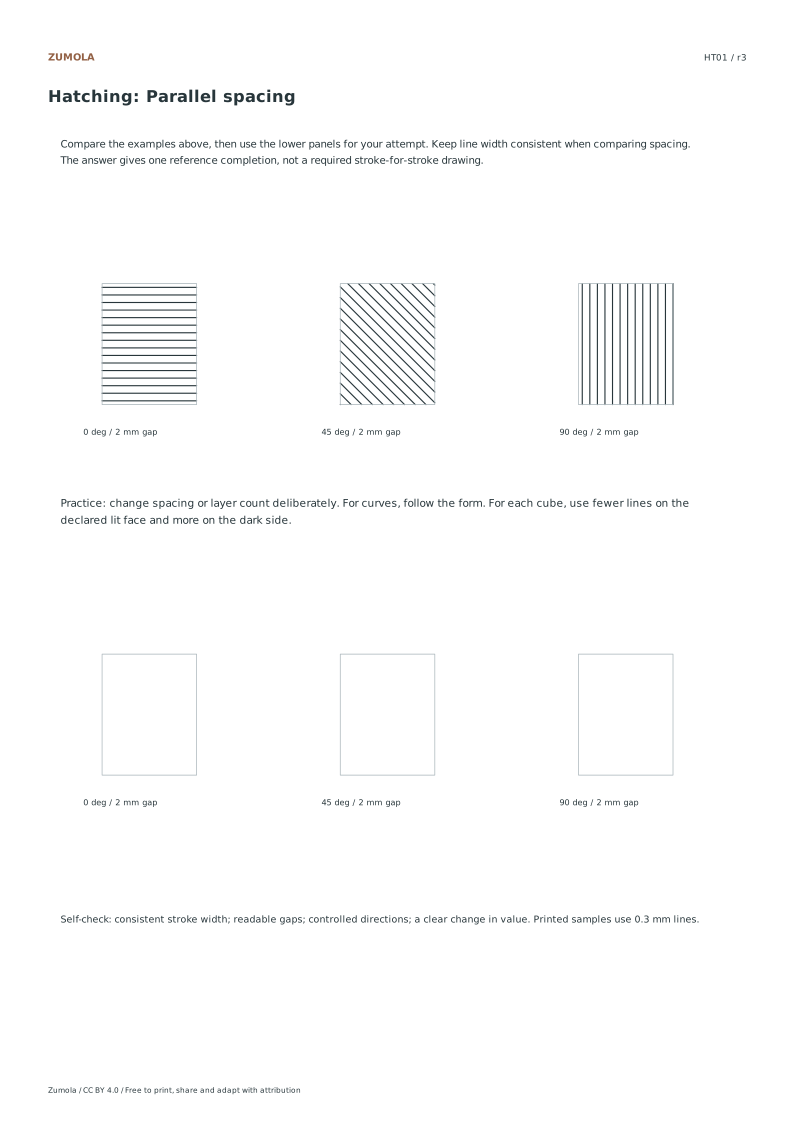
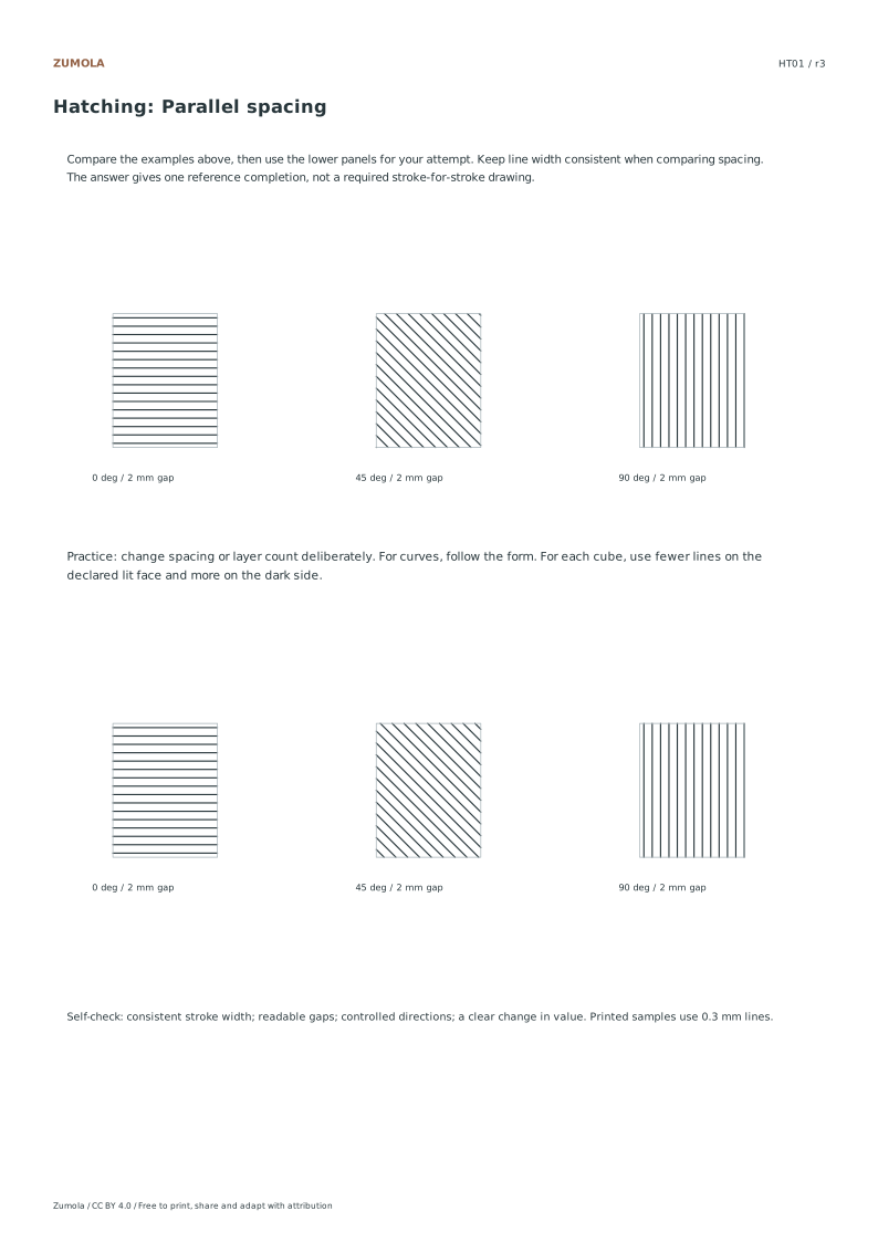
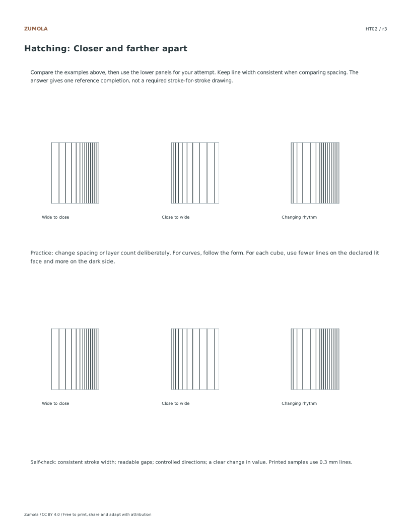
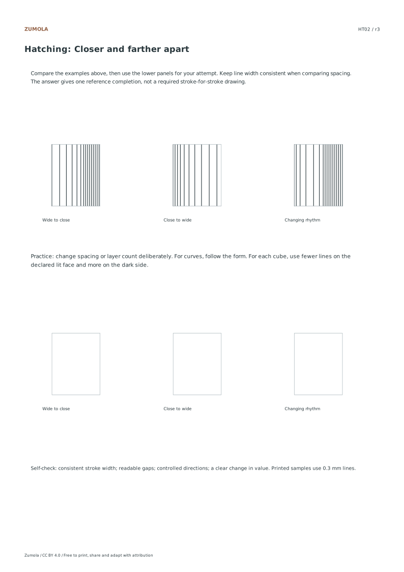
Change line direction, spacing and layers to create value. Practice six distinct line studies, then compare three larger tone examples.
Choose US Letter or A4, then download the PDF for printing or the SVG for editing. Keep the student worksheet separate from its answer or reference completion. All files, including the answers, are free without signup.
Choose your paper and download
Download paper size
Every worksheet and answer is free. No signup.
The complete collection
Keep practice and answers separate.
Use the student pack first, then compare the reference or answer. Packs are PDFs; individual sheets below also include editable SVG files. The paper choice applies to every download.
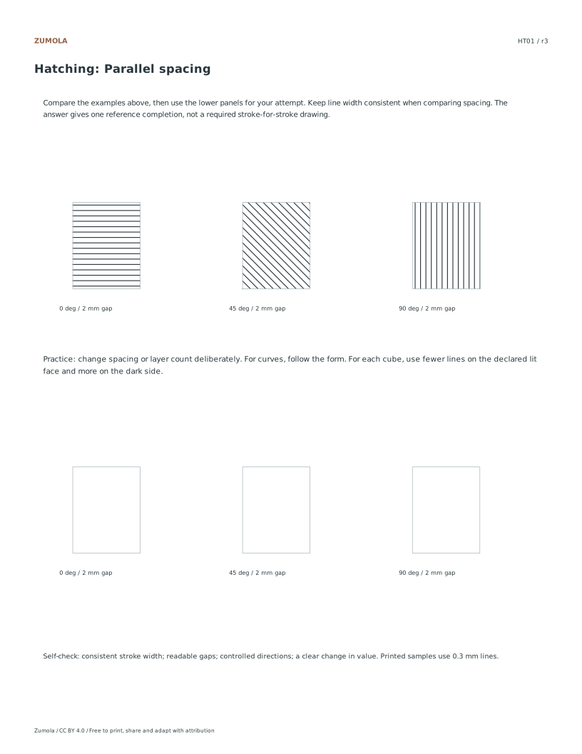
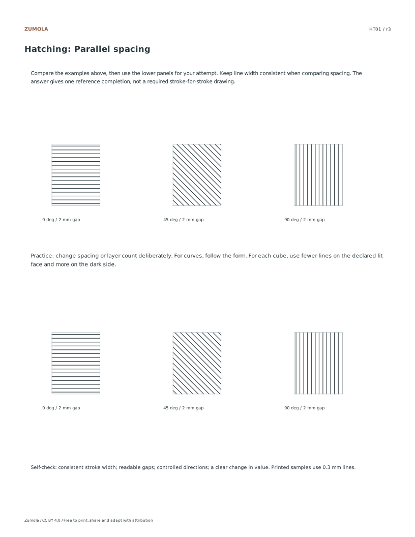
Horizontal, 45° and vertical families at 2 mm spacing
HT02
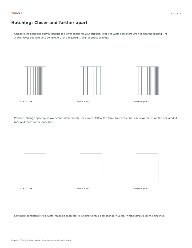
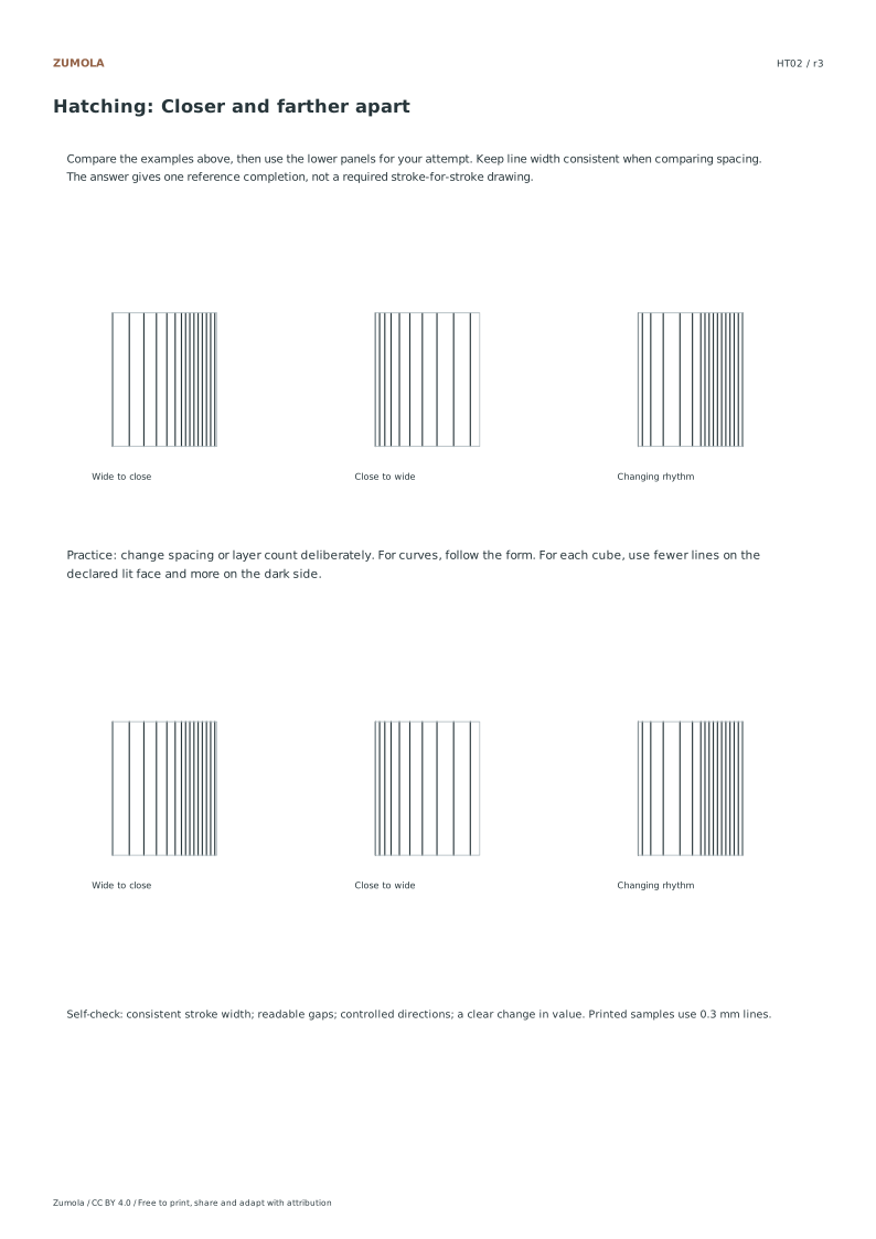
Spacing across a patch
Vertical lines become progressively denser
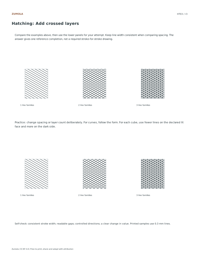
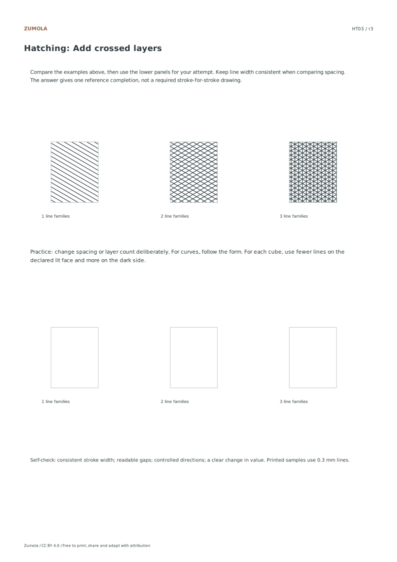
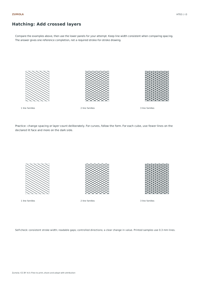
HT03
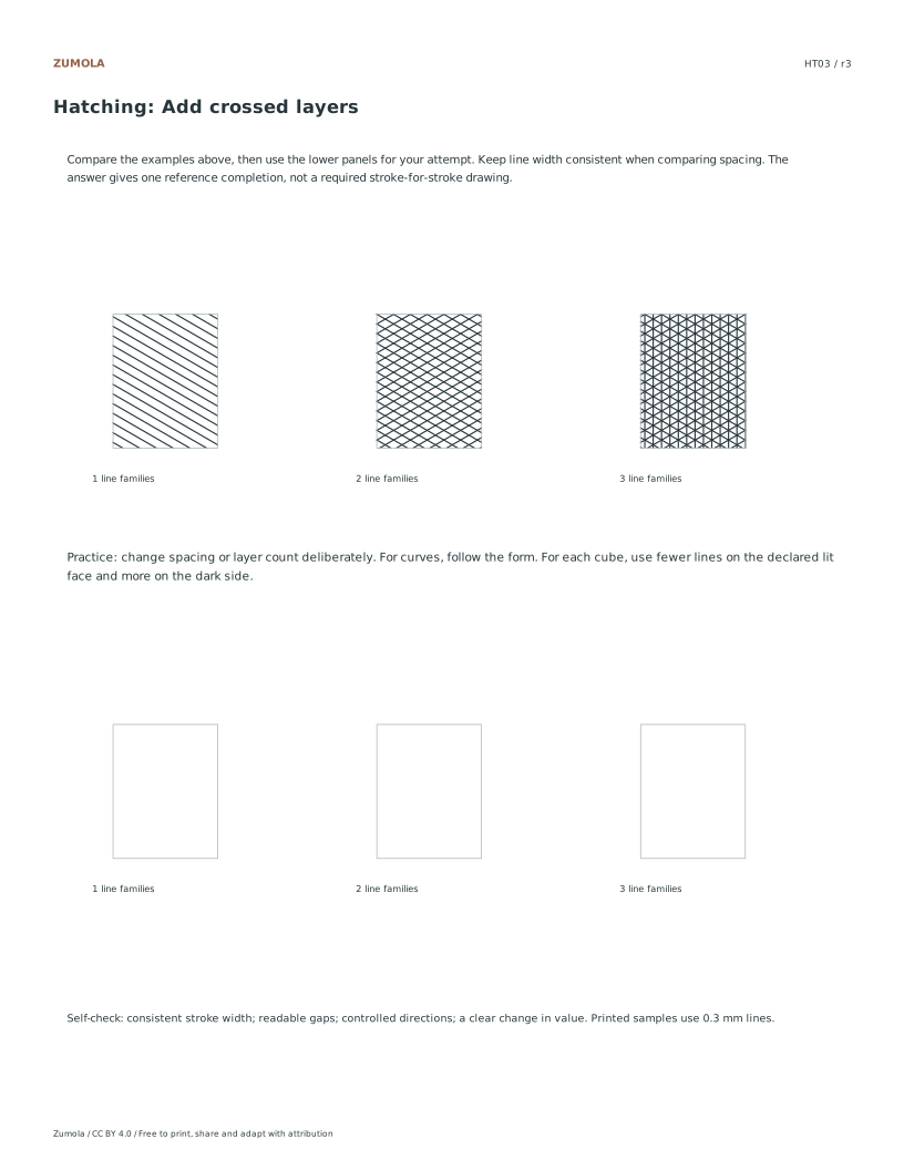
Number of layers
One, two and three crossed line families
HT04
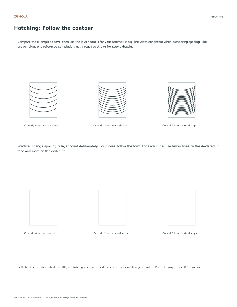
Contour direction
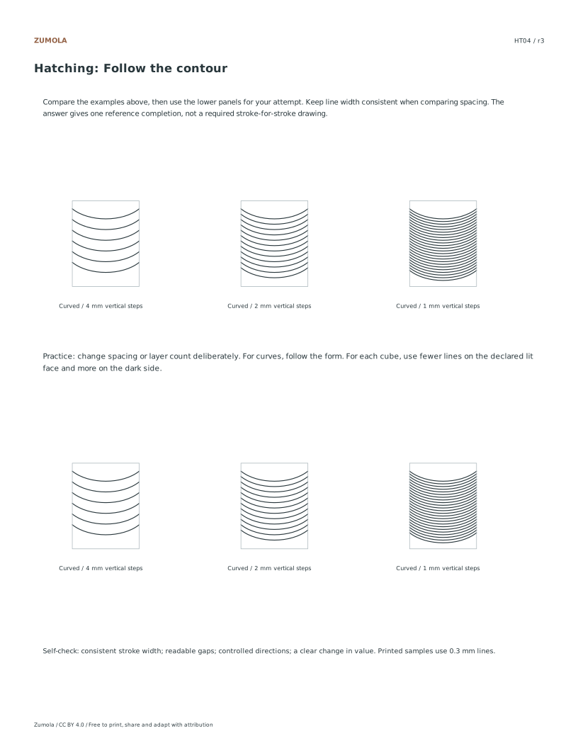
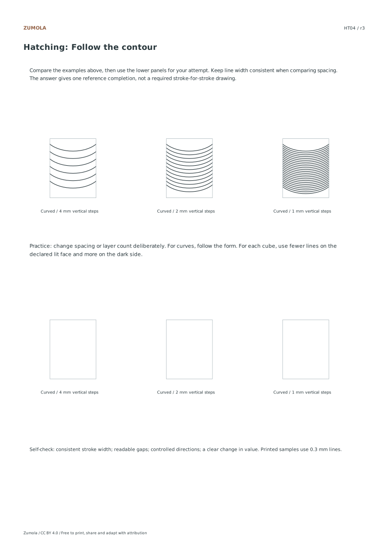
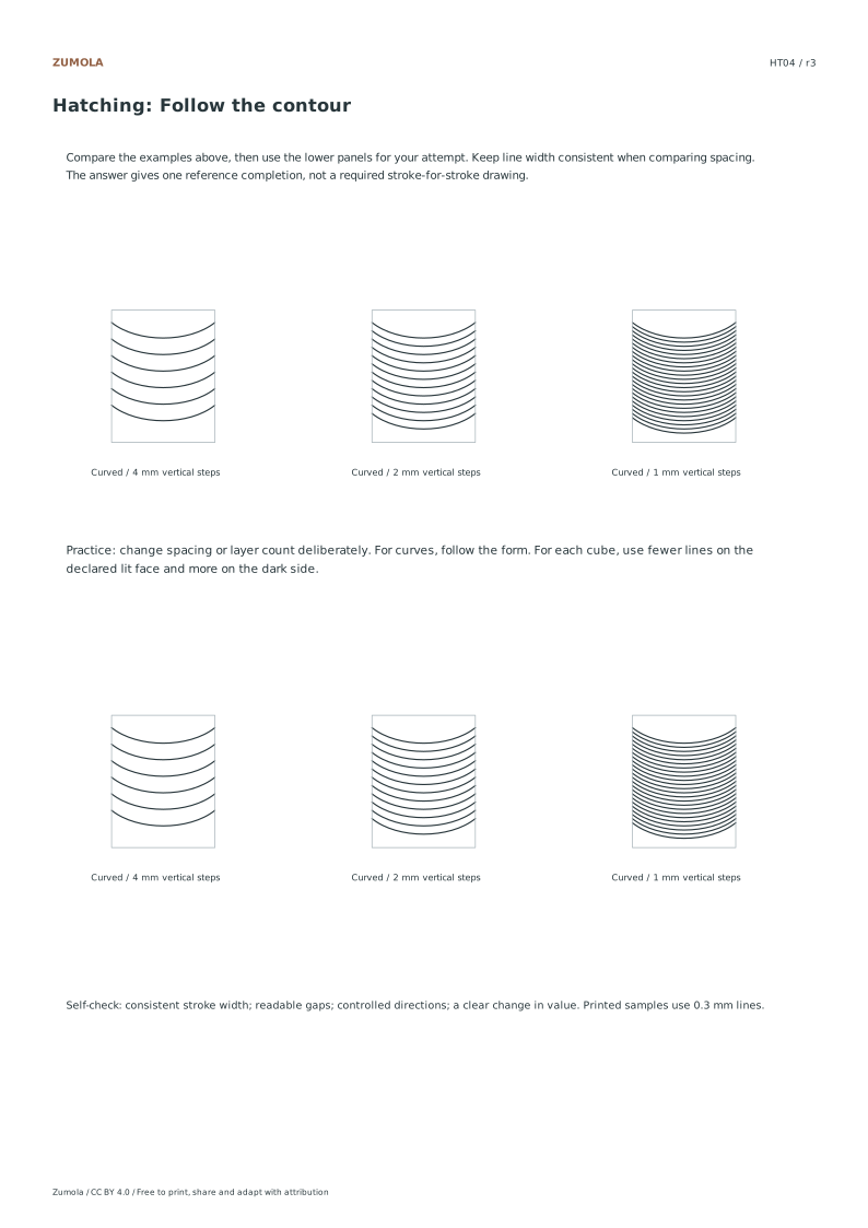
Curved marks follow a rounded surface
HT05
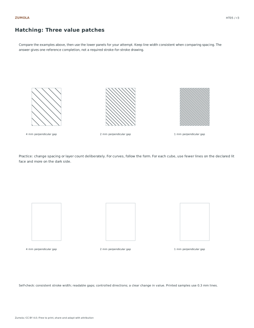
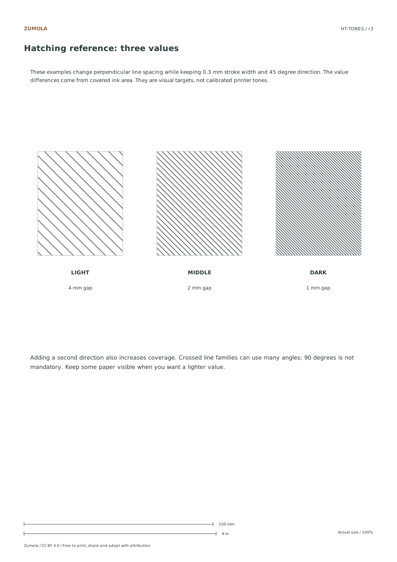
Relative tone
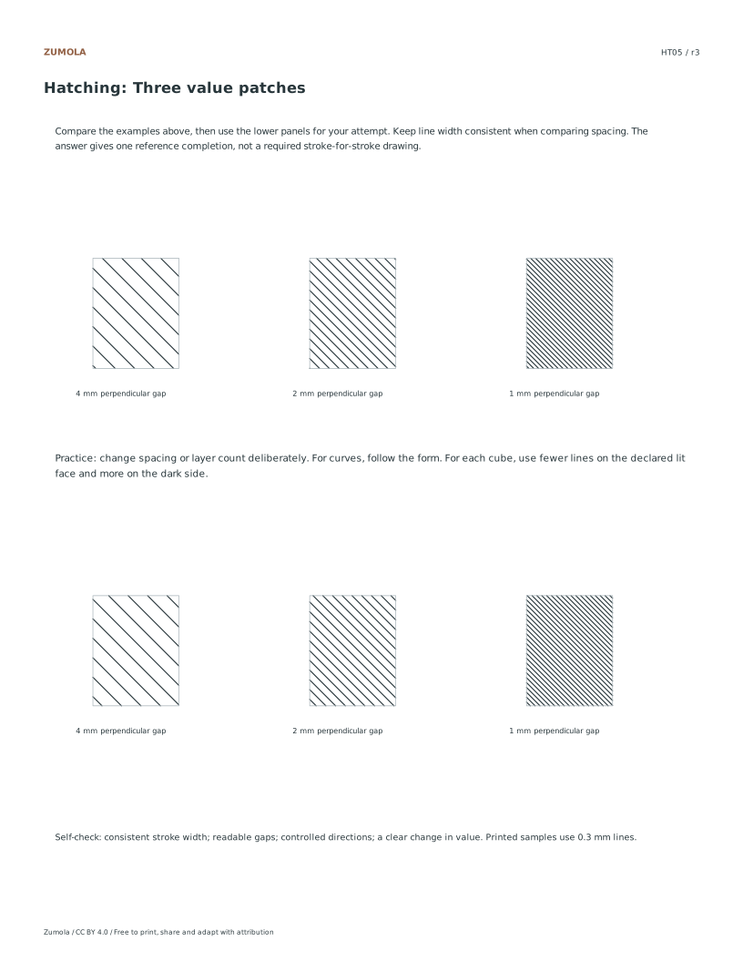
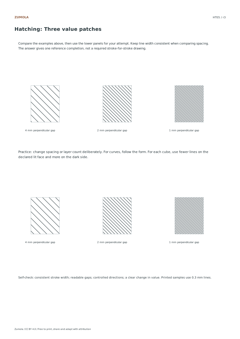
45° lines at 4, 2 and 1 mm spacing
HT06
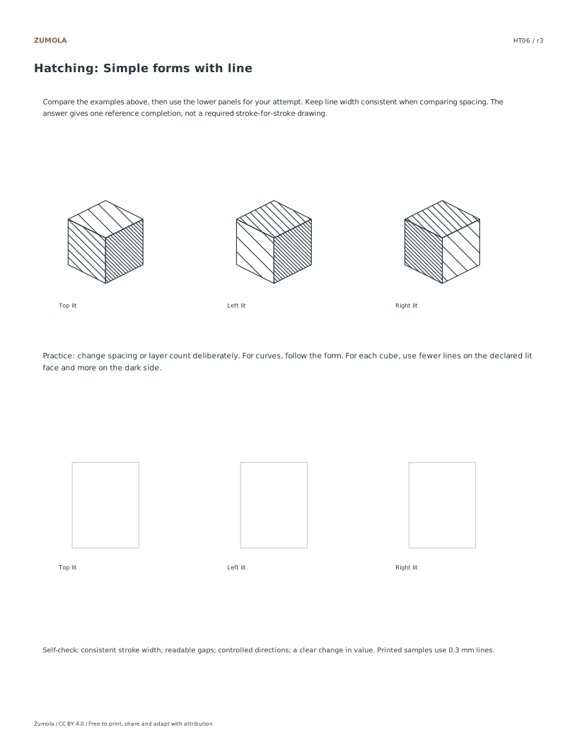
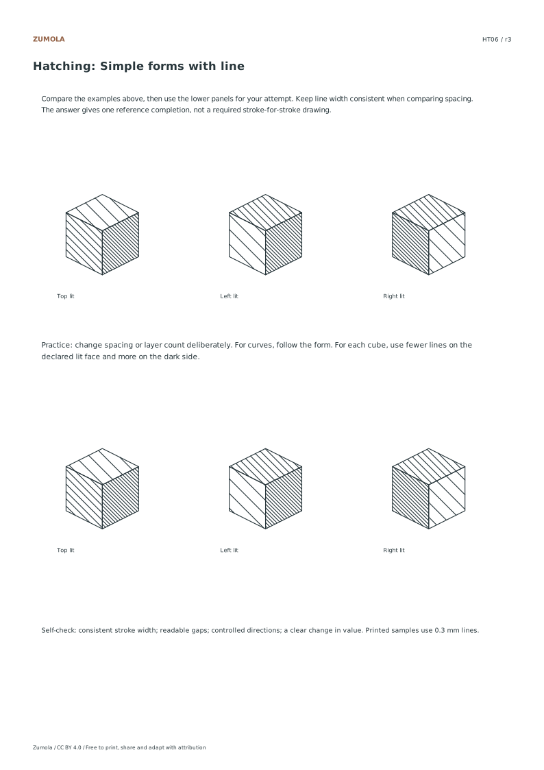
Lit plane
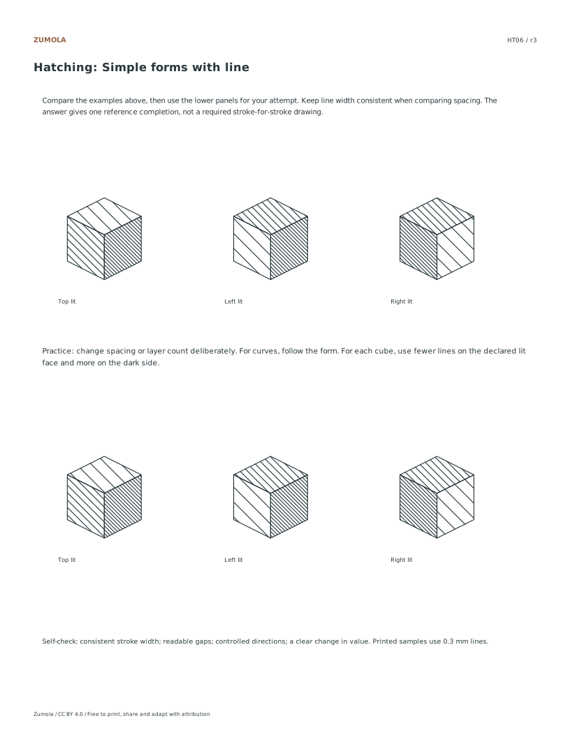
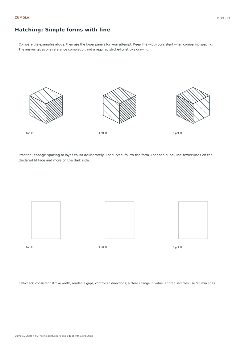
Three cubes place the lightest plane differently
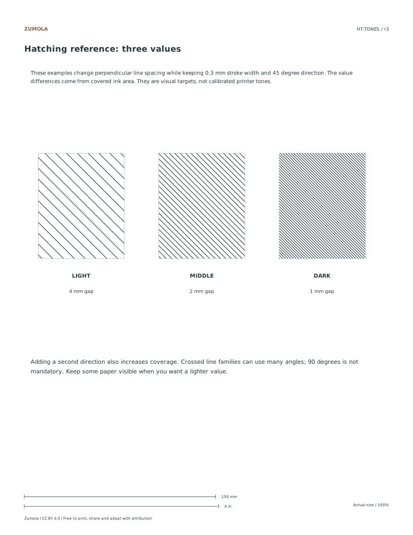
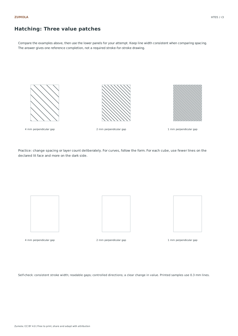
The three tone examples keep 0.3 mm stroke width fixed. Reducing perpendicular spacing from 4 to 2 to 1 mm increases ink coverage and makes the patch darker. Spacing is the distance between line centerlines measured perpendicular to the family, rather than along a diagonal edge of the patch. In the curved study, the printed vertical steps do not imply constant perpendicular spacing along the whole curve.
Cross-hatching adds another direction. A second family can cross at 60°, 90° or another useful angle; it need not form square cells. Make a trial patch before adding a full layer to the drawing. When describing a cube, compare the three planes and preserve the intended lightest face instead of placing identical density everywhere.
The answer files are reference completions and self-check notes. They do not prescribe every hand stroke. Look for a readable difference between light, middle and dark patches, controlled line direction, and a deliberate relationship between density and form.
Work through the page
Maintaining Consistent Stroke Width
When comparing different hatching densities, you must keep your pen stroke width constant to ensure accurate visual comparisons. The provided examples utilize 0.3mm strokes to demonstrate how spacing affects tone. As you narrow the gap between lines, ink coverage increases, creating darker values. This relationship is critical for understanding how density controls light and shadow. Focus on maintaining uniform pressure and line thickness while adjusting only the distance between strokes. This approach isolates spacing as the variable factor, allowing you to clearly observe how tighter gaps result in heavier ink accumulation and darker overall tones within your drawing practice.
Applying Crosshatching Layers
Crosshatching involves adding a second family of lines over your initial hatching layer to build deeper tones. It is important to note that these additional lines do not need to intersect at exactly ninety degrees. You can vary the angle to create more natural or dynamic textures. The goal is to increase density without creating accidental solid black clumps, especially when aiming for lighter mid-tones. By carefully managing the angle and spacing of the second layer, you can achieve smooth transitions and rich values. This technique distinguishes itself from blended shading by relying on discrete line intersections rather than continuous tonal gradients.
Utilizing Reference Sheets
Six individual sheets cover fixed parallel spacing, changing spacing, crossed layers, curved contour lines, three value patches and cube planes. Each has a separate reference completion. An extra sheet provides three larger tone examples; it does not contain all six exercises. The combined packs place that tone reference before the six studies. Compare line direction, spacing and relative darkness, then decide which feature to improve. Hand-drawn work can differ from the mechanically regular vector marks while still showing the intended relationship between line structure and tone.
Small checks that catch common errors
Watch for
Check instead
Allowing stroke width to vary while changing spacing.
Keep stroke width constant to accurately compare how narrower gaps increase ink coverage and darken tones.
Assuming crosshatching lines must always intersect at ninety degrees.
Add a different line family at varied angles to build density without forcing rigid perpendicular intersections.
Creating accidental solid black clumps when aiming for light tones.
Adjust spacing and layer density carefully to maintain lighter values without over-saturating the paper with ink.
Print a test sheet before a full pack
Use the PDF that matches the paper loaded in your printer. Choose Actual size / 100% and turn off Fit, Shrink and browser headers. The SVG keeps millimeter dimensions, but an editor or browser can rescale it; the PDF is the simpler print path. Measure any calibration bars with a separate physical ruler when the exercise depends on printed size. A screen preview does not establish physical scale.
Packs combine the same individual pages; they are not extra different exercises. Print a student copy first and keep references nearby for review. Letter and A4 preserve the stated grid spacing or model definition while their surrounding white space can differ. Color is optional: the references also use line position, text or relative lightness to explain the result.
Useful answers
Do my hand drawings need to match the examples exactly?
No, qualitative answers demonstrating correct direction and density are sufficient. Your hand drawing need not match every stroke of the original examples.
What stroke width and gaps are used in the examples?
The three tone examples use 0.3 mm strokes with perpendicular line spacing of 4, 2 and 1 mm. Individual studies vary direction, spacing or layer count. Curved contour lines use vertical steps, so their local perpendicular separation is not constant.
Is this technique similar to blended shading?
No, this method is distinct from blended shading. It relies on discrete line families and spacing to create value rather than continuous tonal blending.
Are the answers and editable files free too?
Yes. Every linked PDF, SVG, worksheet and answer is free without signup. The original Zumola resources use CC BY 4.0: credit Zumola, link the license and indicate changes. Analytics consent is not required to download or use them.
Optional Google Analytics helps us understand which free resources are useful. It is off until you allow it. Drawing tools and downloads work with either choice. Privacy details