Free printable resources · Original practice
Shading practice.
Find the light. Build the form.
Build a value scale before shading simple forms. Follow one marked light direction and compare the relationships between lighter and darker surfaces.
5 original worksheets.
Reference values + self-checks.
Separate value order from surface form
| Sheet | Task | Reference check |
|---|
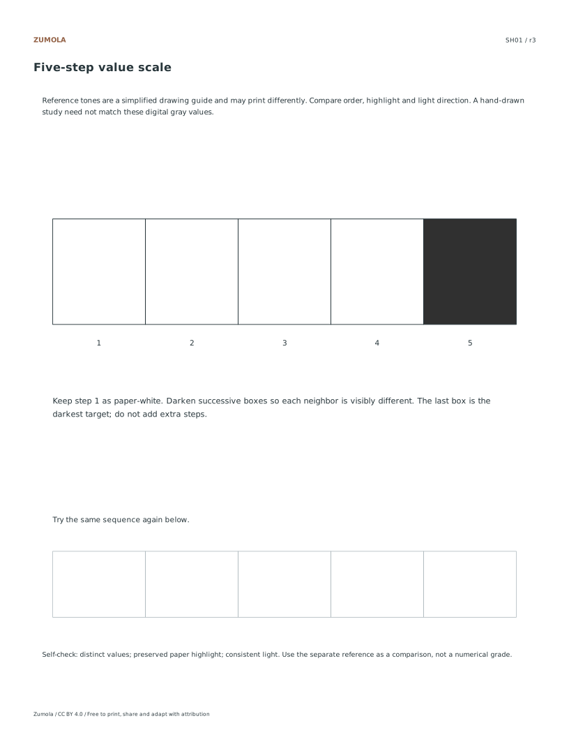
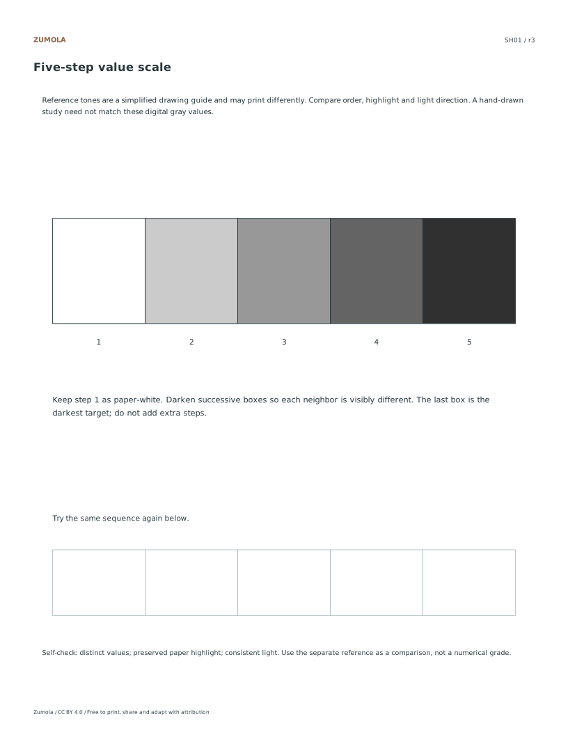
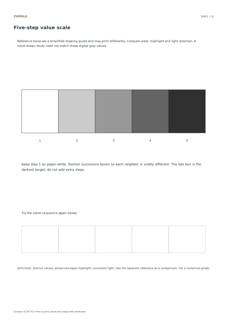
| SH01 | Five-step value scale | Five distinct values, light to dark |
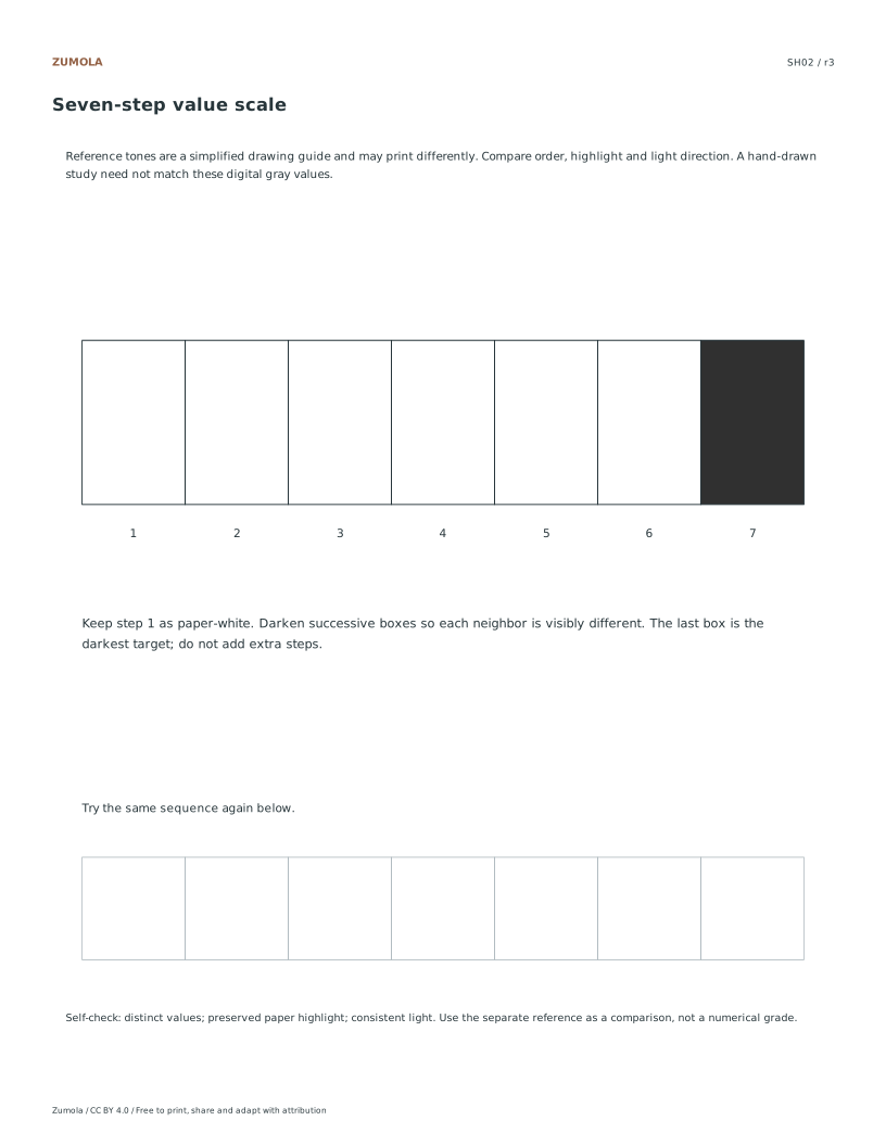
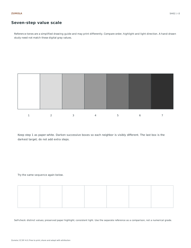
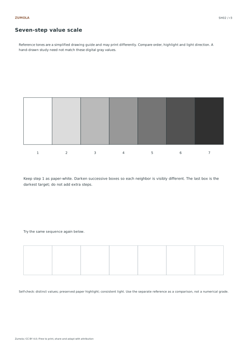
| SH02 | Seven-step value scale | Seven values with a consistent order |
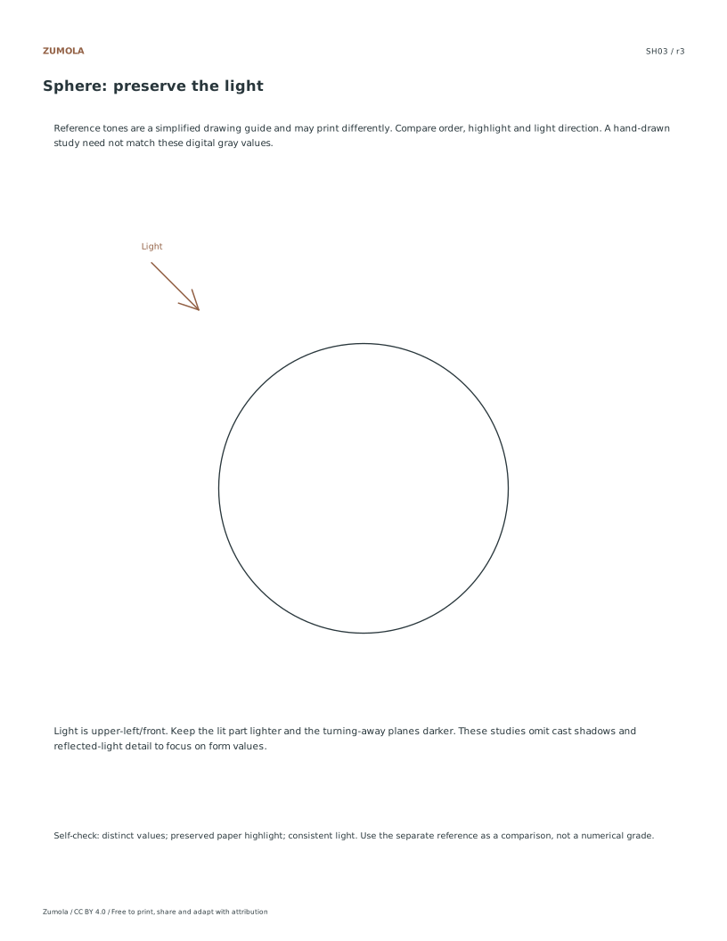
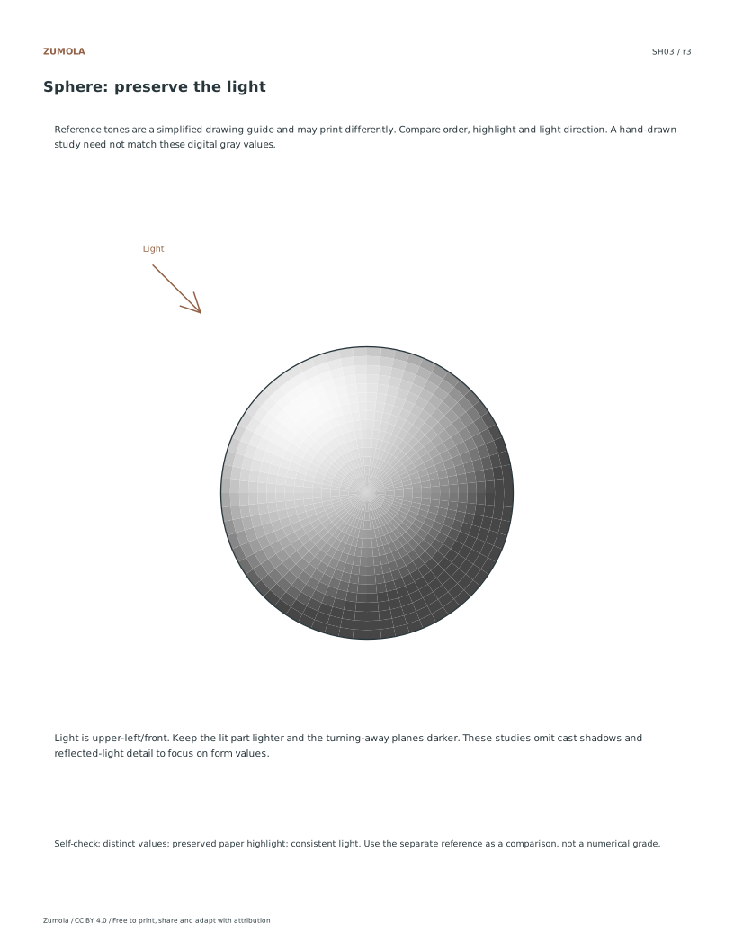
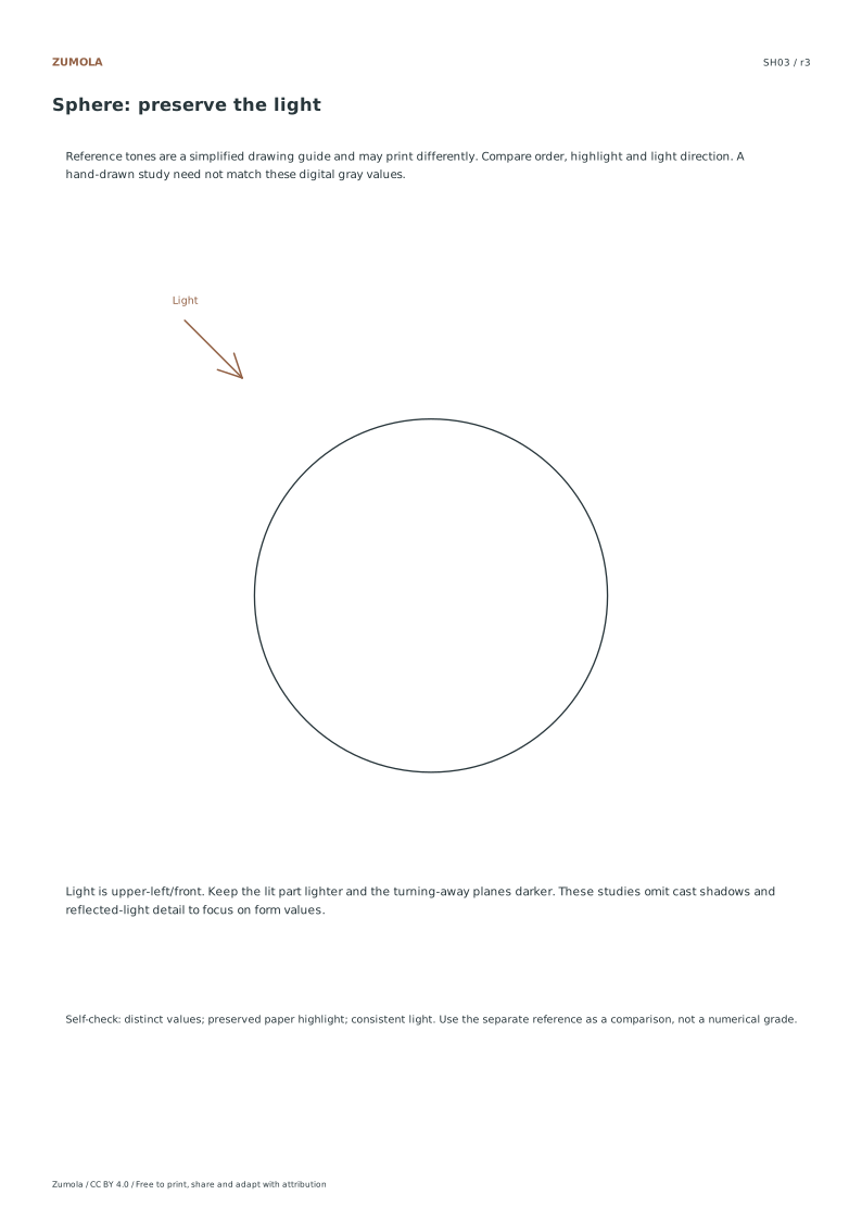
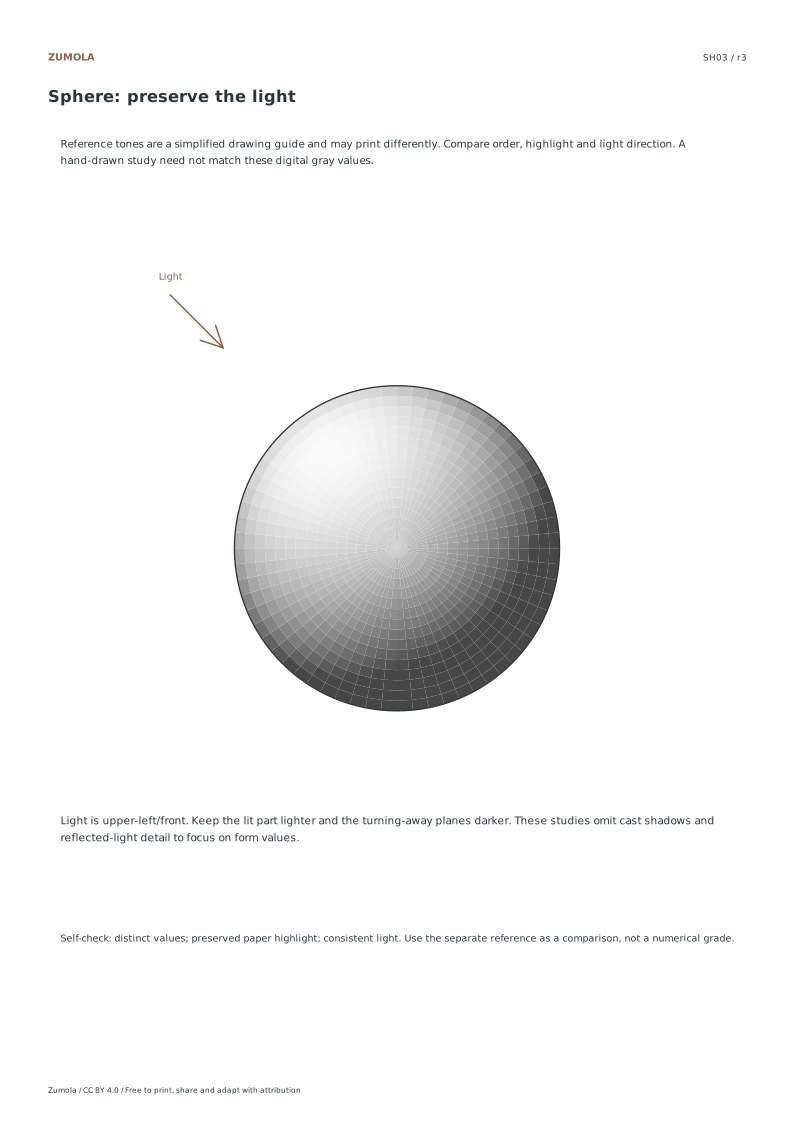
| SH03 | Sphere | Upper-left/front highlight, darker lower-right |
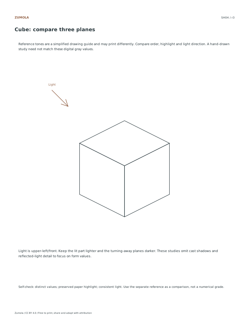
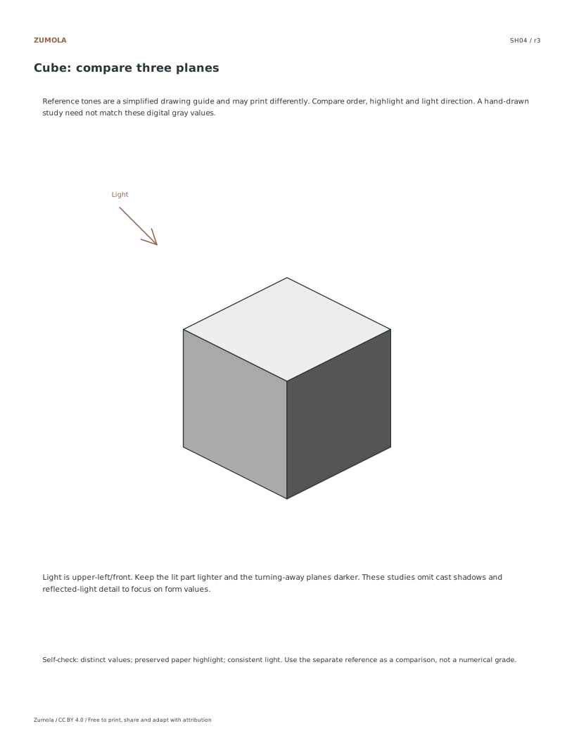
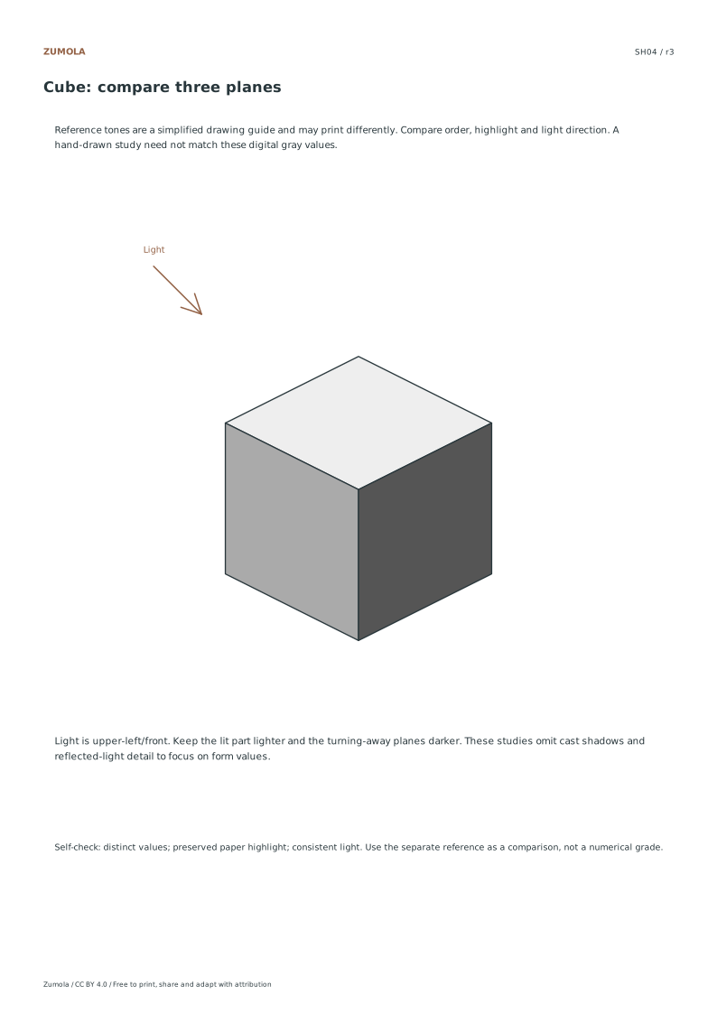
| SH04 | Cube | Top lightest, left middle, right darkest |
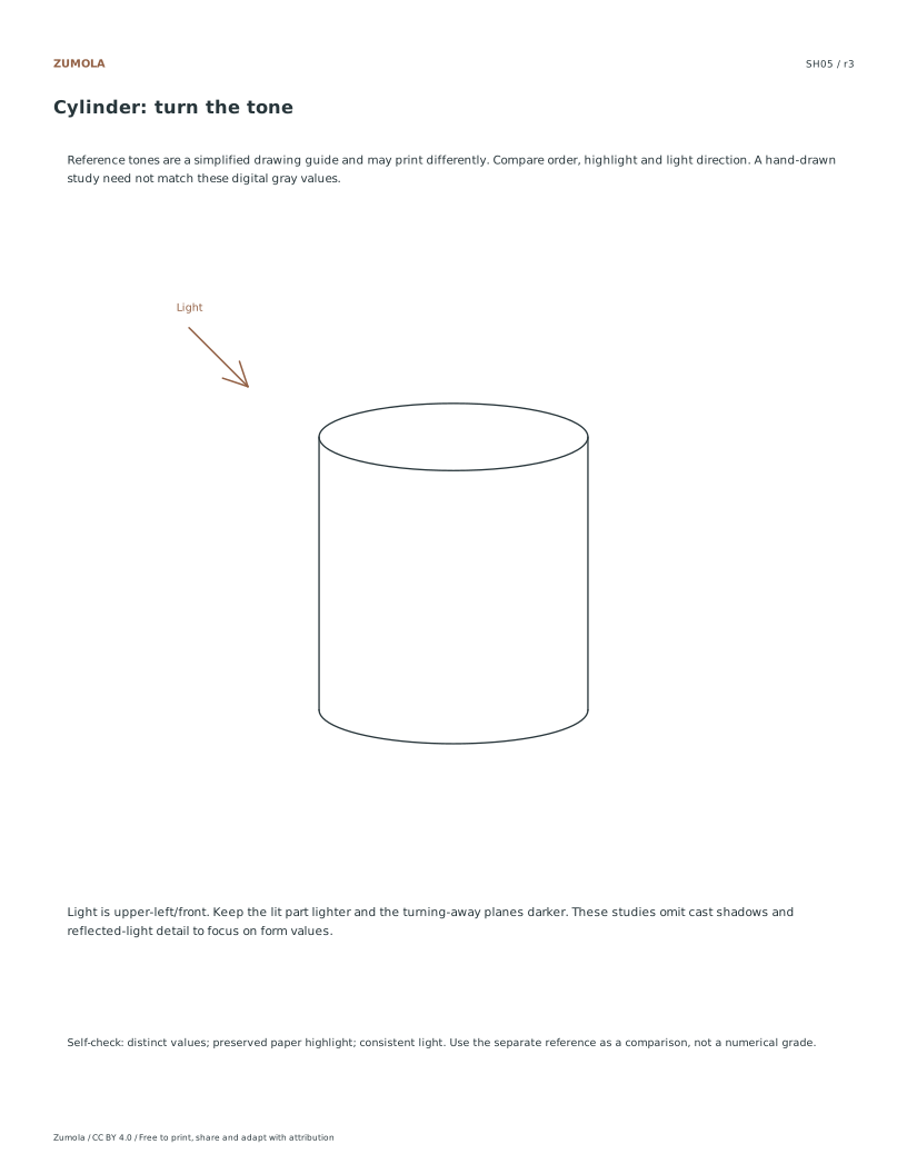
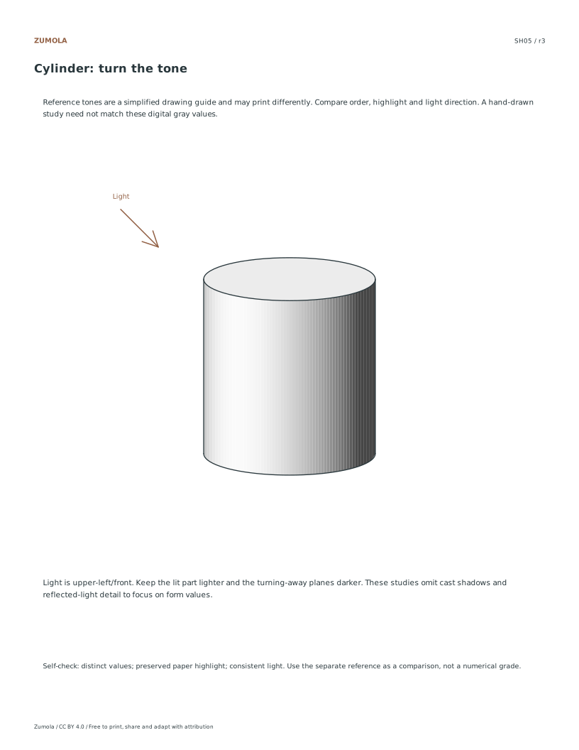
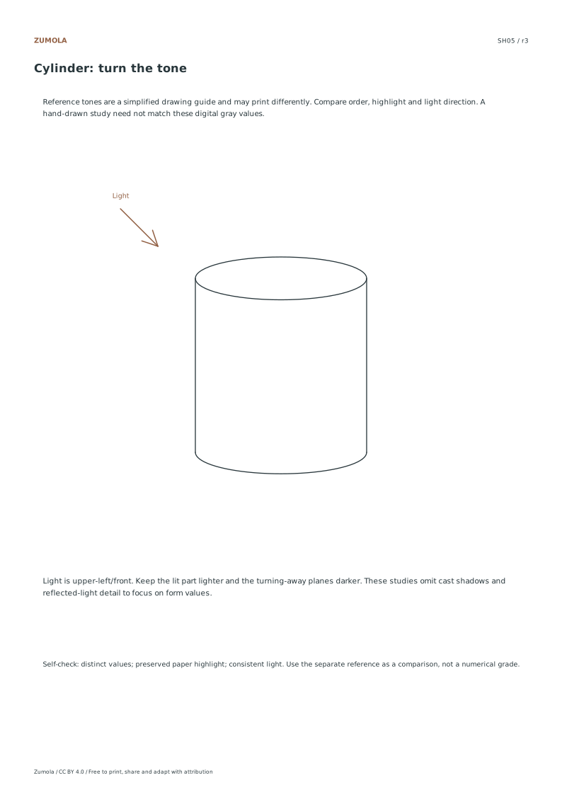
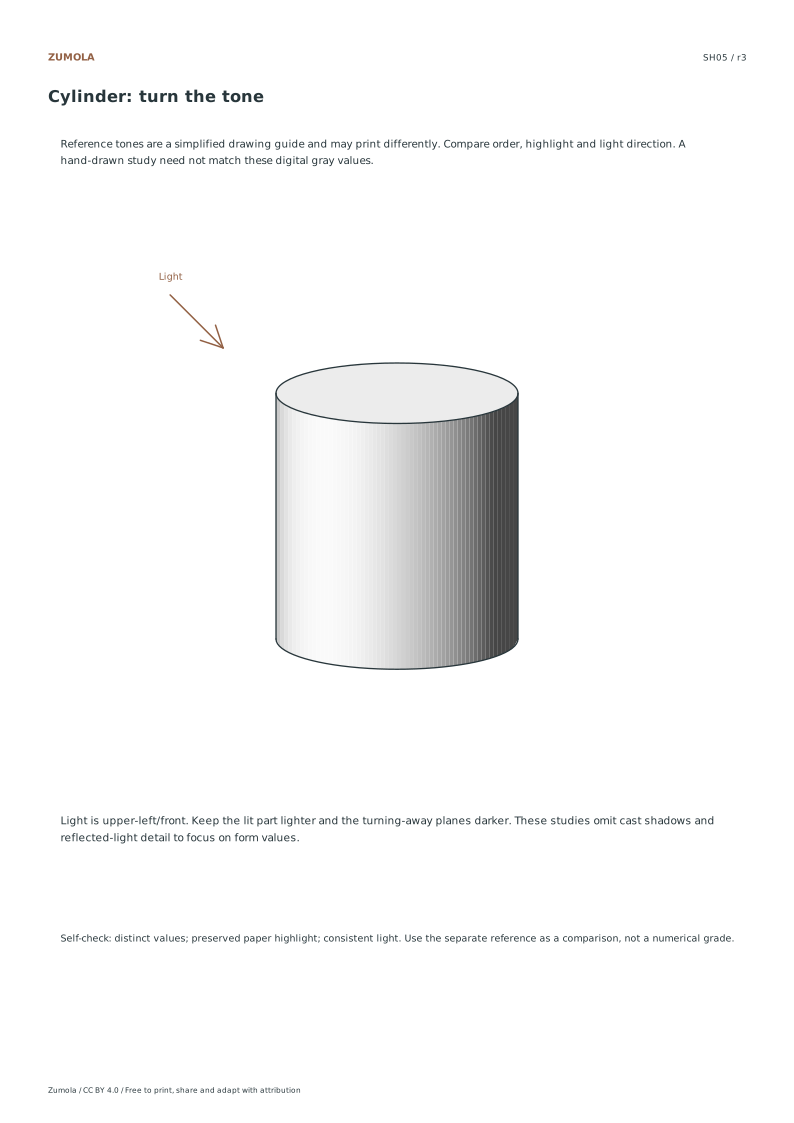
| SH05 | Cylinder | Light top and left/front band, darker right |
On the value sheets, the first and last boxes establish the ends of the range. Fill intermediate boxes so that neighboring values are distinguishable. The digital reference steps from paper white toward a dark gray. A pencil, ink wash or printer will produce a different tonal range, so compare order and separation rather than exact RGB values.
The sphere reference uses small vector tone patches to describe a smooth form. The cube uses three flat plane values. The cylinder uses a light top and a graded curved side. They are simplified original teaching studies with a marked light direction, not material-accurate renderings. Cast shadows, surface textures and environmental reflections are outside these reference examples; add them in a later study if useful.
To review your page, cover the outlines briefly and ask whether the bright and dark regions still suggest the intended form. Check that a second accidental highlight has not appeared on the dark side. If a face looks too similar to its neighbor, adjust that relationship before adding detail.
More ways to practice
Set one light direction before touching the paper
Draw a small arrow in a corner of the sheet to fix the light direction. Keep it consistent for every form on that page. A light coming from the upper left means the sphere's brightest area sits toward the upper left, the cube's top and left planes are lighter than its right plane, and cast shadows fall toward the lower right.
Choose three or four values from your scale and label them lightly at the edge of the sheet. Assigning values before shading prevents the common habit of darkening everything until the page looks busy. The lightest value belongs to surfaces facing the light most directly; the darkest belongs to surfaces turned away or blocked.
- Mark a light-direction arrow in one corner and keep it visible.
- Select three or four values from your scale and note them at the sheet edge.
- Sketch the sphere and cube side by side with enough space for cast shadows.
- Block in the broad value areas first, then refine transitions.
Compare the sphere and cube as a pair
The sphere turns gradually, so its value change should be smooth across the curved surface. The cube changes value abruptly at each edge because its planes face different directions. Shading both on one sheet makes that difference visible: a soft gradient on the cube or a hard band on the sphere signals a mismatch between the form and the marks.
Watch the terminator, the boundary between lit and unlit areas. On the sphere it curves; on the cube it follows an edge. The cast shadow should begin where the form blocks the light and stretch away from the light source. Its edge is usually sharper near the object and softer farther away.
- Shade the sphere with gradual transitions and keep the highlight area light.
- Shade the cube plane by plane, keeping edges between planes distinct.
- Place each cast shadow opposite the light arrow and check its direction.
- Step back and compare the darkest and lightest areas across both forms.
Diagnostic checks after the first pass
Squint at the sheet to blur detail and judge value order. The lit top of the cube and the lit side of the sphere should read as the lightest areas; the shadow sides should read as the darkest. If both forms look equally dark everywhere, the value range is too narrow. If the page looks striped with harsh bands, the transitions are too abrupt for the form.
Check the cast shadows separately. A cast shadow pointing toward the light arrow means the light direction was reversed somewhere on the page. A cast shadow that touches the object along its whole length usually needs a gap or a narrower contact point. These checks are about logic, not exactness.
- Squint to test whether value order matches your chosen scale.
- Trace each cast shadow back to the light arrow and confirm direction.
- Look for hard bands on the sphere or soft smudges across cube edges.
- Adjust the weakest area only, then recheck the pair together.
A variation for a second attempt
On a fresh sheet, move the light arrow to the upper right and repeat the same pair. The forms stay the same, but every lit area, terminator, and cast shadow shifts. Comparing the two sheets shows whether you are following the light direction deliberately or copying previous marks from memory.
You can also swap one form for a cylinder to test a third transition type: a curved surface with straight top and bottom edges. Keep the same value labels so the comparison stays fair.
- Move the light arrow to a new corner on a fresh sheet.
- Redraw the same forms and reassign values from the same scale.
- Compare both sheets side by side for consistent light logic.
What to look for when judging the work
Shading practice has multiple valid outcomes. A darker overall drawing can still be correct if the value relationships hold. Judge the logic of light and the control of transitions rather than matching a single reference image.
Use the rubric below to review your own sheet or a student's sheet. Note one strength and one specific adjustment rather than rewriting the whole drawing.
- Review value order against the labeled scale.
- Check light direction consistency across all forms.
- Check cast-shadow direction and contact.
- Check transition type matches each form.
Try this example
Light arrow points upper left. A sphere and cube sit side by side. Using values 1 (lightest) to 4 (darkest), assign values to the sphere's lit side, the sphere's shadow side, the cube's top, the cube's left face, and the cube's right face.
Show the worked explanation
The sphere's lit side is value 1 and its shadow side is value 3, with a gradual transition between them. The cube's top is value 1, its left face is value 2, and its right face is value 4. Cast shadows fall to the lower right for both forms. The cube's right face is darkest because it faces away from the upper-left light, while the sphere's shadow side is slightly lighter to keep the curved transition readable.
Common mistakes
- Shading the sphere with hard bands that copy the cube's plane changes. Blend gradually along the curve and reserve sharp edges for the cube's plane boundaries.
- Placing cast shadows on the same side as the light arrow. Trace each cast shadow back to the arrow; it should extend away from the light source.
- Using the same mid value on every surface so both forms look flat. Assign at least three distinct values from your scale and place the lightest on surfaces facing the light.
Check your work
- Light direction is marked and every form follows it.
- At least three distinct values from the scale are used.
- The sphere shows gradual transitions; the cube shows distinct plane edges.
- Cast shadows extend away from the light source and contact the forms plausibly.
- Value order remains readable when the sheet is viewed from a distance.
Questions before you start
Can I shade the sphere and cube in any order?
Yes. Shading the cube first can help because its flat planes make value assignment obvious, but either order works if the light arrow stays fixed.
How dark should the darkest value be?
Dark enough to contrast clearly with your lightest value, but not so dark that transitions disappear. Choose it from your scale before shading.
What if my cast shadow looks wrong but I cannot tell why?
Compare its direction to the light arrow and its contact point to the object's base. Most errors come from a reversed direction or a shadow that touches too much of the form.