Scatter graph worksheets. Keep each pair together.
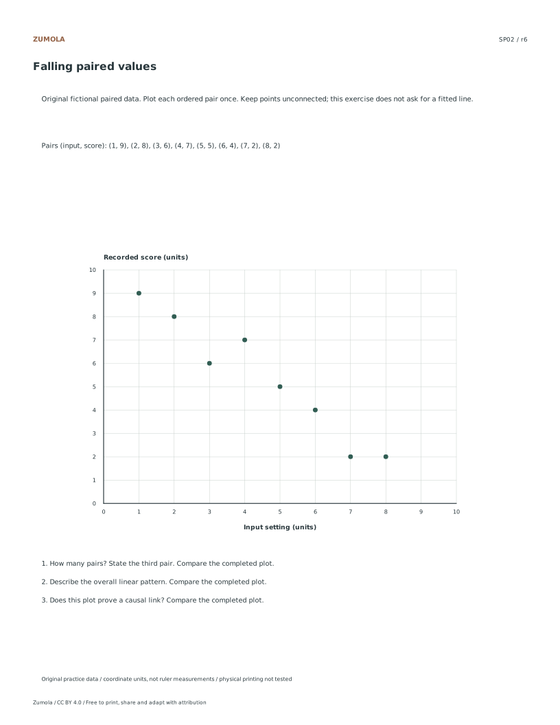
Plot eight numerical pairs in each of four fictional datasets. Compare rising, falling and less clear patterns while keeping association separate from causation.
4 original datasets. 8 pairs per graph; no fitted line.
A graph, a task and a worked check
Plot eight numerical pairs in each of four fictional datasets. Compare rising, falling and less clear patterns while keeping association separate from causation.
Use the student pack for an attempt, then compare the separate reference or worked answer. Every case is original. All PDF and editable SVG resources are free without signup; each collection pack repeats its individual sheets in the same order.
Choose your paper and download
Download paper size
Every worksheet and answer is free. No signup.
The complete collection
Keep practice and answers separate.
Use the student pack first, then compare the reference or answer. Packs are PDFs; individual sheets below also include editable SVG files. The paper choice applies to every download.
The examples and datasets are made for these worksheets. They are not measured classroom results, published textbook questions or evidence about real people. Axis values and the supplied data determine the answers; paper measurements do not replace those numbers.
Check the first case
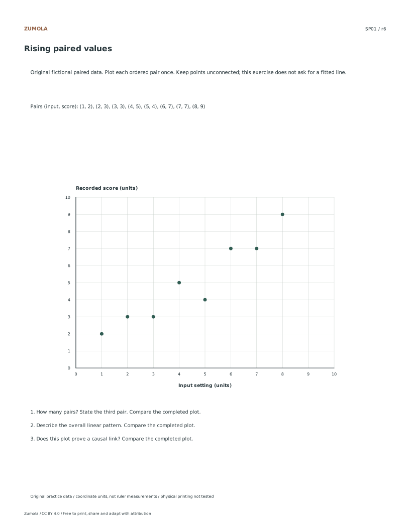
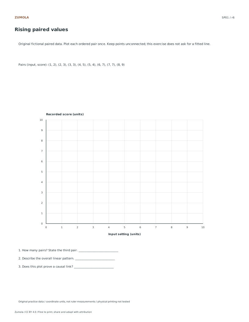
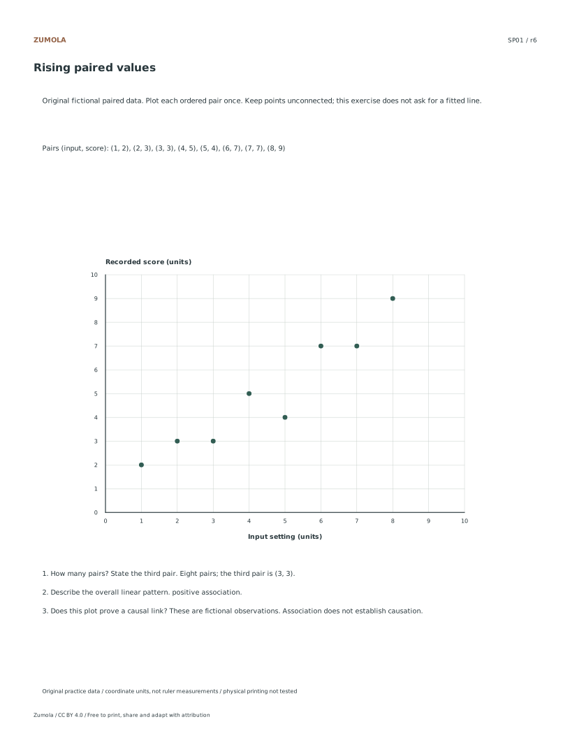
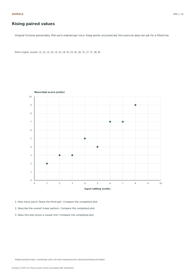
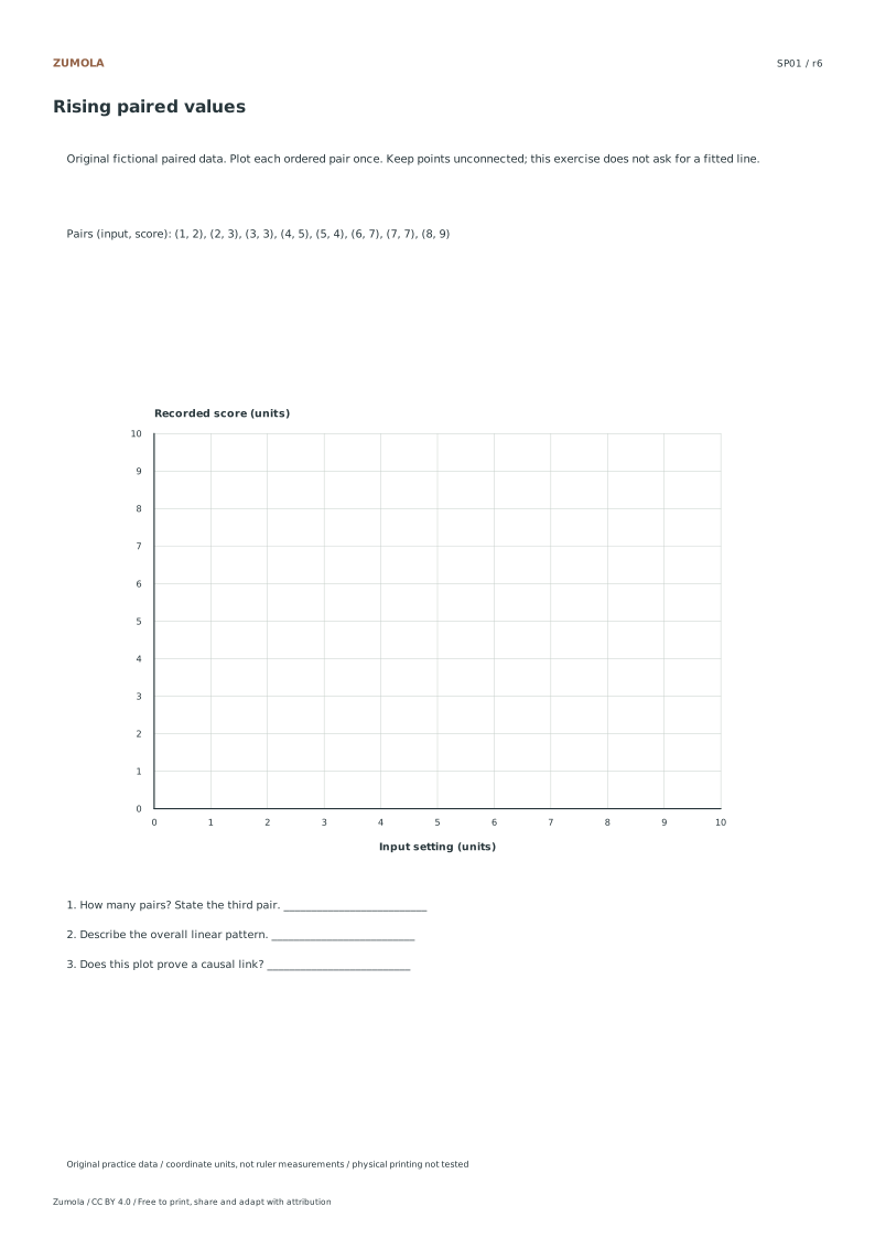
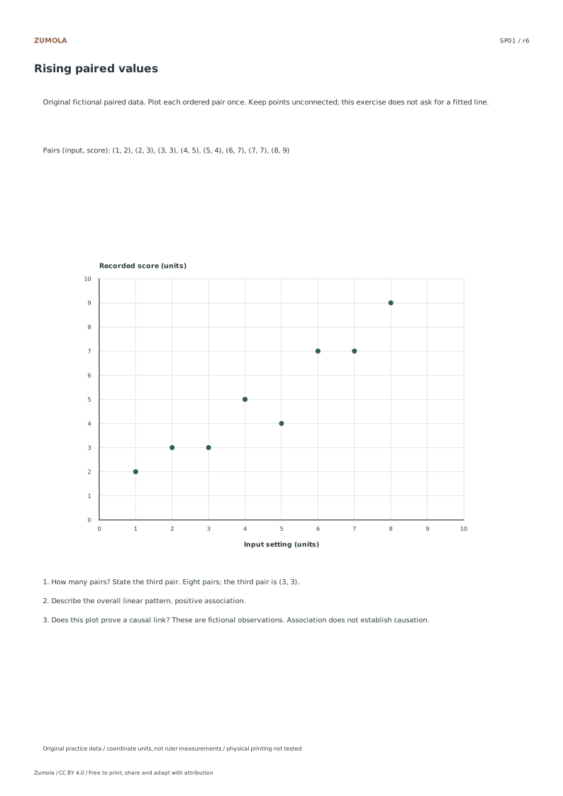
SP01: Rising paired values
Check
Worked result
1
Eight pairs; the third pair is (3, 3).
2
positive association.
3
These are fictional observations. Association does not establish causation.
The table gives one worked case so you can check the method. The separate answer files contain the completed plots and results for every case. Table order can change without changing the scatter, as long as each x and y stay paired.
Work through the graph
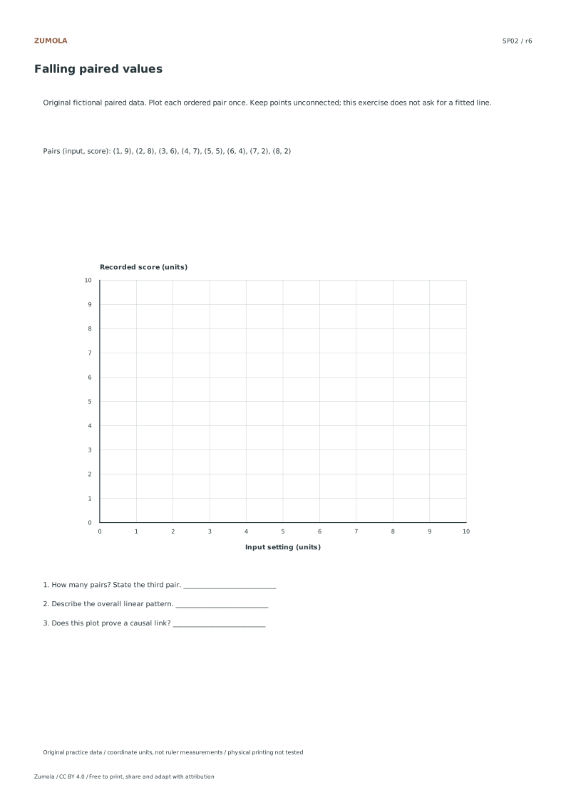
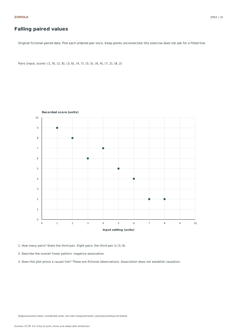
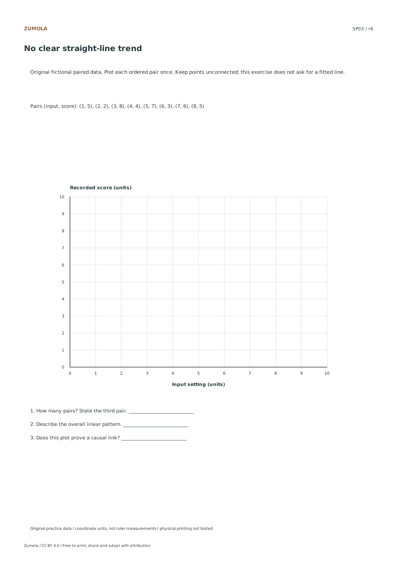
Plot the pairs without changing their partners Each ordered pair has two values from the same fictional observation. Place the first value on the horizontal Input setting axis and the second on the vertical Recorded score axis. Both axes run from 0 to 10 in single-unit steps. SP01 begins with (1,2), followed by (2,3); do not sort the two columns independently. The student file supplies the labeled axes and the eight-pair list. Keep the reference and answer packs aside for your first attempt, then compare each dot with the same pair in the list.
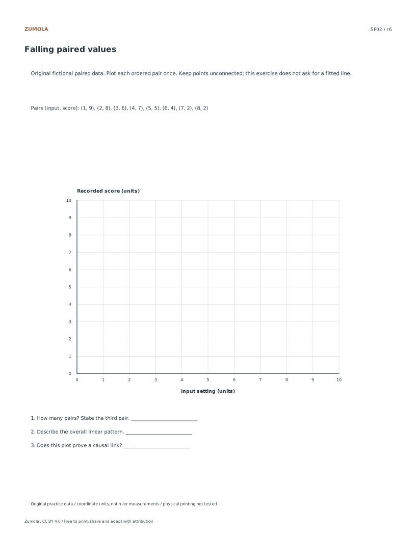
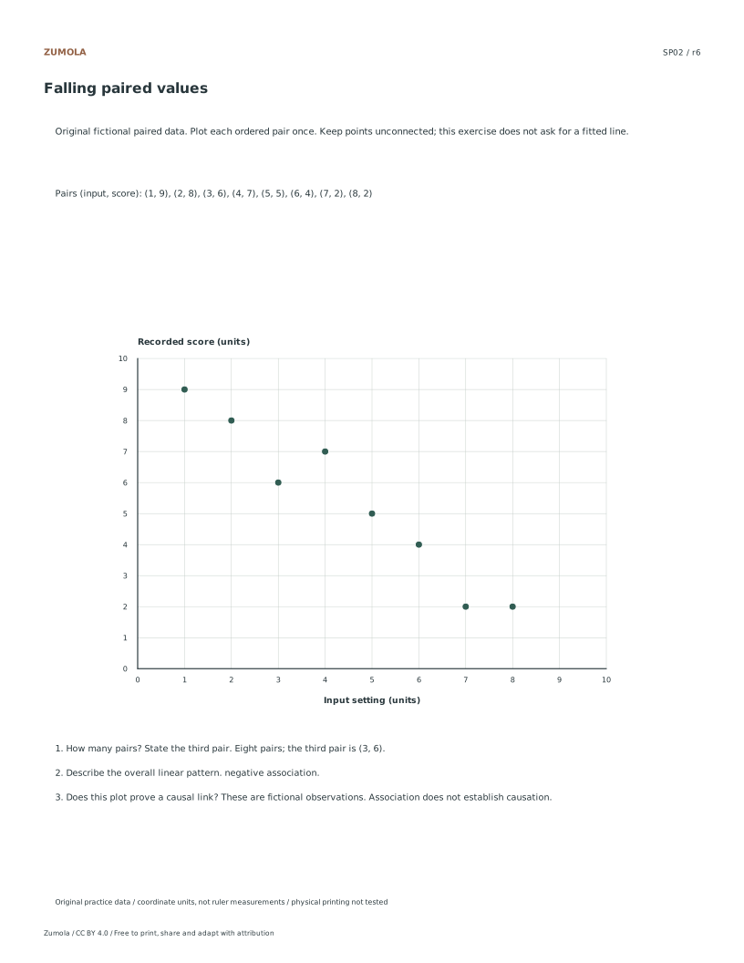
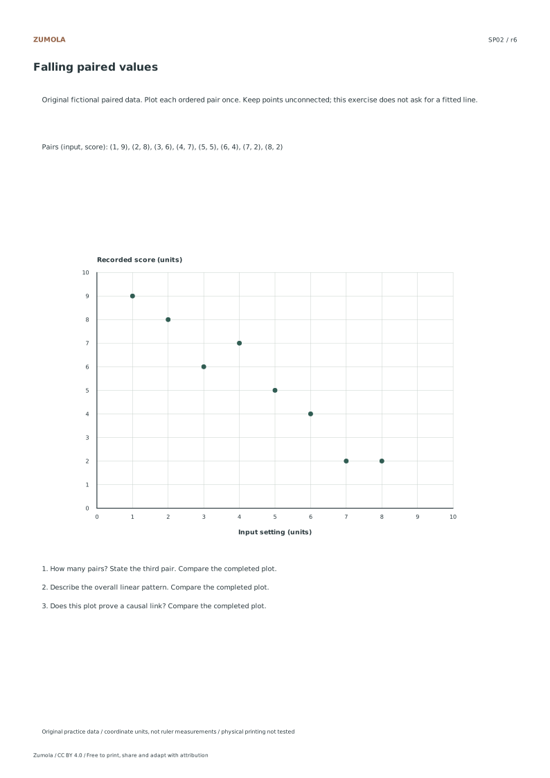
Verifying Axis Labels and Units Before plotting, confirm that the horizontal axis is labeled Input setting in units and the vertical axis is labeled Recorded score in units. These labels apply to all four paired-data construction tasks. Since answers are determined by axis units and plotting rather than physical ruler measurement, precise alignment with these listed coordinates is essential. Check that the scale accommodates the eight observations in each case without truncation. The data points are fictional and not copied from publishers. Ensure the axes are clearly visible on your screen or printed page to accurately interpret the positive, negative, or no clear linear association trends presented in the exercises.
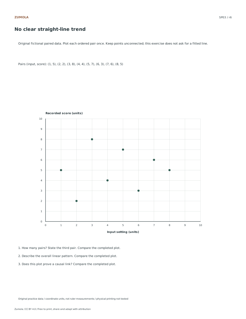
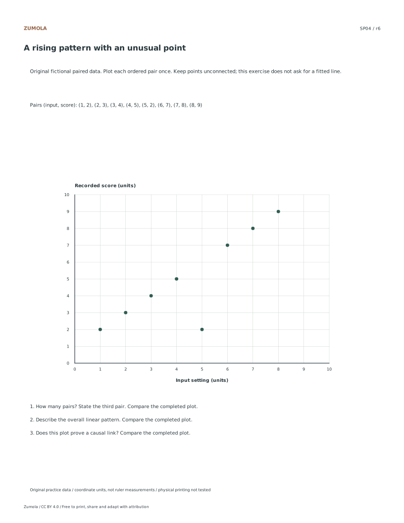
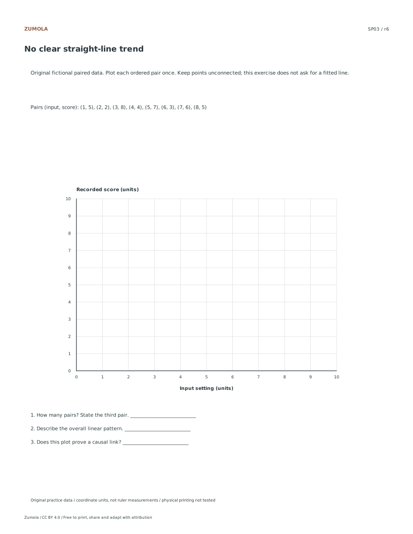
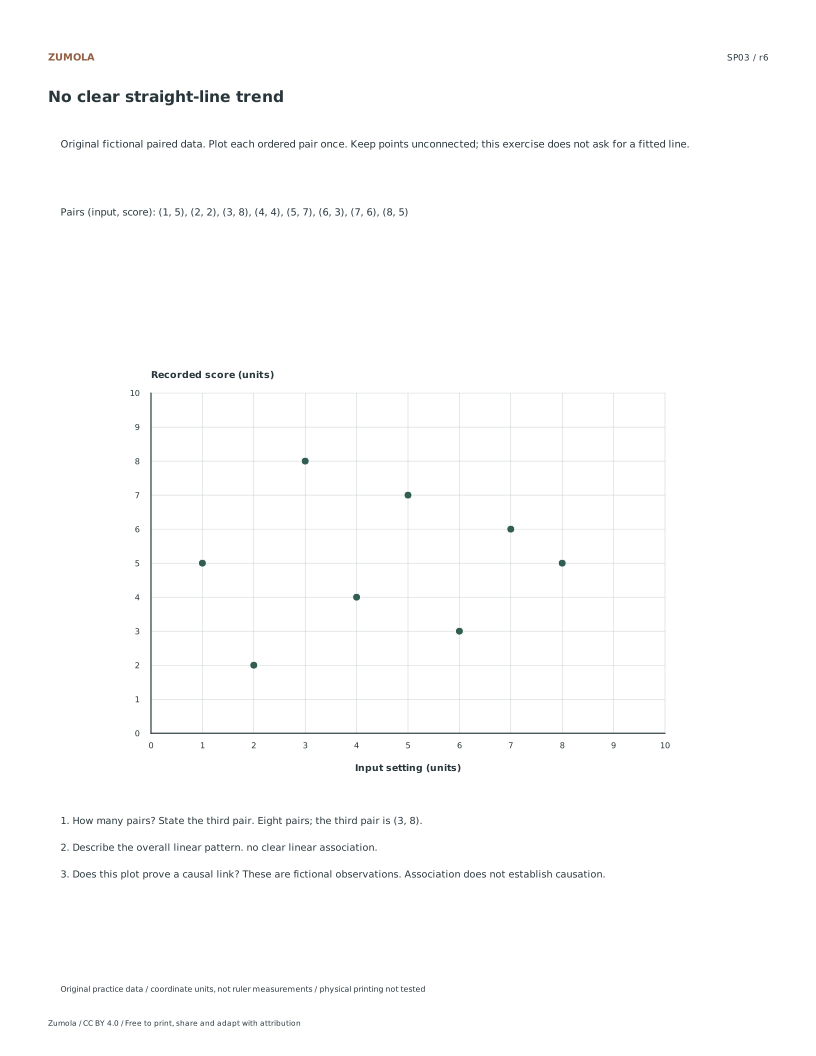
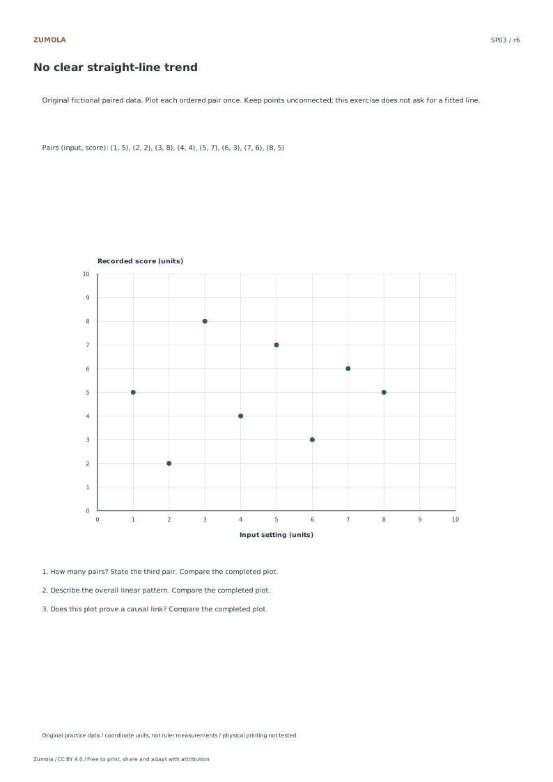
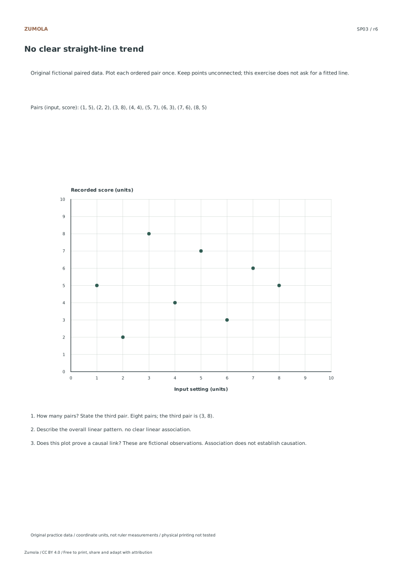
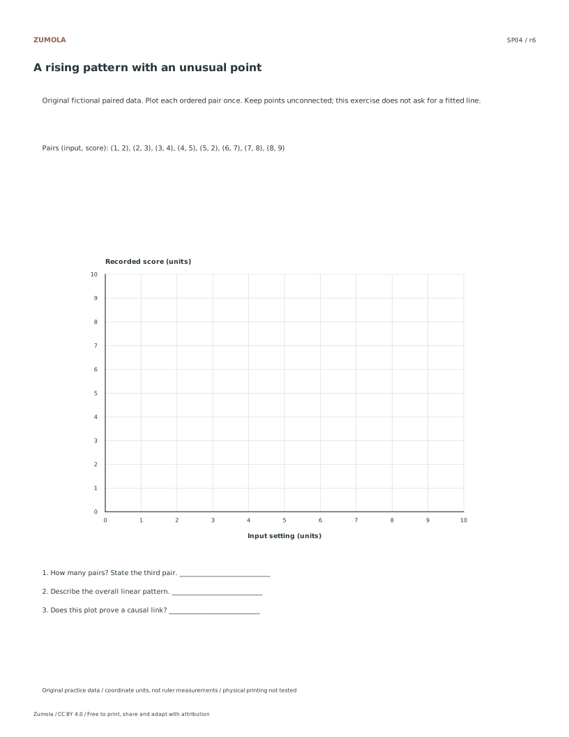
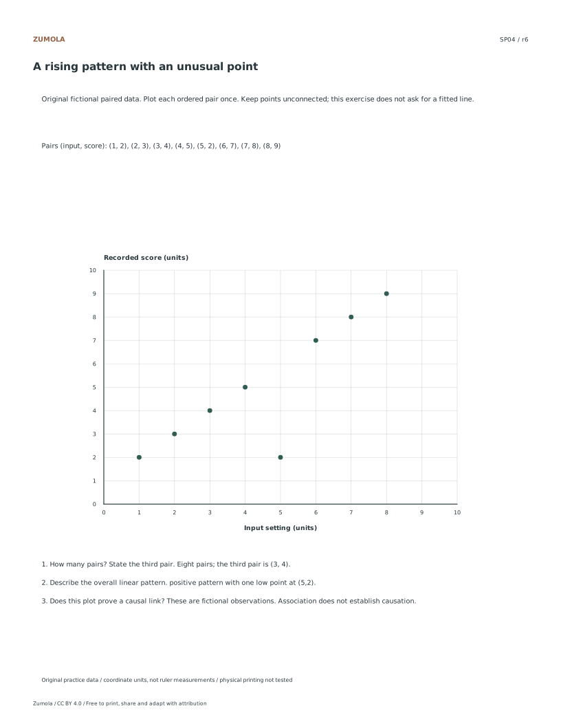
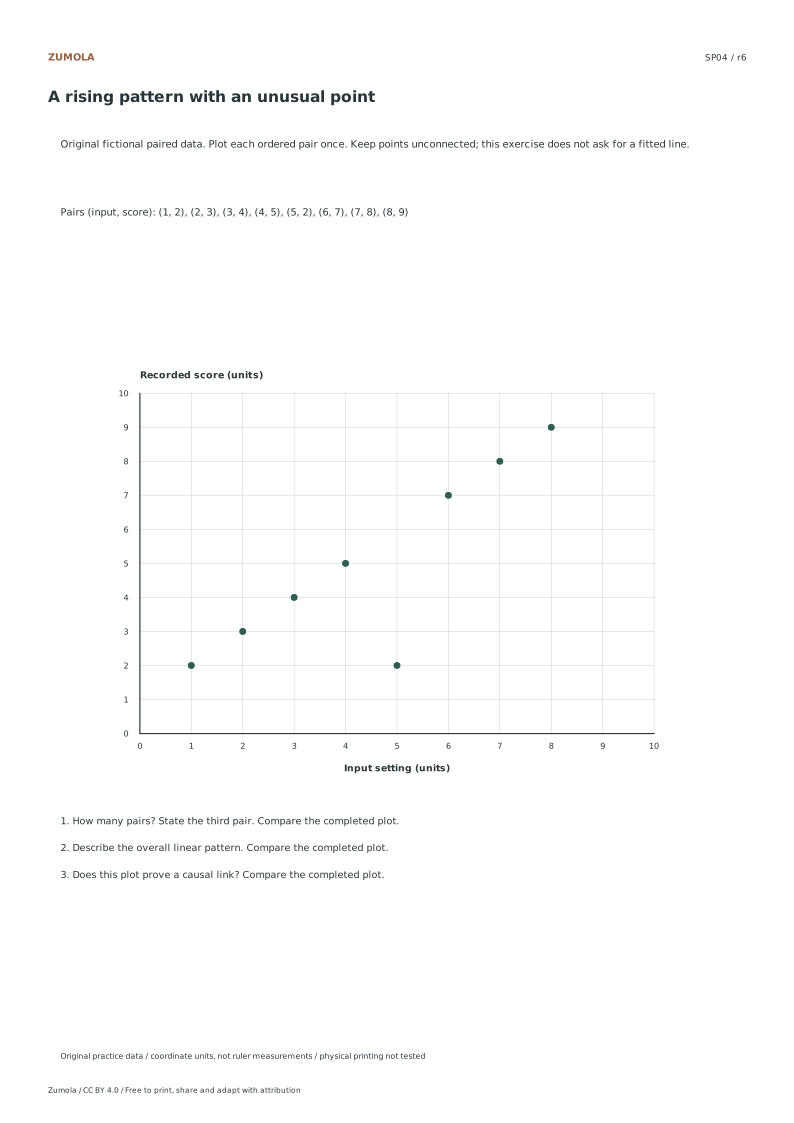
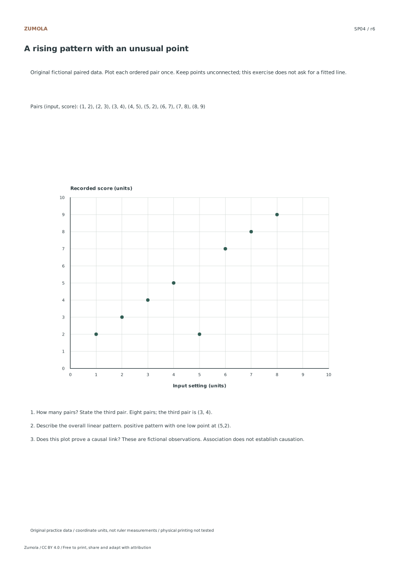
Plotting Points Without Connecting Lines Plot each pair of x and y values exactly once for the eight observations in your selected case. Keep all points unconnected, as no best-fit line or causal calculation is required for these exercises. For the case with a rising pattern, note the unusual low point at coordinates five and two. For the case with no clear straight-line trend, observe the scattered distribution. Remember that a lack of clear linear association does not prove statistical independence. A light label can help identify an unusual point. The visual representation relies solely on the listed coordinates provided in the original fictional datasets, ensuring consistency across all student and worked answer versions.
Checks that catch common errors
Watch for
Check instead
Connecting the plotted points with lines to show a trend.
Leave all points unconnected. The exercises require plotting each pair once without drawing best-fit lines or connecting segments, as the visual pattern is determined by the scattered digital coordinates.
Using physical ruler measurements to determine the answer values.
Rely on digital units and plotting coordinates. Answers are derived from the specific x and y values in the fictional datasets, not from measuring distances on a printed page with a ruler.
Assuming no clear linear association proves statistical independence.
Recognize that a lack of clear linear association does not prove statistical independence. The fictional data shows no p-values or population conclusions, so avoid making definitive statistical claims based solely on the visual scatter.
Keep the labels and margins readable
Choose the Letter or A4 file that matches your paper. Actual size / 100% preserves the designed layout; a different uniform print scale changes physical lengths but does not change the listed numbers or the arithmetic. Keep the whole chart and all labels inside the printable area. A ruler can help draw straight segments, but calculate from the stated numerical scale.
These files have digital geometry, arithmetic and page-boundary checks. Physical printer and classroom trials have not been completed. The resources are practice material, with no claim of curriculum certification or precision-instrument accuracy. The original files use CC BY 4.0: credit Zumola, link the license and indicate changes.
Useful answers
Should I join the points in table order?
No. A scatter graph displays pairs as individual observations. Table order is not a time sequence, and joining it would introduce a path that the task does not specify.
What does no clear linear association mean?
The dots do not show a clear rising or falling straight-line pattern in this small example. That does not prove independence or rule out every other possible relationship.
Is the unusual point automatically an error?
No. SP04 deliberately includes a low point at (5,2). Plot it as supplied and describe its position; do not delete a point merely because it differs from the surrounding pattern.
Are the answer files and editable graphs free?
Yes. Reference, student and worked-answer files are all free without an account. Single sheets include PDF and SVG; collection packs are PDF files. Analytics consent is not required to download.
Optional Google Analytics helps us understand which free resources are useful. It is off until you allow it. Drawing tools and downloads work with either choice. Privacy details