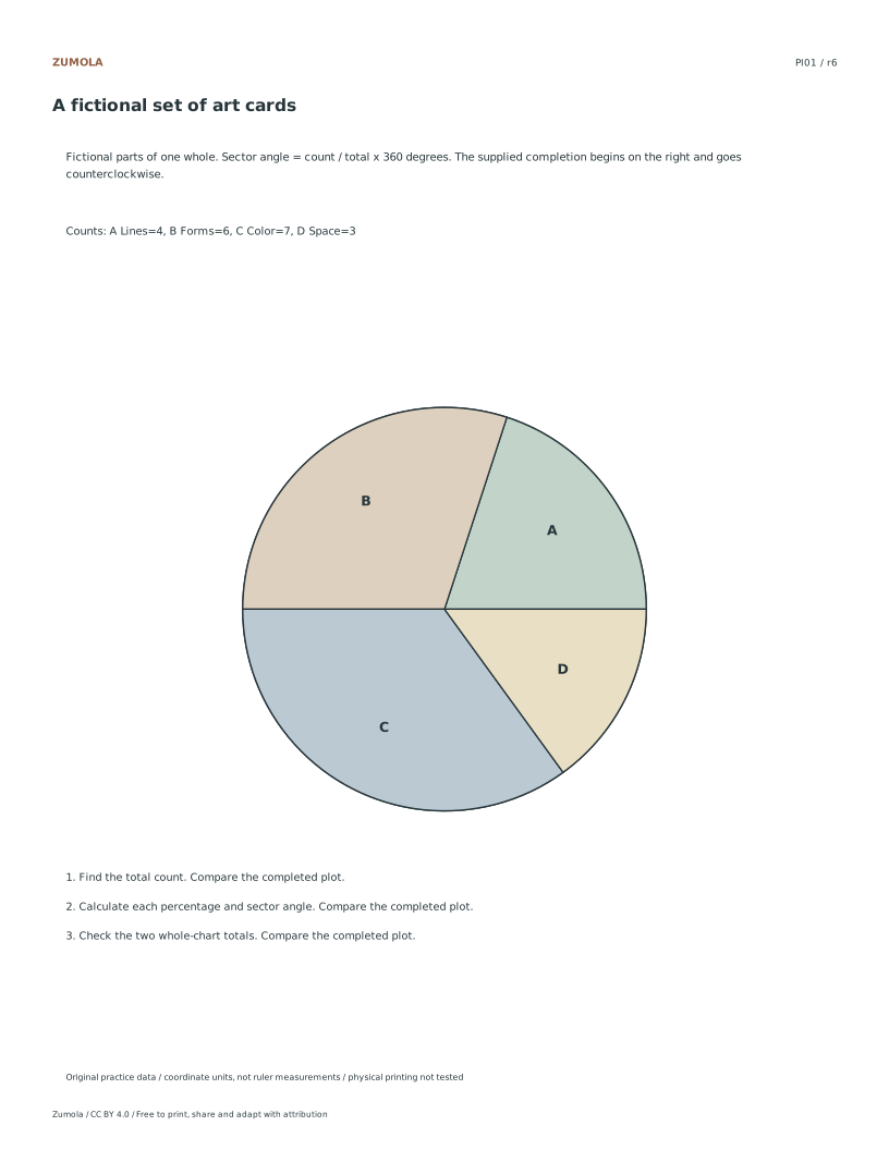
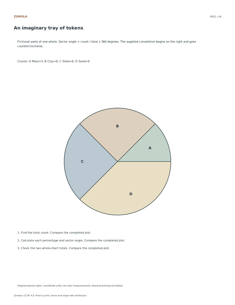
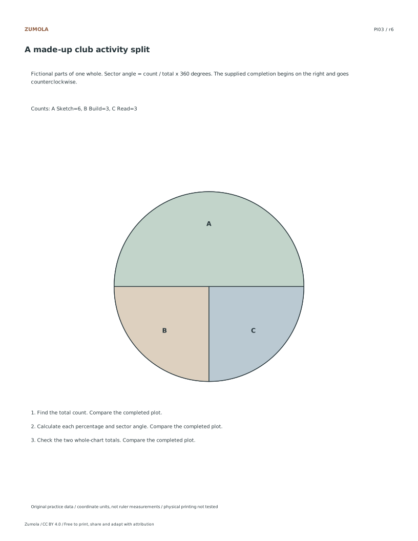
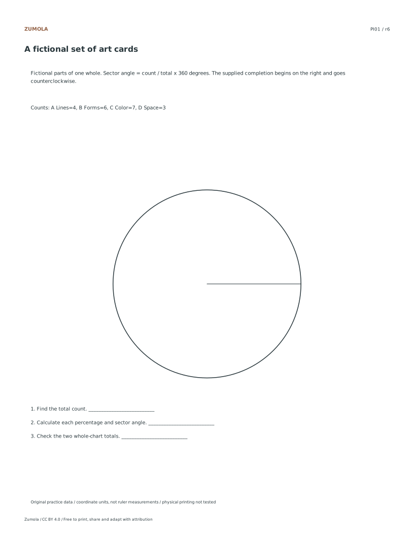
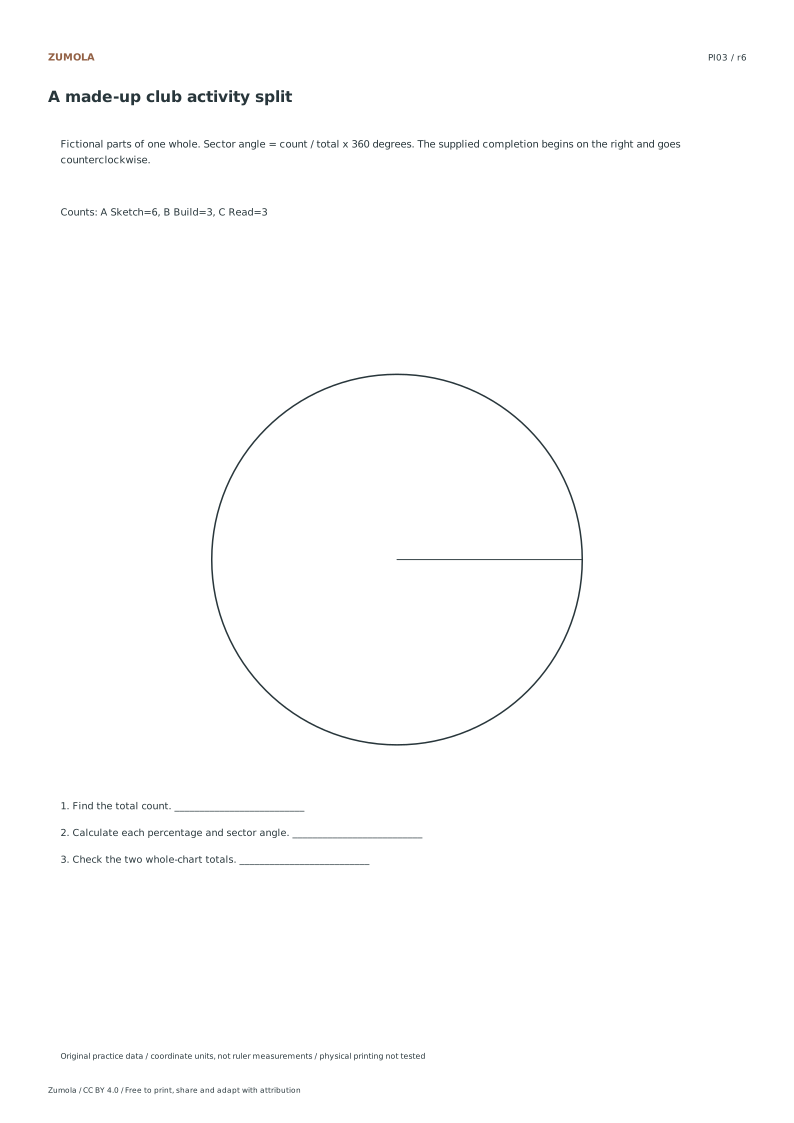
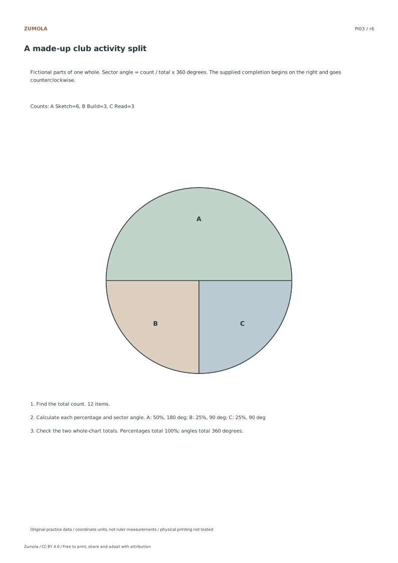
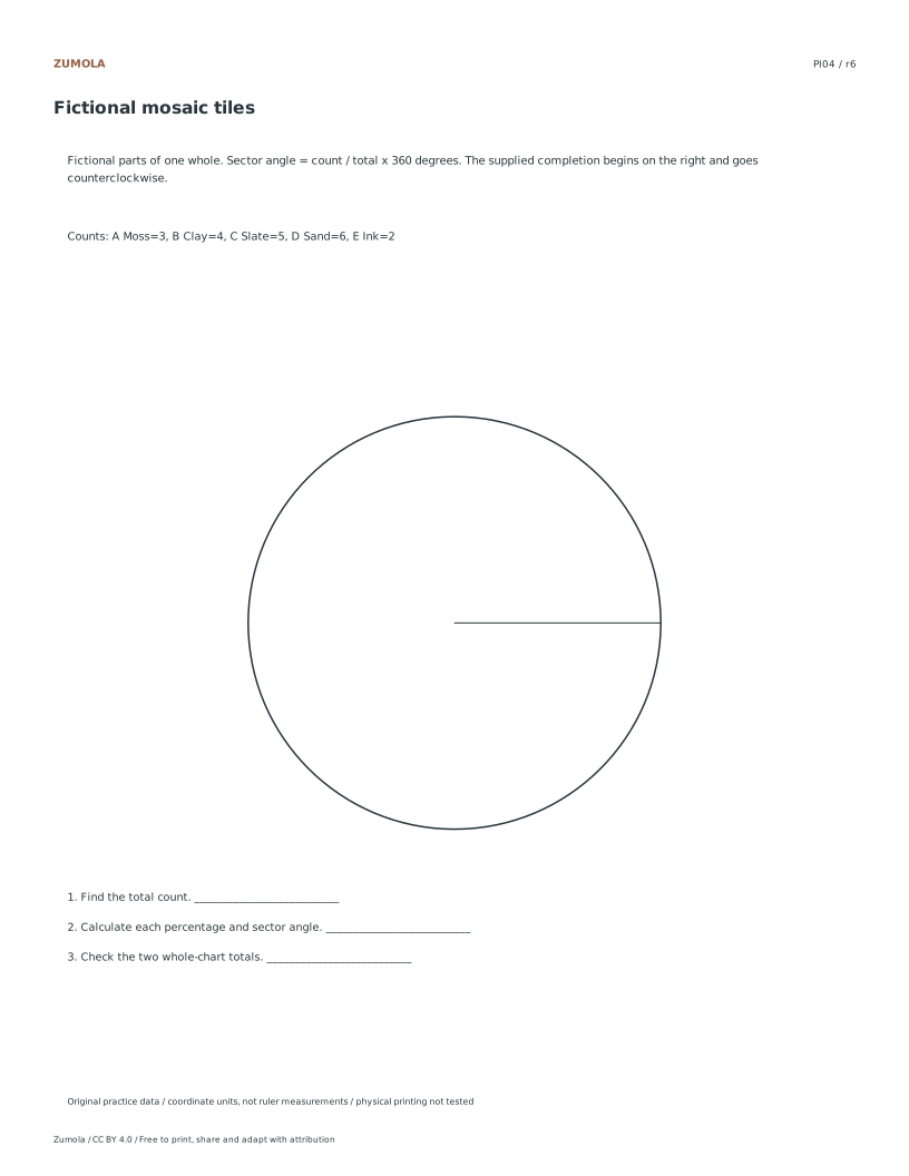
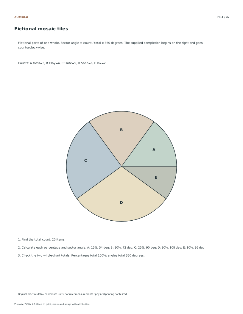
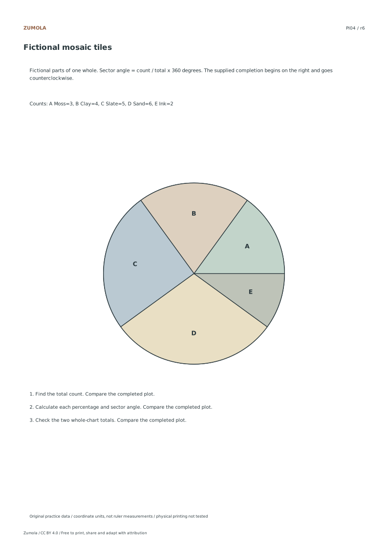
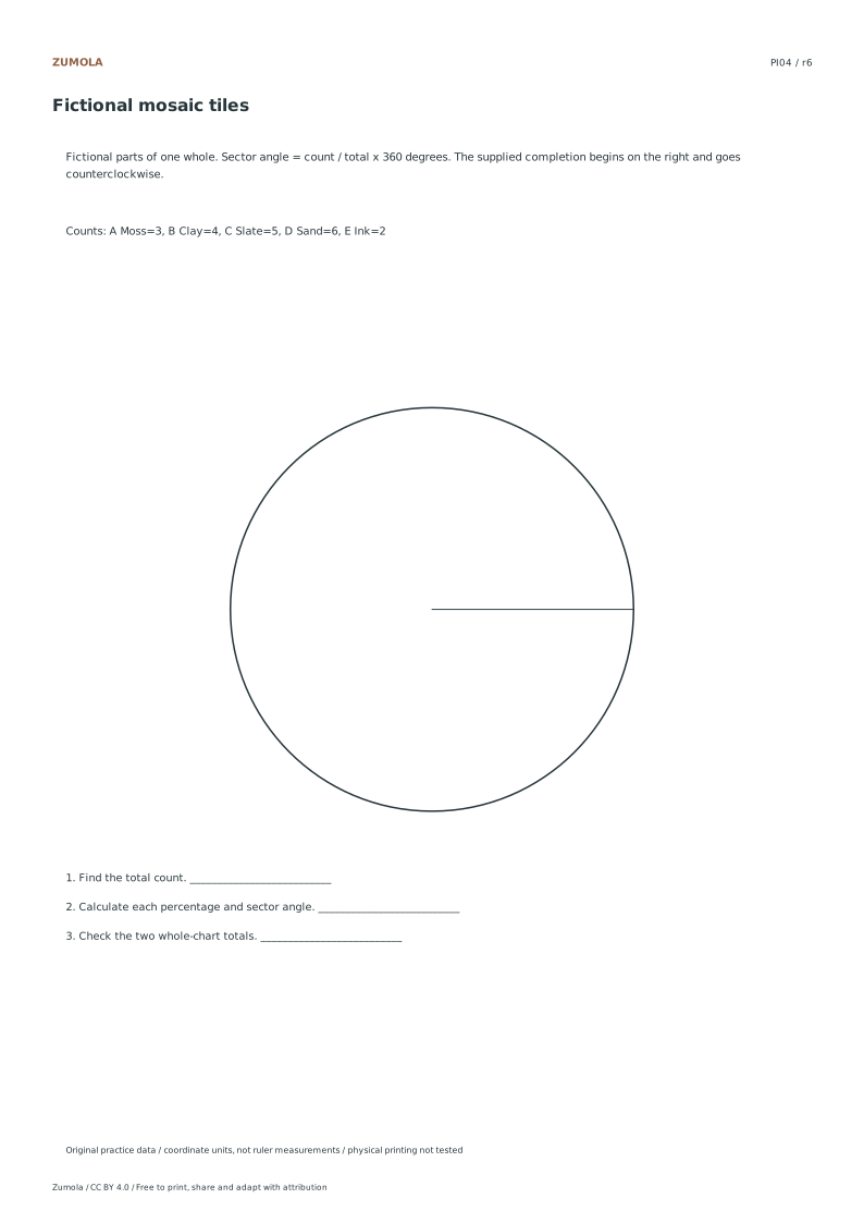
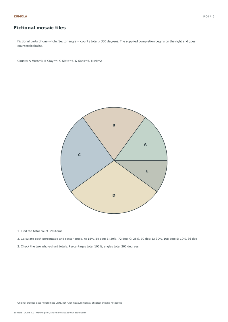
Convert four fictional category tables into percentages and sector angles. Label every slice and check that each complete chart accounts for the same whole.
4 part-of-whole tasks. Counts, percentages and angles.
A graph, a task and a worked check
Convert four fictional category tables into percentages and sector angles. Label every slice and check that each complete chart accounts for the same whole.
Use the student pack for an attempt, then compare the separate reference or worked answer. Every case is original. All PDF and editable SVG resources are free without signup; each collection pack repeats its individual sheets in the same order.
Choose your paper and download
Download paper size
Every worksheet and answer is free. No signup.
The complete collection
Keep practice and answers separate.
Use the student pack first, then compare the reference or answer. Packs are PDFs; individual sheets below also include editable SVG files. The paper choice applies to every download.
The examples and datasets are made for these worksheets. They are not measured classroom results, published textbook questions or evidence about real people. Axis values and the supplied data determine the answers; paper measurements do not replace those numbers.
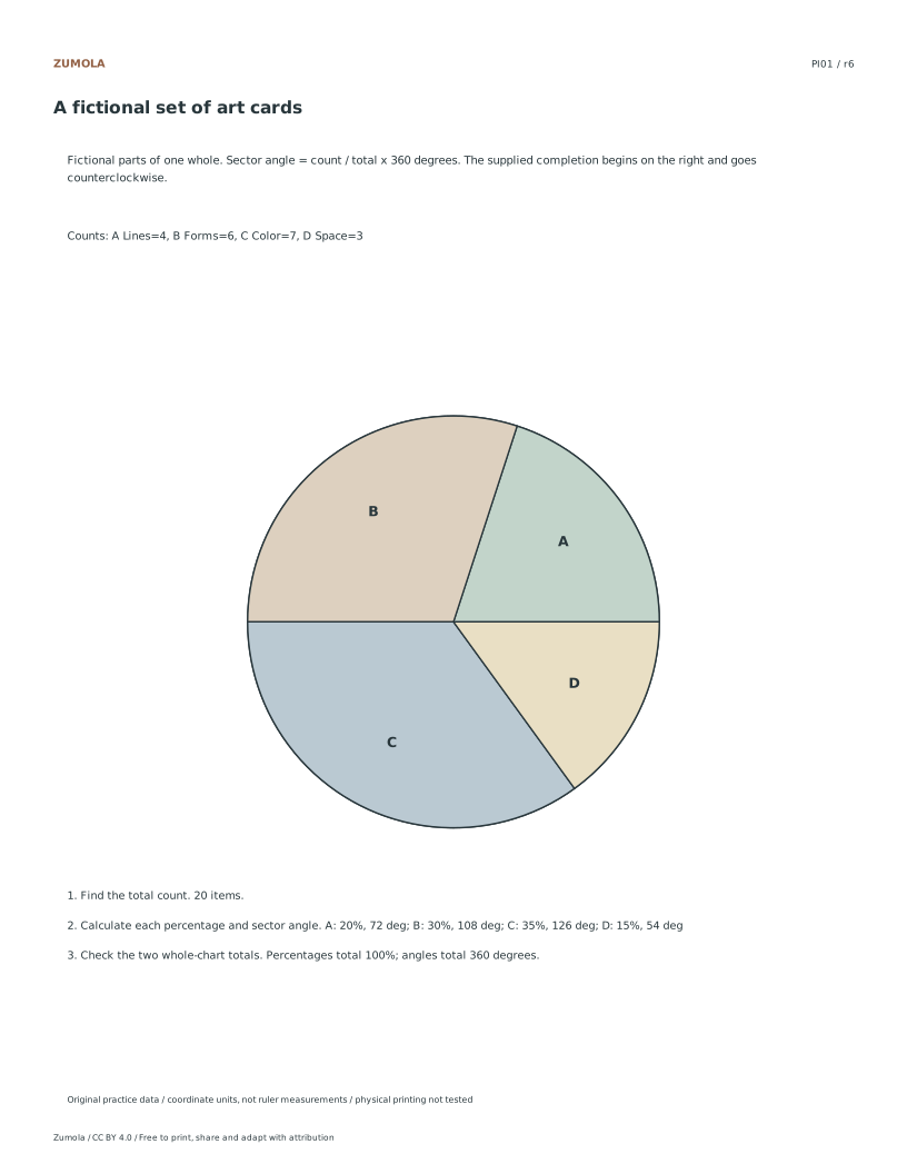
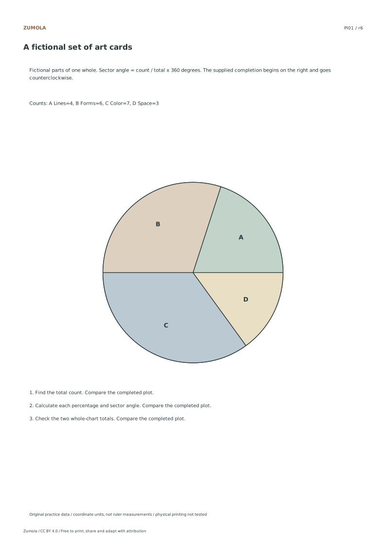
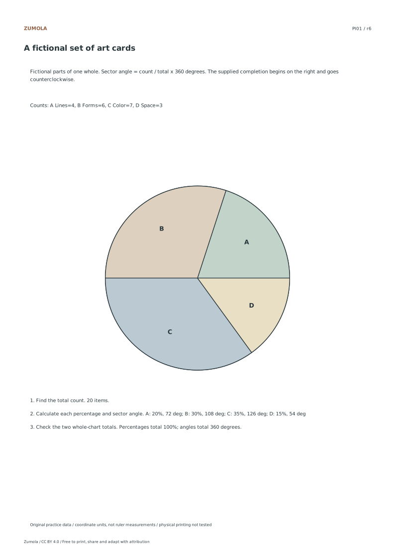
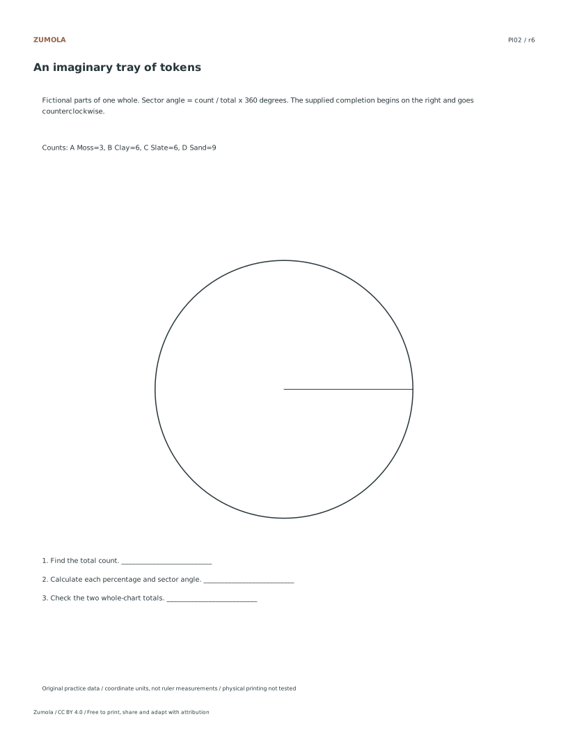
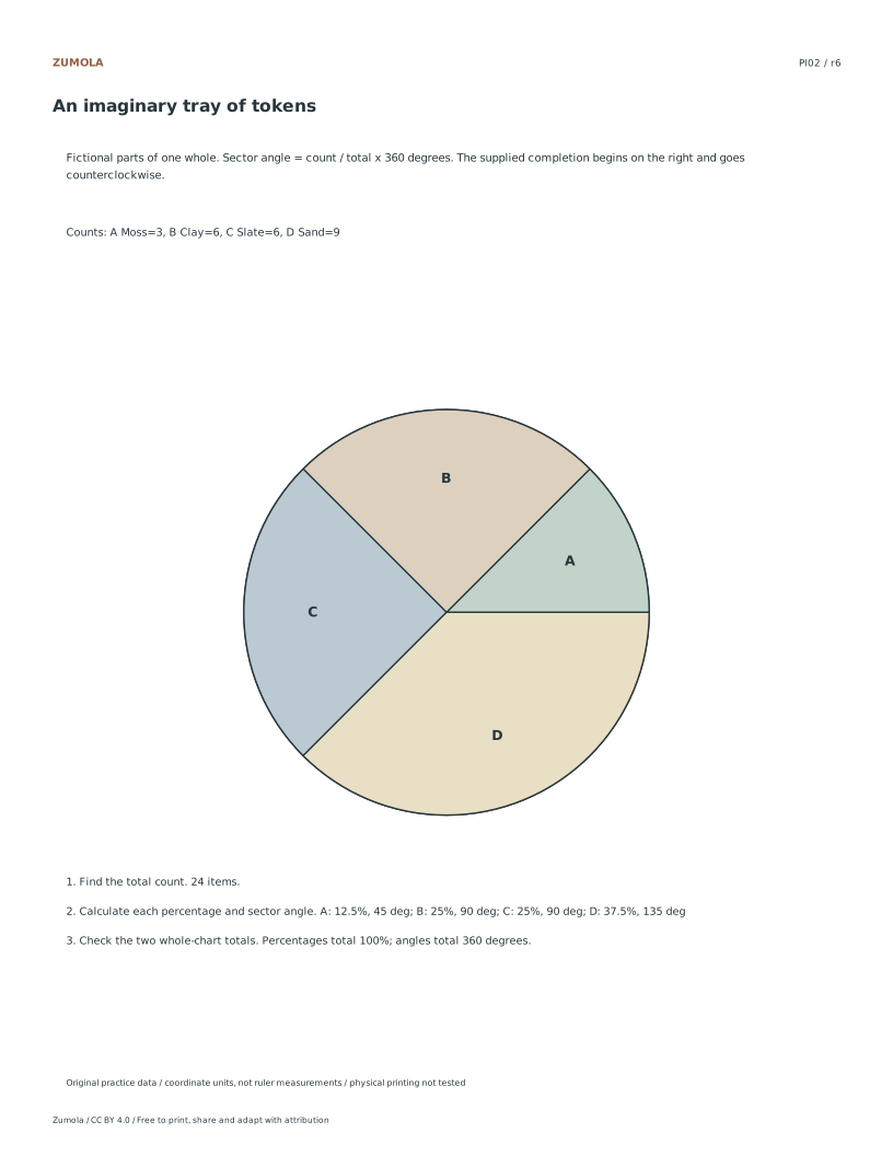
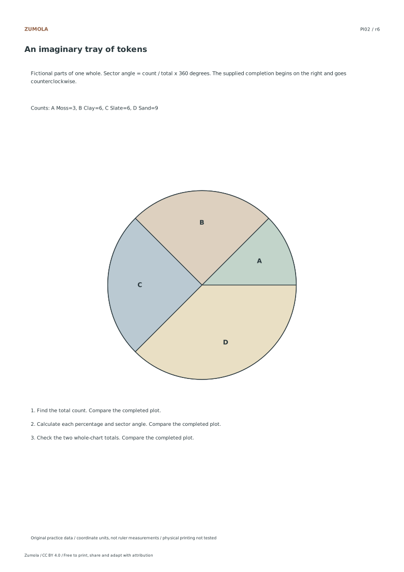
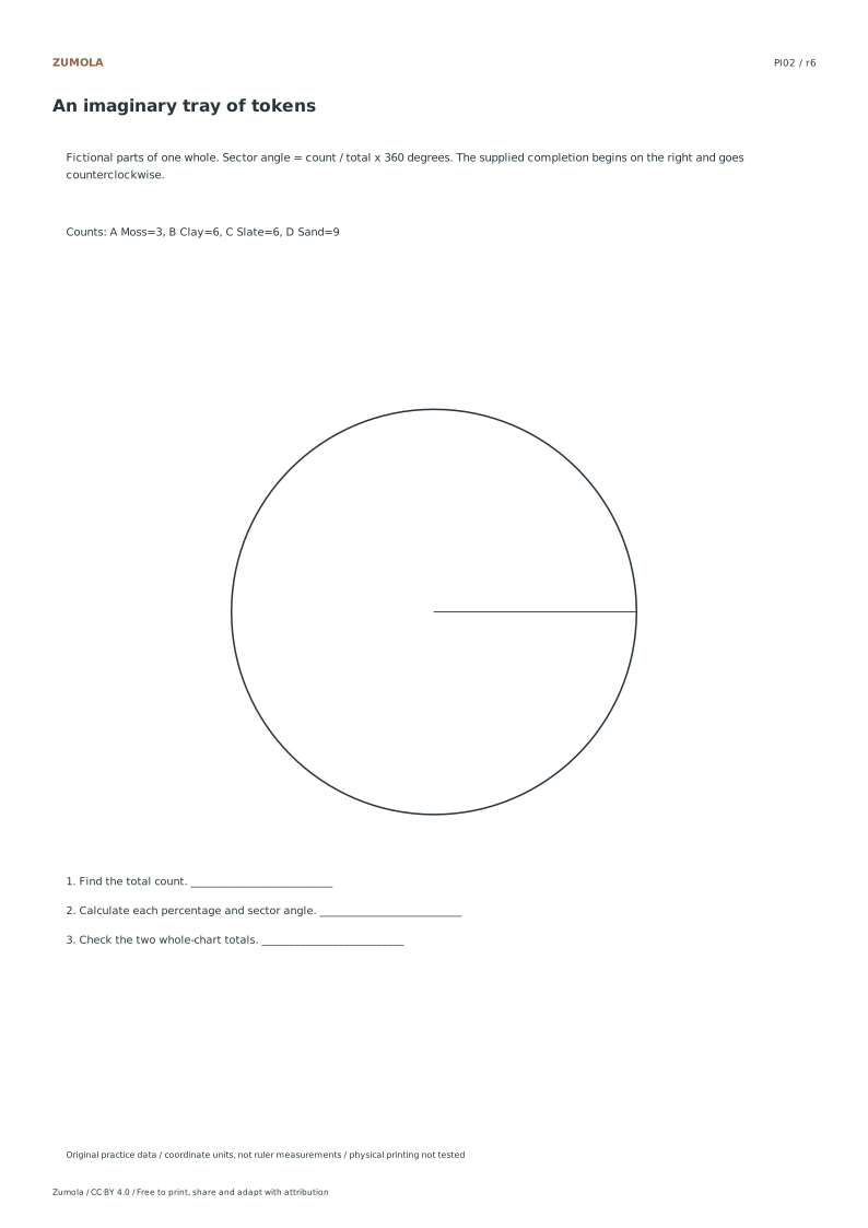
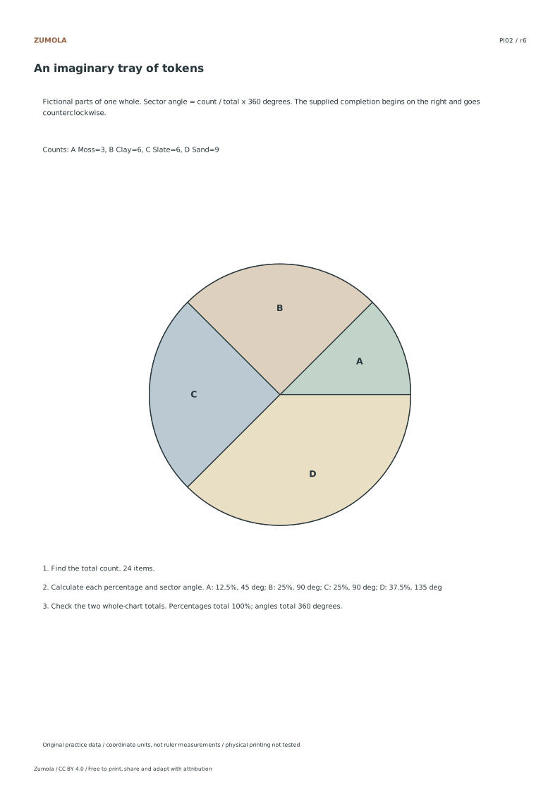
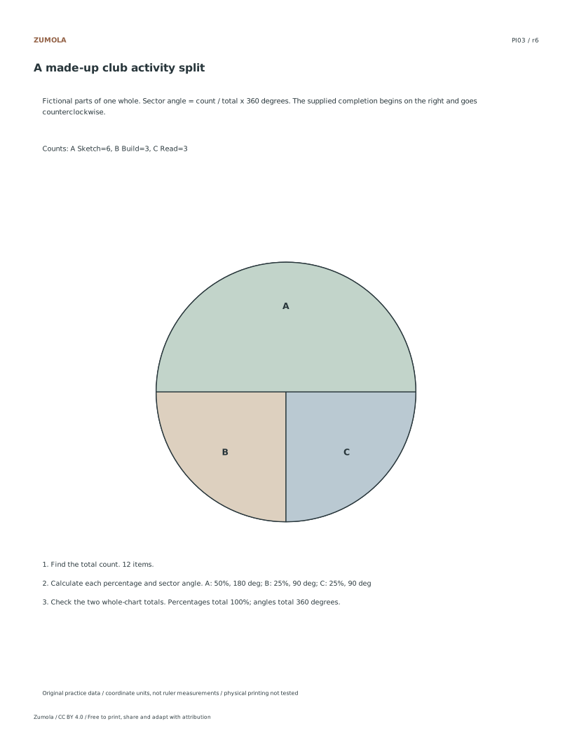
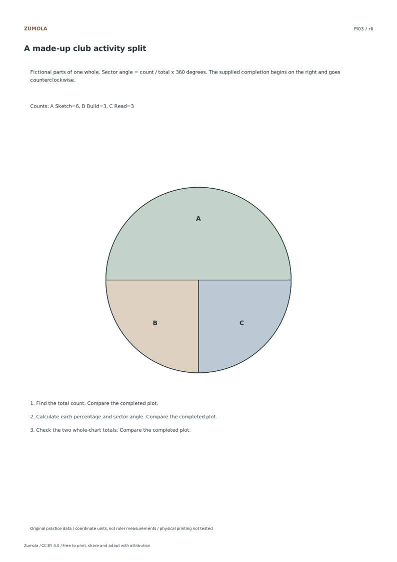
The table gives one worked case so you can check the method. The separate answer files contain the completed plots and results for every case. Another starting angle or category order can be valid when all proportions and labels agree.
Work through the graph
Calculating Sector Angles Precisely Begin by summing all category counts to establish the total dataset size. For each individual category, divide its specific count by this total sum. Multiply the resulting fraction by three hundred and sixty degrees to determine the exact sector angle. This method ensures geometric accuracy without relying on physical measurement tools. Since all provided examples yield integral sector angles, you can verify your calculations by checking for whole number results. Calculate first, then compare the drawn sectors with those values.
Determining Percentage Values To find the percentage for each category, divide the individual count by the total sum of all counts. Multiply this decimal result by one hundred to convert it into a percentage format. The fictional datasets provided are designed to produce exact finite percentages, meaning no rounding is necessary for the final answer. This precision allows for clear labeling on the chart. Ensure that the sum of all calculated percentages equals one hundred percent. This verification step confirms that no data points were omitted or double counted during the initial summation process.
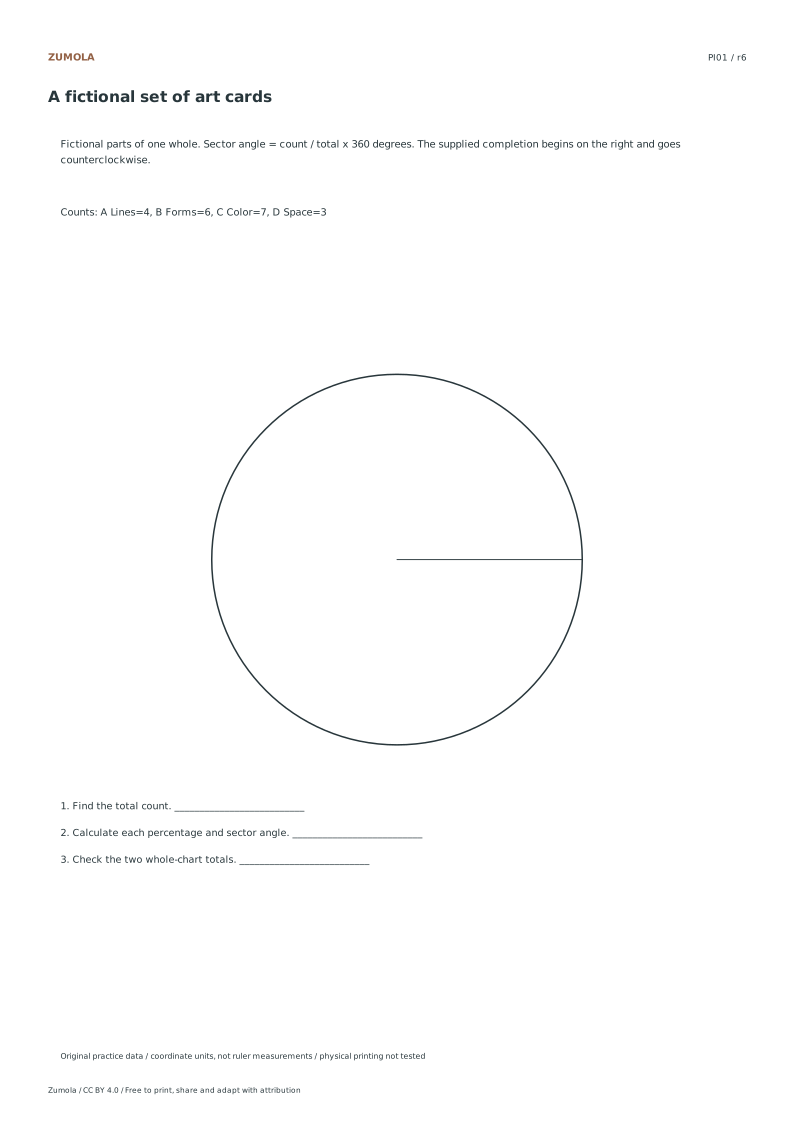
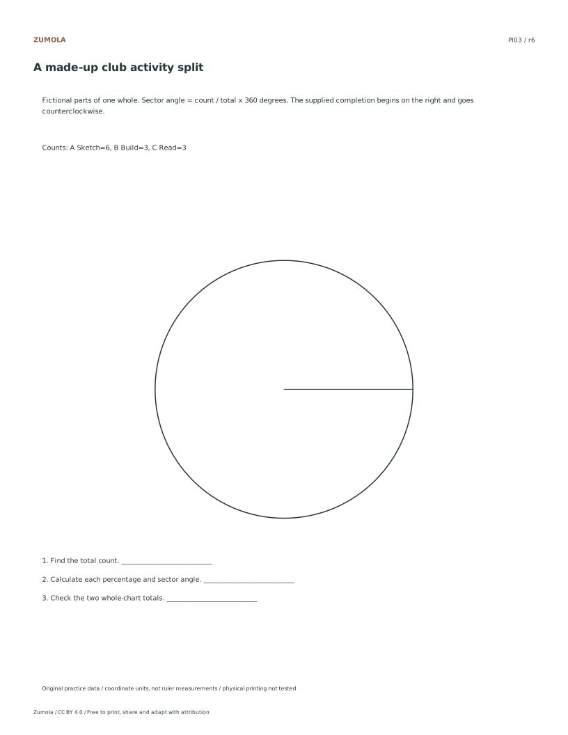
Label sectors so orientation stays clear Use the category letters A, B and so on from the data list. The reference begins at the right-hand radius and draws sectors counterclockwise, but another starting point can represent the same proportions. Calculate each angle before constructing it; a protractor can help transfer those angles to the student circle. Keep the letters in the completed slices and match them to the category list. This makes the chart usable without depending only on muted colors. The final category closes the circle; it is not added a second time.
Checks that catch common errors
Watch for
Check instead
Using physical ruler measurements to determine sector sizes.
Calculate angles digitally using the formula count divided by total times three hundred sixty degrees.
Adding a repeated closing category to the chart.
Ensure the chart contains only the distinct categories defined in the dataset without duplication.
Assuming overlapping categories exist in the data.
Verify that all categories are mutually exclusive with positive whole counts and no overlaps.
Keep the labels and margins readable
Choose the Letter or A4 file that matches your paper. Actual size / 100% preserves the designed layout; a different uniform print scale changes physical lengths but does not change the listed numbers or the arithmetic. Keep the whole chart and all labels inside the printable area. A ruler can help draw straight segments, but calculate from the stated numerical scale.
These files have digital geometry, arithmetic and page-boundary checks. Physical printer and classroom trials have not been completed. The resources are practice material, with no claim of curriculum certification or precision-instrument accuracy. The original files use CC BY 4.0: credit Zumola, link the license and indicate changes.
Useful answers
Must my first slice start at the right?
That is how the supplied completion is oriented. Another consistent starting direction or category order can be valid if proportions and labels remain correct.
Why do the angles need to add to 360 degrees?
All categories together represent one circle. Dividing each count by the same total and multiplying by 360 allocates exactly one full turn.
Can I use the chart in grayscale?
Each completed slice has a letter matched to the category list. Those letters identify the slices even when color differences are difficult to see.
Are the answer files and editable graphs free?
Yes. Reference, student and worked-answer files are all free without an account. Single sheets include PDF and SVG; collection packs are PDF files. Analytics consent is not required to download.
Optional Google Analytics helps us understand which free resources are useful. It is off until you allow it. Drawing tools and downloads work with either choice. Privacy details