Free original lessons
Red Bird Drawing: Red-Tone Shading and Wing Contrast
Learn to draw a perched red bird using layered red tones and clear breast-to-wing contrast, with a convention-based rubric that accepts valid stylistic variation.
Free lesson
Four exercises
Worked answers
Object Drawing Lessons
This lesson teaches a repeatable method for drawing a perched red bird whose body reads as red while the wing remains visibly distinct. You will define a simple red-tone convention, block the body and wing shapes, then shade in ordered passes so contrast survives at small size. The approach is species-neutral: it does not require a cardinal or any named bird, and it accepts different lettering and line styles. All measurements are hypothetical examples; measure your own paper and tools before relying on any number. Work in pencil first, then add red media, keeping the wing edge readable against the breast.
Practice materials: Printable downloads are not available for this lesson yet. Use the instructions and four exercises below.
Reference illustration
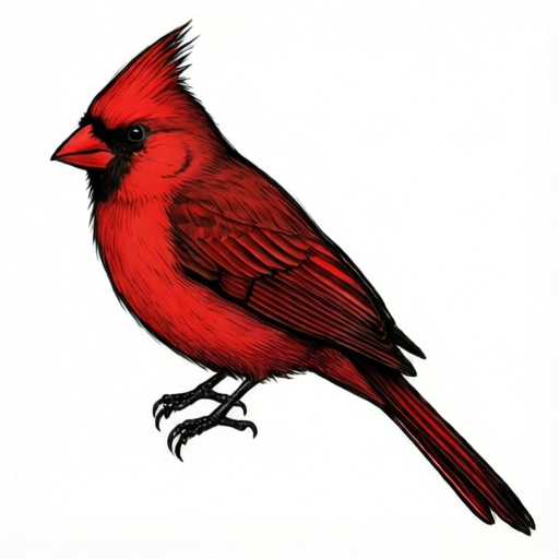
Use the stated measurements and conventions for each exercise.
Set a red-tone convention before shading
Choose three red values and name them: light red, mid red, and deep red. Assign each a fixed job so shading decisions stay consistent. A workable convention is light red for lit breast and head, mid red for the body's turning form, and deep red for the wing's shadow side and the breast-wing boundary. Write the three names on a scrap sheet and make a small swatch of each before touching the bird.
Contrast is a relationship, not a single color. The wing must differ from the breast in at least one visible way: value (lighter or darker), edge sharpness, or stroke direction. Decide which cue you will use and keep it constant. If you rely on value alone, the wing should be clearly darker or lighter than the adjacent breast at every point along the boundary.
- Make three labeled swatches: light red, mid red, deep red.
- Decide the wing cue: darker value, lighter value, sharper edge, or different stroke direction.
- Test the cue by placing a wing swatch beside a breast swatch and checking the difference at arm's length.
Block the perched pose and wing shape
Begin with a light outline: an oval body tilted slightly, a smaller head circle overlapping the top, a tail wedge below, and a wing shape folded against the side. Keep the wing outline separate from the body outline so the boundary can be adjusted later. The perch is a simple horizontal line or short cylinder under the feet; it exists only to anchor the pose.
Check proportions before shading. As a hypothetical example, if the body oval is 8 cm long, a head circle about 4 cm across and a wing covering roughly half the body length will read as a perched bird. These numbers are examples only; scale them to your paper. Confirm the feet sit on the perch line and the tail clears it.
- Draw the body oval, head circle, tail wedge, and perch line in pencil.
- Add the folded wing as a separate closed shape on the body's side.
- Adjust so the wing covers about half the body and the feet meet the perch.
Shade in ordered passes for red-tone depth
Shade in three passes, lightest first. Pass one: cover the whole bird in light red, leaving the eye and beak unshaded. Pass two: add mid red on the body's lower and rear areas and under the head, following the form. Pass three: place deep red only in the wing's shadow side and along the breast-wing boundary. Stop between passes and view the drawing at arm's length; if the wing and breast merge, strengthen the chosen cue before continuing.
Keep stroke direction purposeful. Strokes following the body's curve support roundness; strokes across the wing support flatness. Either is valid if applied consistently. Avoid blending everything into one tone, because the brief requires visible wing contrast, not a uniform red silhouette.
- Pass one: light red over the whole bird except eye and beak.
- Pass two: mid red on lower body, rear body, and under the head.
- Pass three: deep red on the wing shadow side and the breast-wing boundary.
- Check at arm's length and strengthen the wing cue if contrast is weak.
Refine edges and verify the contrast
Refine the wing edge last. If your cue is a sharp edge, keep the boundary crisp and the breast strokes softer. If your cue is value, confirm the wing is consistently darker or lighter along its whole length. Add the eye and beak in a dark neutral so they do not compete with the red tones. A small highlight on the head or breast is optional and should stay light red, not white, to preserve the red-tone scheme.
Final verification: squint at the drawing. The bird should still read as red, and the wing should remain distinguishable from the breast. If either fails, adjust the wing cue rather than adding new colors.
- Refine the wing edge according to your chosen cue.
- Add eye and beak in a dark neutral.
- Squint test: confirm red reads and wing contrast survives.
Worked example
A perched bird is drawn with an 8 cm body oval, a 4 cm head circle, and a wing covering about half the body. Light red covers the bird, mid red sits on the lower body, and deep red marks the wing shadow side. The wing edge is sharp while breast strokes are soft. Explain why this satisfies the brief.
Worked answer
The bird reads as red because all shading uses the three defined red values. The wing contrasts with the breast through both value (deep red shadow side) and edge sharpness (crisp wing edge versus soft breast strokes). The perched pose is anchored by the perch line, and the proportions are consistent with the hypothetical example. No named species is required, and the convention allows valid alternatives such as a lighter wing if applied consistently.
Four practice exercises
Exercise 1
A drawing uses light red on the breast and mid red on the wing, with soft edges on both. Does it meet the wing-contrast requirement? Explain.
Show answer and check
It can meet the requirement only if the value difference is clearly visible at arm's length. Light red versus mid red is a valid cue, but soft edges on both sides remove the edge cue, so the value difference must carry the contrast alone.
Why: The brief requires visible wing contrast, not a specific cue. A one-step value difference may be too subtle, so the drawer should test it and strengthen the wing value if the shapes merge.
Check: Squint at the drawing from about one meter; if the wing boundary disappears, the contrast is insufficient.
Exercise 2
A bird is shaded entirely in deep red, with the wing outlined in pencil but not shaded differently. Identify the problem and give one fix.
Show answer and check
The wing has no tonal or edge contrast because the whole bird is one value. Fix by reserving deep red for the wing shadow side and using light or mid red on the breast, or by sharpening the wing edge while softening breast strokes.
Why: Uniform deep red removes the value cue, and a pencil outline alone is too weak to satisfy visible contrast once red media is applied.
Check: Compare a breast swatch and a wing swatch side by side; they should differ in value, edge, or stroke direction.
Exercise 3
A perched bird has an 8 cm body oval and a 4 cm head circle. The wing covers about 6 cm of the body. Is the wing proportion plausible for a perched pose? Give a simple check.
Show answer and check
A 6 cm wing on an 8 cm body covers about three-quarters of the body, which is larger than the hypothetical half-body example. It can still be plausible, but check that the wing does not hide the tail or feet.
Why: The half-body figure is a hypothetical guide, not a rule. The real check is whether the perched pose remains readable and the wing shape stays separate from the body outline.
Check: Measure the wing length and body length on your paper; divide wing by body. If the result is near 0.75, confirm the tail and feet are still visible.
Exercise 4
A drawing uses a sharp wing edge and soft breast strokes, but the wing is the same mid red as the breast. Does the edge cue alone satisfy the brief? Justify with a check.
Show answer and check
The edge cue alone can satisfy the brief if the sharp boundary remains visible at arm's length. However, same-value shapes often merge when red media is applied, so the drawer should test and add a one-step value difference if needed.
Why: The rubric accepts edge sharpness as a valid contrast cue, but the contrast must survive viewing distance and media application.
Check: View at arm's length and squint; if the wing edge is still traceable, the cue works. If not, darken or lighten the wing by one defined red value.
Common mistakes
- Shading the whole bird in one red tone so the wing disappears into the breast. Use the three-value convention and reserve deep red for the wing shadow side and boundary.
- Drawing the wing outline merged with the body outline, leaving no adjustable boundary. Keep the wing as a separate closed shape until the final refinement pass.
- Adding white highlights that break the red-tone scheme. Use light red for highlights so all shading stays within the defined red values.
- Changing the wing cue midway, producing inconsistent contrast. Decide one cue before shading and apply it along the entire breast-wing boundary.
Self-check rubric
- Bird is clearly red and uses only the defined red-tone values for shading.
- Wing contrast against the breast is visible at arm's length through value, edge, or stroke direction.
- The chosen contrast cue is applied consistently along the whole breast-wing boundary.
- Perched pose is readable: body, head, tail, wing, and feet relate plausibly to the perch.
- Shading follows form in ordered passes rather than a single flat tone.
- Eye and beak use a dark neutral and do not compete with the red scheme.
- Valid alternatives, such as a lighter wing or different stroke direction, are accepted if consistent.
Questions and answers
Does the bird have to be a cardinal?
No. The brief excludes named species; any perched bird shape works if it is red with red-tone shading and visible wing contrast.
Can I use only two red values?
Yes, if the wing still differs from the breast by value, edge sharpness, or stroke direction. Three values make the contrast easier to control.
Are the centimeter examples required?
No. They are hypothetical examples; measure your own paper and scale the shapes to fit.
What if my wing is lighter than the breast?
That is valid. The rubric accepts either direction as long as the contrast is consistent and visible.