Free original resources
Handwriting Paper Printable: Baseline, Waistline and Ascender Ratios
Plan handwriting practice paper by setting baseline spacing, waistline height and ascender/descender proportions, then check line count per page before printing at 100%.
Free resources
Letter & A4
PDF & SVG
Letter & A4
PDF & SVG
Make it yours.
Free · no signup · calculated in your browser
Your free printable kit.
Original reference, student practice and separate worked answers. No account or payment.
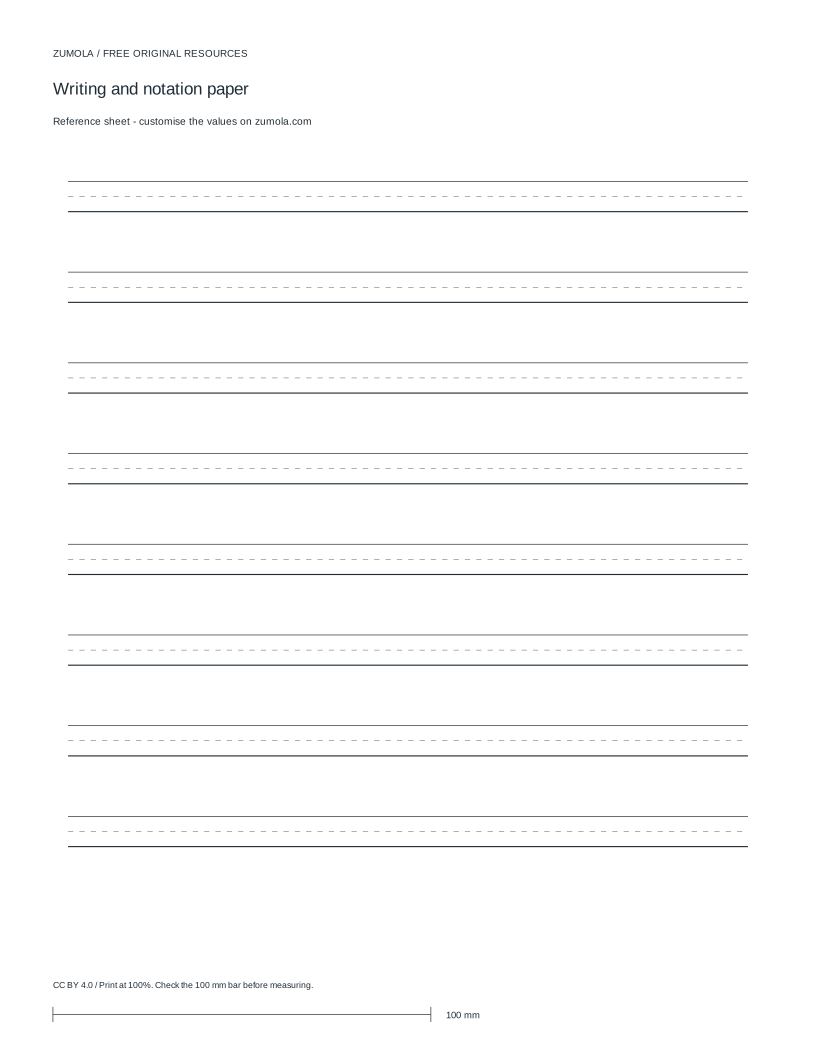
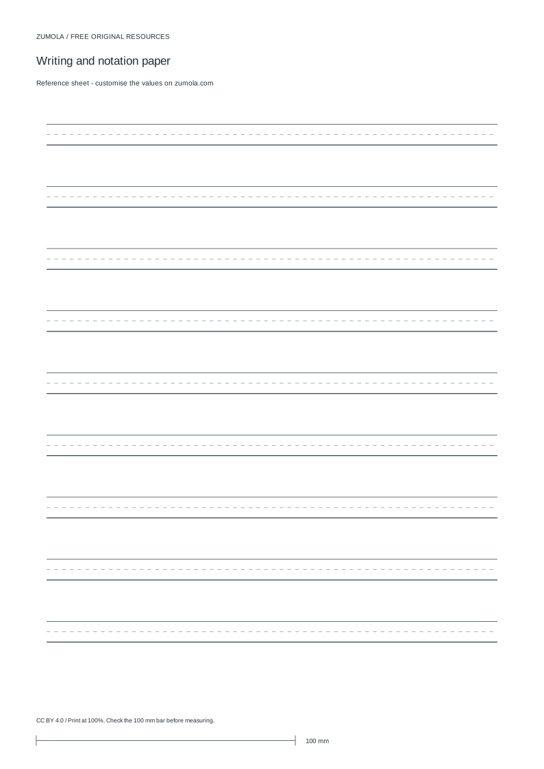
Practice worksheet
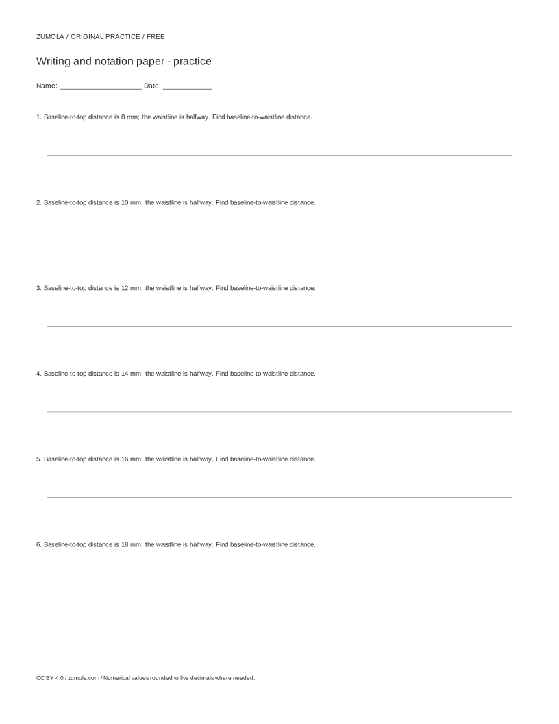
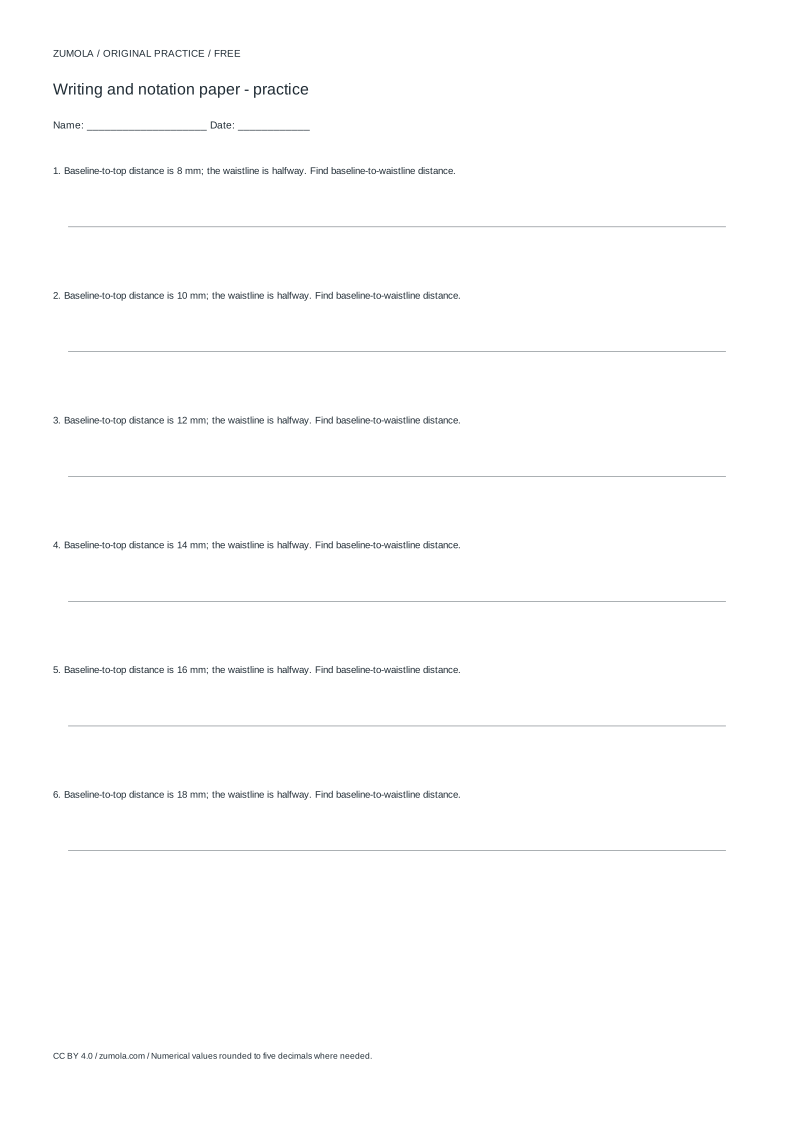
Worked answers / rubric
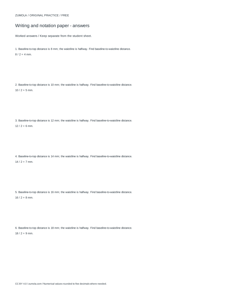
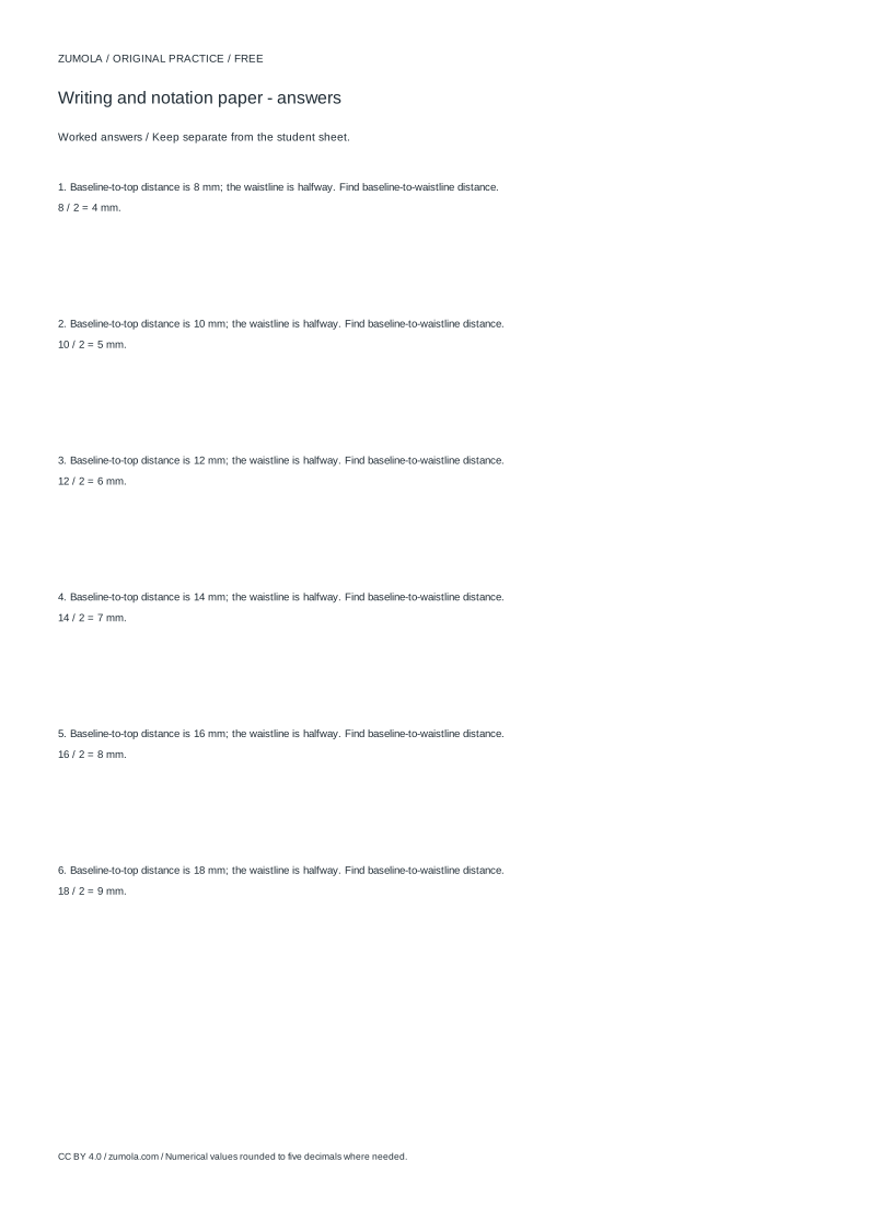
Print at Actual size / 100%. Check the calibration bar before using physical dimensions.
Handwriting paper works only when its lines describe a clear writing zone. This page explains how to plan a printable sheet around three measurements: the distance between baselines, the height of the waistline above each baseline, and the space reserved for ascenders and descenders. You will also learn how to check that the layout fits the page and how to judge practice sheets with a rubric rather than a single correct answer.
Define the writing zone before choosing line spacing
A handwriting line is not one line but a small stack of reference lines. The baseline is where most lowercase letters sit. The waistline (often called the midline) marks the top of short letters such as a, c, e, m, n, o, r, s, u, v, w, x and z. Above the waistline, ascenders reach toward a top line: b, d, f, h, k, l and t. Below the baseline, descenders drop toward a bottom line: g, j, p, q and y.
The ratio between these zones matters more than the absolute size. A common beginner arrangement gives the waistline roughly half the ascender height, so the x-height zone and the ascender zone are close to equal. If the waistline sits too low, short letters look cramped; if it sits too high, ascenders have nowhere to go and learners compress them. Decide the ratio first, then scale the whole stack up or down for the writer's age and comfort.
Keep the baseline spacing consistent across the sheet. Uneven gaps force the writer to re-measure every line and hide whether letter height is actually controlled. A single repeated spacing value also makes it easy to count how many writing lines fit on one page.
- Choose the baseline-to-baseline spacing in millimetres.
- Set the waistline height as a fraction of that spacing, for example one half.
- Reserve the remaining upper space for ascenders and the lower space for descenders.
- Repeat the same stack for every writing line on the sheet.
- Check the total height against the printable area before printing.
Check margins, line count and page capacity
Margins protect the writing zone from the printer's non-printable edge and give the hand a resting reference. A margin of about 18 millimetres on each side is a reasonable starting point for a practice sheet, but the important step is arithmetic: subtract the left and right margins from the paper width to get the usable writing width, and subtract the top and bottom margins from the paper height to get the usable writing height.
Then divide the usable height by the baseline spacing. If the usable height is 240 millimetres and the spacing is 8 millimetres, the sheet holds 30 line intervals. Because each interval is one writing line, that is 30 writing lines, minus any space you reserve for a name, date or heading. Round down rather than up; a partial line at the bottom is worse than one fewer line.
Width deserves the same check. A cue space at the left, for example 48 millimetres for a model letter or a starting point, reduces the space available for independent writing. Subtract it from the usable width and confirm the remaining writing width is comfortable for the intended word length. A summary strip at the top or bottom also consumes vertical space and must be counted.
- Measure the paper width and height in millimetres.
- Subtract left and right margins to find usable width.
- Subtract top and bottom margins to find usable height.
- Divide usable height by baseline spacing and round down.
- Subtract any cue or summary space, then recheck the line count.
Plan original practice content, not copied models
A blank layout is the foundation, but the practice content should be original. Write your own short model strings: repeated letter patterns, simple words, or a sentence that uses the target letters. Keep each model short enough to fit the cue space and the writing width you calculated.
Match the content to the zone being practised. If the goal is ascender control, include words with b, d, h, k and l. If descenders are the focus, use g, j, p, q and y. If the waistline is the focus, use short letters only. Mixing every letter type on a beginner sheet makes it hard to see which zone the writer is struggling with.
Slant is a separate decision. A slight forward slant, around 55 degrees from horizontal in schematic terms, suits many cursive styles, but young beginners often do better with upright letters first. Whatever you choose, keep it consistent so the writer is not adjusting posture between lines.
- Write original model strings that target one zone at a time.
- Check each model fits the cue space and writing width.
- Decide on upright or slanted guides and keep the choice consistent.
- Leave enough blank lines for independent repetition.
Print at 100% and verify with a calibration bar
Screen measurements do not transfer to paper automatically. Print a calibration bar first and measure it with a ruler. If the bar measures the intended length, print the practice sheet at 100% scale with any fit-to-page option disabled. If it does not, adjust the print scale before producing a full sheet.
After printing, check the actual baseline spacing with a ruler rather than trusting the screen. Confirm the waistline sits where you intended and that the margins leave the writing zone clear of the printer's edge. A sheet that looks correct on screen but prints compressed will teach the wrong letter proportions.
- Print a calibration bar and measure it with a ruler.
- Set the print scale to 100% and disable fit-to-page.
- Measure the printed baseline spacing and waistline height.
- Reprint only after the measurements match the plan.
Judge practice sheets with a rubric
Handwriting layout has many valid outcomes, so there is no single correct sheet. Use a rubric to evaluate whether a layout does its job: consistent spacing, a clear waistline, adequate ascender and descender space, sensible margins, a line count that fits the page, and practice content that targets the intended zone. A sheet can be plain and still score well if these criteria are met.
- Score spacing consistency.
- Score waistline clarity and ratio.
- Score ascender and descender space.
- Score margin and line-count accuracy.
- Score relevance of the original practice content.
Try this example
Plan a practice sheet on A4 paper measuring 210 by 297 millimetres, with 18 millimetre margins on all sides, 8 millimetre baseline spacing, a waistline at half the spacing, and a 40 millimetre summary strip at the top. How many writing lines fit?
Show the worked explanation
Usable width is 210 minus 18 minus 18, which equals 174 millimetres. Usable height is 297 minus 18 minus 18, which equals 261 millimetres. Subtract the 40 millimetre summary strip to get 221 millimetres. Divide 221 by 8, which equals 27.625, so round down to 27 writing lines. The waistline sits 4 millimetres above each baseline because half of 8 is 4.
Common mistakes
- Setting the waistline at an arbitrary height without relating it to the baseline spacing. Express the waistline as a fraction of the baseline spacing, such as one half, and apply the same fraction to every line.
- Counting lines from the paper height without subtracting margins and heading space. Subtract top and bottom margins and any name or summary strip first, then divide by spacing and round down.
- Printing without checking scale, so the printed spacing differs from the planned spacing. Print a calibration bar, measure it, set 100% scale, and measure the printed baseline spacing before using the sheet.
Check your work
- Baseline spacing is identical on every writing line.
- Waistline height is a stated fraction of the baseline spacing and is applied consistently.
- Ascender and descender zones are visibly reserved above and below the writing zone.
- Margins are subtracted before the line count is calculated, and the count is rounded down.
- Practice content is original and targets the specific letter zone being practised.
- Printed output is checked against a calibration bar at 100% scale.
Questions before you start
What is the difference between the baseline and the waistline?
The baseline is where most lowercase letters rest. The waistline is the line above it that marks the top of short letters such as a, c, e and m. Ascenders rise above the waistline; descenders fall below the baseline.
How many writing lines fit on one page?
Subtract the top and bottom margins and any heading space from the paper height, divide by the baseline spacing, and round down. For example, 240 millimetres of usable height at 8 millimetres spacing gives 30 lines.
Should beginners use slanted or upright guides?
Either can work. Upright guides are often simpler for young beginners, while a slight forward slant suits some cursive styles. Keep the choice consistent across the sheet so the writer is not adjusting between lines.