Bar graph worksheets. Make category counts visible.
Use equal-width, separated bars to compare four or five categories. Calculate totals and count gaps, including a case with two categories tied for the largest value.
4 category-count tables. Separate bars; zero baseline.
A graph, a task and a worked check
Use equal-width, separated bars to compare four or five categories. Calculate totals and count gaps, including a case with two categories tied for the largest value.
Use the student pack for an attempt, then compare the separate reference or worked answer. Every case is original. All PDF and editable SVG resources are free without signup; each collection pack repeats its individual sheets in the same order.
Choose your paper and download
Download paper size
Every worksheet and answer is free. No signup.
The complete collection
Keep practice and answers separate.
Use the student pack first, then compare the reference or answer. Packs are PDFs; individual sheets below also include editable SVG files. The paper choice applies to every download.
The examples and datasets are made for these worksheets. They are not measured classroom results, published textbook questions or evidence about real people. Axis values and the supplied data determine the answers; paper measurements do not replace those numbers.
Check the first case
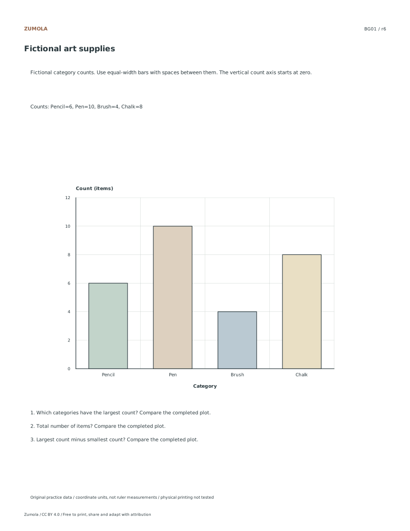
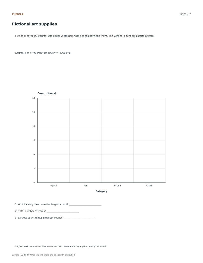
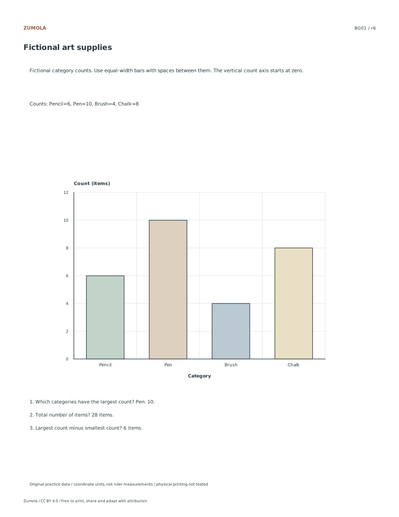
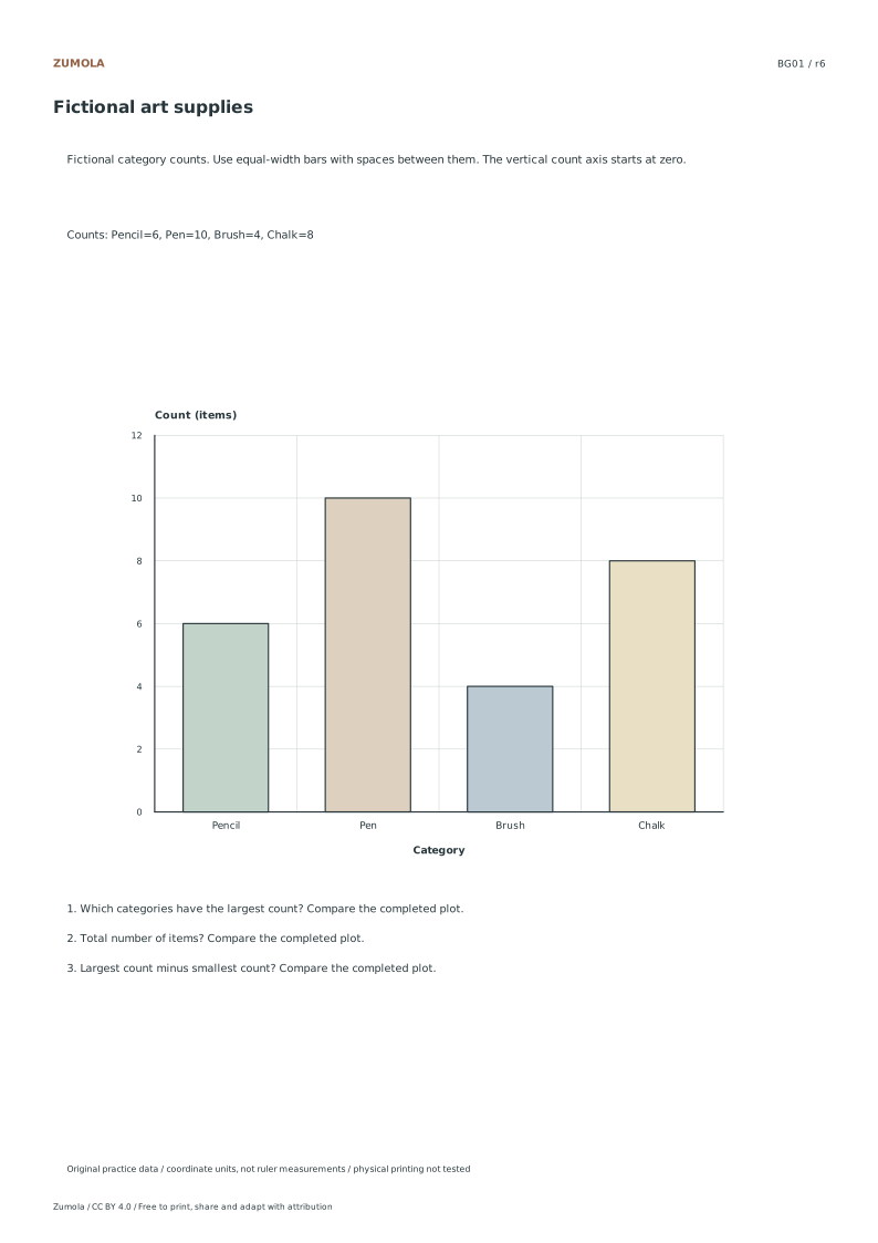
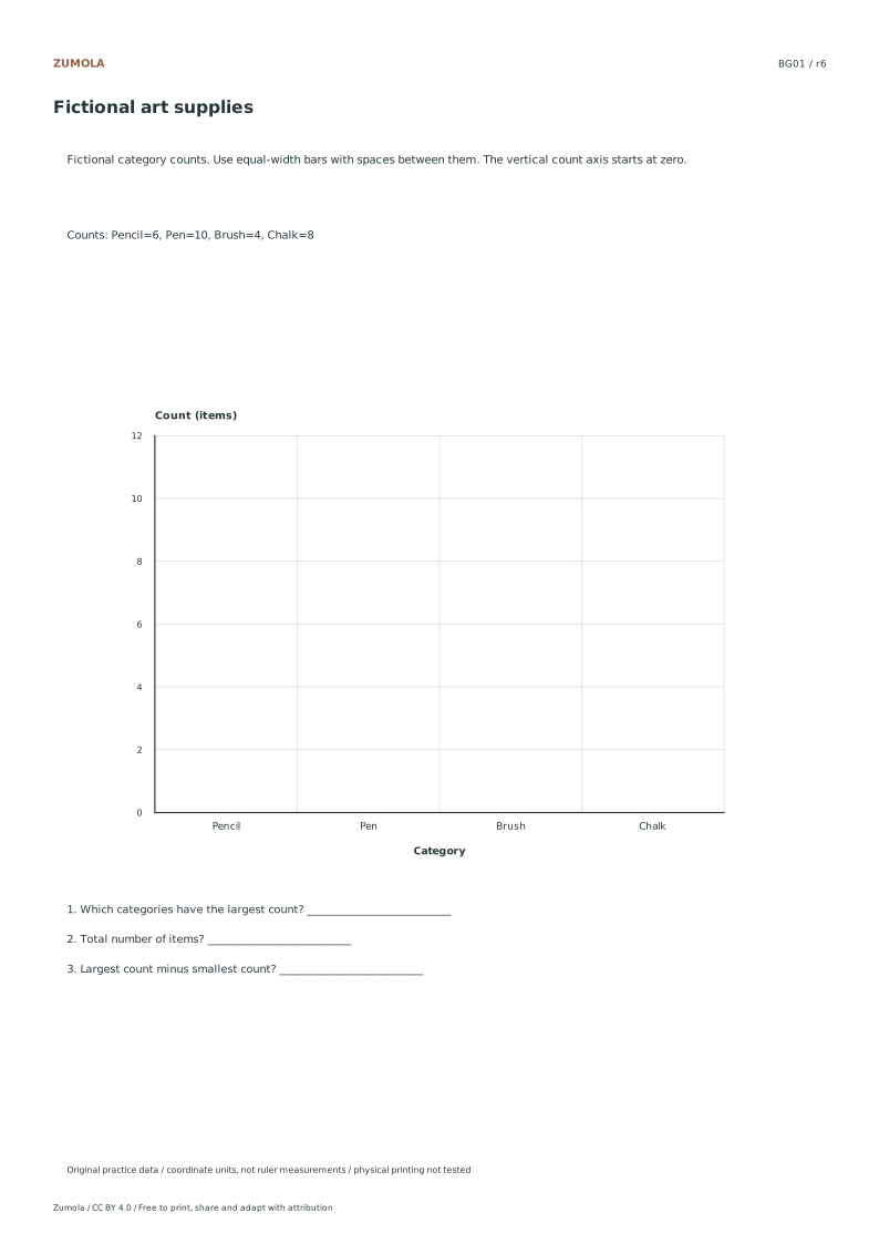
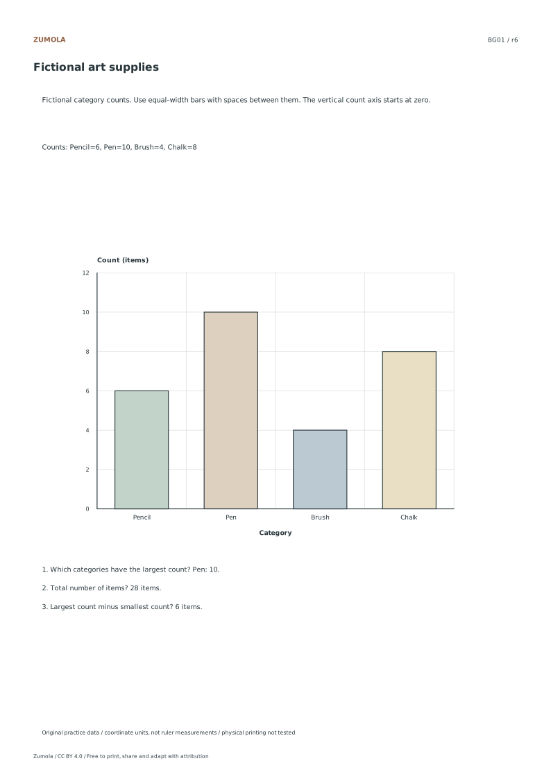
BG01: Fictional art supplies
Check
Worked result
1
Pen: 10.
2
28 items.
3
6 items.
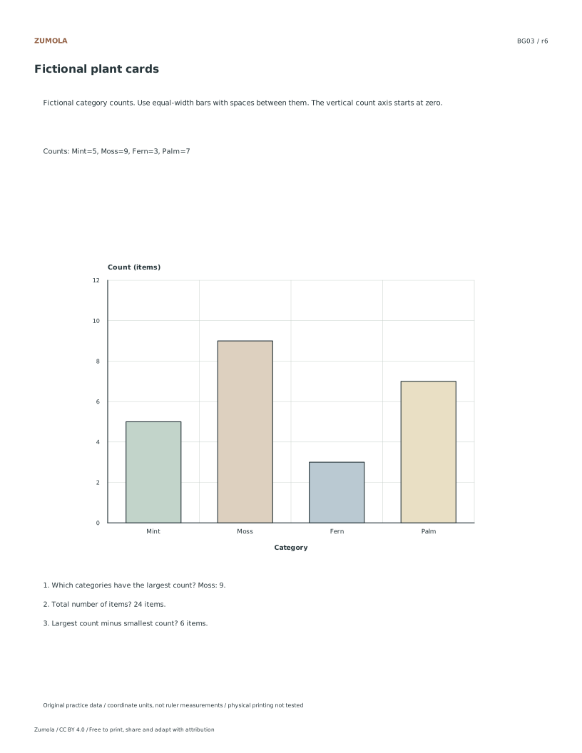
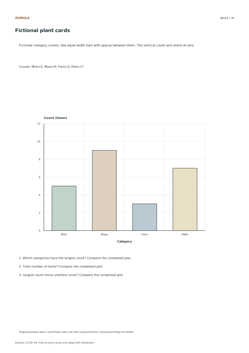
The table gives one worked case so you can check the method. The separate answer files contain the completed plots and results for every case. Keep the count scale and equal bar widths consistent, and include every tied maximum.
Work through the graph
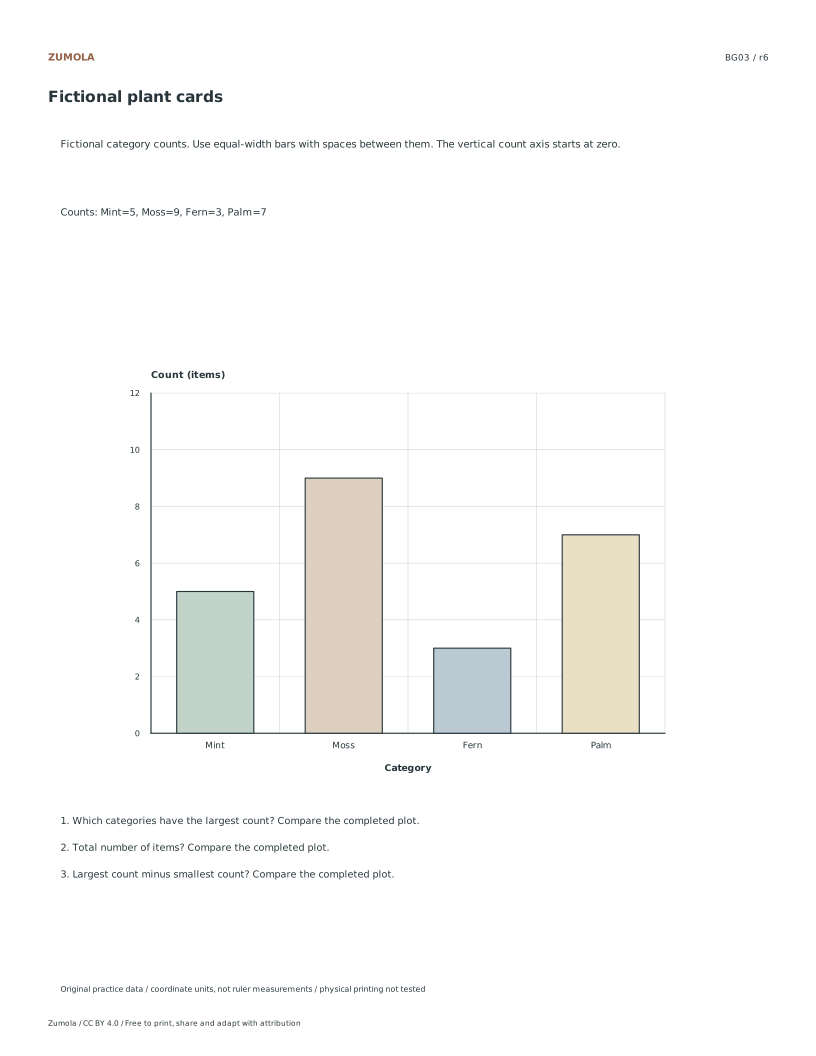
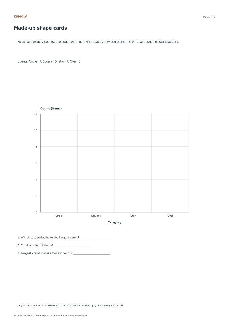
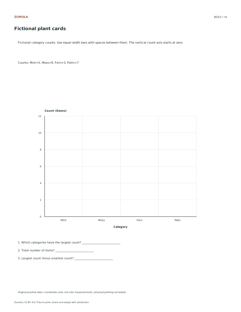
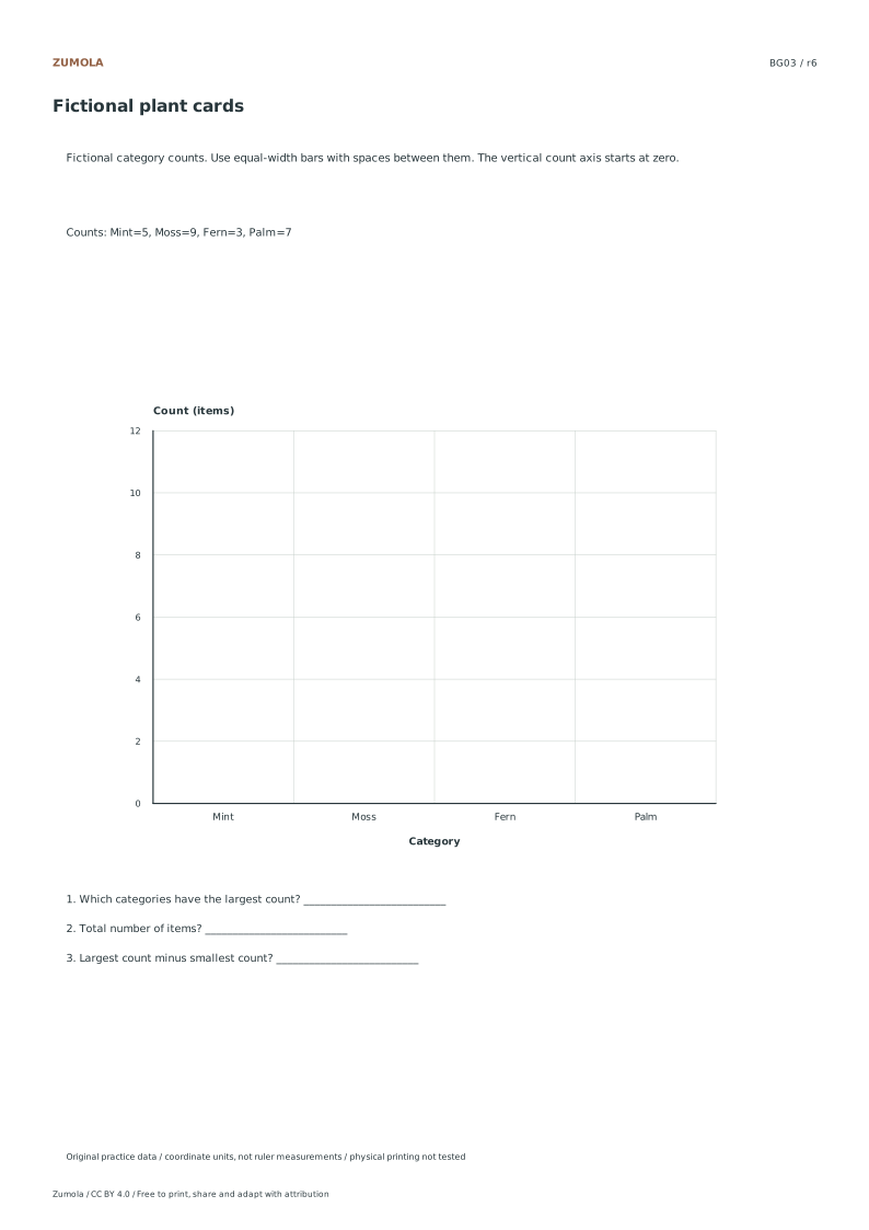
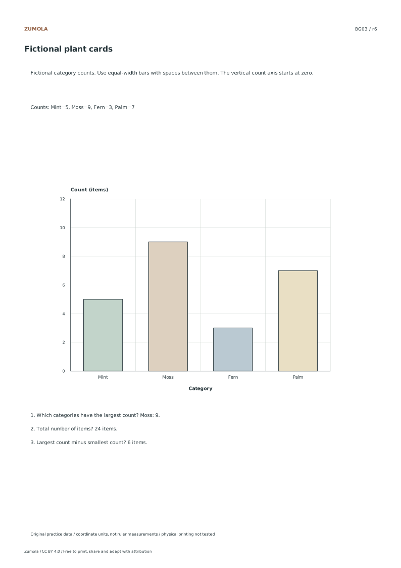
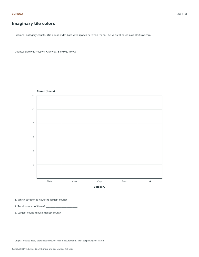
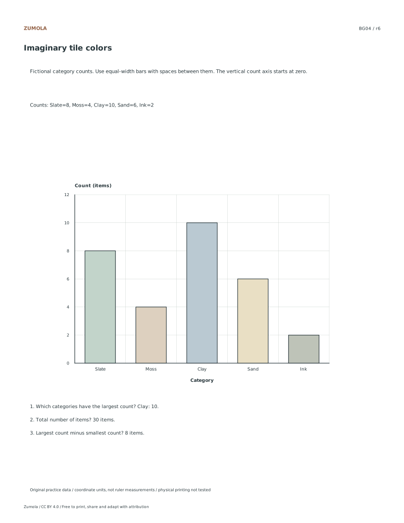
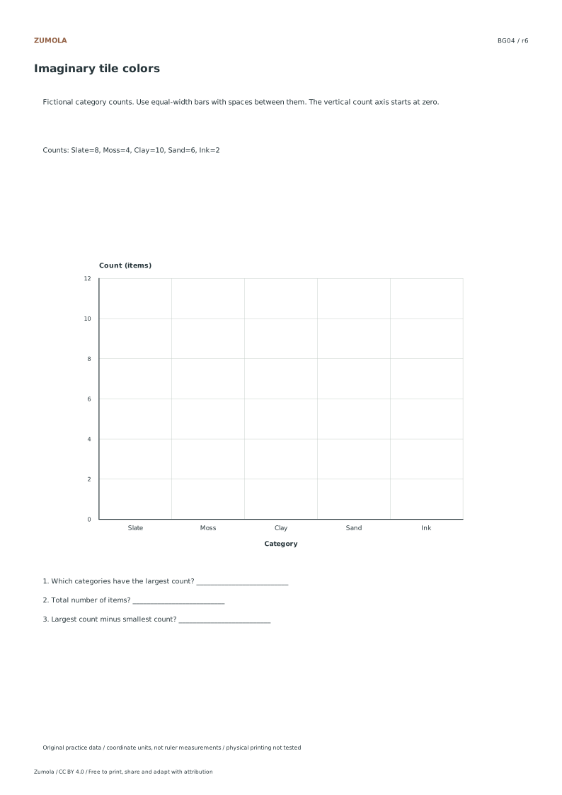
Read the category scale before drawing Choose one of the four count tables. The student graph already labels the categories and marks the vertical count axis from 0 to 12 in steps of two. A count of five belongs halfway between four and six, rather than on the fifth labeled tick. Use the same width for every bar and preserve gaps between categories. The counts are fictional practice values, so there is no survey sample or real population to infer. Read the table, construct the bars and keep the axes intact before calculating comparisons.
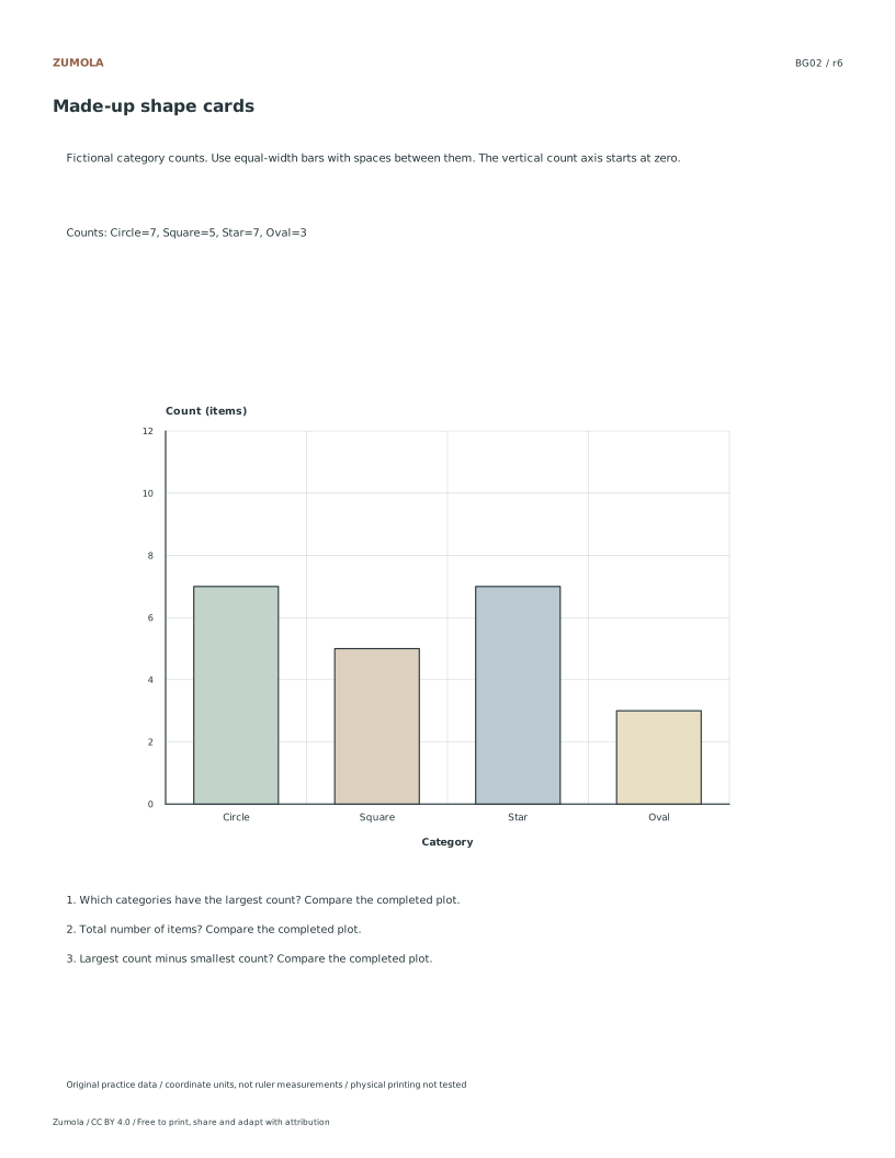
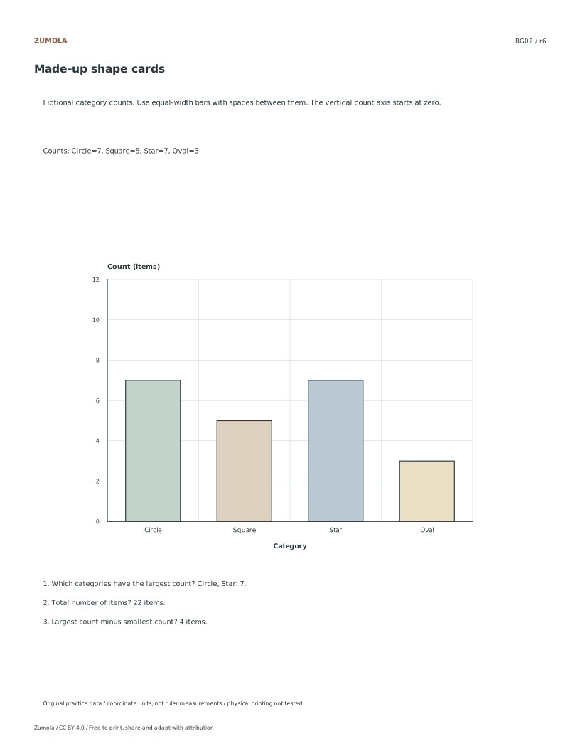
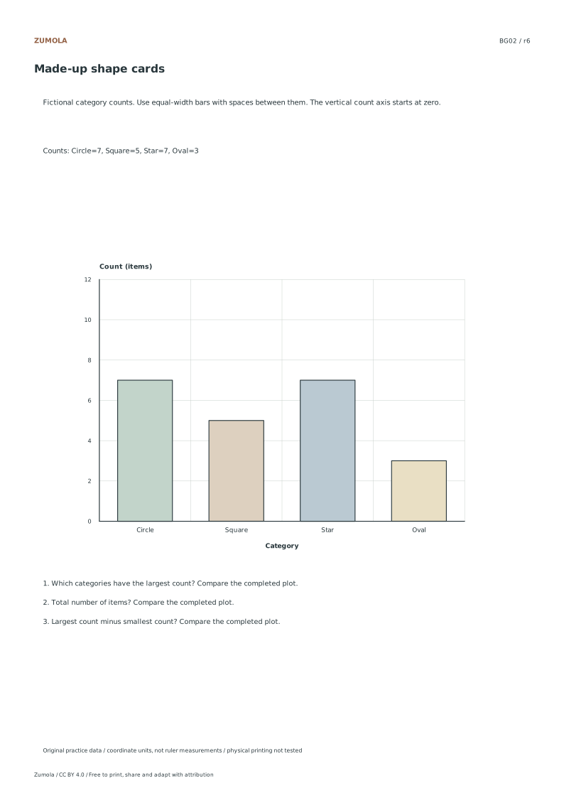
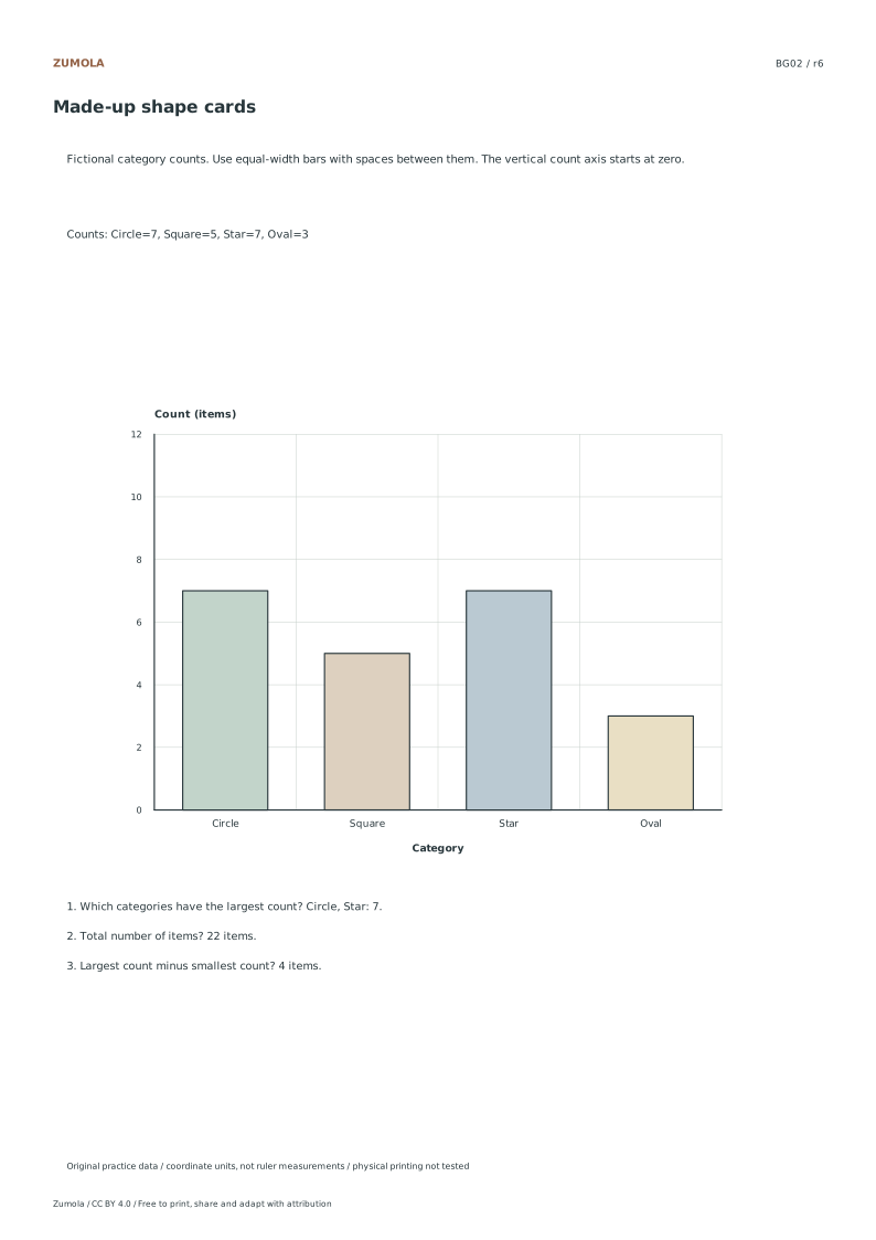
Make the bar heights match the counts Start each bar at the zero baseline and extend it to the corresponding value. In BG01 the Pencil bar reaches 6 and the Pen bar reaches 10; their difference is 4 items. Give Brush and Chalk their own equal-width bars rather than stacking them. In BG02, Circle and Star both have count 7, so their tops align halfway between the 6 and 8 grid lines. Preserve both as maxima. A complete drawing must identify each category as well as its numerical height.
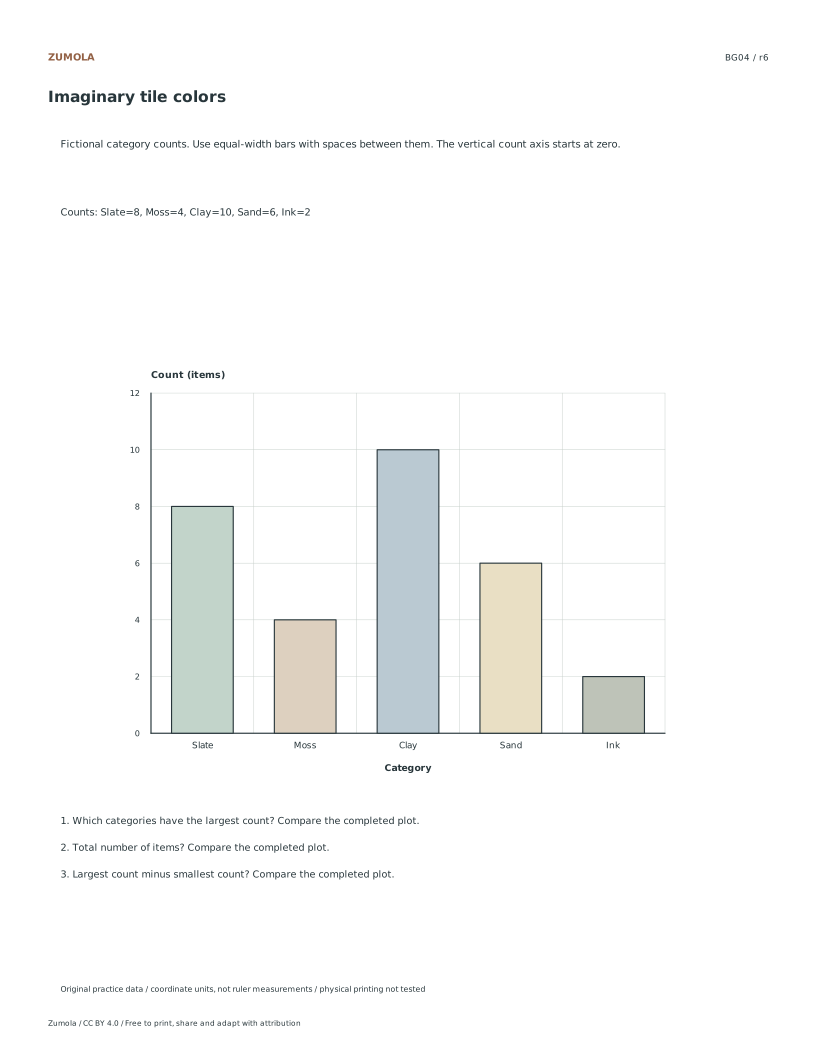
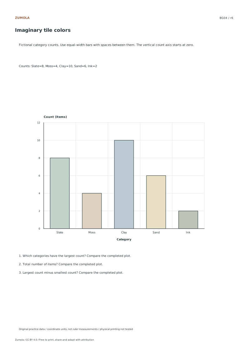
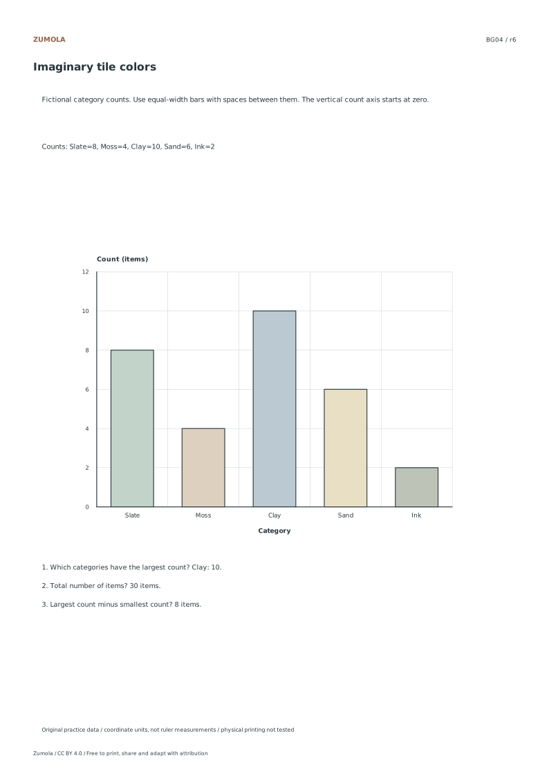
Calculate Totals and Identify Maxima Sum the recorded values to find the total count for the dataset. For example, add the values for tile colors to get the aggregate number. Next, identify the largest value to determine the maximum. If multiple categories share the highest value, include all tied maxima in your answer. Calculate the gap by subtracting the smallest value from the largest value. This difference is measured in count units, not graph heights. Review the worked answer sheet to verify your calculations against the reference. This process confirms understanding of discrete category data and basic arithmetic operations on the counts.
Checks that catch common errors
Watch for
Check instead
Measuring bar height with a physical ruler to determine the count.
Read the numeric value directly from the y-axis tick marks aligned with the top of the bar.
Treating the categories as adjacent numeric histogram bins.
Recognize these are discrete categories with separated bars, not continuous intervals.
Reporting only one maximum value when ties exist.
List all categories that share the highest count as tied maxima.
Keep the labels and margins readable
Choose the Letter or A4 file that matches your paper. Actual size / 100% preserves the designed layout; a different uniform print scale changes physical lengths but does not change the listed numbers or the arithmetic. Keep the whole chart and all labels inside the printable area. A ruler can help draw straight segments, but calculate from the stated numerical scale.
These files have digital geometry, arithmetic and page-boundary checks. Physical printer and classroom trials have not been completed. The resources are practice material, with no claim of curriculum certification or precision-instrument accuracy. The original files use CC BY 4.0: credit Zumola, link the license and indicate changes.
Useful answers
Why do the bars have spaces?
Each bar represents a separate category. Equal bar widths and gaps help separate those groups; the horizontal axis is not a sequence of continuous numerical bins.
Does the bar width change the count?
In these worksheets the count is read from height on the labeled zero-based axis. Keep widths equal so area does not suggest a different comparison.
Can more than one category be the largest?
Yes. BG02 has equal largest counts for Circle and Star. Include both rather than choosing one arbitrarily.
Are the answer files and editable graphs free?
Yes. Reference, student and worked-answer files are all free without an account. Single sheets include PDF and SVG; collection packs are PDF files. Analytics consent is not required to download.
Optional Google Analytics helps us understand which free resources are useful. It is off until you allow it. Drawing tools and downloads work with either choice. Privacy details